Stats Page
I came across Brian Baking’s “Cool Things People Do With Their Blogs” which led me to Luke Harris’ stats page which motivated me to finally make something similar of my own.
I’ve written previously about enumerating the external and internal links on my blog. I’ve also written previously about graphing my blogging goals. All of these are different forms of representing stats about my blog, so really this was an exercise in making all these disparate statistical representations accessible in one central place: my /about page.
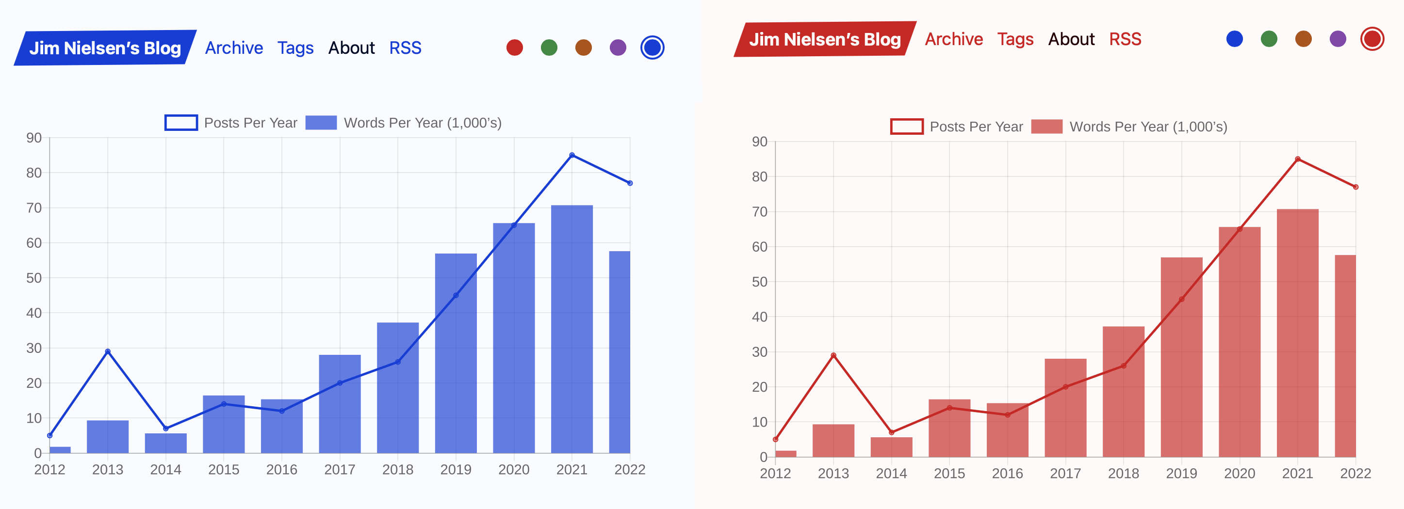
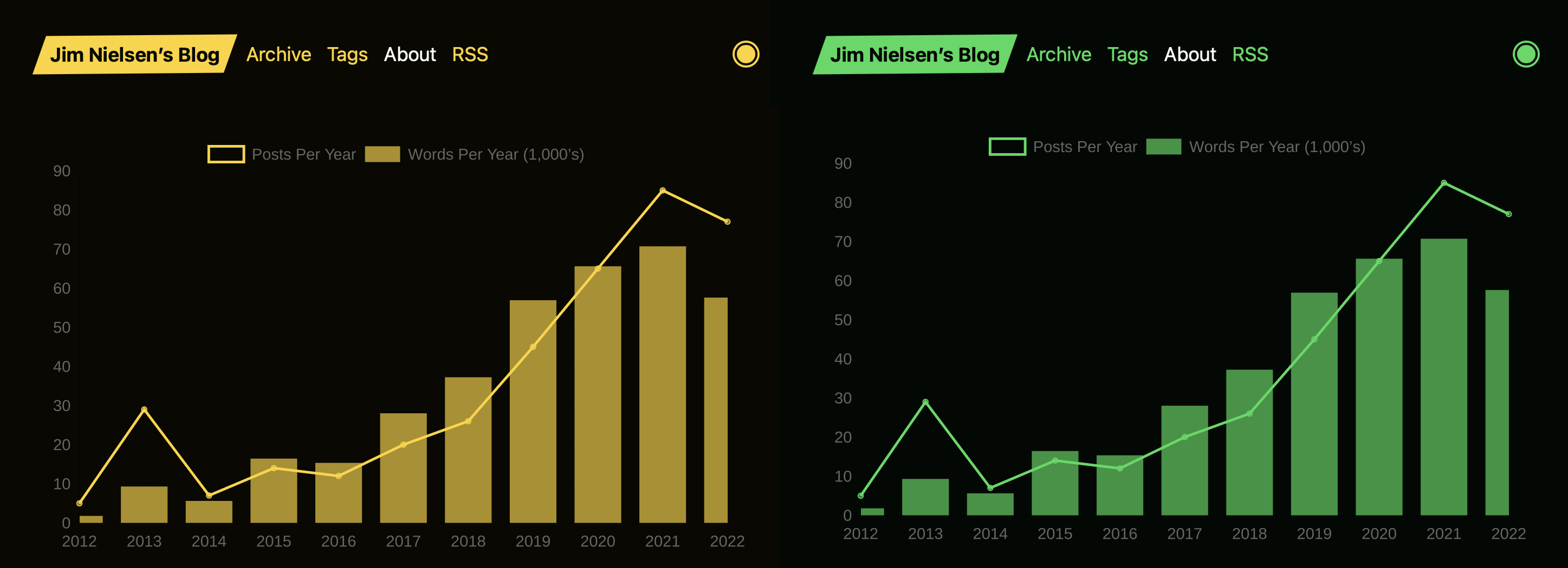
First, I created a general overview of stats surrounding my blogging over time. At the time of authoring this post, I have 11 years of blogging which has yielded 385 posts consisting of 364,601 words. A build-time generated chart from quickchart.io breaks down these stats over time.
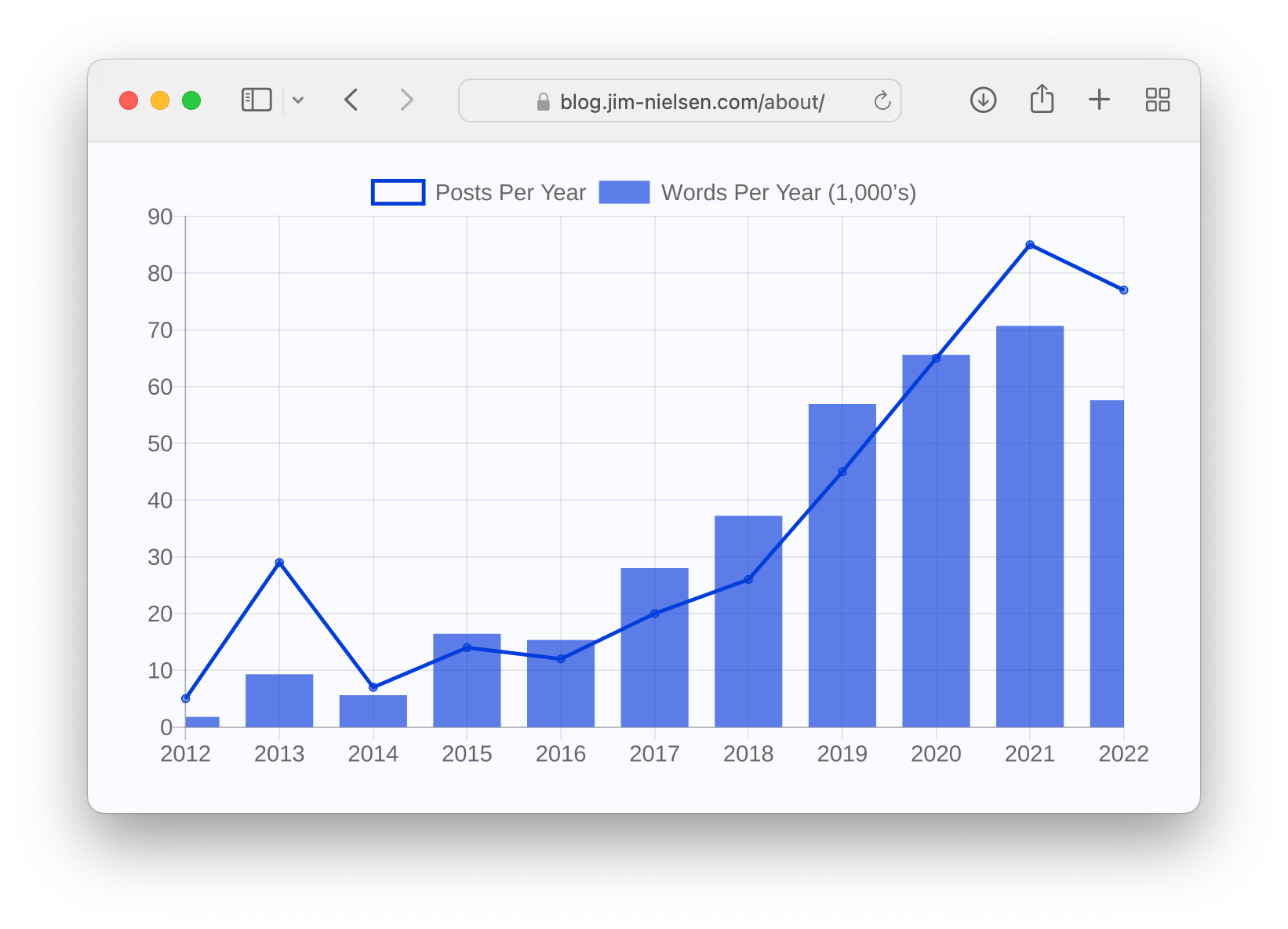
I’m not sure these numbers means anything to me — they’re just numbers. However, the 11 years of blogging is pretty cool I think.
Next comes the prevalence of tags on my site.
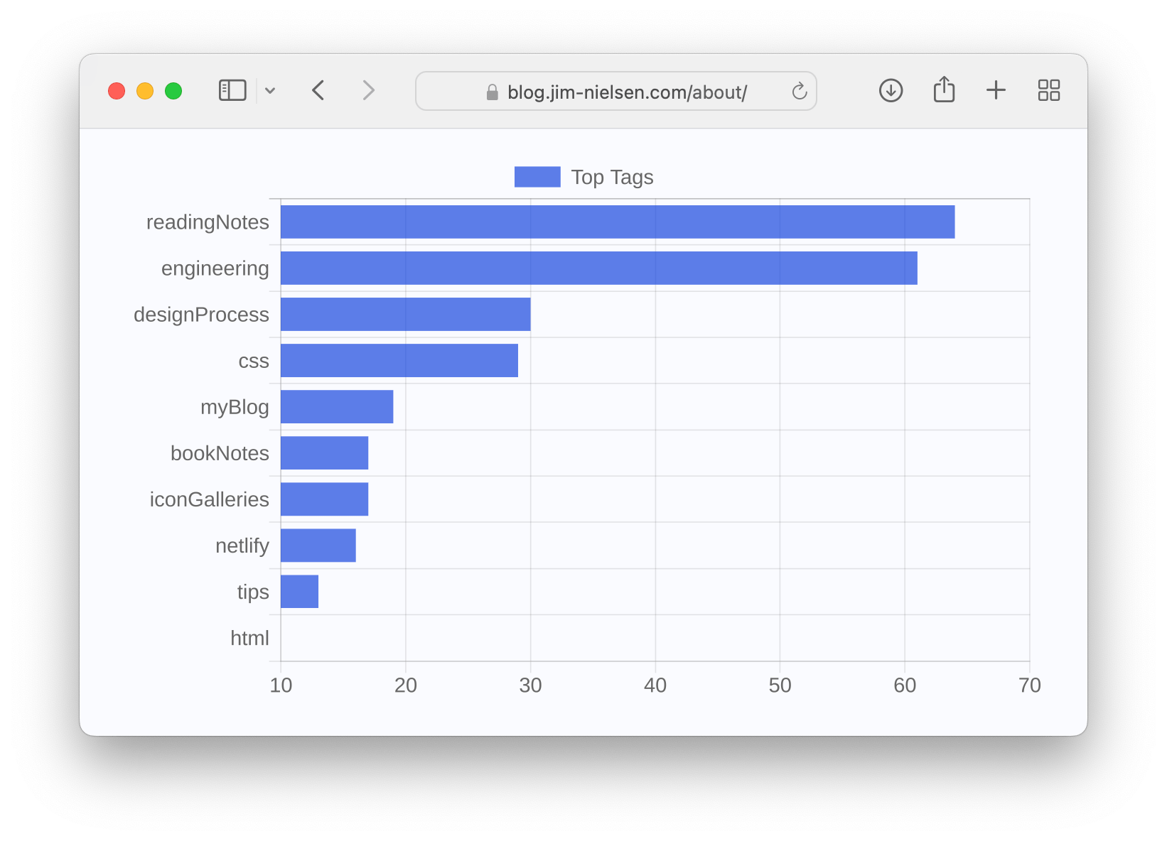
When I first generated this chart from the data, I discovered the generic (and useless) tag #thoughts was the most used, which I promptly pruned from all my posts. This is one of the reasons I like this “dashboard” of stats: it helps keep me responsible for tagging things in a way that’s useful.
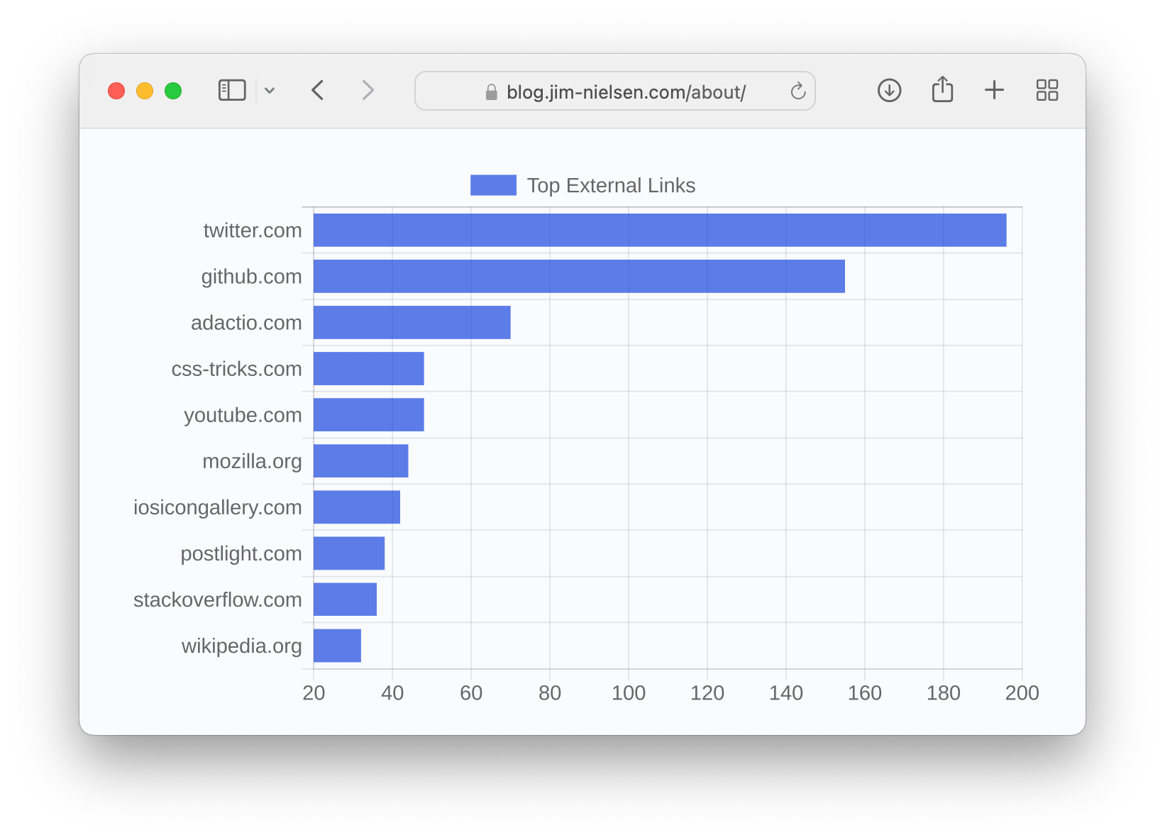
Next comes my charts around internal and external links. At the time of this writing, I have 1,961 external links that go from my blog to some other site on the web with the top three spots occupied by: 1) twitter.com, 2) github.com, and 3) adactio.com. Not much of a surprise there, but it’s interesting to see the top 10 tags on a chart showing their proportions to each other.
As mentioned earlier, these charts are generated at build time using the quickchart.io API. I get back an SVG which I embed in the page — with a few slight tweaks. Using SVGs allows me to style the charts for light and dark mode:
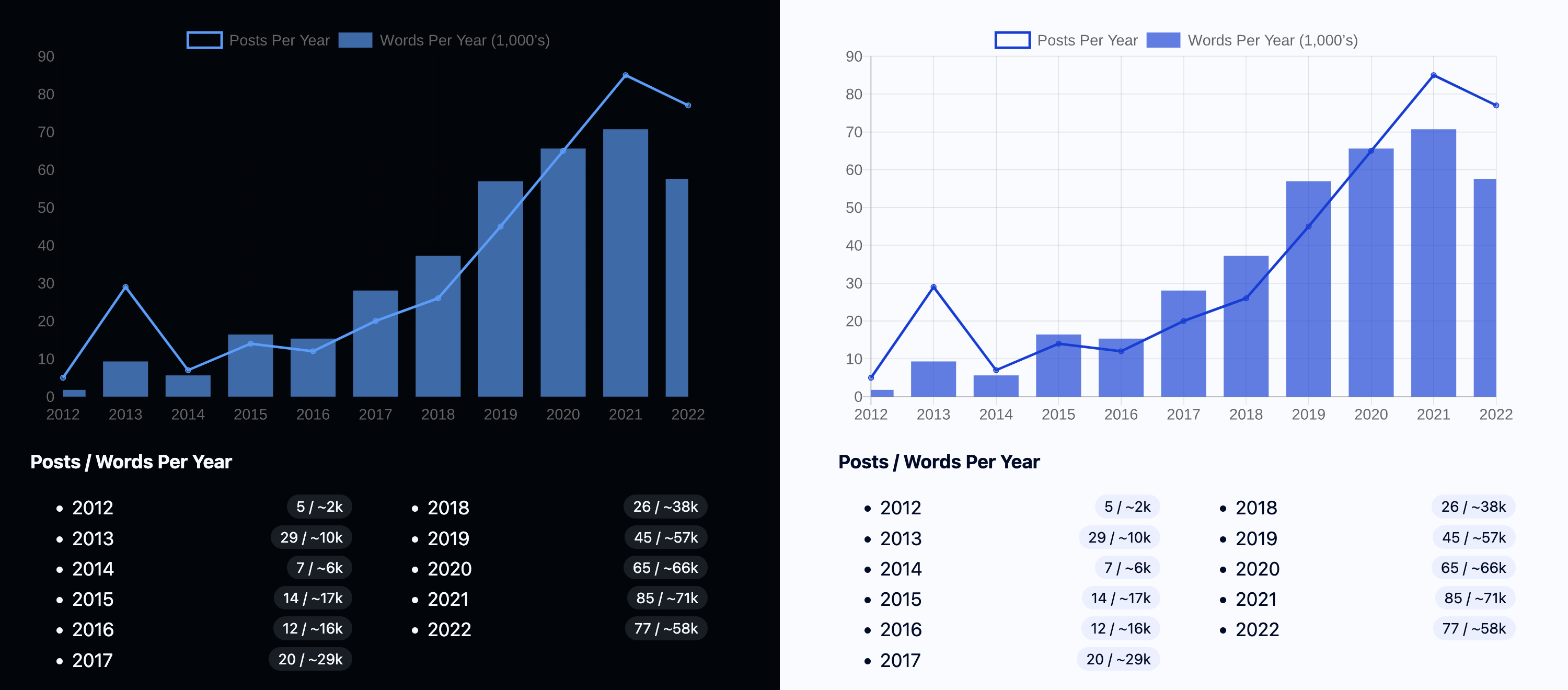
As well as themed versions that can dynamically re-paint to match my blog’s active theme color:
I’ll probably do more with this page in the future, but for now I’m satisfied. You can check it out here.