Graphing My Blog Post Goals
My recent redesign got me thinking about the “how am I tracking against my goal to write n blog posts this year?” status indicator on my blog’s home page.
What I want to understand from this widget is how on-track I am to reaching my goal — and I want to understand that a glance. This means not only understanding where I am currently in progress towards the goal, but where am I in relation to a trajectory over time. If my goal is to publish 72 posts this year and I’ve got 28 published through May, what does that mean? Am I ahead of schedule? Merely seeing 28/50 at a point in May isn’t enough to understand that progress quickly. The previous design had statuses (“On Pace” or “Falling Behind”) with corresponding visual indicators (👍 or 👎). And while those are helpful because they communicate status — i.e. I’m behind, on, or ahead of schedule — they don’t tell me by how much. If 28/50 in May is on track, how much on track is it? How far ahead of schedule am I? What is my current trajectory towards the end of year goal?
As I thought about how to communicate that at a glance, it became clear the best way to do it would be to graph the information. So I investigated.
I found this wonderful service called quickchart.io which lets you send a bunch of data to their API and it’ll give you back a chart of your choosing and configuration. I chose to do a line graph that charts two lines: 1) the trajectory of my goal spread across the year by month and 2) my current status along that trajectory.
Given the scenario I initially described — it’s May and I’ve posted 28/50 times — I asked myself whether this graph would help me quickly understand A) am I on target to reach my goal, and B) by how much? You can see in this example chart how succinctly that information gets communicated:
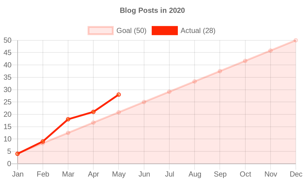
Perfect! This is what I wanted. So I implemented it.
I implemented it in such a way that I can pass it a specific set of parameters (goal, year, point in time, etc.) and see my status. The current implementation passes in the goal for this year along with the point in time of the build, but this flexibility made it easy for me to also pass in December 31 of last year (2020) and see where I was at the end of the year against my goal. You can see that charted here:
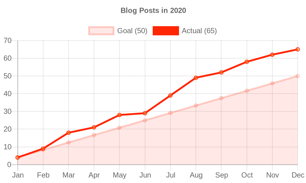
Hey, look at that: I was ahead of schedule on my goal all year! As the years go by and I (hopefully) continue to set goals, I’ll have a nice little archive of these graphs year over year.
Under the Hood
To accomplish displaying a graph like this that changes each time I publish a new post, I created a function that takes the yearly goal, a moment in time for that year, and all posts for the site. This flexibility allows me to create a graph for any given point in time. For the site’s normal build, my moment in time is merely new Date(). However, if I want to pick another moment in time and create a chart on the fly, it's easy enough to provide a different moment in time, like new Date("2020-03-25"). This is what allowed me to create a chart against my goal last year: I set the goal at 50, the moment in time as December 31, 2020, and I got back a graph.
The quickchart.io API let’s you do some neat things, including the ability to embed an <img> tag whose src attribute has all your chart’s data in it:
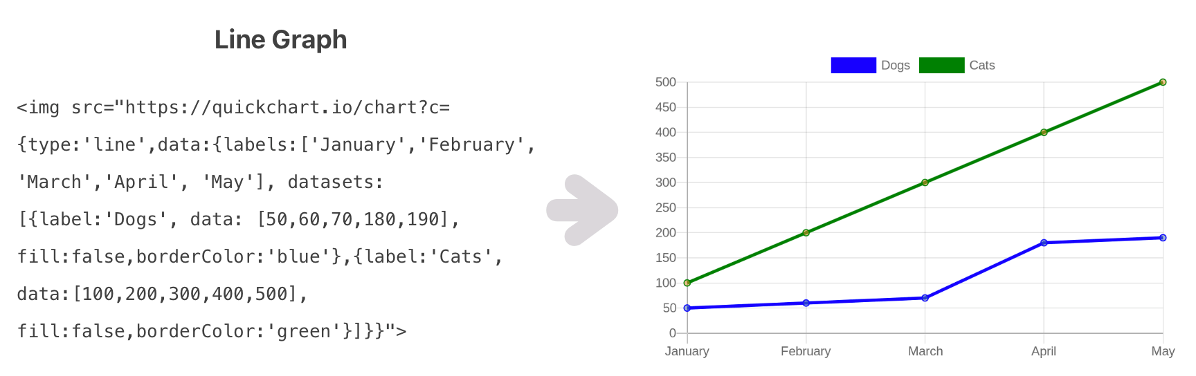
I decided against that style of integration because I didn’t want to surpass their API rate limiting (due to deferring the generation of the graph happening on every single client that visits my web page). Instead, I ask the API to generate an image of the graph at build time, then I bring the image data into my template and write it as a base64 encoded value, i.e.
async function getData() {
  const imgData = await fetch("quickchart.io/...")
    .then(res => res.buffer())
    .then(imgBuff => imgBuff.toString("base64"));

  return html`
    <img src="data:image/png;base64, ${imgData}" />
  `;
}
If you want to really give into the details, you can see more in my merged PR.