Feat: New Style
I did a redesign of my blog.
Actually, no. I did a realignment.
That’s not it either. I...changed some things.
Why did I do it? Because of a whim. It started with the thought, “what if I just tweaked these styles?” It ended with me changing a few hundred lines of code. That’s the beauty of your own site: you can do whatever the hell you want on a whim and ship it. Or don’t. Whatevs.
What was the whim? To distill.
When I first started blogging, I thought my blog’s design was something to be looked at. I had barely written anything, and what I had written felt like garbage. “At least I can make the design good,” I reasoned. Oh young Jim, you never did let content drive form.
The content I have now isn’t exponentially better, but it is more useful—at least to me. So while I used to think my of blog’s “design” as something to be looked at, I now see it as something to be referenced, to be used. So I’ve changed my blog’s appearance to reflect that posture. I expressed this sentiment more fully in my blog redesign post from 2018.
As mentioned, my aim was to distill. To reduce the style and function of my blog back down to its essence—its starting point in the browser. It’s kind of funny because some of the “redesign in public” sites out there like Jonnie Hallman’s destroytoday.com start with base styles and then slowly, iteratively add more and more. I’m going in the opposite direction: I started with more and am now removing (not that my old design was a lot).
I wanted to have a base set of styles, not much more than the browser defaults, and see how far that got me. So I started with the modern version of normalize.css. That was a good base. From there I gave myself some colors in CSS, a few custom styles for use in post lists, a few typographic tweaks, and that’s about it. From that starting point, I reasoned, I’d write my HTML and let the chips fall where they may. If I use an <h1> anywhere in the markup, it’ll look like an <h1>. No special overrides.
I like where I ended up. I might even try removing more, but I’m hoping this base set of styles will give me a good foundation to consider art directed posts in the future. Maybe, maybe not. We’ll see.
Changelog
Here’s a topical summary of the changes I made and why. I rationalize design decisions a lot in my day-to-day job, so doing it here on my blog ain’t no thang.
Navigation
I settled on removing navigation from every page. The navigation for the entire site lives solely on the home page. In my distillation process, site nav felt cluttered on individual blog pages, and hiding it behind a “Menu” toggle entailed a click, so I figured why not just make that click navigate you home where the site nav already lived? As a side effect, this decision simplified my templating setup because I only needed site navigation defined in one place.
Header
Adding things is easy. Removing things is hard.
It took me a while to distill my the header to its essence. I tried different markup, different styles, different designs, but nothing was sticking.
Eventually I said “well, this is really just an <h1> on the top of the page, so don't try and make it special. Make it an <h1> and let the default styles take over (which are intended to handle hierarchy for you).” So I did. And I liked the result.
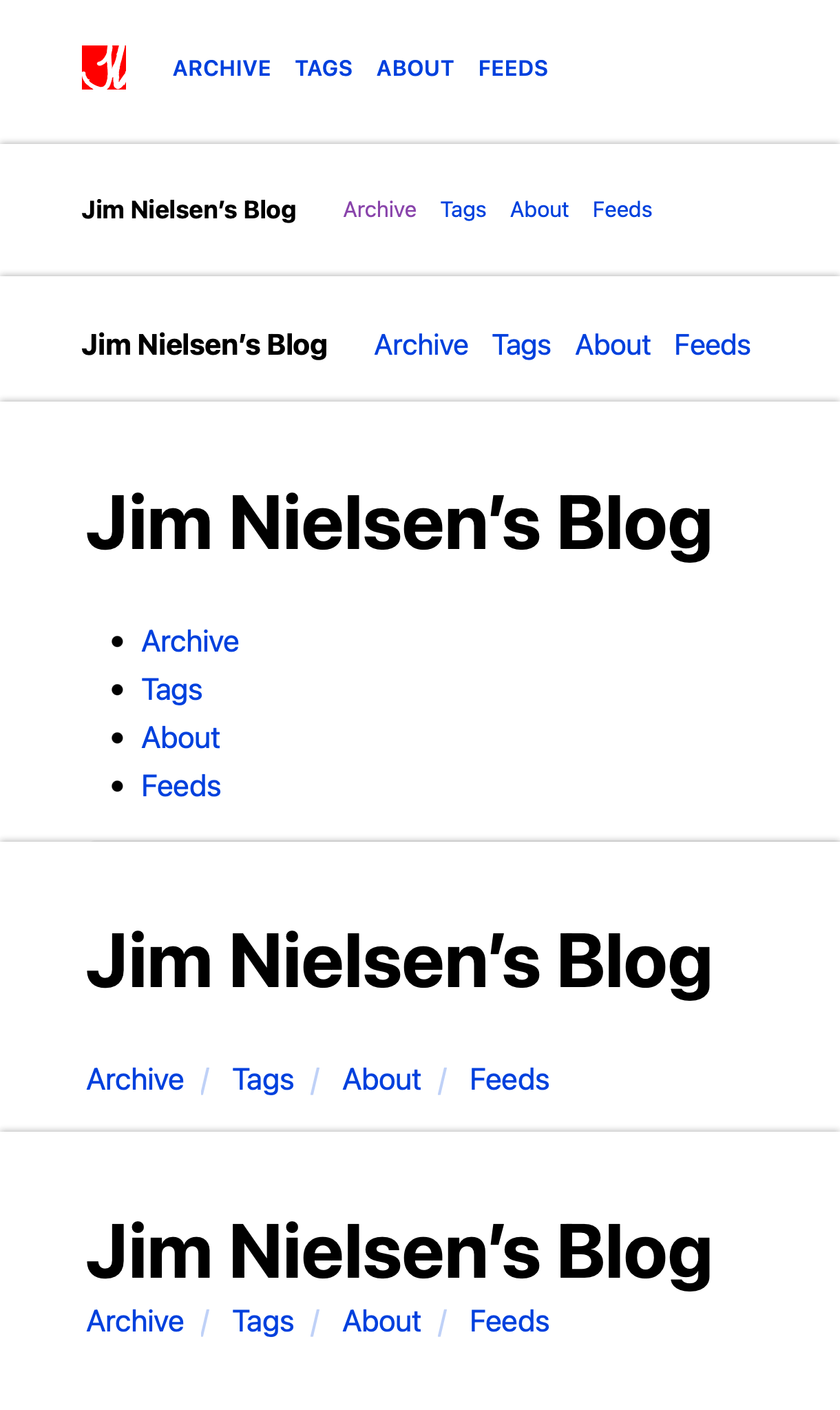
Look at all those iterations. These were screenshotted from Netlify deploy previews, meaning each of these were commits I actually built in code at some point thinking, “yeah this might work...”
As you can see, I started with a version where I reused the favicon for my site as the top-left link back to home. Because there were so few graphics on screen, I thought “I better make what’s there damn cool!” So I started down this path of animating my favicon:

Eventually, however, I wanted to pare my site down even further and decided against using a graphic. But I’d already done the SVG animation! No biggie, I can write about it here in my blog so my ego feels satisfied showing this thing I felt proud of but never got to show to anyone (FWIW: this post about how line animation works in SVG was a great resource for learning).
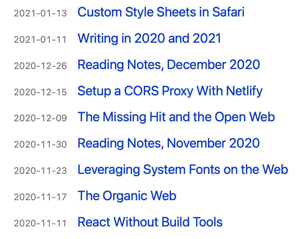
Weblog -> Blog
I stopped calling it my “Weblog” and reverted to “Blog”. At one point in the past, I was trying too hard to be different. “My writing is a log on the web, a weblog like the old days” I told myself. But now I don’t feel like standing out. Plus the very domain of the site uses the word “blog” not “weblog”. Call a spade a spade, as they say.
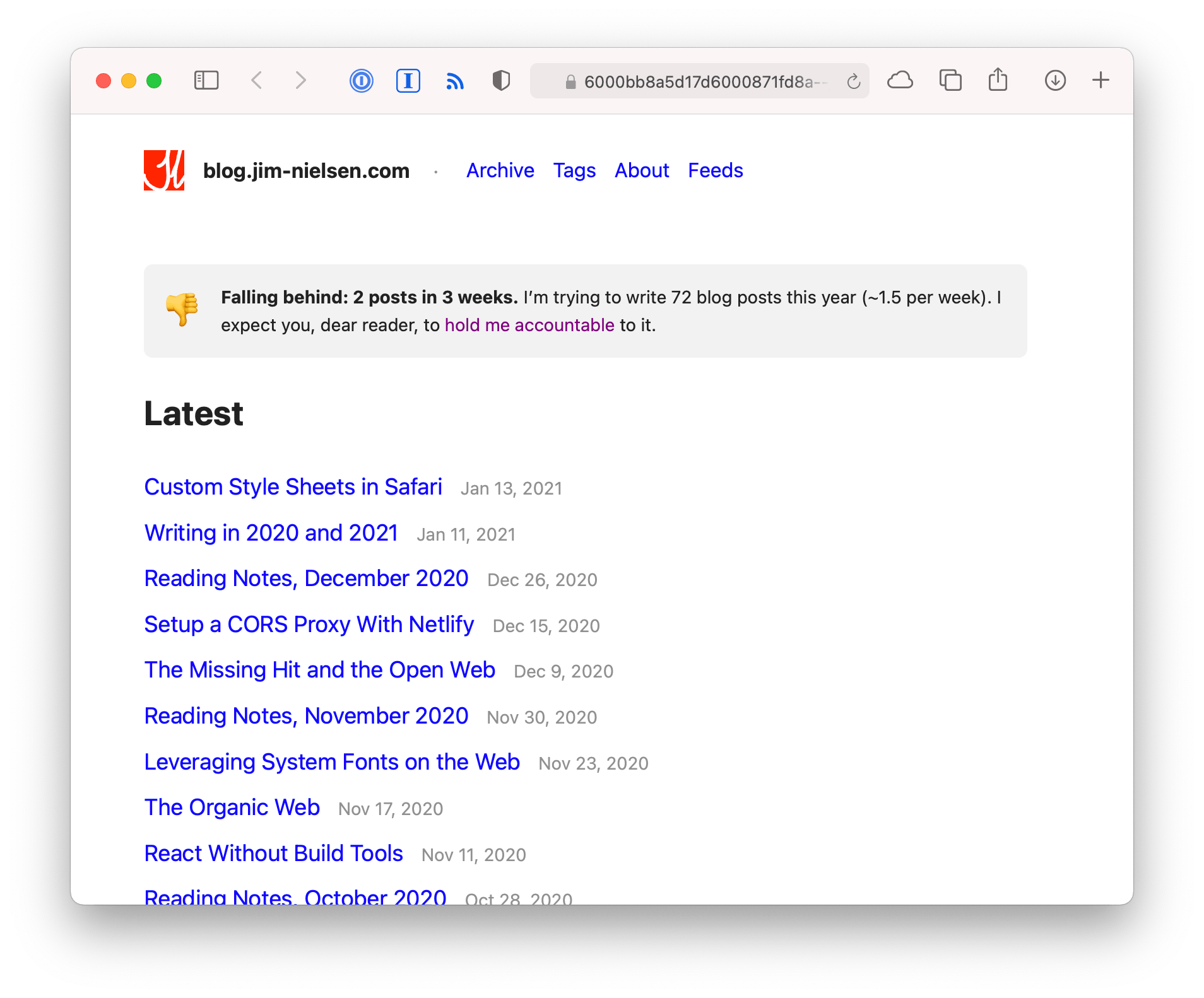
Dates
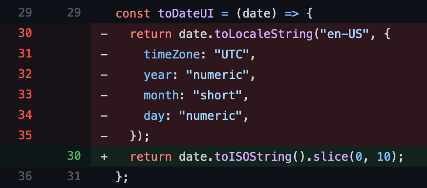
I changed the display of my dates from localized values to a more universal value. For example, for en-US sites, you’d see dates formatted like “Jan 9” or “Jan 9, 2020”. Which is fine. But seeing as I’m a believer in ISO8601 (as explained by this xkcd comic), I figured I should be the change I want to see in the world and format all my dates as YYYY-MM-DD.
Additionally, I moved the dates from coming after the post title to being before it:
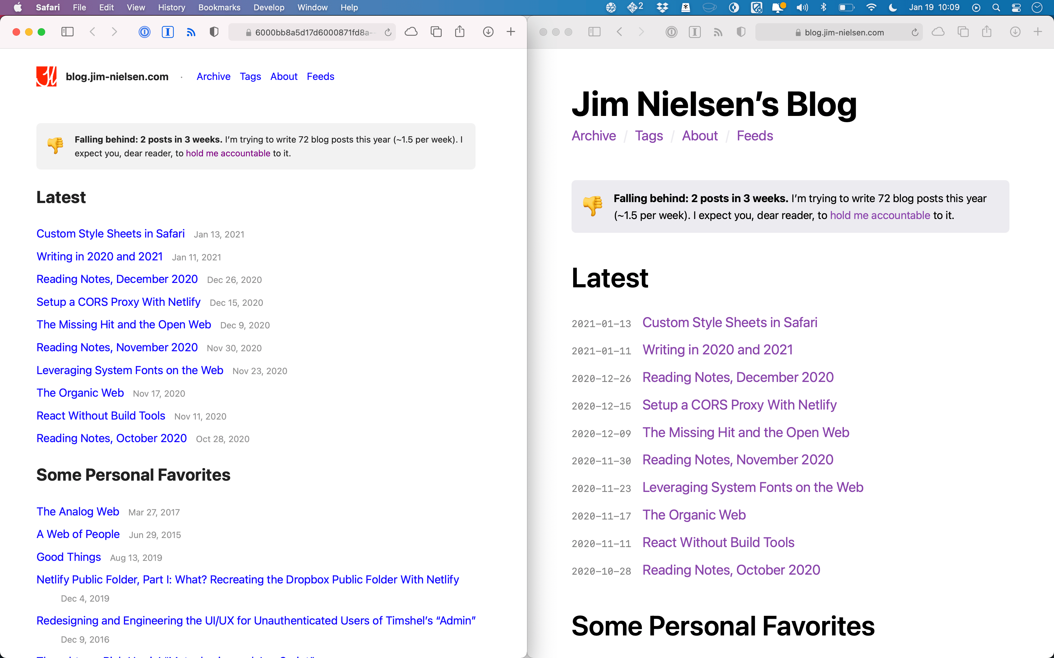
Why? I felt the post date to be incredibly relevant, almost more relevant than the title—like a big qualifier to the content: hey, FYI, I wrote this years ago when I was less mature and less knowledgeable.
Colors and Variables
One interesting tidbit: I try not to control the explicit color values for black and white. I let the browser handle it, where supported. If it’s not supported, I give simple fallbacks (looking at you Firefox).
@supports not (color-scheme: light dark) {
   html {
     background: #fff;
     color: #000;
   }
   @media screen and (prefers-color-scheme: dark) {
     html {
       background: #000;
       color: #fff;
     }
   }
 }
This might not be a good idea, but I like it for now.
Reply All
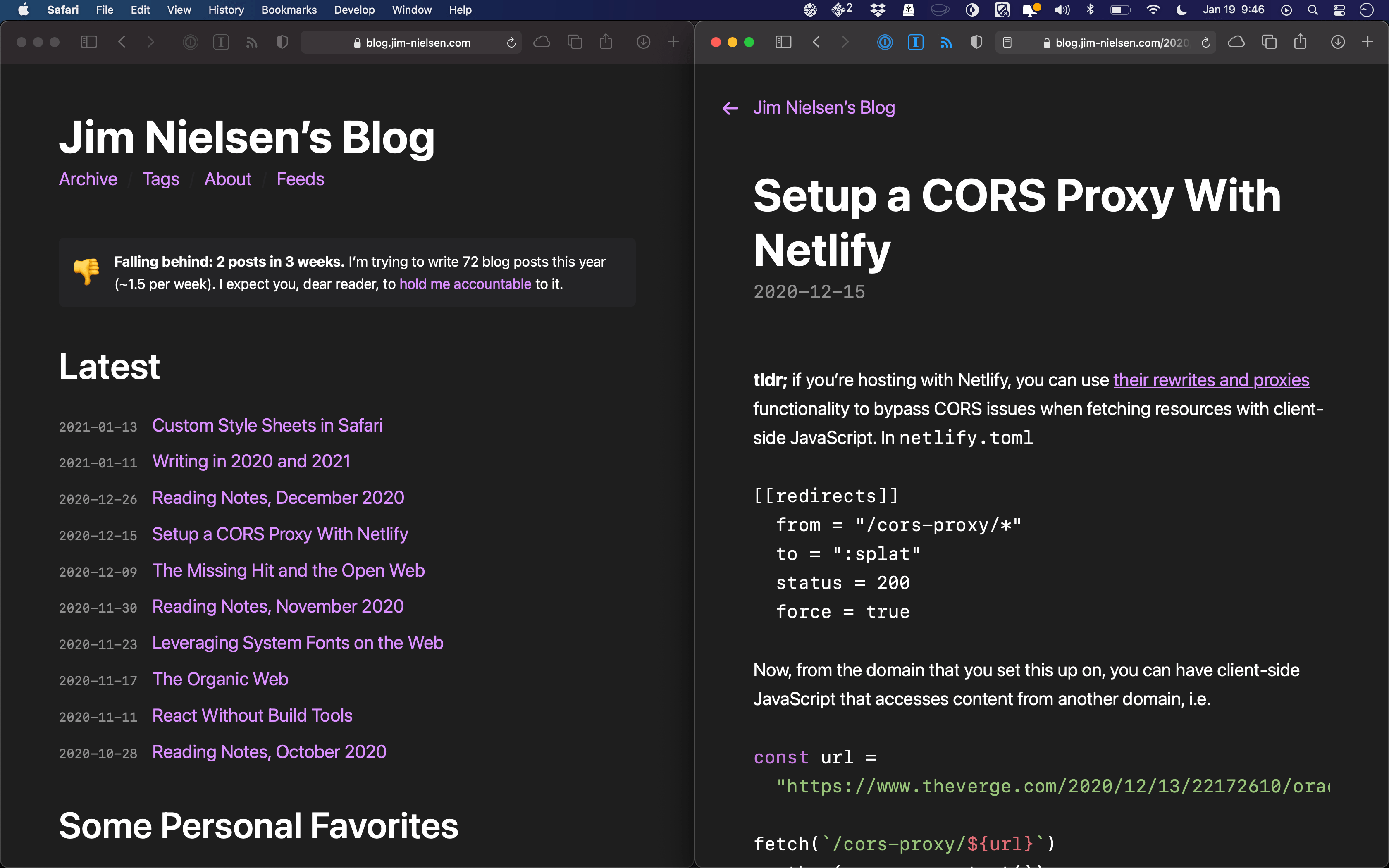
This is the only change you’ll see if you subscribe via RSS. I now have a unified footer, in both RSS and HTML, for individual blog post pages. It merely states how the post was tagged (if applicable) and provides links for folks to get in contact via email or on twitter. Occasionally folks reach out to me after I’ve written a post and I enjoy the casualness of it. So if you feel like reaching out, now’s as good a time as any.
Update: 2021-01-23
After posting, I received this friendly note from Matt Widmann:
I noticed that you typeset your dates in a monospace font. Is that because you want the numbers to line up? If so, you could use a proportional font but then specify this CSS to get tabular numbers:
font-variant-numeric: tabular-nums;
Matt nailed it: I was using a monospace font to ensure the numbers lined up. When I made my notes about the design principles behind the SF font family, I specifically cited one of the examples around using proportional vs. monospace numbers. But I didn’t think you could actually achieve that kind of fixed-width spacing with a proportional font in the browser. Turns out you can! Big thanks Matt.