A note before we start: I don’t know how much of this I believe. I’m sketching out some feelings in this post and thinking through whether it actually makes any sense. I’d be curious where other folks land on this.
I’m not sure I totally understand this impulse we have on the web to override the default style and appearance of fundamental computing controls.
Everyone wants their own checkboxes, radios, and select menus that fit their brand.
But websites aren’t about you or your brand. They’re about the people you’re serving who have to use them, i.e. the users.
And their needs vary from one person to the next, based on their unique context and environment (operating system, device, etc.)
For them, a checkbox that’s visually and functionally uniform across every website is a good thing. It provides consistency and sets expectations — “Oh hey, a checkbox, I know how to use this. It looks and functions the same as a checkbox on every other website, app, or system preference on my computer.”
But where we’ve arrived on the web is consistency for brands is more important than consistency for end users.
Take Radios, For Example
Imagine a radio control in macOS. There are some design considerations in how that system-level control looks and functions that are unique to macOS.
For example, when a window loses focus in favor of another window, radio controls are de-emphasized visually because the user is now focused on something else in a different window.
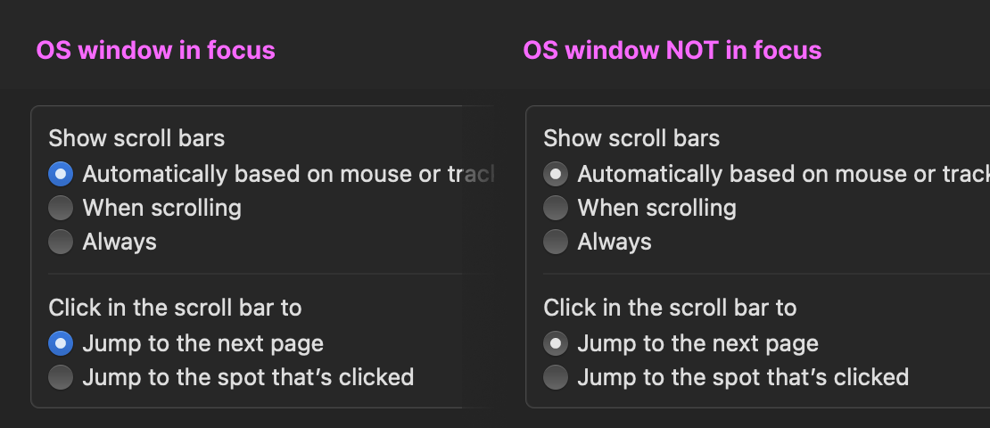
This is a unique solution for a specific computing experience where multiple windows may be on the screen at the same time and, as the user shifts focus from one window to another, additional visual help is provided to emphasize and de-emphasize the user’s focal point in the user interface.
The beauty of leveraging a system-level element is that you’re tapping into these kinds of solutions which are tailored to solve problems unique to their context and environment.
Contrast that with a radio somebody re-implemented on the web to match their brand. I highly doubt many have taken into consideration a de-emphasized state for windowed computing experiences.
Or Take Select, For Example
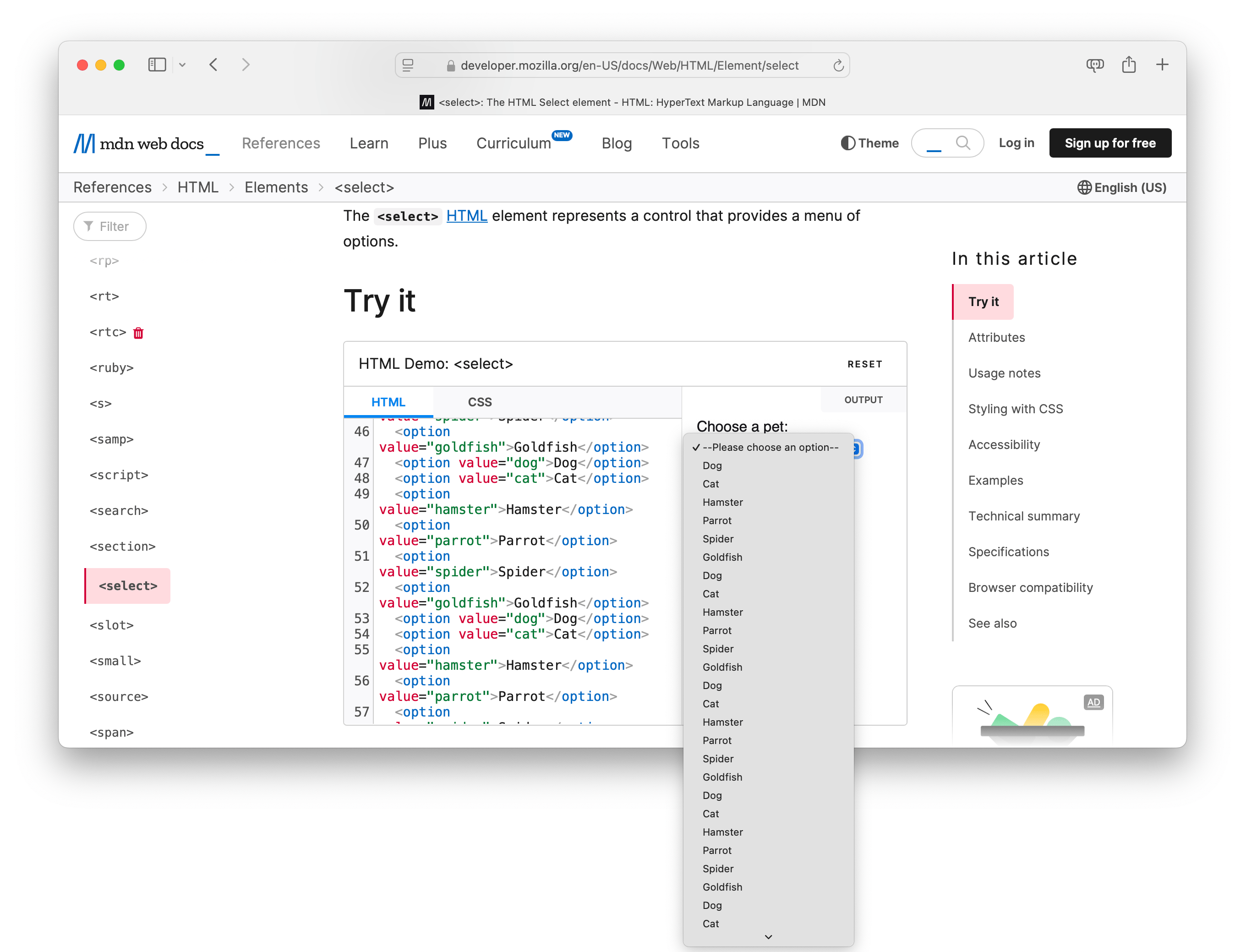
As another example, consider how the <select> element can break outside of the browser window because it is an OS-level control.
For example, have a list with a lot of options? A <select> element can provide users something your custom select never could: an adaptation to its environment, the operating system. If the browser window is small on screen (because, say, the user is trying to do something else within their computing environment like side-by-side windows) the <select> can break out of the browser window and accommodate more space.
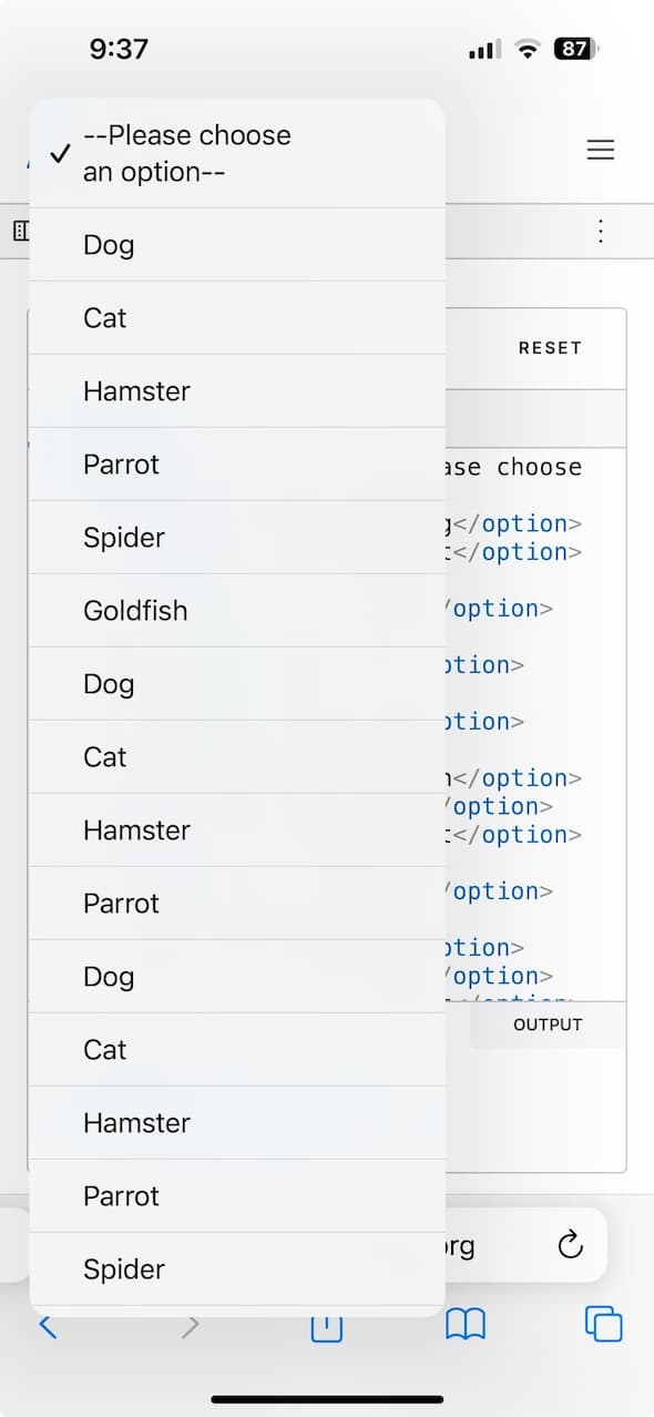
Similarly, though perhaps not as advantageous, on mobile devices like iOS the <select> can break outside of the browser window. Something a custom element could never do.
Additionally, these native controls are incredibly forward looking. If new hardware or OS appears on the scene (see visionOS), how the <select> works is handled for you. When it ships, you’re up to date (vs. a design system where now you have to go consider how, if at all, things change for your entire system and every site it supports).
Business case: there’s no more economical way to ship websites than using the platform. You get outside engineering resources to build your UIs at no cost to you! Every component you build is a liability, so what’s the least you can do to deliver value?
I get it, there are trade-offs. But when building UIs, how often do we stop to ask: What’s lost when we refuse to consider the context and environment of our users because we instead force upon them the context and environment of our brand?
Two Cents on Design Systems
We extoll the virtues of a “design system” within our brands and organizations — consistency, familiarity, uniformity, all for our users! But once they leave the walled garden of our brand, it’s ok that they suddenly lose this privilege?
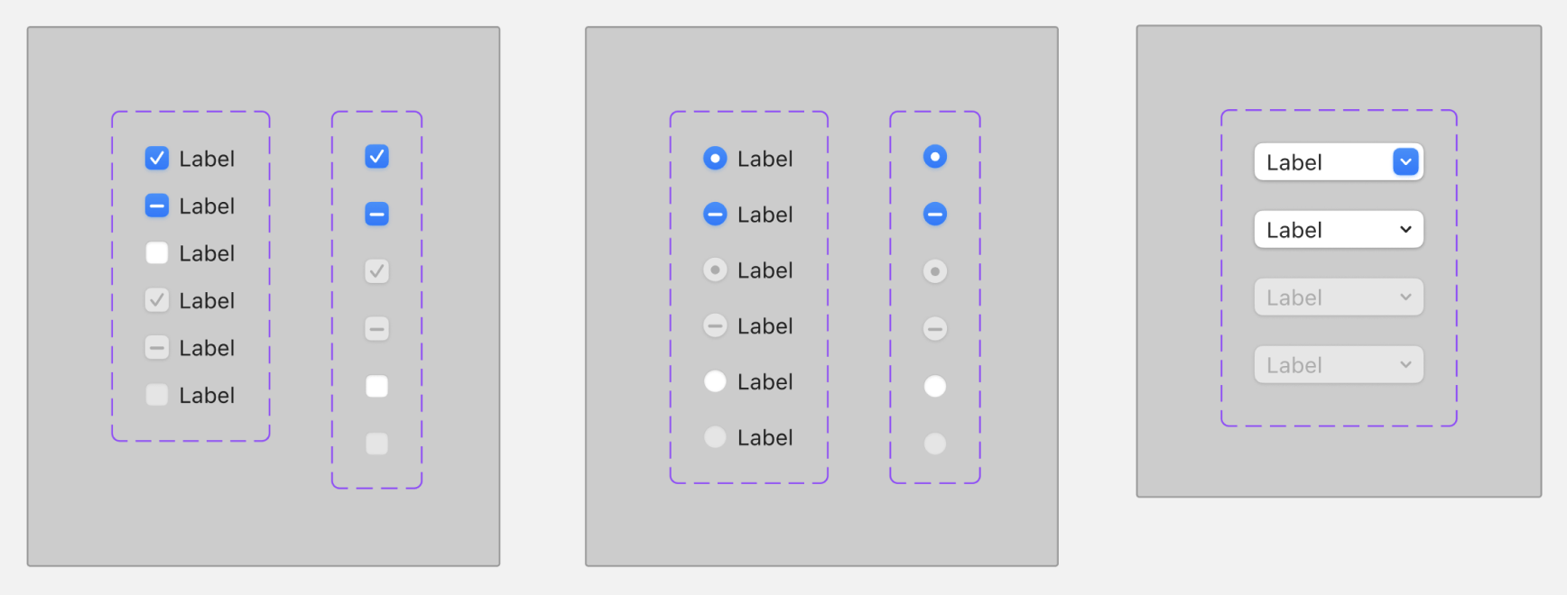
If the inconsistencies across design systems for basic computing controls were within our own organizational systems, we would be enraged! But since they’re across brands (e.g. websites), it’s fine? (Below is an example of radios and checkboxes and selects across various popular design systems.)
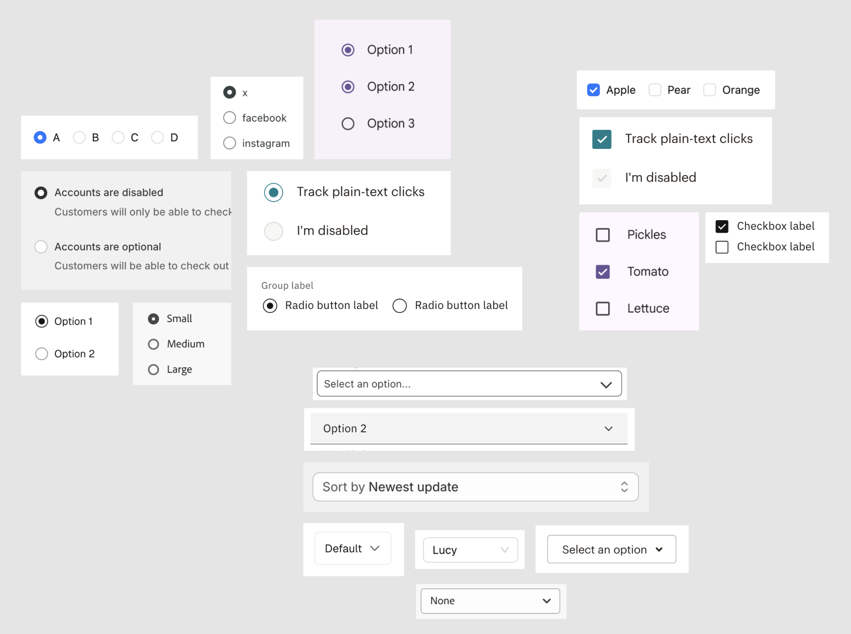
In the end, it’s the user who has to deal with these inconsistencies. But isn’t that what “systems” are meant to solve in the first place?
In other words, the default, un-styled, system-level controls for radios, switches, checkboxes, etc., are the original design system before our branded design systems overrode them.
Are Organizational Design Systems User-Centric?
Your organization’s design system lacks the sensibilities of your users’ platforms.
“We made our own radios! They’re great! They’re ‘on-brand’ and consistent across all our stuff.”
But they’re not consistent across all your users’ stuff.
In other words, you made a radio for your company without considering what makes a radio a radio on the computer it will be used on.
You oriented a visual and functional experience around you and your environment, rather than the person you’re serving and their context and environment.
And I just tend to think we’re losing out on something with that choice — to say nothing of its cost.
Disclaimers
Disclaimer 1: I know I’m cheating here. Not all native system controls have been standardized in a way that serves the varied needs of complex applications. But, on the other side of this coin, a simple healthcare form that would be perfectly suited to some basic radio controls and a plain <select> menu instead rolls its UI for no other reason than to make it “on-brand” and it’s worse in almost every way: visually, functionally, accessibly.
Disclaimer 2: Yeah I know, this puts us as developers at the mercy of browser vendors and OS platforms and the paltry level of access they give us to system controls. For example, it’s still not easy to mark a checkbox with an indeterminate state in HTML alone. I get that. But perhaps if we spent more time advocating for these kinds of enhancements (instead of re-theming a checkbox for the nth time) maybe we’d get what we ask for?
Disclaimer 3: In case it’s not clear, I am not advocating every website everywhere should only use form controls provided by the web platform. The web is a big place, it’s silly to make universal statements for something so big. What I’m trying to do is bring attention to the fact that maybe you don’t need to roll your own. Maybe design systems should consider the computing context and environment of their users over the context and environment of their own brand.
Disclaimer 4: I get that system-level consistency is a kind of branded consistency. If you choose an Apple product, you’re choosing an Apple-branded experience for native form controls. I realize these things are not totally brand-agnostic. But consumers make a choice when they buy a computing device, and maybe we should honor that choice rather than try overriding it.
Disclaimer 5: Having disclaimers clears me of any and all criticism lol.