Your Product Doesn’t Have to Look the Same On Every Platform
In case you couldn’t tell from the title, this post is a hot take.
It’s a bit of rambling and not quite coherent, but that’s because my thoughts around it aren’t quite coherent. I’m hoping in writing this all down I can work through and flesh out some of my thoughts and feelings towards actually having a more informed opinion on the matter, rather than just some feels.
Hypothesis
Remember the effort involved in convincing people that websites don't have to look the same in every browser?
I believe the next version of this argument will be convincing people that software products don't have to look the same in every operating system / platform.
So what do I mean by that?
Back Story
Traditionally (and maybe that’s why I feel the way that I do, I’m an oldie now) software products used to take on the conventions, gestures, and aesthetics of their environment: the operating system. Photoshop CS4 on Mac was different than Photoshop CS4 on Windows.


Do those screenshots strike a bit of nostalgia in you? I know it does for me. I remember when Photoshop used to have those very Mac-esque floating windows, such that even when Photoshop was open you could see right down through the app into the underlying desktop. Photoshop for Windows, on the other hand, was an app that took up the entire screen. Even if nothing was open, you couldn’t see the desktop. And that made sense, that was very Windows-esque.
Similarly, look at the native controls. Photoshop for Mac used the underlying Aqua-themed controls native to the operating system. Your select menus and checkboxes in Photoshop looked like the select menus and checkboxes of the underlying operating system.
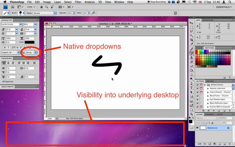
This resulted in applications providing a kind of coherence and cohesiveness within the environment of the operating system. As you switched from one app to the next, many of your controls looked and functioned the same. Granted there were similarities in a product across operating systems (Photoshop on Mac still looked a lot like Photoshop on Windows), but they were not identical. I have nothing against similarities. Identical is what I’m trying to get at. Identical is what we used to strive for in web designs across different browsers. “Your website doesn’t have to look identical in every browser” would’ve been a similar refrain.
What’s interesting is how the web seems to be the one that spurred this change of direction, at least in part. When the web came along, web sites couldn’t always tap into OS-specific gestures or UI toolkits like native applications could. So websites created their own UI kits via CSS: custom navigation elements, dropdowns, buttons, etc. This made web applications look the same across operating systems, whereas native applications did not. (Granted, there are a few elements you can use on a website that look like system-level UI controls—<button>, <input type="radio" />, <input type="checkbox"> or <select>—but even the appearance, and in some cases functionality, of those elements has been increasingly hijacked from the system’s defaults to the whims of the web page’s developer. Creating custom radio buttons, checkboxes, and dropdowns in CSS used to be hard, but it’s gotten way easier and, I predict, will only increasingly become so.)
Then came electron, which carried along with it this “web” way of designing apps: ignore the conventions of the OS, instead make things consistent within your product across operating systems. For example, GitHub once created a desktop app that was different, depending on whether you had the Windows version or the Mac version.


I liked the old GitHub for Mac. It felt like a Mac app. The newest GitHub for Mac, on the other hand, looks identical whether you’re on Mac or Windows. Besides the green, yellow, and red circle buttons in the upper left to control the window, there’s nothing really “Mac-y” about it.

I get it. Design, engineer, and maintain one piece of software instead of two. It makes a lot of business sense. I’m not saying it doesn’t. But there’s tradeoffs in everything, and I think we’re losing something here. It really gives me an appreciation for apps like BBEdit or Transmit (by Panic) that are built specifically for Mac and always have been.
The new ethos of product design seems to have at it’s core the underlying assumption that if your user goes from a native Mac app to a Windows desktop app to a mobile Android app and then to a web app on iPhone, we can should make the experience look and function the same across all those experiences. That would’ve seemed insane 15 years ago, but now seems to very much be our reality. The best example of this is new kind of product design trajectory is probably the new Twitter, whose aim appears to be making the experience of Twitter become more and more identical across all possible touch points, irrelevant of your operating system, even down to emojis. It seems products are aiming to be the new operating systems: they dictate every element of the GUI you experience.
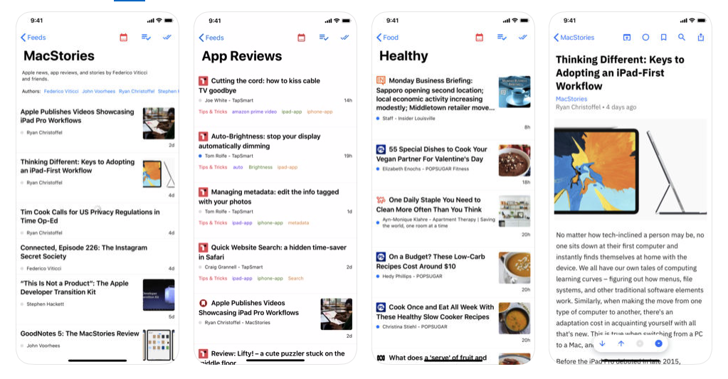
This isn’t just happening in the space of desktop operating systems. I think every product designer buds up against the question: should I leverage the UI elements of the operating system I’m building on? Or should I make everything custom and cohesive within my own made up world of UI language? Let me give an example by comparing two RSS readers for iOS: Elytra vs. Reeder.
Elytra seems to be taking the stance of: I’m going to be an iOS reeding app. I’m going to look like iOS. I’m going to feel like iOS. If Apple built an RSS reader, this is what it would look like. It looks, feels, and functions like iOS.
On the other hand there’s Reeder, which uses many of the system-level gestures of iOS, but very much has taken the position of creating it’s own UI language for communicating how to interact with the product wholly apart from iOS.
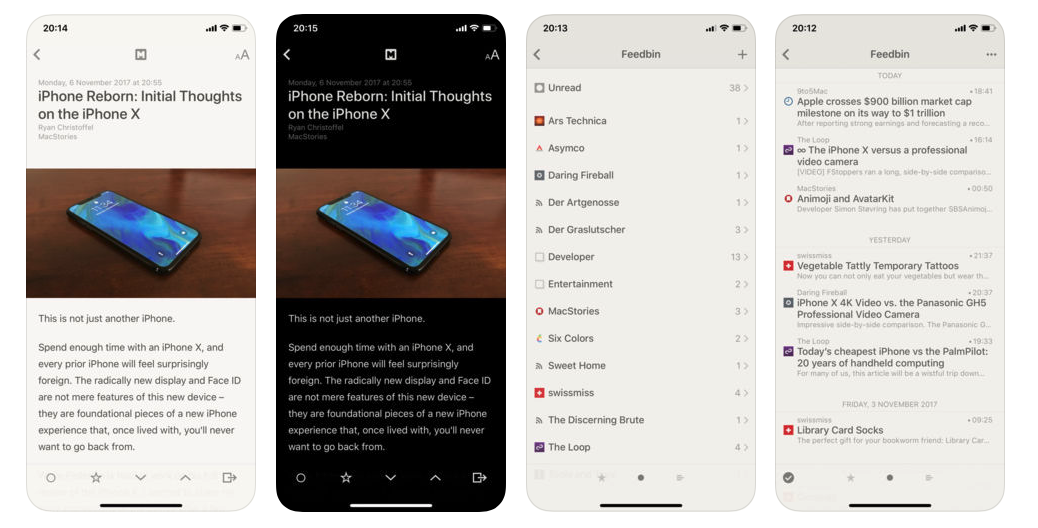
I’m not necessarily saying one choice is bad and the other is good. I love Reeder and have been a long time user. However, when I recently came across Elytra, I immediately wanted it because of it’s continuity of UI language at the system level within iOS. For whatever reason (and this post is trying to help me figure it out) there is something in me that yearns for that operating-system-inspired look in my apps.
Maybe It’s About Control?
In some regards, this does seem like a fight of control. Apple can dictate how UIs should look because they own the operating system. Microsoft is in the same boat. But where does that leave Google or Facebook? That doesn’t seem fair to them right? So many of their products are web-based, in a sense agnostic of the operating system on which they live. How can they create their own design language that is uniquely Google and not Apple or Microsoft? That’s precisely what they’ve been doing with material. And material is, in a sense, the design language of an operating system: Android. But, unlike Aqua which was the design language of an Mac OSX, Material is a language for more than just an operating system. It’s a language for a product, for a company. It’s agnostic in a lot of ways to what operating system you’re on.
Summary
Note the inversion in all of this: whereas you previously used an operating system and had some semblance of continuity between various user interfaces of different products (and with the system itself), that continuity within the operating system is now dissolving and instead you have continuity between products across operating systems. Twitter for Mac looks like Twitter for web looks like Twitter for Android looks like Twitter for Windows. But once you switch to Facebook, all bets are off. Radios are different. Dropdowns are different. Checkboxes are different. Similar, perhaps, but still different. We gave up coherence and continuity across products within an operating system for coherence and continuity across operating systems within a product.
I don’t think I like this direction. I enjoyed the operating system being the platform in which I lived, the products I use adapting to the language of the OS. Now, it seems, the products I use are the platforms in which I live (Twitter, Facebook, GitHub) and I have to adapt to the language of each particular product’s platform. The former felt centered around me. It’s a personal computer. The latter feels centered around them. It’s their computer, I’m just using it.
At least that’s how I feel write now (meaning as I write this right now). Things could change.
What do you think?