Design Principles Applied to the SF Fonts
I recently watched Apple’s “Introducing the New System Fonts”, which is a recording of a presentation at WWDC 2015 that introduced the San Francisco fonts. While the talk was focused on the SF font specifically, it provided an overview of a number of good typographic principles and how they were applied during the design and development of the SF fonts.
Visual Perception
Visual perception is largely about illusion.
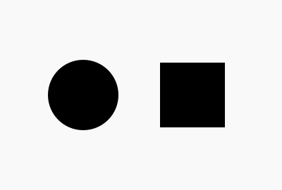
When I first started designing on a computer, I did not grasp this. Want to make two different shapes of the same size? First open Photoshop. Then choose the square shape and punch in 24×24 pixels. Now choose the circle shape and punch in 24×24 pixels. Done.
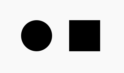
But wait, why do those not look like they’re the same size, even though their pixel dimensions are identical? The square looks slightly bigger? Well, technically, it is bigger. Think about it: if they’re both the same pixel dimensions, the square has a larger area. The circle is just the square with more of its area trimmed off.
This is why, if you want the shapes to appear as though they are the same size, you have to make them different pixel sizes.
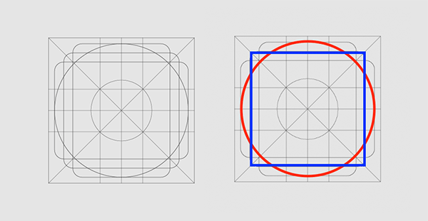
This is why when you look at something like an icon system design grid you’ll see the guides for the circle be larger than the square. You have to offset those changes in area in order for the objects to appear as though they are the same size. Visual similitude is not mathematical equality.
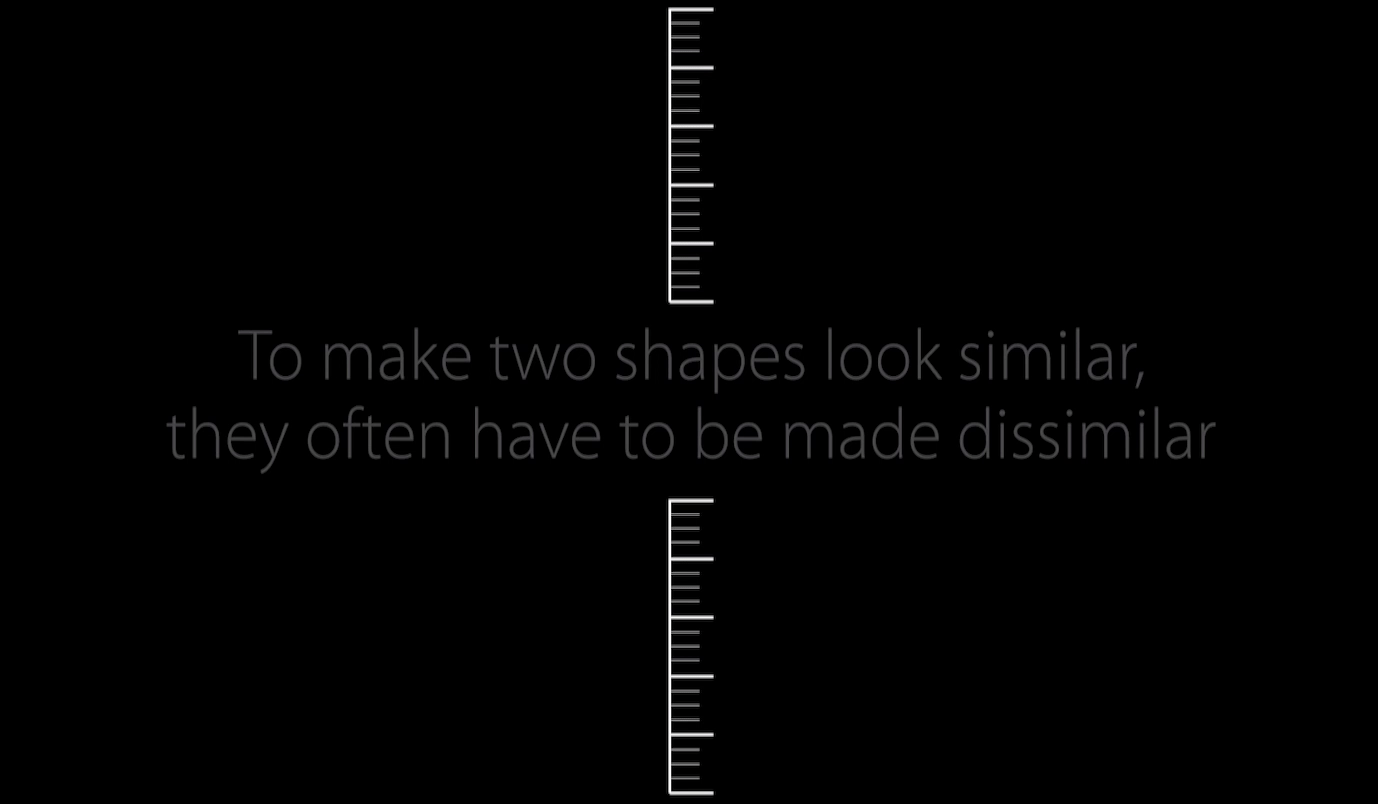
This is why the author says visual perception is about illusion. Things on screen might look the same, but the underlying dimensions, the math behind the items on screen, might be quite different. That’s why the presenter keeps stressing this point through the video:
to make shapes look similar, they often have to be made dissimilar.
He gives two more examples of this. First, he shows a couple slides where the text alignment on the slide appears centered when it’s not actually centered. His point is to show that text sits in a box and while that box can be mathematically aligned in the center of the screen, it won’t appear as such. You have to create the illusion that it’s centered visually by changing the spacing from being equal to unequal.
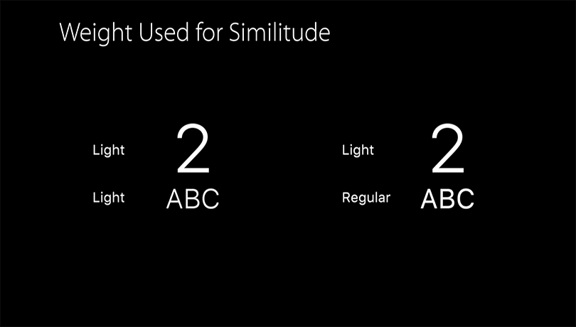
The presenter shows another example of this principle from the perspective of typography. He talks about how you have to use two different weights of a font to achieve visual similitude when the fonts are at different sizes. Again, the natural inclination might be: “I want two fonts at different sizes to look the same, so I’ll use the same weight.” But to make them appear as though they are the same, you have to actually use a lighter weight at the larger size and a heavier weight at the smaller size.
“SF Pro Display” and “SF Pro Text”
When I first installed the SF fonts on my computer and tried using them in Sketch, I noticed that there were a number of font variations belonging to the “SF Pro” family.
So what’s the difference? Which one should I use? My thought process went like this: “well, Mono is the monospaced version, I know when I’ll need that. Rounded appears to be a rounded variant, i.e. it has rounded terminals on all the shapes, I know when I’ll need that. **But what’s the difference between SF Pro Display and SF Pro Text?**” I honestly didn’t know the answer to that question, so I just chose one and used it (being too lazy to research it at the time).
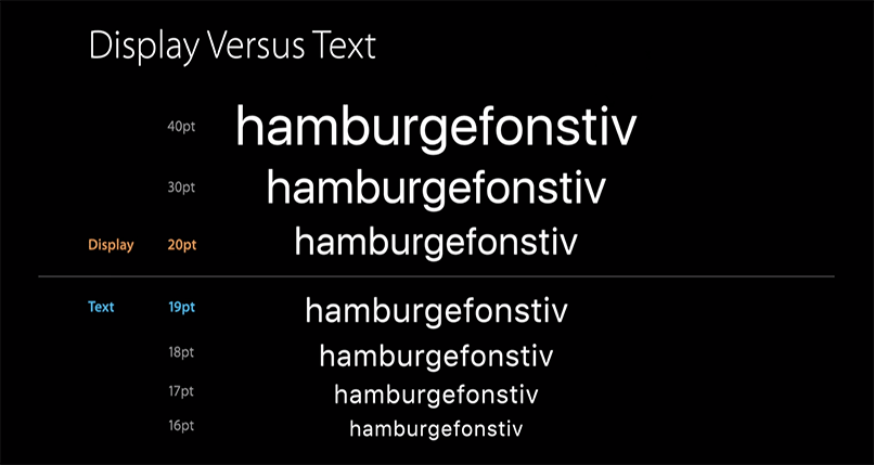
This presentation clarified the difference: SF Pro Display is designed to be used at sizes above 20pt, whereas SF Pro Text is designed to be used at sizes 19pt and below. “Ok well, now those names make perfect sense” I thought, “‘Display’ is for type at large display sizes, ‘Text’ is for type at reading sizes. Duh. Their naming makes perfect sense.”
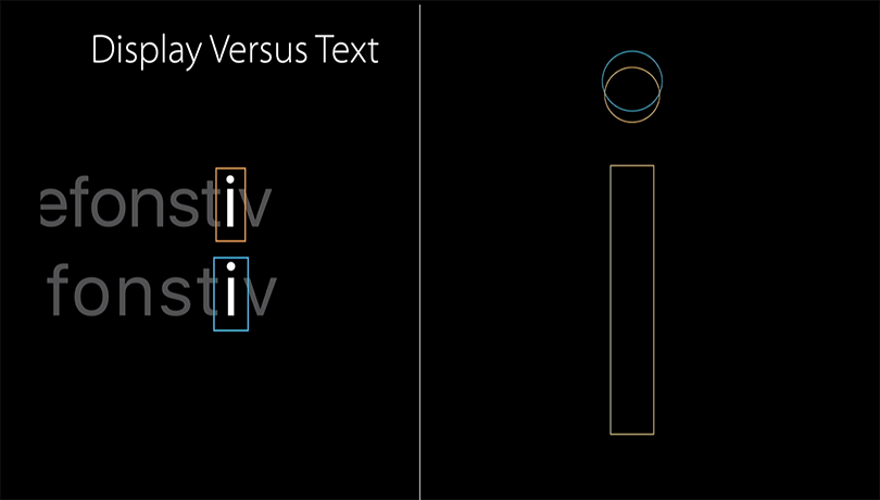
Each character in Pro and Text are designed slightly different with this constraint in mind. For example, the dot of the i is set at different heights because it needs to be closer to the base of the i at smaller sizes (Text) and further apart from the base at larger sizes (Display).
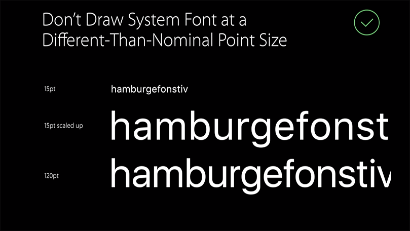
It’s worth noting that the presenter said Apple’s operating system dynamically changes which variant to use based on the type size you’re using. Set some text in 24pt? The system will set that using “Display” for you. Set some text in 14pt? The system will set that using “Text” for you. However, if you’re using a design application like Photoshop, you are in charge setting it in the correct variant yourself, depending on your usage context. The presenter advises against setting some text at the smaller size and then scaling it up beyond the threshold of the family. You won’t get all the smarts that went into it. Instead, if you scale your type up to a size in the “Display” variant, choose the “Display” font family instead of scaling up something from the “Text” family. Note the differences in his slide where he shows the same text twice: once as the “Text” family scaled up to 120pt, once as the “Display” family set at 120pt.
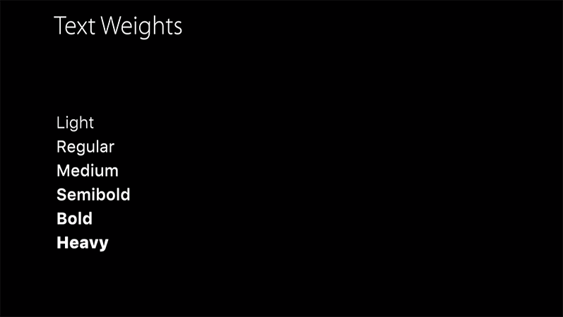
The presenter also outlined the differences in weight between the two variants. SF Pro Text weights comes in six weights.
Meanwhile SF Pro Display comes in nine weights.
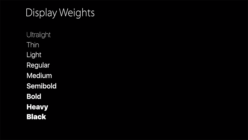
Why not have the same weights in each? The extreme weights of the family are designed for display titles, so it doesn’t make sense to use them below 20pt in the Text variant.
Proportional and Monospace Numbers
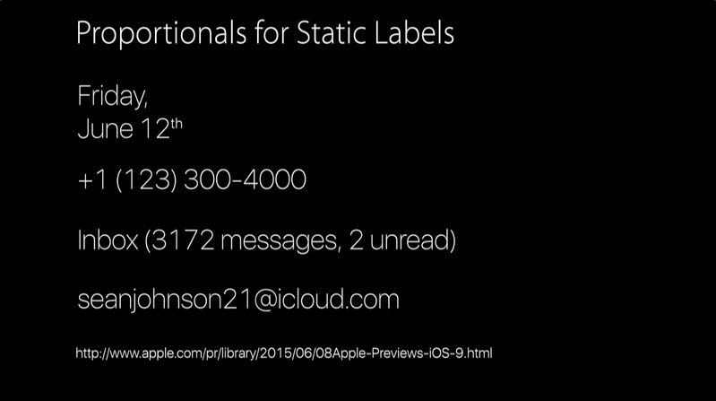
In another part of the talk, the presenter talks about how the the SF Family has proportional numbers and monospaced ones. Proportional numbers are what gets displayed by default while monospace numbers are by opt-in. So when do you opt-in? The general rule of thumb appears to be: monospaced for animation, proportional for static. Let me show some of his examples.
If you use a proportional spacing when animating text, you’ll get a constant shifting of numbers when text is set inline. Whereas if you use monospace, the text stays fixed. Here, a gif says a thousand words:
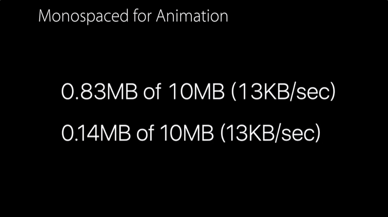
In a similar vein, if your numbers are static and fixed, proportional spacing looks more natural for inline text.
The End
Mostly I feel like I need to end this blog post by saying something, so there, I’ve said something and now conclude this post.