Designing and Engineering Event Management for Timshel’s “Admin” Web Application
Allow me to preface this piece of writing by saying this post has been a long time coming. It’s been almost a year since I departed Timshel / The Groundwork (I miss the people there very mucho), so my recollections of around the “events” of what happened (pun intended) might be a little fuzzy. Nevertheless, I wanted to get some words (and pictures) into a post about the engineering and design work I did while I was there.
The Feature
One of the web applications I worked on was called “Admin”, which was very aptly named because it was an administrative application for customers where they could manage the variety of data associated with their accounts. (I’ve written previously about the design/code I did on the integrations part of Admin.)
One of the portions of the app I was tasked on designing and (partially) engineering was “Events” (think “event management”). Our customers—or people on their behalf—would organize and host events supporting specific causes and they needed our platform’s software to help manage all facets of hosting events like scheduling, invitations, reminders, ticketing, messaging, etc.
The trickiest part of this feature was that it was intended to be engineered on a world-wide basis, i.e. under the assumption that anyone in the world could be using it. Because events deal in large part with time, that put me down a rabbit hole of computing I hadn’t really explored yet in my career: dealing with dates on an international level. In the end I learned a lot about dates in software (a slice of knowledge that’s proven very useful since then).
The Design
In collaboration with one of my favorite product people I’ve had the pleasure of working with, I initially started out on this feature talking through specifications and expectations. This led to sketches and wireframes (which, unforunately, I no longer have) to help flesh out the ideas and concepts. Once we arrived at a place that felt like we knew what we we’re doing, I began executing on high-fidelity mocks.
For context: the design (and engineering) team at The Groundwork already had a visual language established for the user interface of the Admin application, so I was able to quickly get up and running in Sketch. I did, however, have the liberty to create new UI components that I felt were needed for my feature but that weren’t available via our pattern library. We had a good iterative process internally that allowed us flexibility in designing and trying new UI components. If they proved effective, we would incorporate them back into our standardized pattern library for usage elsewhere in the application. It felt like the right balance of freedom while maintaining flexibility and creativity.
The Events Index Page
First I began working on the events index page. This is where users could go to see all the events associated with their account. On the first iteration, I came up with three separate lists: events occurring “today”, events occurring “in the future”, and “ended” or cancelled events. (FYI: I put those words in quotes because, as you’ll see later, those are time-based words that are relative and mean different things depending on where you are in the world).
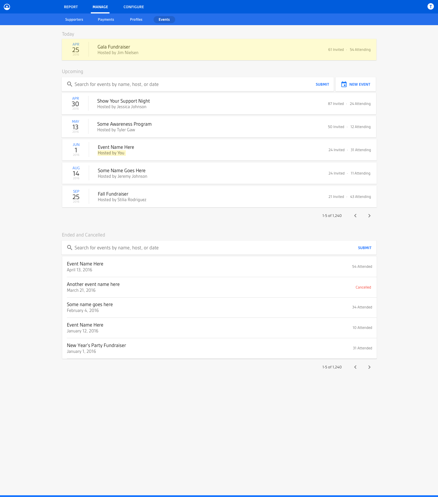
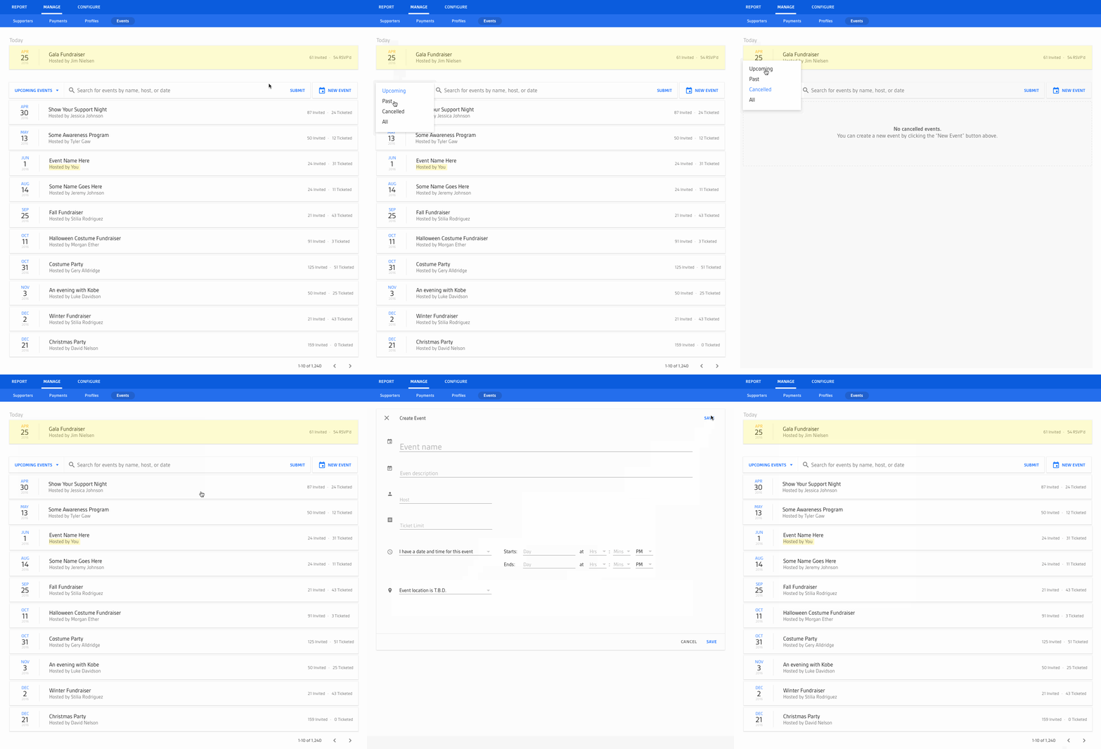
After an initial round of feedback, I decided to simplify the UI down to a single list which would initially filter all events to just the “upcoming” ones while any events occurring “today” would be hoisted to the top (to lend them prominence). The label for the list would serve as a dropdown filter where the user could then filter by other “types” of events (like “ended” or “cancelled”).
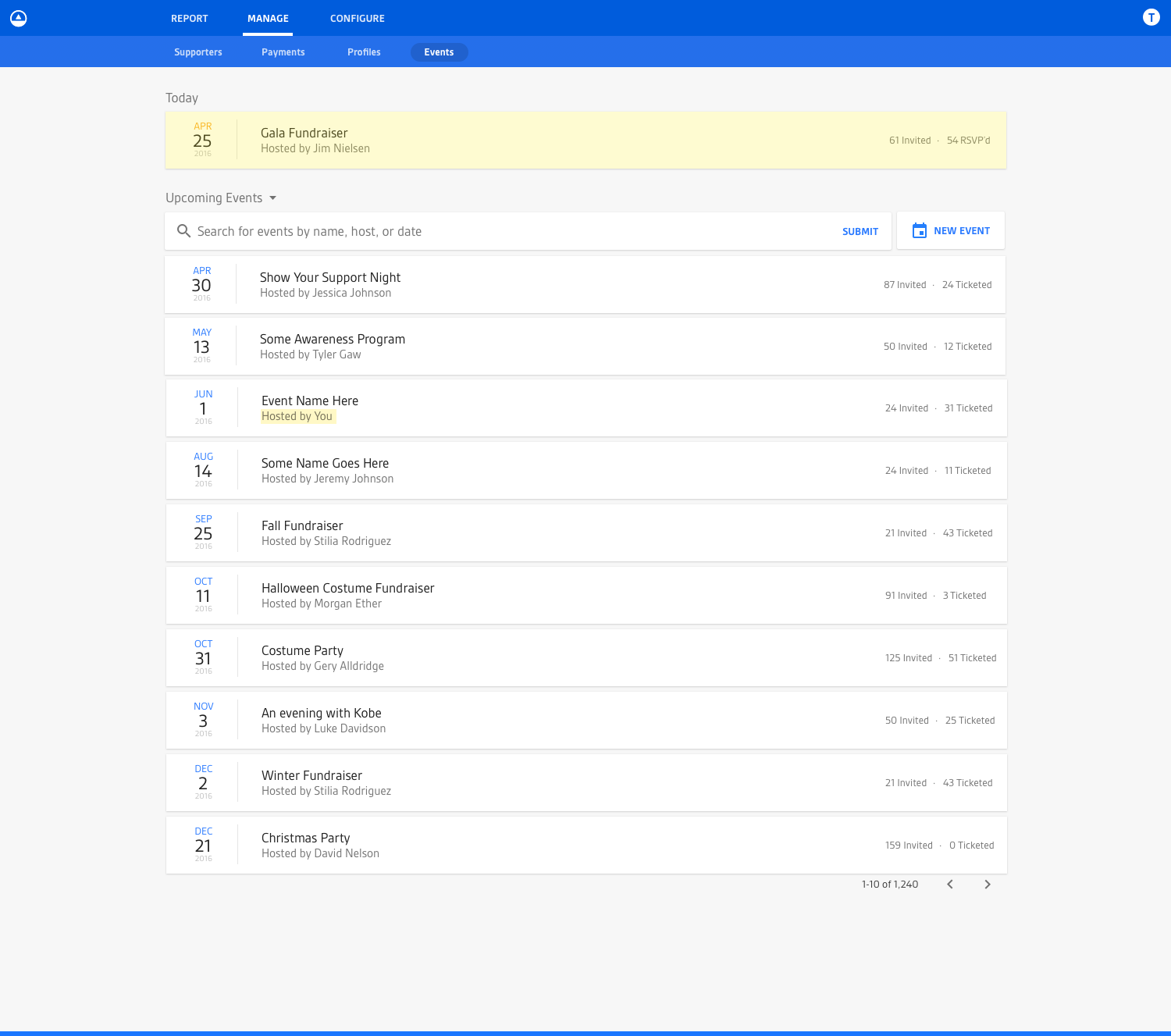
Eventually after more feedback and more feature clarification, I eventually arrived at a design like you see below. It functioned much like the mocks you’ve seen previously, but also took into account events that spanned multiple days.

One thing worth noting here: having the design of those multi-day events break the vertical alignment of date representations was, in fact, intentional. It was something I thought about a lot and decided to do purposefully. Multi-day events were, in most cases, an exception in the system. So calling them out specifically in the UI by breaking the linear flow was intentional (something I pointed out on Dribbble). And that’s what design is all about: fulfilling purpose through intentional form. Anyway, I digress...
The Individual Event View
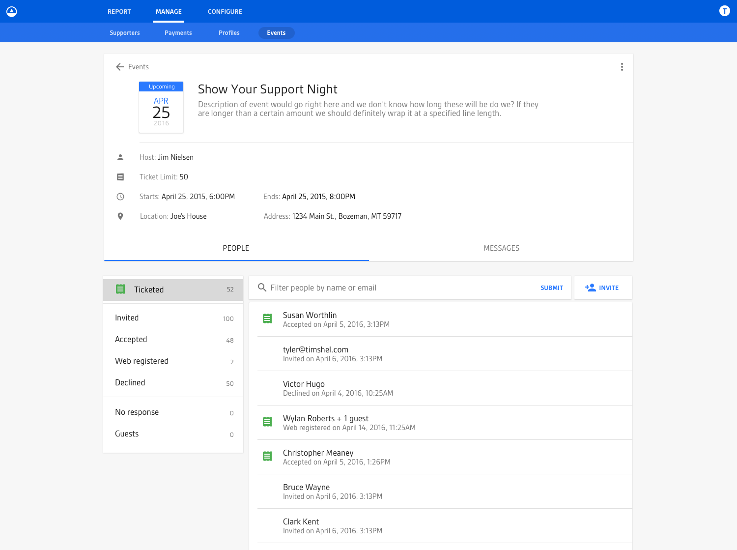
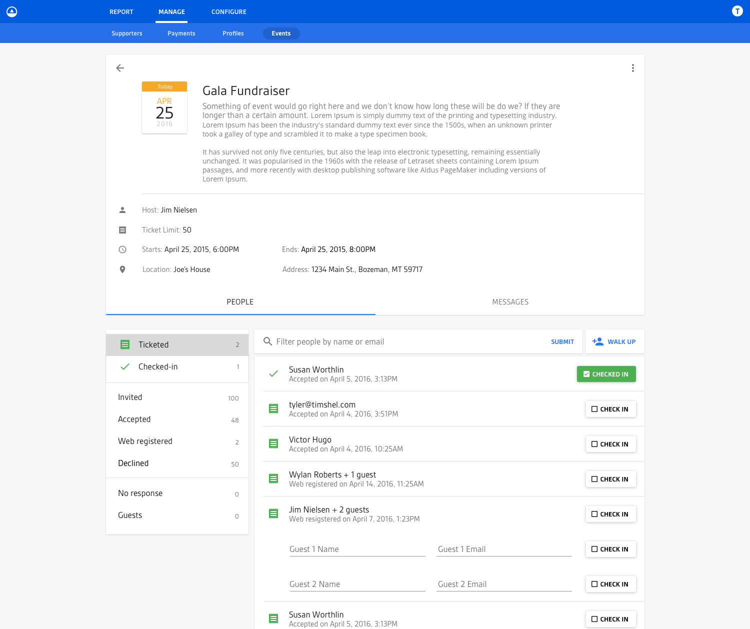
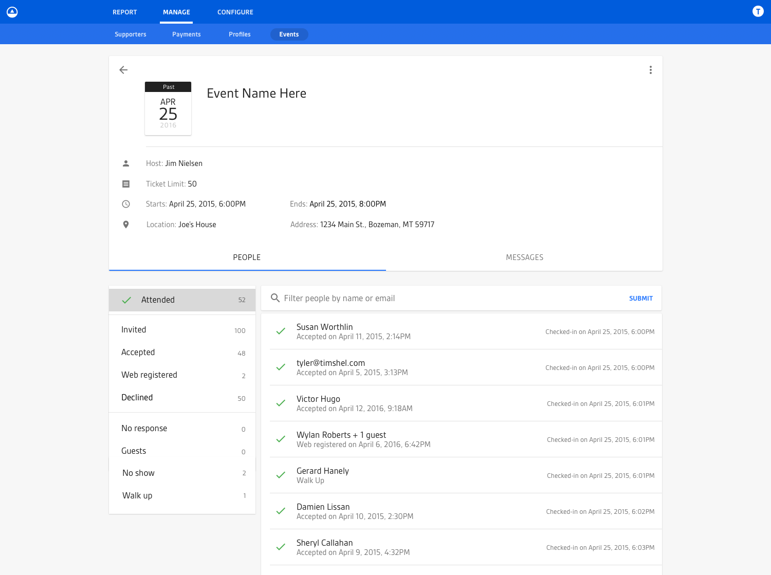
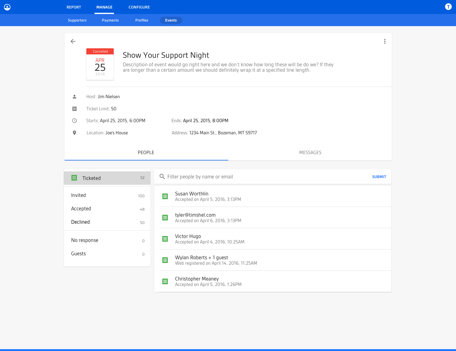
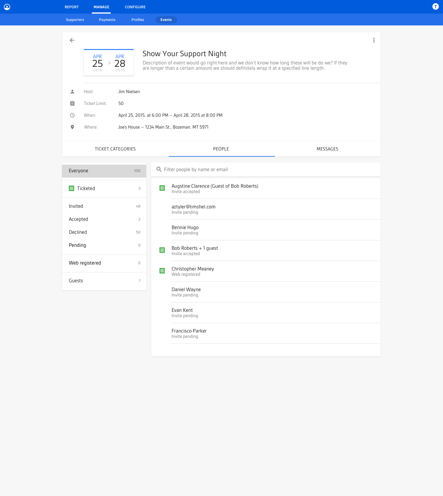
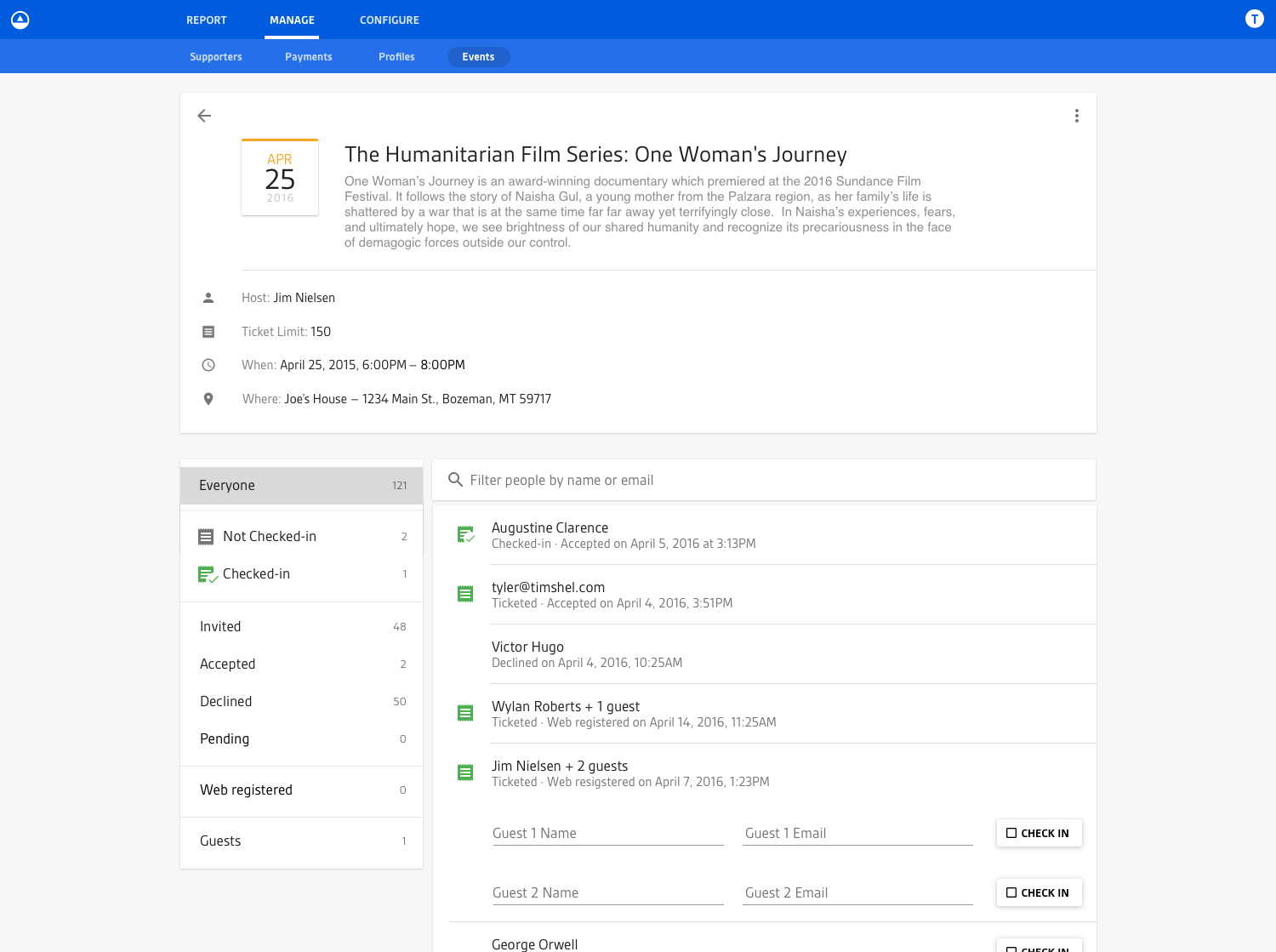
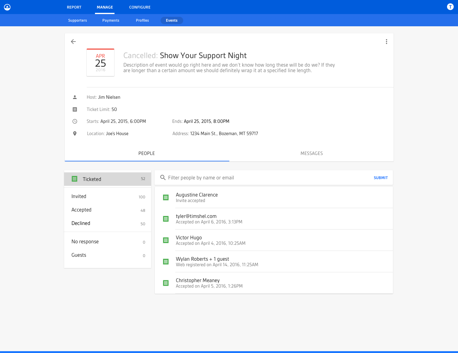
Another event management view I tackled was the individual view of an event. This is where users could see meta information around their event, like date and time, location, and description. This view also served as the central location for viewing additional information associated with the event, like the number of tickets for the event and time-based information around the ticketing. For example, if it was an upcoming event, they could see how many tickets had been sold and the contact information associated with each ticket. Whereas if it were an event in the past, they could see who actually came and redeemed their tickets. If it were an event occurring today, they would see a UI for checking-in individual guests and redeeming tickets. In this manner a lot of the user interface was time-based and would change based on the date of the event (because users’ needs changed based on the date).
The First Iteration
Designing the first iteration gave me a better sense of the overall relationships between different pieces of information. In hindsight, I over-designed the UI on the first pass in trying to communicate everything (like RSVP state through individual icons) when not everything needed to be communicated. This became apparent when I tried showing the designs to other designers and trying to communicate everything that was going on in the UI. It was just too much, but that was a good exercise in making me go back to the drawing board and really define what pieces of information were most pertinent.
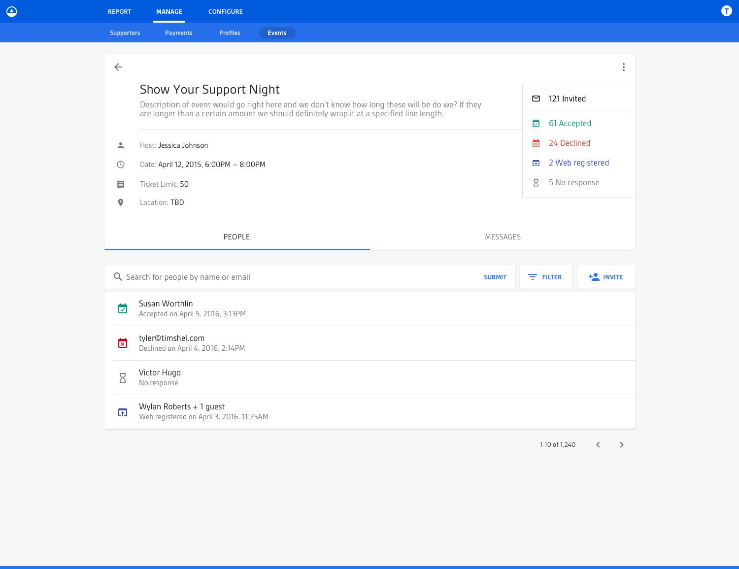
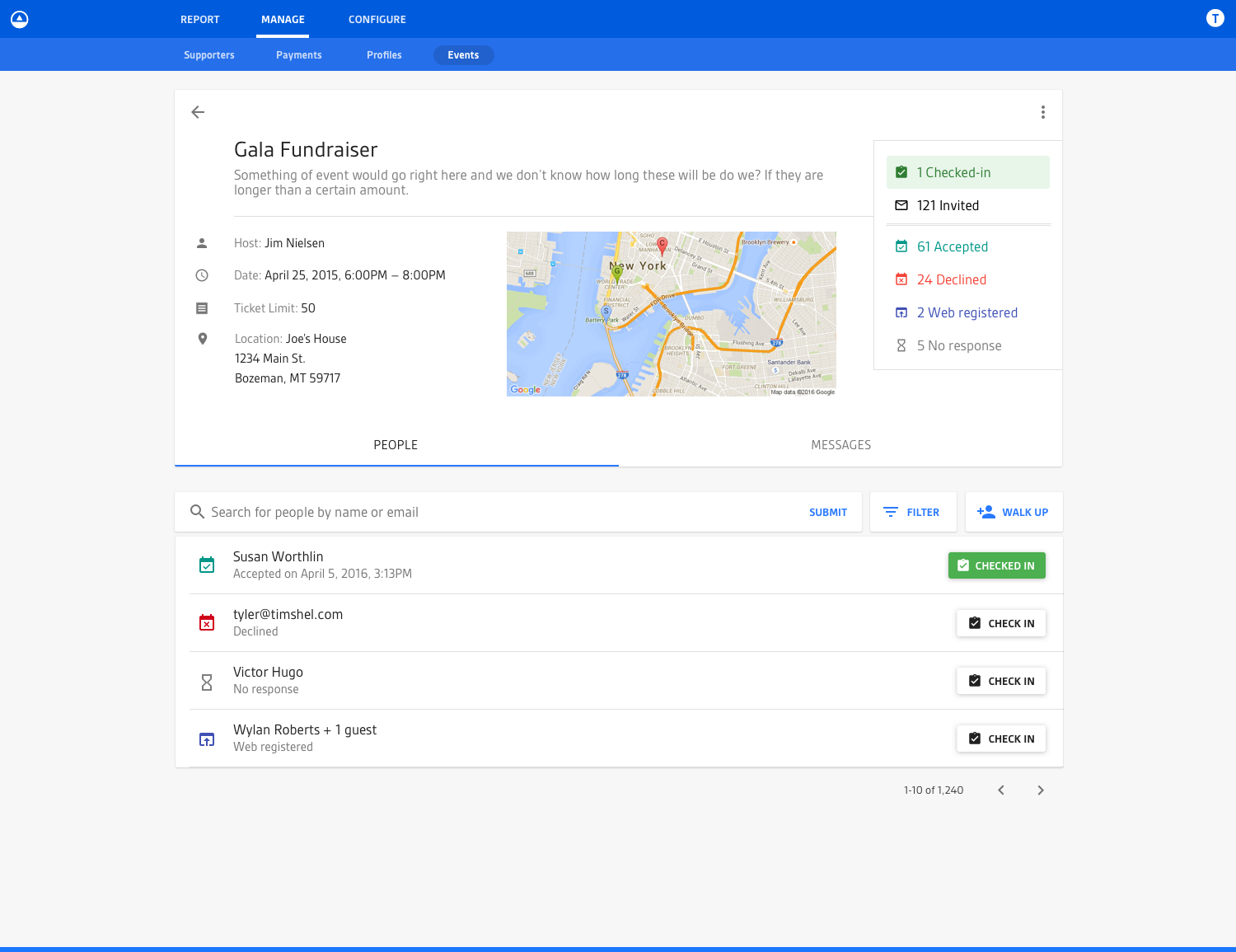
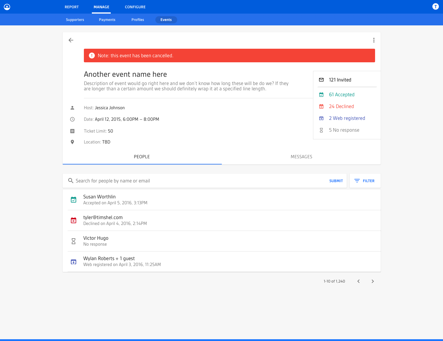
The Second Iteration
The second iteration moved some of the pieces of information around to more relevant locations, but in hindsight I still didn’t go far enough in fully removing unnecessary complexity. Most of the individual pieces of the UI stayed the same but a better hierarchy and relationship between parts was achieved.
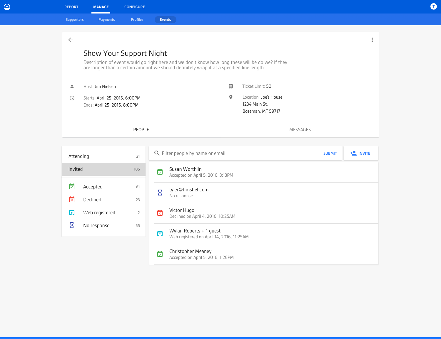
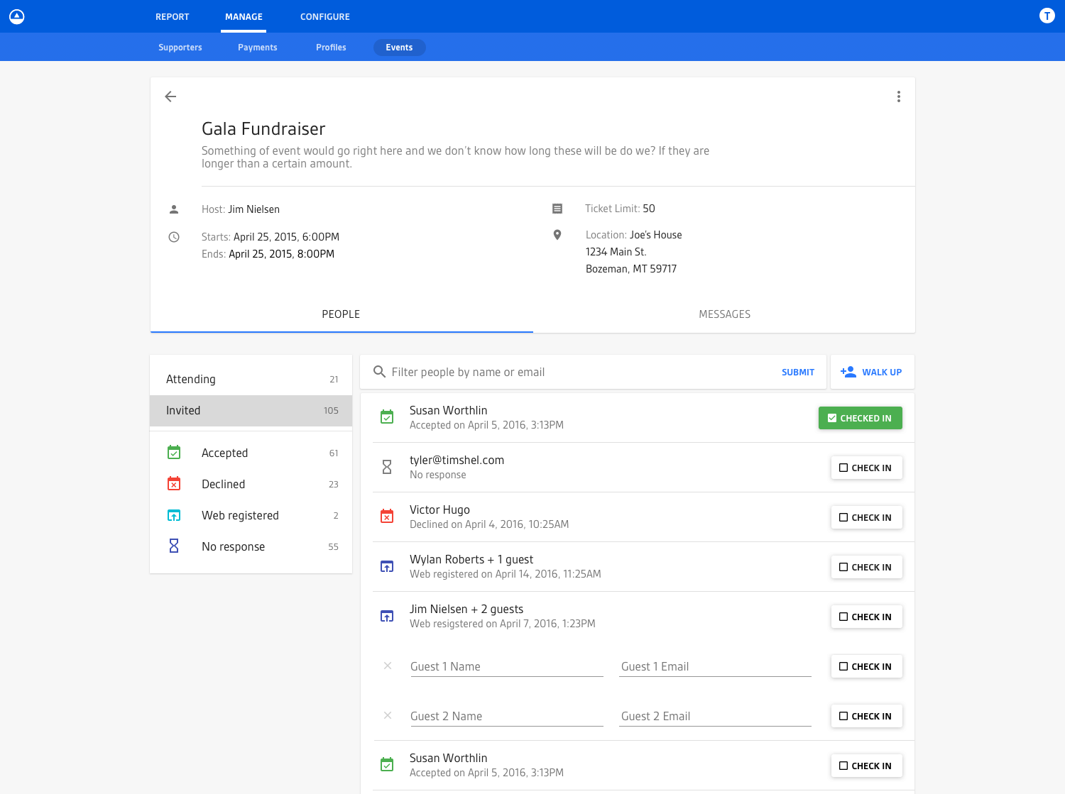
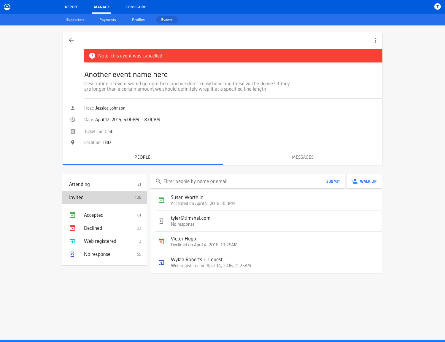
The Third Iteration
The third iteration was where I feel like I did a much better job of simplifying the usage of icons down to just the important possibilities: ticketed and checked-in. The more fine-grained details of a person’s status related to the event is communicated via text. Narrowing down this usage of icons so they communicate only the most important status vs. all the statuses was a big help in making the page more digestible.
You’ll also notice the more graphical representation of the event’s date. This felt like a solid enhancement that really helped better visually anchor the design of the page and communicate the timeliness of what the user was looking at.
The Fourth (and Relatively-Final) Iteration
This fourth and final iteration got us to a place where we felt we could start building an MVP. It explored a few variations in minor UI sections for dealing with edge cases (which you might notice, like multi-day events) but overall gave us a good sense of how everything was going to fit together as a whole.
The Create/Edit Event View
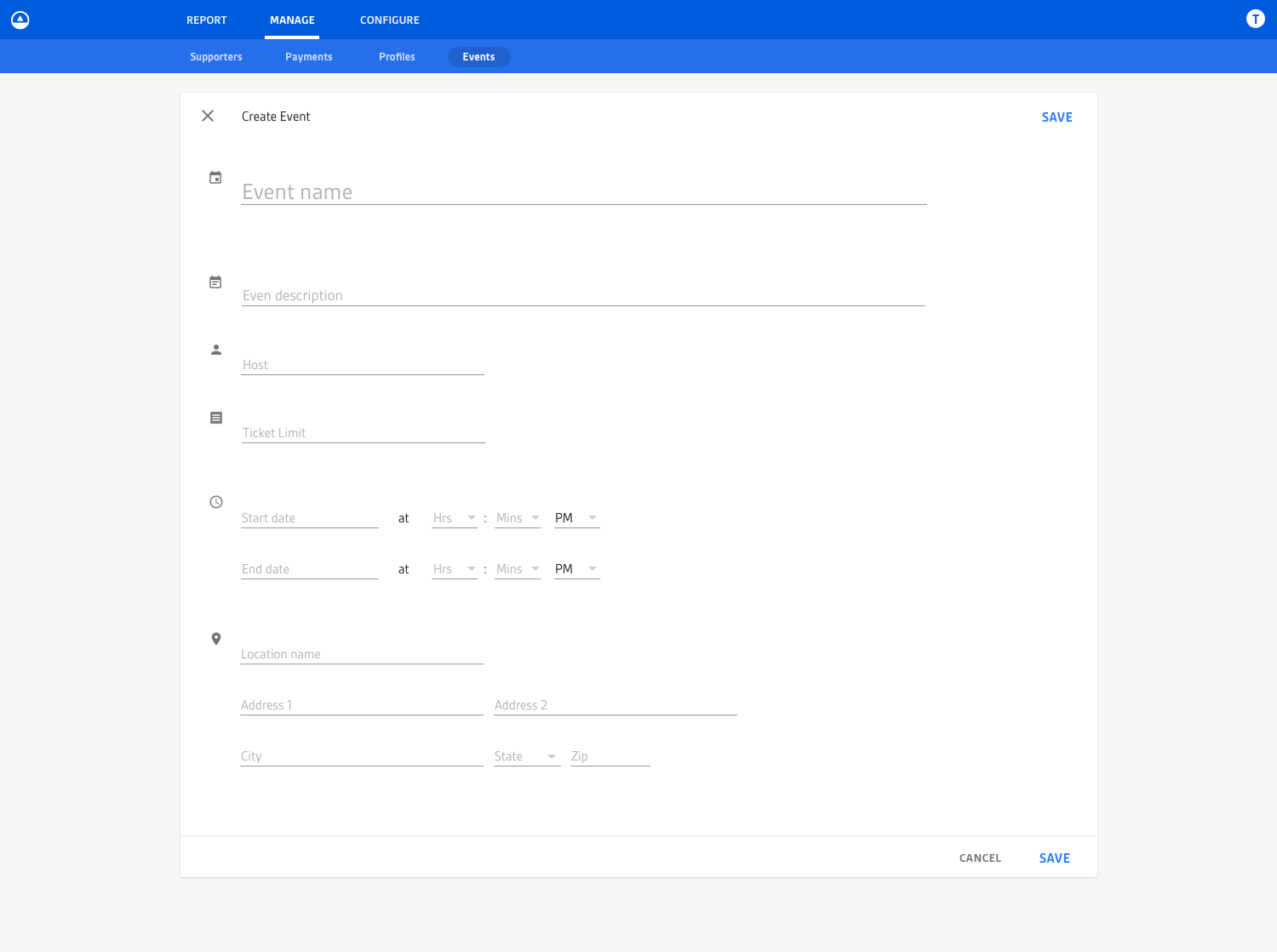
There’s always the need for users to create events. This UI covered that, in addition to editing events which was the same UI just populated with data.
The Messages Tab on the Event View
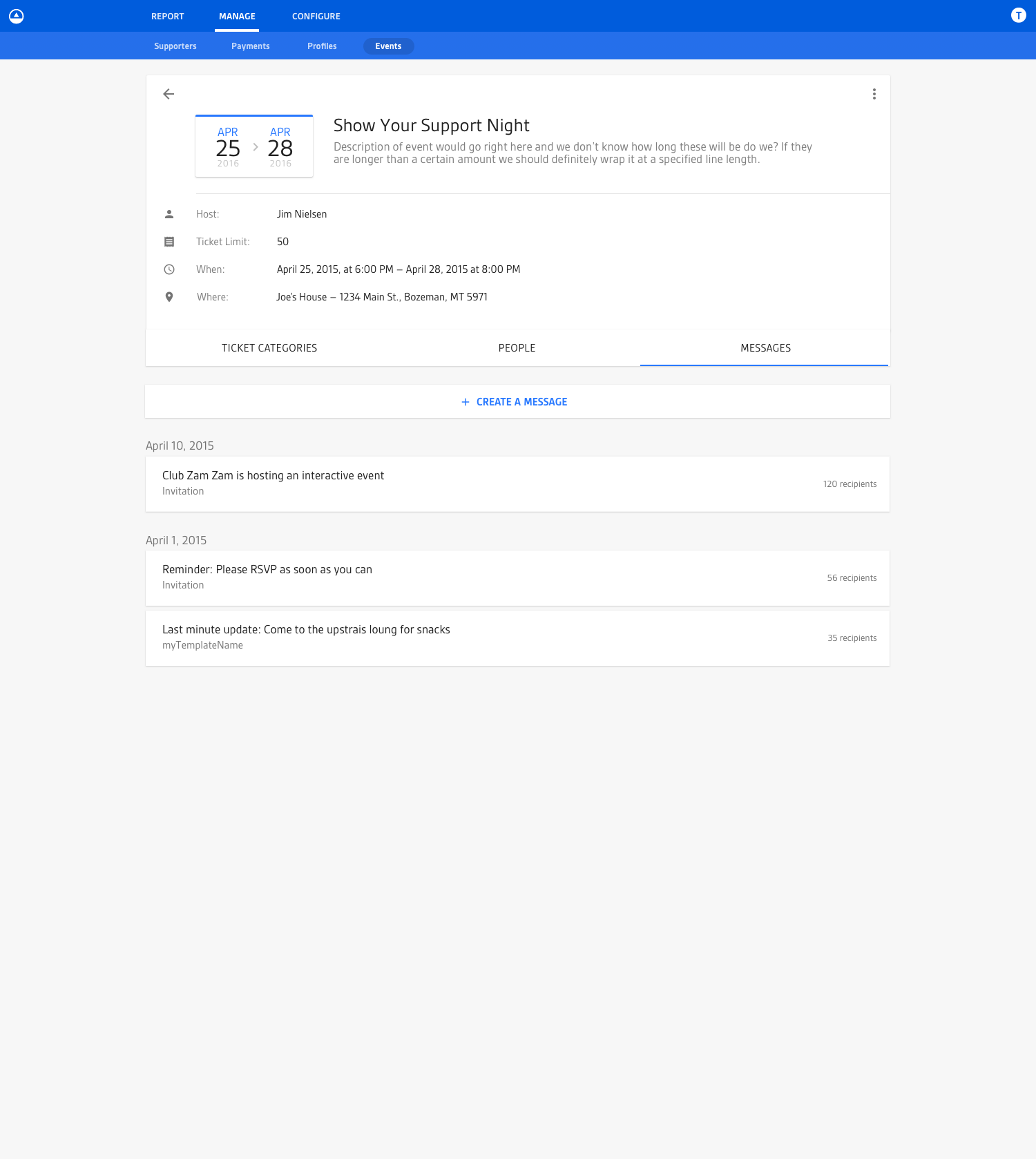
One of the tabs on the events view was the “Messages” tab, which allowed users to manage all messaging associated with an event. For example, if the administrator of an event wanted to send out a message to invited guests (or a subset of invited guests, like only guests who have RSVP’d) they could use this UI in the context of the event to send out an email blast.
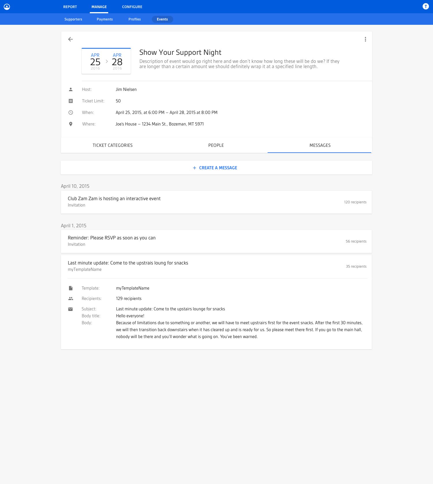
The messages UI was a list by default that you could expand/collapse for more detail. At the top of the list was the ability to create a new message which provided a stepped UI process for creating and sending messages to people associated with the event.
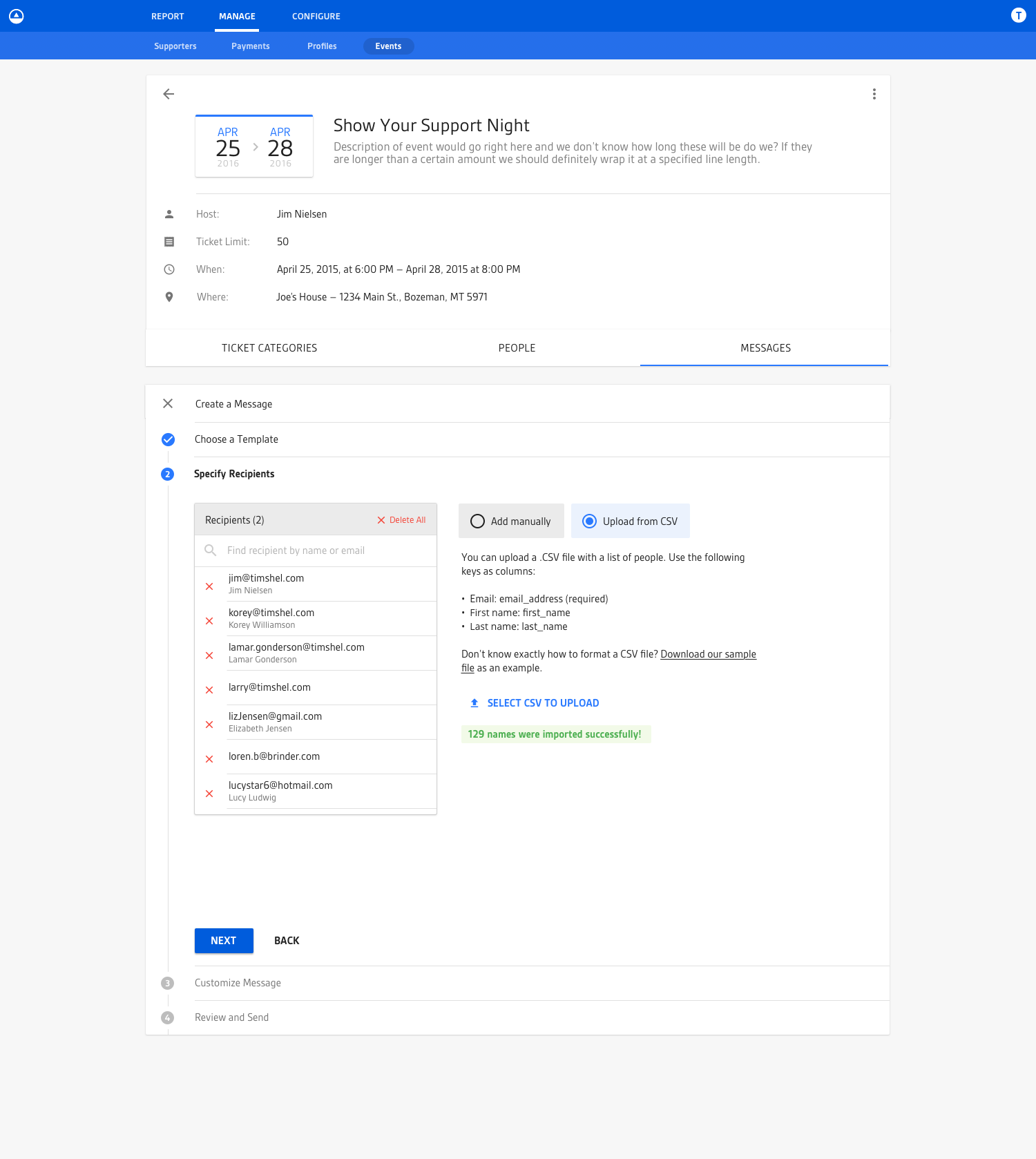
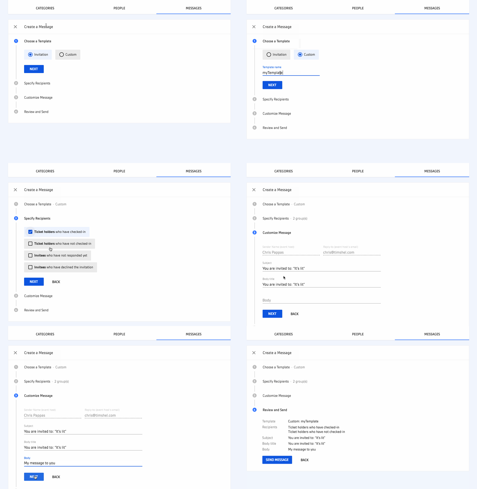
The “Create Message” process was somewhat sophisticated in what it allowed users to do, which is why I broke it up into a stepped process. Many of the different steps were dependent on choices made in prior steps, so the UI would change based on your decisions when creating a message. For example, you could specify the recipients of your message manually, either by entering them one-by-one or by uploading a .csv file. Additionally, there was a case where you would be provided a “smart set” of recipients for common actions like sending a reminder message to all invitees who had not yet responded to your invitation. You can see an example of how this all played out in this animated .gif of the “Create Message” process:
Stitching it All Together
Once I had these different views and their variations based on event date/time, I stitched them together into an Invision mock so that stakeholders could click through the different UIs and get a better sense of the overall UX, which looked something like this (excuse the not-so-great visual fidelity of the .gif):
The (Front-end) Engineering
Once the designs were complete, I transitioned into writing the view layer for each of these views. Technologies I used included:
- React
- Redux
- Material UI
- Radium
Most of the coding process was a balance of me writing styles, components, and view-related Javascript while the talented damassi worked on a lot of the architecture and plumbing like routing, wiring up API calls, etc.
The most interesting aspect to me of this whole endeavor was the date/time related pieces. A simple example of how complex this can actually be was the events home view which hoisted all events occurring “today” to the top. Now saying that an event occurs today might seem straightforward but you know how computers are: they need to be told exactly what to do. So when you start diving into the details of what “today” means it gets hairy fast because the word “today” is relative. “Today” might be July 21 to somebody in Australia but July 20 to somebody in America. To figure that all out you have to do date and time conversions across the world and that gets especially sticky when you talk about inconsistent local time shifts like daylight savings (thank goodness for libraries like moment.js).
From a product standpoint, we made the decision that we wanted our UI language around the timeliness of an event (like “today” or “upcoming”) to be relative to the location of the event itself and not the location of the user viewing the user interface. As such, I wrote a few date/time conversion utilities to help reason about what language and styles to show in the UI based on the timeliness of the event. What made this really interesting was the learning that took place all along the way. For example, after writing some of my utilities and presuming they worked, I’d found out the next day that all my CI tests would fail around 7PM. Then the same thing happened the next night. Then I’d learn that it was because our CI servers were on the east coast and 7PM was 12AM UTC, which meant was the time at which dates would no longer match. For example, July 13th at 6:59PM on the east coast is July 13th at 11:59PM UTC, which meant a lot of my dates and times which were converting back to UTC were looking like July 13th == July 13th? True! However, when it hit 7PM, that logic became July 13th == July 14th? False! So anyway, that ordeal was an interesting one that was frustrating at times but the knowledge I gained from it has served me quite well since!
I wish I had some actual code to share with you, but I don’t. Want to know what buzzwords I used on this project? css-in-js, functional JS, ES6/7, webpack, test-driven development, react, redux. I can’t anymore.
The End
Designing and engineering this feature was a treat. I got to work on a really solid platform with a lot of (at the time) bleeding edge technology. Plus, everyone on my team, from designers to front-end engineers to back-end engineers to product managers, were all a pleasure to work with.
Phew. I’m glad I got the bird’s eye generalization of this project written down. Now I know i’ll be able to look back on it in 10 years and say “geez Jim, you had no idea what you were doing”.