I made some updates to my notes blog, including a change to how my “Shuffle” feature worked.
Figured I’d blog about it.
Shuffle? On a Blog?
At the time of this writing, I have 974 “notes” that I’ve published.
For fun, I have a “shuffle” button that digs up a random note from the past. I like to press it from time to time and re-encounter some insight from the past.
It’s like going through an old album, pulling out a random photo, and thinking, “Oh yeah, I remember this! Good times.”
Like old photos, there’s also the occasional “that didn’t age so well”.
But I find it fun to randomly dig up old insights from others and continue to be inspired.
How Did It Work Before?
Since my site is built and hosted as static files without a runtime server, this feature required JavaScript to work.
Every page had a snippet like this:
<button id="js-shuffle">Shuffle</button>
<script>
// All 974 note IDs injected by my SSG
const noteIds = ['id-1', 'id-2', id-3', 'id-4', '...'];
document.querySelector("#js-shuffle")
.addEventListener('click', () => {
// randomly grab an item in `noteIds`
const randomId = '...';
window.location.href = `/n/${randomId}/`
})
</script>
Essentially: inject every note ID into every HTML page and, when the shuffle button is clicked, randomly grab one and navigate the user to it.
Not the most elegant thing, but it worked.
The problem was that every time I published a new post, every single page had to be re-uploaded to Netlify because every file’s hash would change and its etag/cache was invalidated.
This made my builds slow. It also made it difficult, from a development perspective, to ensure refactors didn’t result in unexpected changes to output (using Dev.changes from my SSG web origami).
So I decided to make a change.
What About a No-JS Approach?
Because I love to see if I can make things work without JavaScript, I had the thought to randomly write the href at build time using my SSG, which would result in output like this:
<a href="/notes/3">Shuffle</a>
<a href="/notes/1">Shuffle</a>
<a href="/notes/2">Shuffle</a>
And every time I re-build my site, just have this logic run on the static site generator so that it’s different href for every page, every time.
Pros:
- Doesn’t require JavaScript
- Doesn’t require a server (request-time logic)
Cons:
- File hashes change across builds (even if there’s no new content or template changes, every HTML page now has a different
href for the shuffle link for every build). This makes deployments way slower because Netlify has to redeploy every file on every build. Plus Etags change so caching is basically ineffectual.
I decided I didn’t want to do this, so on to JavaScript!
How Does It Work Now?
My first thought was to create a single JSON file that contained all my note IDs. Then when the “Shuffle” button gets clicked, I fetch that, grab a random ID, and navigate the user, e.g.
<button id="js-shuffle">Shuffle</button>
<script type="module">
const noteIds = await fetch("/notes.json").then(...);
</script>
This would work. It localizes the caching issue to a single file, so only one file has to be invalidated/re-uploaded across builds.
But in playing with it a little more, I decided to try something a little more...unconventional.
I’ve written before about having lots of little HTML pages and I thought, “Can I put this functionality in a single HTML page rather than a JSON file?”
And what I ended up with was a link, e.g.
<a href="/shuffle/">Shuffle</a>
That when clicked navigates the user to a new page. That page has all the JS logic embedded in it, e.g.
<span>Shuffling...</span>
<noscript>JS is required to use the Shuffle functionality</nocript>
<script>
// All 974 note IDs injected by my SSG
const noteIds = ['id-1', 'id-2', id-3', 'id-4', '...'];\
// A slight delay so user sees "Shuffling..." effect
setTimeout(() => {
// randomly grab an item in `noteIds`
const randomId = '...';
window.location.href = `/n/${randomId}/`
}, 300);
</script>
There are a few things I like about the experience this implementation provides.
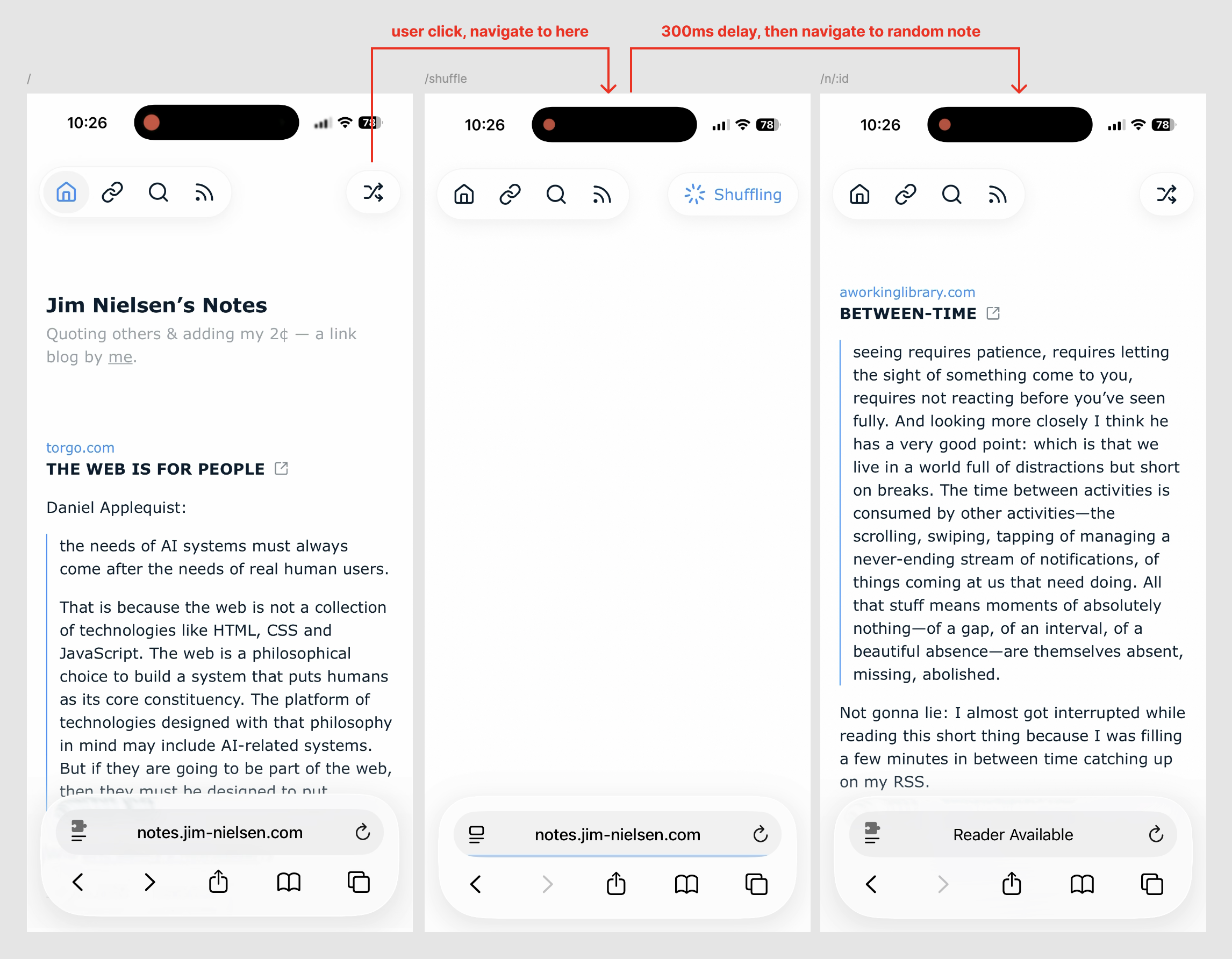
First: shuffle is a route, so I can navigate to it directly without using the GUI, e.g. notes.jim-nielsen.com/shuffle
Second: I handle the UI/X with a slight delay to make it appear like something is happening when you click the button. If you click the button and it immediately jumps to the next, randomized page, it almost seems to happen too fast. Like you’re left with this feeling of “What just happened?”
But in this scenario, it navigates you to the “Shuffle” page, the button you just clicked turns into a spinner + text indicating something is happening, and there’s a slight (intentional) delay before the JS executes and sends you to a randomized note.
I know it’s a bit weird. “Introduce artificial slowness? Are you crazy?” But I like it. It feels like the shuffle feature on an old music player.
I remember one of my CD players had a “Shuffle” feature. When I’d click the button, it would display “Shuffling…” on the little black and white screen and you’d encounter this brief state where (I presume) the lens inside the hardware would move along the physical track to the spot where it would start reading a new, random song from the CD.
The hardware constraints necessitated this kind of an experience, but I always liked it because it felt like the CD player was “thinking” about what track to pick next. This state clearly conveyed to me that my intent to shuffle was received and being followed. I liked that feedback, and it’s exactly what I wanted to do on my notes site (even though it was completely unnecessary).
I like having that brief moment of feedback where it’s very clear that your intention was received and being followed, vs. having it happen so fast you can’t even perceive precisely what happened.
Here’s a video to show it in action:
Why?
I know that’s a lot of information for something so small — and, arguably, unnecessary.
But I still enjoy writing about how I make decisions when I build things for myself.
Hence this post.
Reply via:
Email
· Mastodon ·
Bluesky