A little while back I heard about the White House launching their version of a Drudge Report style website called White House Wire. According to Axios, a White House official said the site’s purpose was to serve as “a place for supporters of the president’s agenda to get the real news all in one place”.
So a link blog, if you will.
As a self-professed connoisseur of websites and link blogs, this got me thinking: “I wonder what kind of links they’re considering as ‘real news’ and what they’re linking to?”
So I decided to do quick analysis using Quadratic, a programmable spreadsheet where you can write code and return values to a 2d interface of rows and columns.
I wrote some JavaScript to:
- Fetch the HTML page at
whitehouse.gov/wire - Parse it with cheerio
- Select all the external links on the page
- Return a list of links and their headline text
In a few minutes I had a quick analysis of what kind of links were on the page:
This immediately sparked my curiosity to know more about the meta information around the links, like:
- If you grouped all the links together, which sites get linked to the most?
- What kind of interesting data could you pull from the headlines they’re writing, like the most frequently used words?
- What if you did this analysis, but with snapshots of the website over time (rather than just the current moment)?
So I got to building.
Quadratic today doesn’t yet have the ability for your spreadsheet to run in the background on a schedule and append data. So I had to look elsewhere for a little extra functionality.
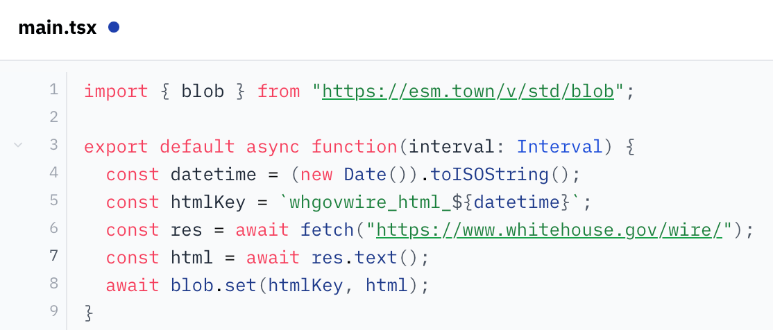
My mind went to val.town which lets you write little scripts that can 1) run on a schedule (cron), 2) store information (blobs), and 3) retrieve stored information via their API.
After a quick read of their docs, I figured out how to write a little script that’ll run once a day, scrape the site, and save the resulting HTML page in their key/value storage.
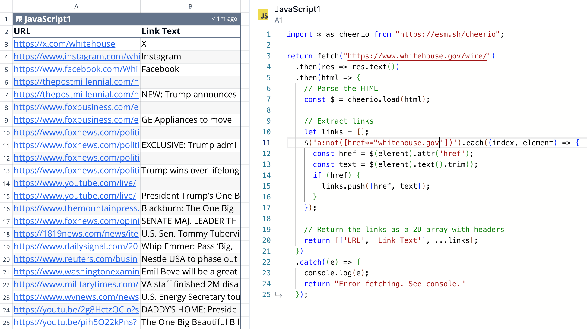
From there, I was back to Quadratic writing code to talk to val.town’s API and retrieve my HTML, parse it, and turn it into good, structured data. There were some things I had to do, like:
- Fine-tune how I select all the editorial links on the page from the source HTML (I didn’t want, for example, to include external links to the White House’s social pages which appear on every page). This required a little finessing, but I eventually got a collection of links that corresponded to what I was seeing on the page.
- Parse the links and pull out the top-level domains so I could group links by domain occurrence.
- Create charts and graphs to visualize the structured data I had created.
Selfish plug: Quadratic made this all super easy, as I could program in JavaScript and use third-party tools like tldts to do the analysis, all while visualizing my output on a 2d grid in real-time which made for a super fast feedback loop!
Once I got all that done, I just had to sit back and wait for the HTML snapshots to begin accumulating!
It’s been about a month and a half since I started this and I have about fifty days worth of data.
The results?
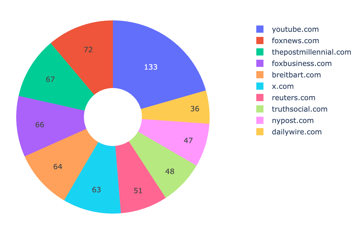
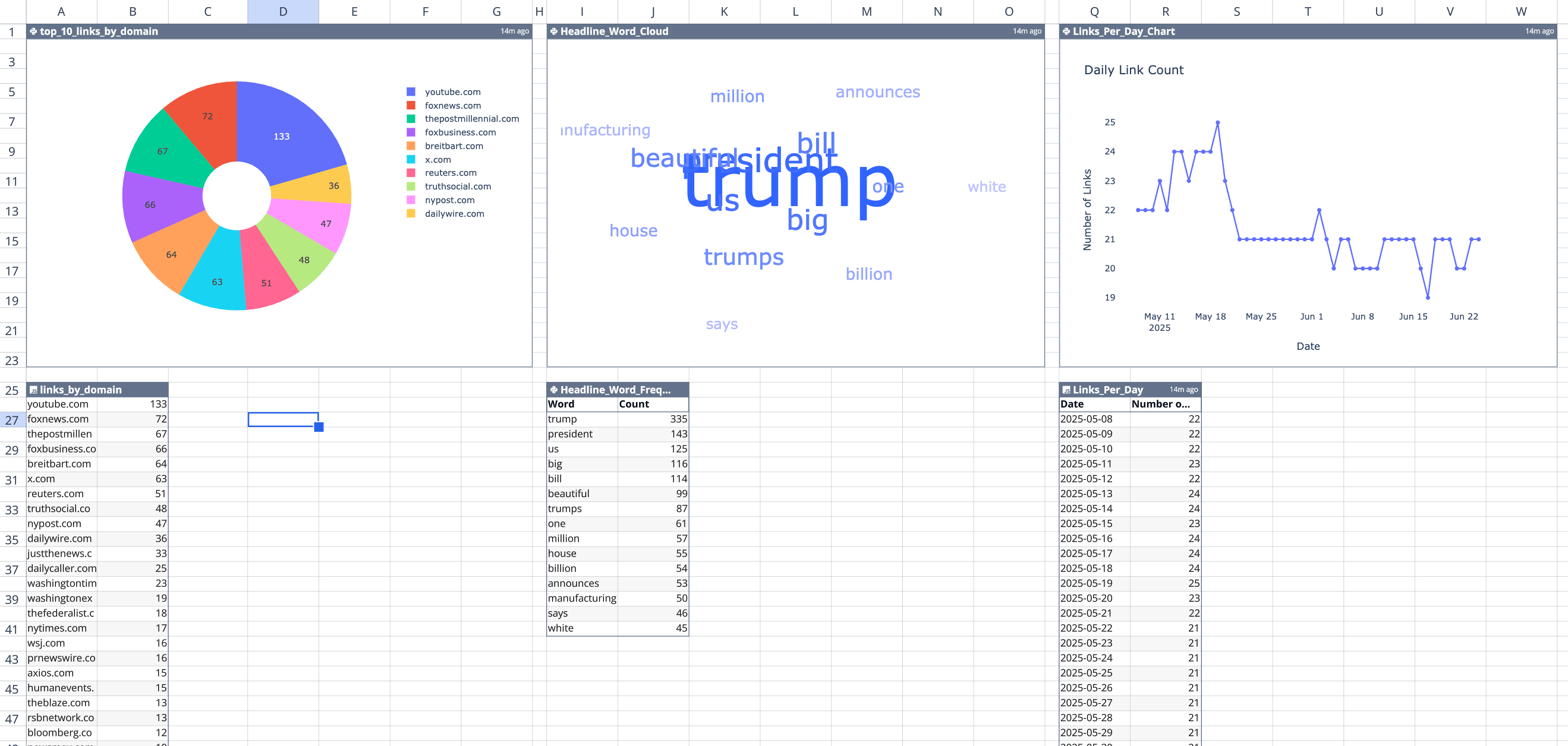
Here’s the top 10 domains that the White House Wire links to (by occurrence), from May 8 to June 24, 2025:
youtube.com (133)foxnews.com (72)thepostmillennial.com (67)foxbusiness.com (66)breitbart.com (64)x.com (63)reuters.com (51)truthsocial.com (48)nypost.com (47)dailywire.com (36)
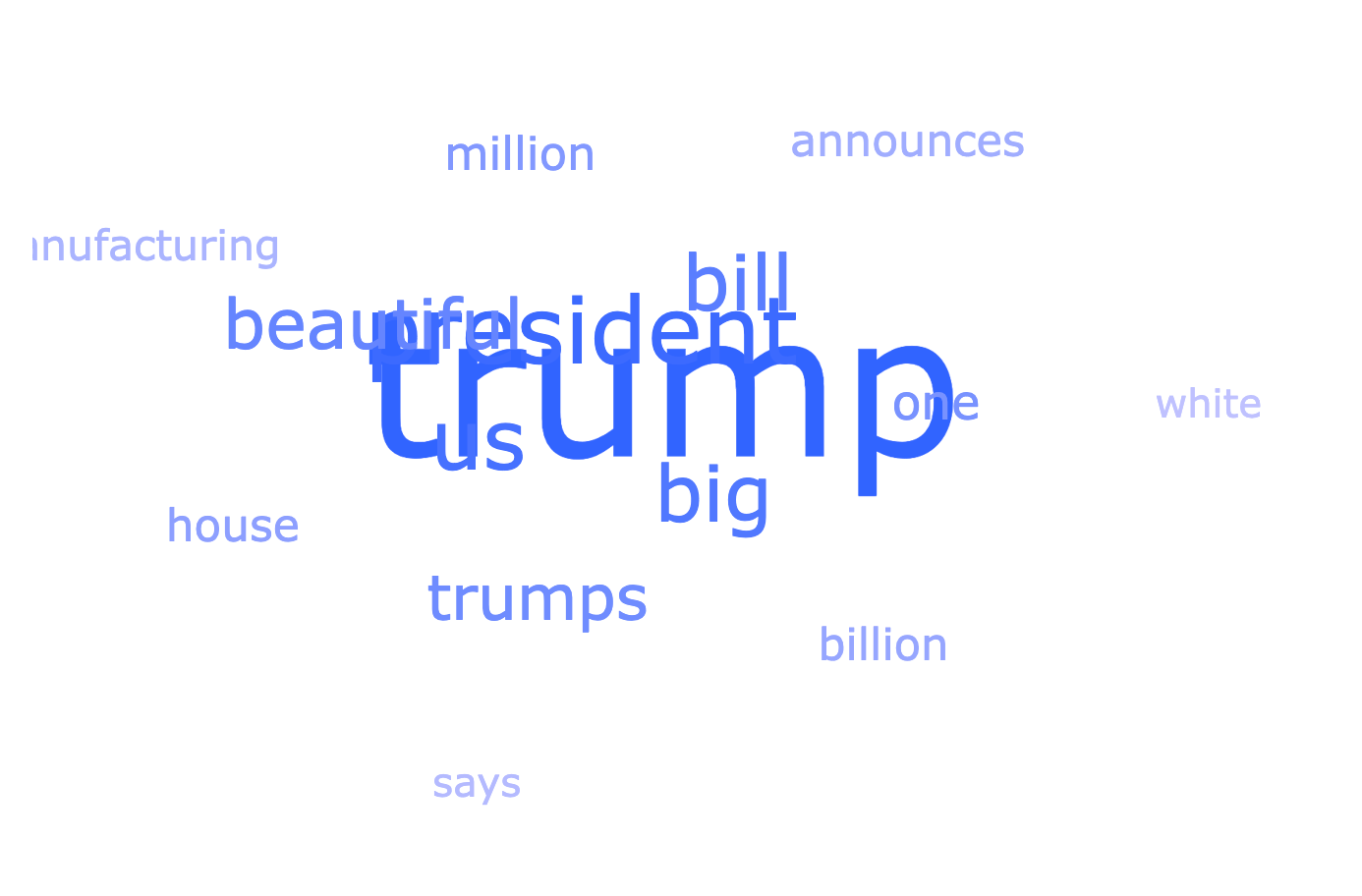
From the links, here’s a word cloud of the most commonly recurring words in the link headlines:
- “trump” (343)
- “president” (145)
- “us” (134)
- “big” (131)
- “bill” (127)
- “beautiful” (113)
- “trumps” (92)
- “one” (72)
- “million” (57)
- “house” (56)
The data and these graphs are all in my spreadsheet, so I can open it up whenever I want to see the latest data and re-run my script to pull the latest from val.town. In response to the new data that comes in, the spreadsheet automatically parses it, turn it into links, and updates the graphs. Cool!
If you want to check out the spreadsheet — sorry! My API key for val.town is in it (“secrets management” is on the roadmap). But I created a duplicate where I inlined the data from the API (rather than the code which dynamically pulls it) which you can check out here at your convenience.
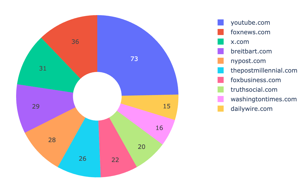
Update: 2025-07-03
After publishing, I realized that I wasn’t de-duplicating links. Because this works by taking snapshots once a day of the website’s HTML, if the same link stayed up for multiple days, it was getting counted twice.
So I tweaked my analysis to de-duplicate links because I want a picture of all the links shared over time. It didn’t really change the proportions of which sites were shared most frequently, just lowered their occurrence because links now weren’t counted twice.
Given that, here’s an update of the “top 10 links by domain” from May 8th to July 3rd.
youtube.com (73)foxnews.com (36)x.com (31)breitbart.com (29)nypost.com (28)thepostmillennial.com (26)foxbusiness.com (22)truthsocial.com (20)washingtontimes.com (16)dailywire.com (15)