I refreshed the little thing that let’s you navigate consistently between my inconsistent subdomains (video recording).
Here’s the tl;dr on the update:
- I had to remove some features on each site to make this feel right.
- Takeaway: adding stuff is easy, removing stuff is hard.
- The element is a web component and not even under source control (🤫). I serve it directly from my cdn. If I want to make an update, I tweak the file on disk and re-deploy.
- Takeaway: cowboy codin’, yee-haw! Live free and die hard.
- So. Many. Iterations. All of which led to what? A small, iterative evolution.
- Takeaway: it’s ok for design explorations to culminate in updates that look more like an evolution than a mutation.
Want more info on the behind-the-scenes work? Read on!
Design Explorations
It might look like a simple iteration on what I previously had, but that doesn’t mean I didn’t explore the universe of possibilities first before coming back to the current iteration.
v0: Tabs!
A tab-like experience seemed the most natural, but how to represent it? I tried a few different ideas. On top. On bottom. Different visual styles, etc.
And of course, gotta explore how that plays out on desktop too.
Some I liked, some I didn’t. As much as I wanted to play with going to the edges of the viewport, I realized that every browser is different and you won't be able to get a consistent “bleed-like” visual experience across browsers. For example, if you try to make tabs that bleed to the edges, it looks nice in a frame in Figma, and even in some browsers. But it won’t look right in all browser, like iOS Safari.
So I couldn’t reliably leverage the idea of a bounded canvas as a design element — which, I should’ve known, has always been the case with the web.
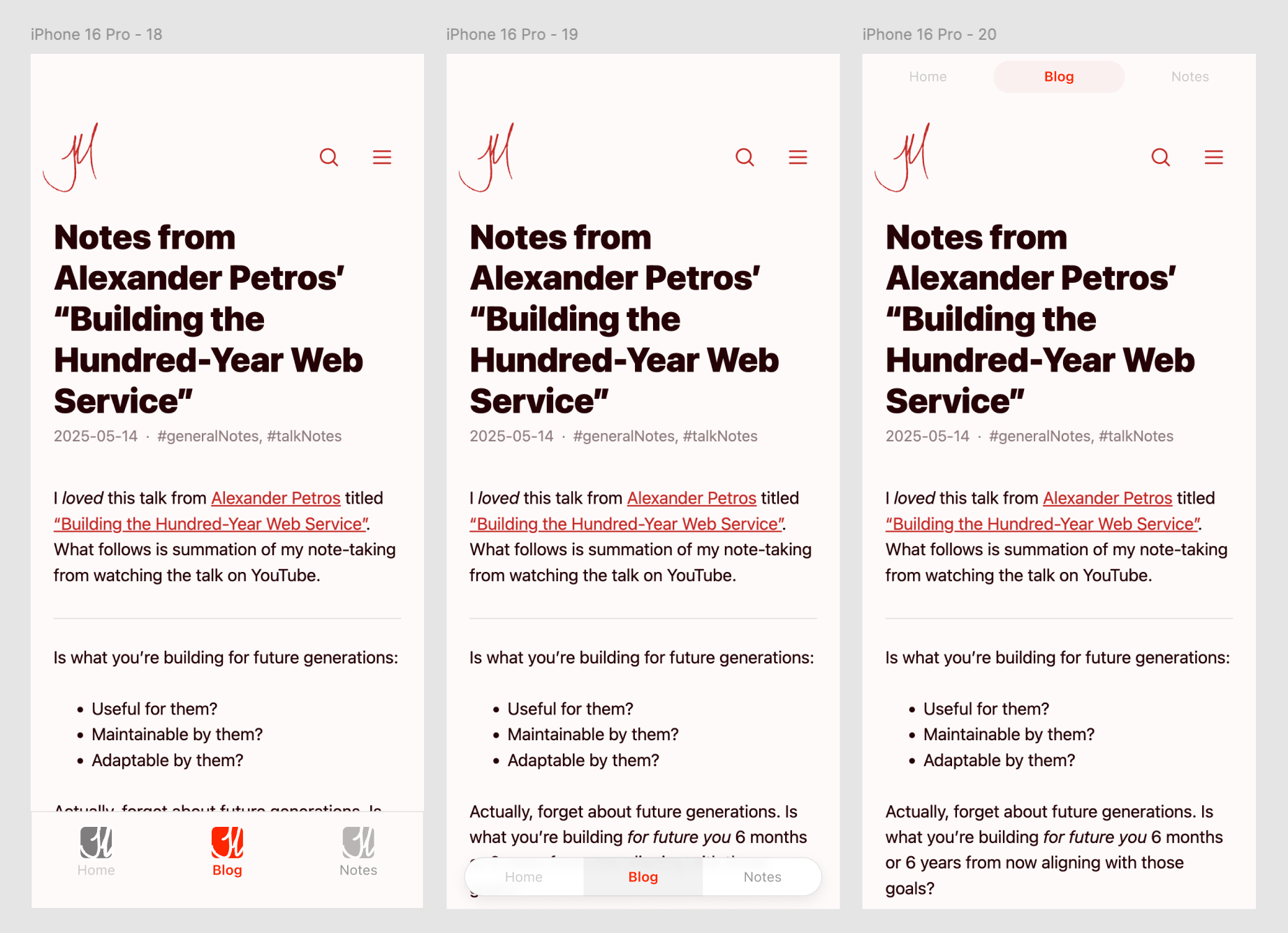
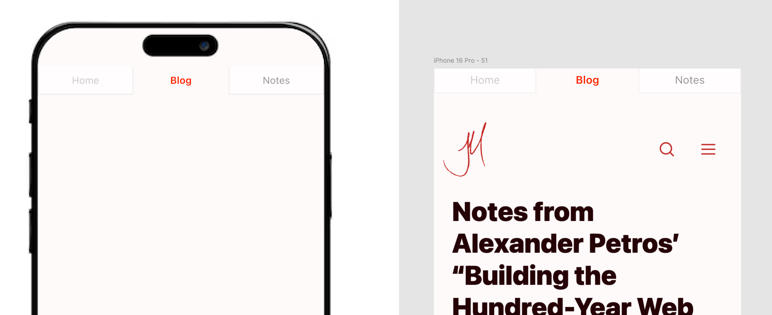
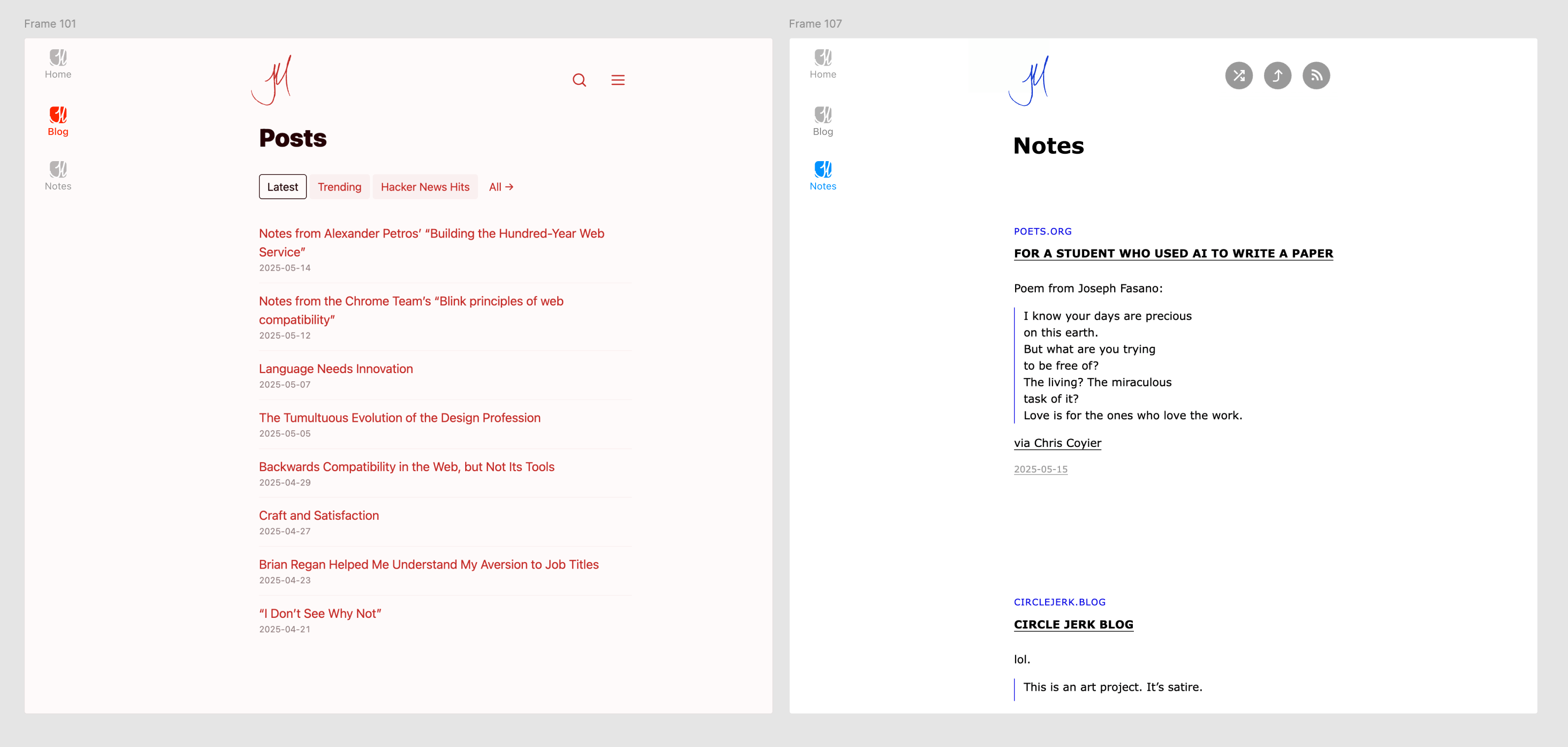
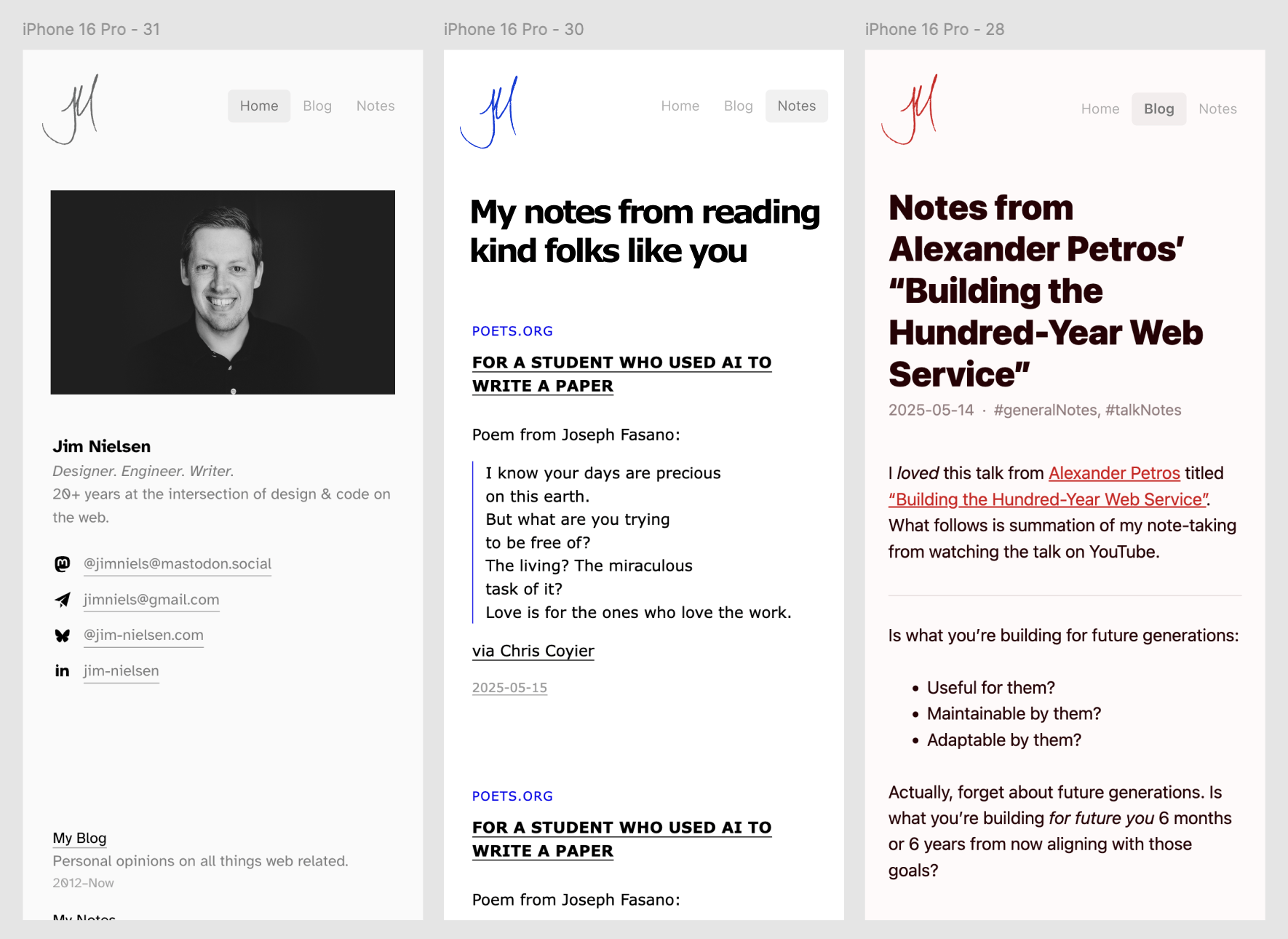
v1: Bottom Tabs With a Site Theme
I really like this pattern on mobile devices, so I thought maybe I’d consider it for navigating between my sites.
But how to theme across differently-styled sites? The favicon styles seemed like a good bet!
And, of course, what do to on larger devices? Just stacking it felt like overkill, so I explored moving it to the edge.
I actually prototyped this in code, but I didn’t like how it felt so I scratched the idea and went other directions.
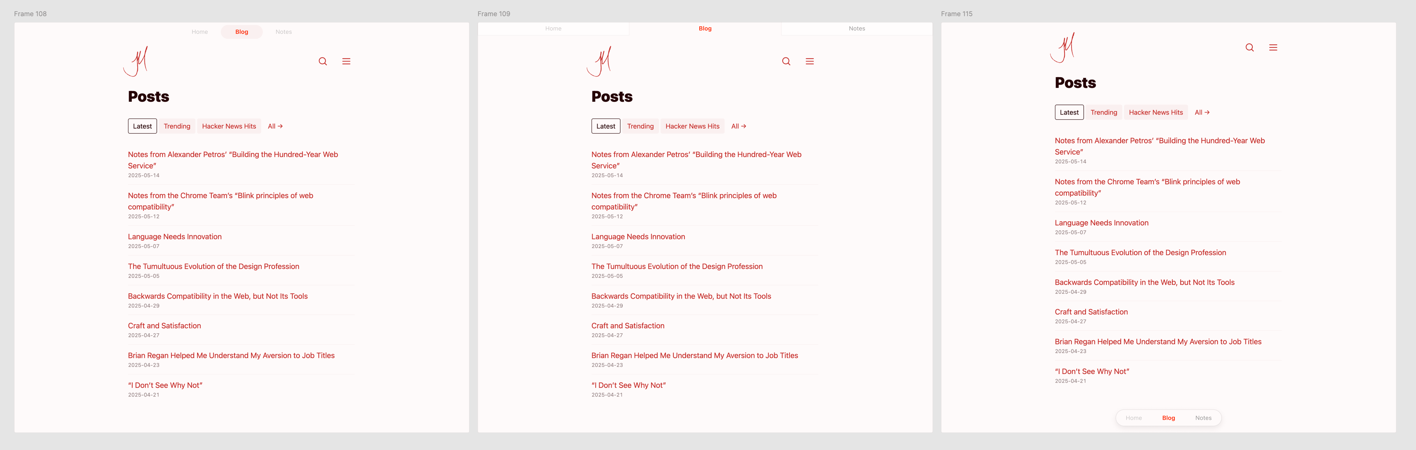
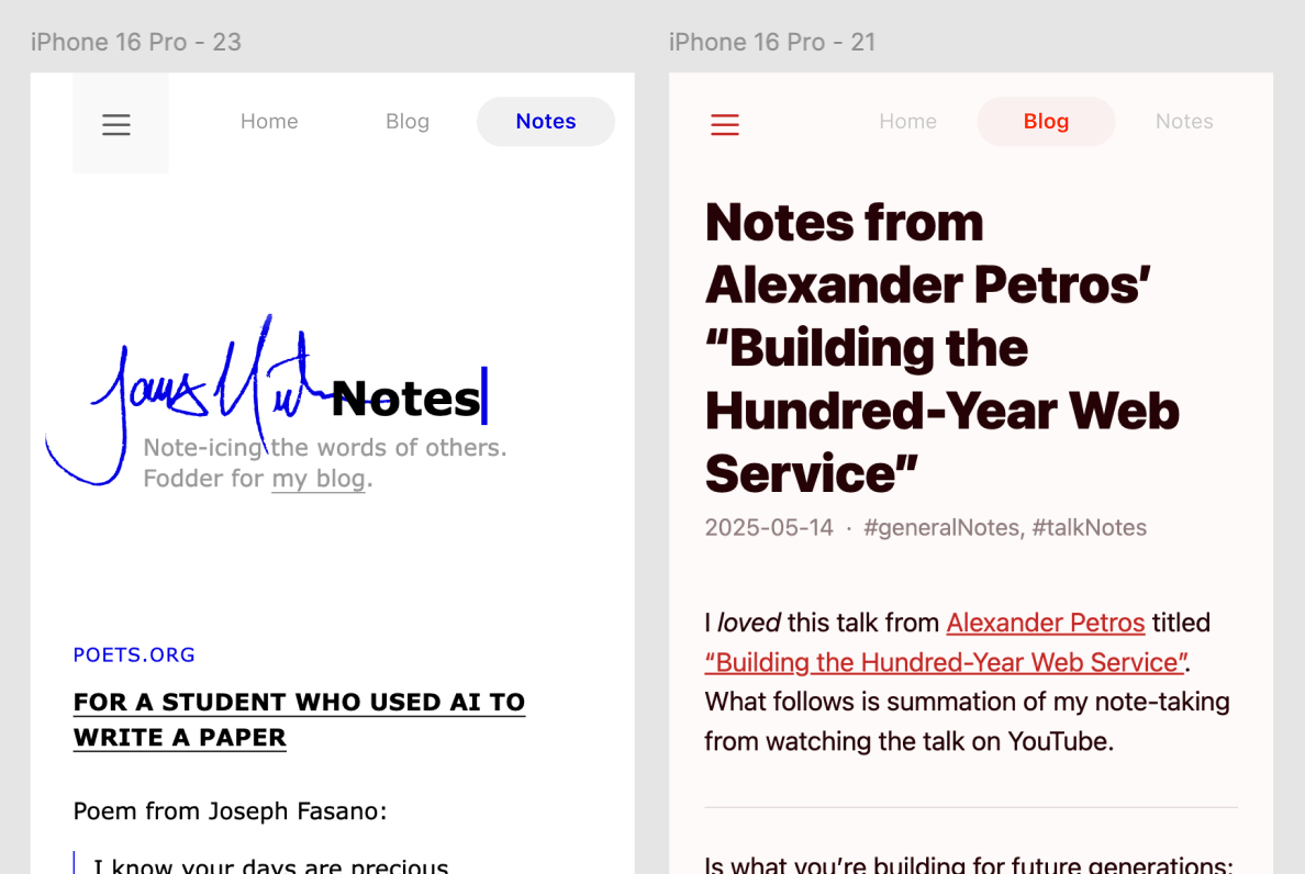
v2: The Unification
The more I explored what to do with this element, the more it started taking on additional responsibility.
“What if I unified its position with site-specific navigation?” I thought.
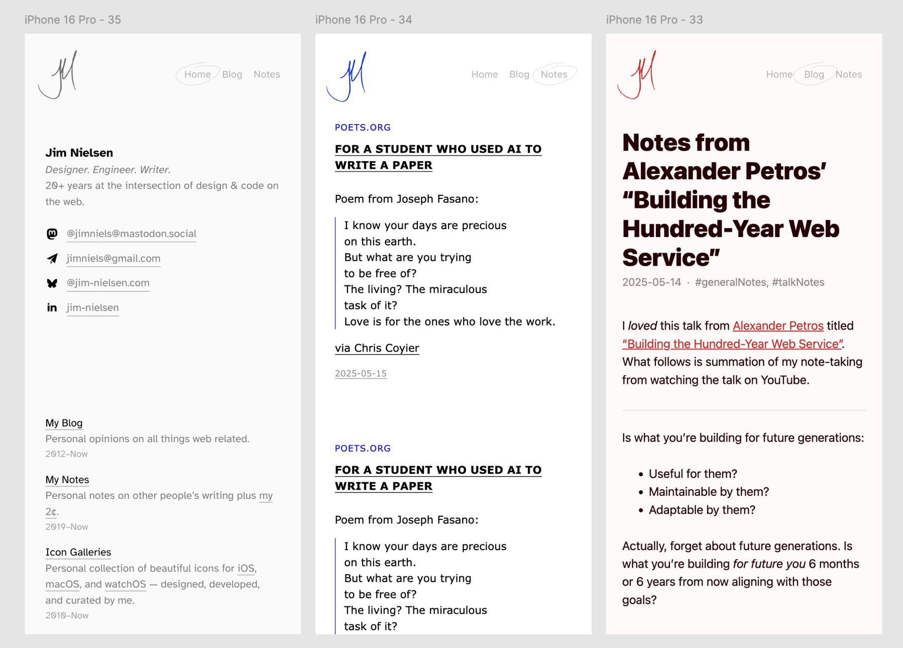
This led to design explorations where the disparate subdomains began to take on not just a unified navigational element, but a unified header.
And I made small, stylistic explorations with the tabs themselves too.
You can see how I played toyed with the idea of a consistent header across all my sites (not an intended goal, but ya know, scope creep gets us all).
As I began to explore more possibilities than I planned for, things started to get out of hand.
v3: Do More. MORE. MORE!!
Questions I began asking:
- Why aren’t these all under the same domain?!
- What if I had a single domain for feeds across all of them, e.g.
feeds.jim-nielsen.com? - What about icons instead of words?
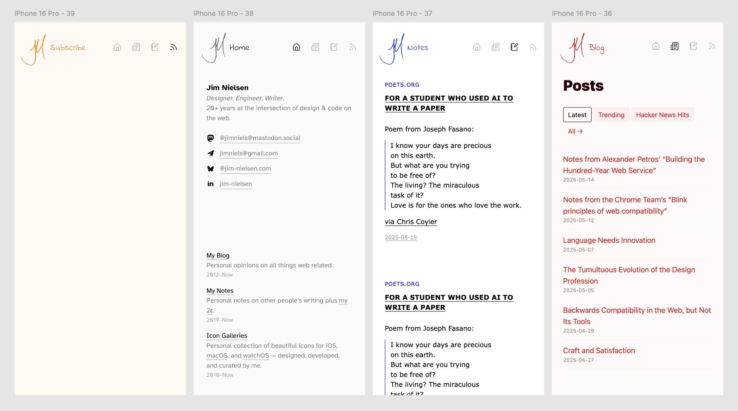
Wait, wait, wait Jim. Consistent navigation across inconsistent sites. That’s the goal. Pare it back a little.
v4: Reigning It Back In
To counter my exploratory ambitions, I told myself I needed to ship something without the need to modify the entire design style of all my sites.
So how do I do that?
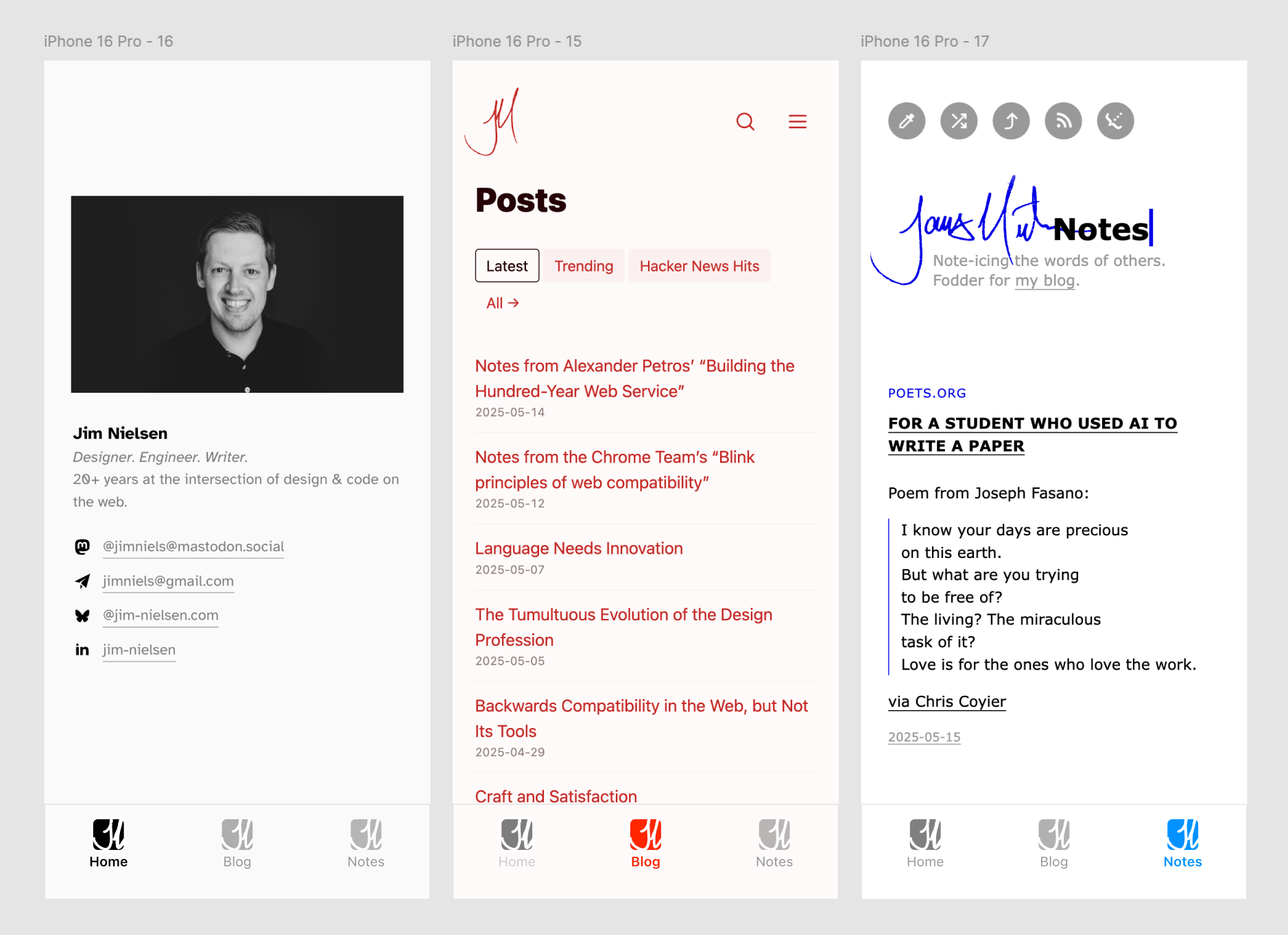
That got me back to a simpler premise: consistent navigation across my inconsistent sites.
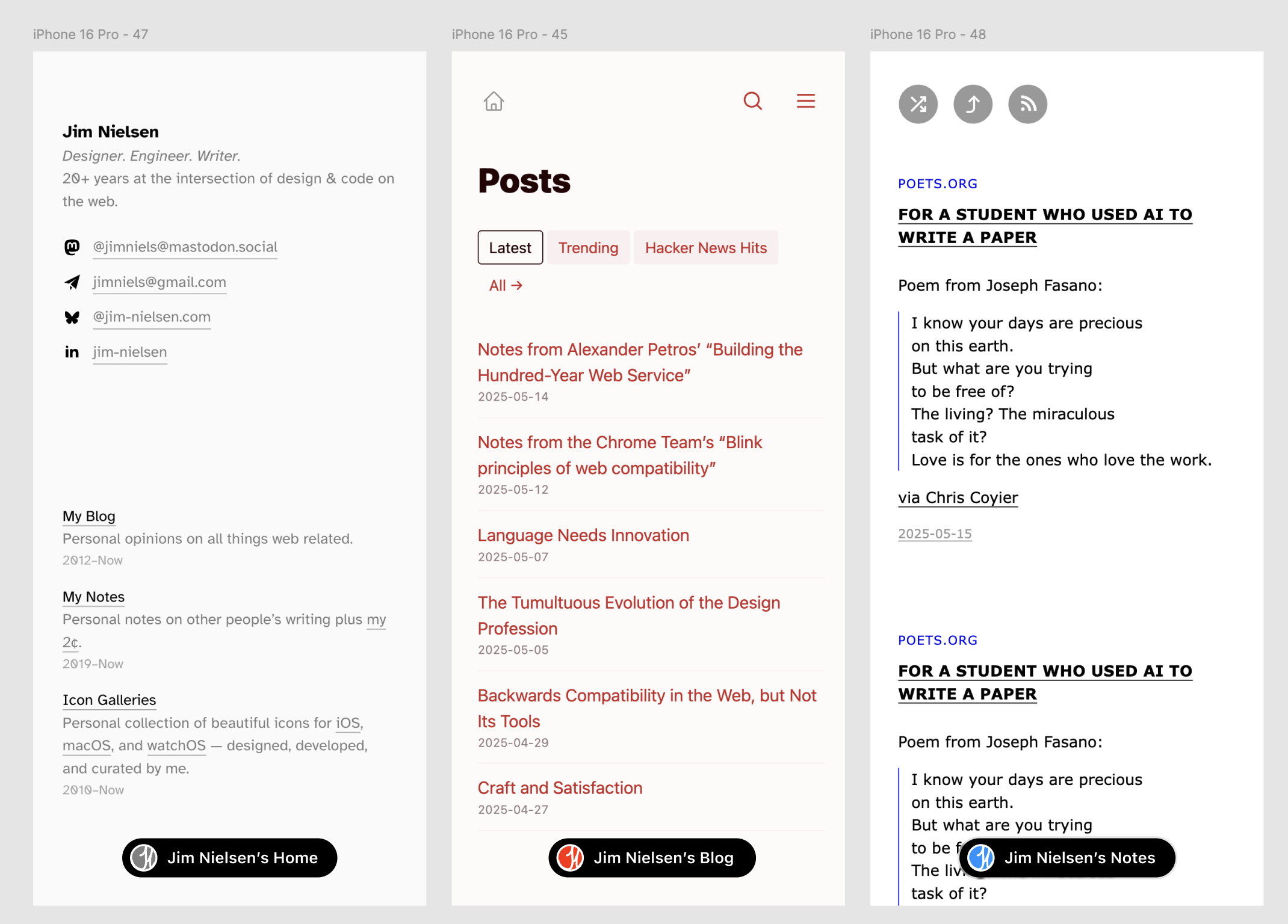
Better — and implementable.
Technical Details
The implementation was pretty simple. I basically just forked my previous web component and changed some styles. That’s it.
The only thing I did different was I moved the web component JS file from being part of my www.jim-nielsen.com git repository to a standalone file (not under git control) on my CDN.
This felt like one of the exceptions to the rule of always keeping stuff under version control. It’s more of the classic FTP-style approach to web development. Granted, it’s riskier, but it’s also way more flexible. And I’m good with that trade-off for now. (Ask me again in a few months if I’ve done anything terrible and now have regrets.)
Each site implements the component like this (with a different subdomain attribute for each site):
<script type="module" src="https://cdn.jim-nielsen.com/shared/jim-site-switcher.js"></script>
<jim-site-switcher subdomain="blog"></jim-site-switcher>
That’s really all there is to say. Thanks to Zach for prodding me to make this post.