Consistent Navigation Across My Inconsistent Websites
Anything I ship to my personal domain jim-nielsen.com is made using IDD: impulse driven development.
I can convince myself that just about anything is a good idea at the time. But in retrospect my rationales are quite often specious.
At one point in the past, I decided that I wanted to have my personal homepage and my blog be different “websites”. By that I mean: rather than have one site that has unified navigation and a coherent experience across all content, I wanted to have independent sites that evolve and progress at their own pace.
For example, if I decided I wanted to redesign my homepage (which acts as a sort of resume), I wouldn’t have to think about the typography of my blog posts. I could go super whacky in one direction, if I wanted, without having to think about how it affects the whole.
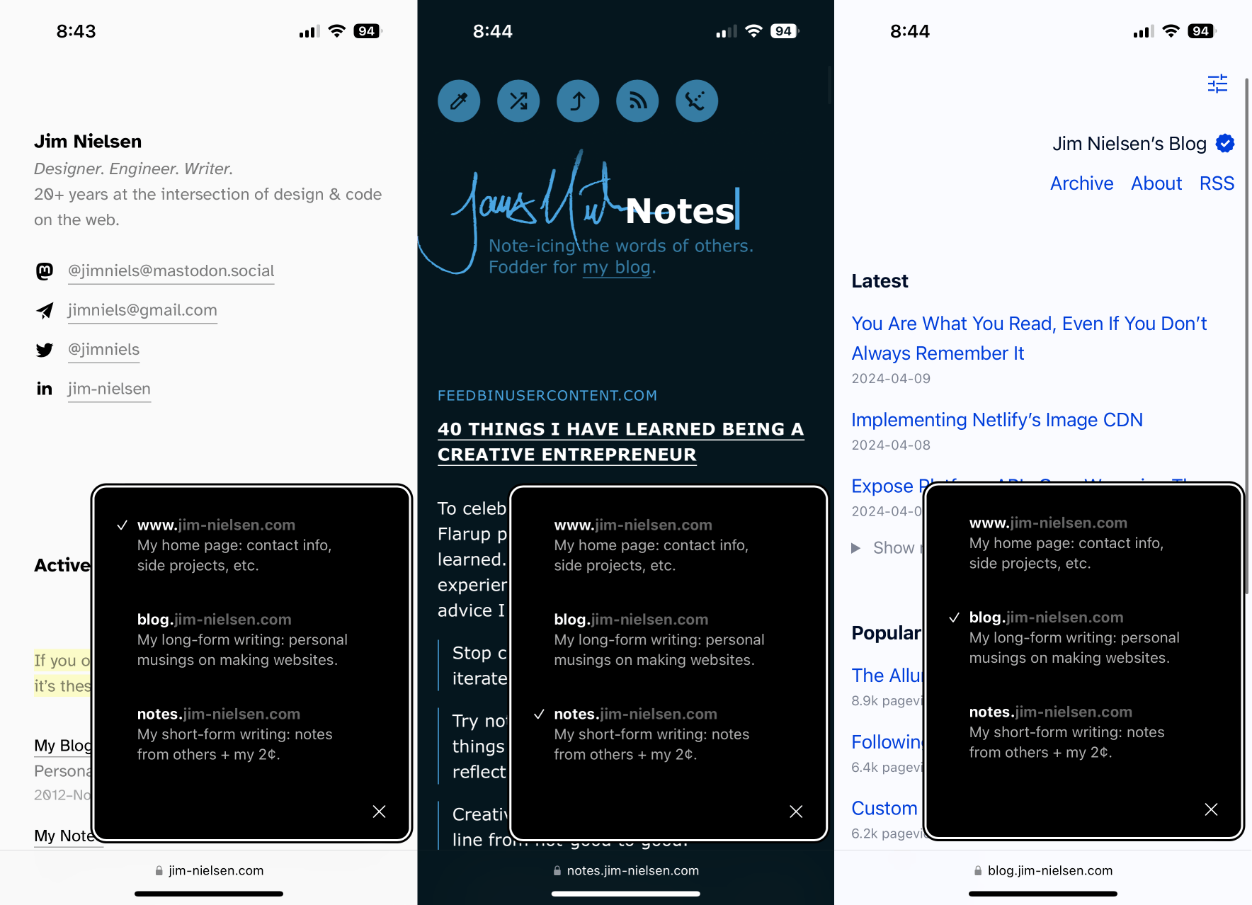
That’s how I’ve ended up with the different sites I have today, like my homepage jim-nielsen.com, my blog blog.jim-nielsen.com, and my notes notes.jim-nielsen.com. Each has their own unique design and codebase that can be modified and changed without regard for the others.
That’s nice for me, but one of the drawbacks has been that it’s not immediately apparent to people who visit those sites that all three exist. There’s no top-level navigation across all three sites with links to “Home”, “Blog”, and “Notes”.
I sort of always knew this and thought “Well that’s intentional, they’re three different sites after all!” But the trouble it actually presents people was brought to my attention by Chris Coyier when I was on the ShopTalkShow (he called it an “intervention”):
Jim, I gotta tell ya, intervention here, you don’t make it easy. You go to jim-nielsen.com, there’s no link to the blog, you gotta just “know” it’s a subdomain. And then, Jim has this incredible blog, cause he has the “think blog” and then he has this “what I’m reading” with thoughts [and they’re] equally great blogs (you should subscribe I’m not blowing smoke) but you just can’t find [them]. Like you have to go to the “About” page to find the reading blog. You gotta just smash them together [Jim]. I mean, you do you, but they’re just too hard to find.
I’m nothing if not a very poor marketer for myself and the things I do.
This was a Good Idea from Chris.
Honestly, I have lots of ideas on how to remedy this. But in the spirit of avoiding curiously exploring all the possibilities and then shipping nothing, I decided to just start with something small as a stop-gap.
My thought was: what kind of widget can I build that represents a coherent interaction across an otherwise incoherent set of web properties?
My solution? A floating head. Of myself. Fixed on every page.
At least you’ll know who the site belongs to, right?
So that’s what I built. It’s a JavaScript web component. Basically I stick this markup on every page across all my domains:
<jim-navbar></jim-navbar>
<script
  type="module"
  src="https://www.jim-nielsen.com/jim-navbar.js">
</script>
And, for browsers that support it, you get a floating head of me that works as a navigational widget across my home page, blog, and notes. When you click it, you get a popup that lets you easily navigate between the three disparate sites.
I’m Rusty on Animations, But They’re Fun
For my first implementation of the widget, I wanted to try and make a little animated menu. I settled on the idea of my head and, when clicked, it spins around and reveals a menu.
For the v1 iteration, I used CSS transform to scale and rotate the different elements.

It was pretty decent. I liked it, but I wanted to try doing something more sophisticated — something like what iOS does with the dynamic island.
To do this, I would need to make it look like the round avatar of my head was transforming its shape into the popup menu. In v1, the popup menu was just scaling down to zero and was distinct and separate from the shape of the avatar. So I tried doing this in v2.

The difference here is subtle. You almost have to slow down the animation to notice it: the popup transforms itself into the circle shape of the avatar.

In slow motion you’ll notice there are some other parts of this animation that aren’t quite right (like the timing of the opacity on the profile photo).
Feeling like I could do better, I tried a third iteration. This is the one that’s on the site today. It’s still not as refined as the dynamic island, but hey, baby steps.

Honestly, even v3 is still not very great. But I’m improving on it, including responding to bugs on social media (in that case, I was excited about shipping nested CSS without compilation, but maybe the world isn’t quite ready for that yet).
I’ve got even better ideas for this in the future, but who knows if I’ll ever get to them. This works for now.
Anyhow, that’s a very long way of saying: intervention succeeded.