Designing and Engineering for Progressive Disclosure
I’ve had a couple ideas brewing in my head lately and they all came together into a single idea after reading Adam Silver’s “Designing for actual performance”. The author pokes holes in many modern “tricks” used to make JavaScript-powered web apps be perceived as fast.
You know what's better than perceived performance? Actual performance. Avoid techniques that merely provide a mirage of speed.
There’s a lot of good stuff in that article, you really should read it. One of the core ideas, in particular, that stood out to me was the author’s musings on web page speed.
The best way to make pages fast, is to have less stuff on them...And yet web pages keep getting bigger...The fastest feature is one we never build.
Of course, it’s easy to read a sentence like that and think “yeah, all those people building web sites like that. Shame on them.” It’s easy to think of egregious examples of bloated web pages, but what about the more subtle ones? What about the stuff I’m building? It got me thinking about my own websites. Then the author expanded on the idea:
Product pages, for example, contain an image carousel, description, add to basket form, shipping information, related products, ratings and comments. We can split some of these things up.
Most users don't read every single thing on a page on every visit. Instead give users a lightweight page and a clear information architecture that makes it easy to drill down. This is called information scent.
Give users one high-definition image without a carousel. Then let users show all which would take users to a page with all the images. No Javascript needed. Fast and accessible.
Using the natural building blocks of the web as a form of progressive disclosure speeds things up drastically.
People on expensive data contracts benefit too. They can choose to see all the images by following the link or they can wait until they are connected to WI-FI.
There are so many sensible—and yet boring—pieces of advice in that excerpt. The sexy JavaScript interaction? The dense information architecture? The sophisticated unfolding of content? Dump it all. That’s where my brain went when I was reading this. Just get rid of it.
These thoughts really got my brain churning and that’s how I ended up making the changes described below.
Real-World Application
One of the thoughts that came into my head while reading the aforementioned article was that I could apply “progressive disclosure” on my icon gallery sites. On those sites, the page for each individual icon features the icon itself, its associated metadata, and then a bunch of icons which have some kind of related metadata.
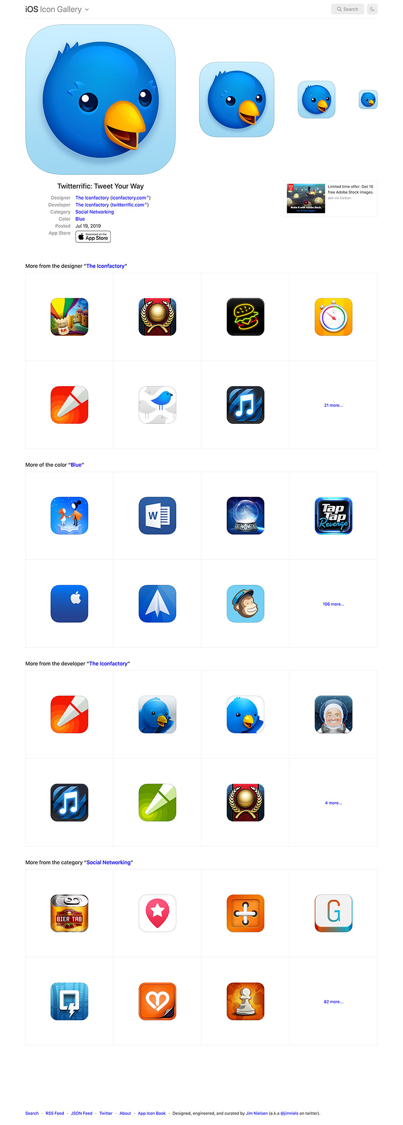
It makes for a nice big page full of icons. But that kind of felt like the problem, it’s like every other site on the internet: “hey you liked X? Check out A, B, and C!” In my case, it was more like “hey, you liked X icon? Check out A, B, C, D, E, F, G, H, I, J, K, L, M, N, O, P, Q, R, S...”
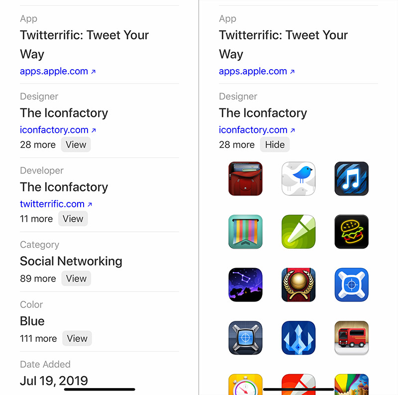
So, to the point in Adam’s article, what if I removed all that extra info and made only the essential information available on initial page load? What if instead of saying “here, look at these 12 related icons!” I said, “hey, there are 12 related icons, you want to see them? You’re going to have to click here.” A lean view by default, but the ability to gorge if you want it.
Here’s what I came up with:
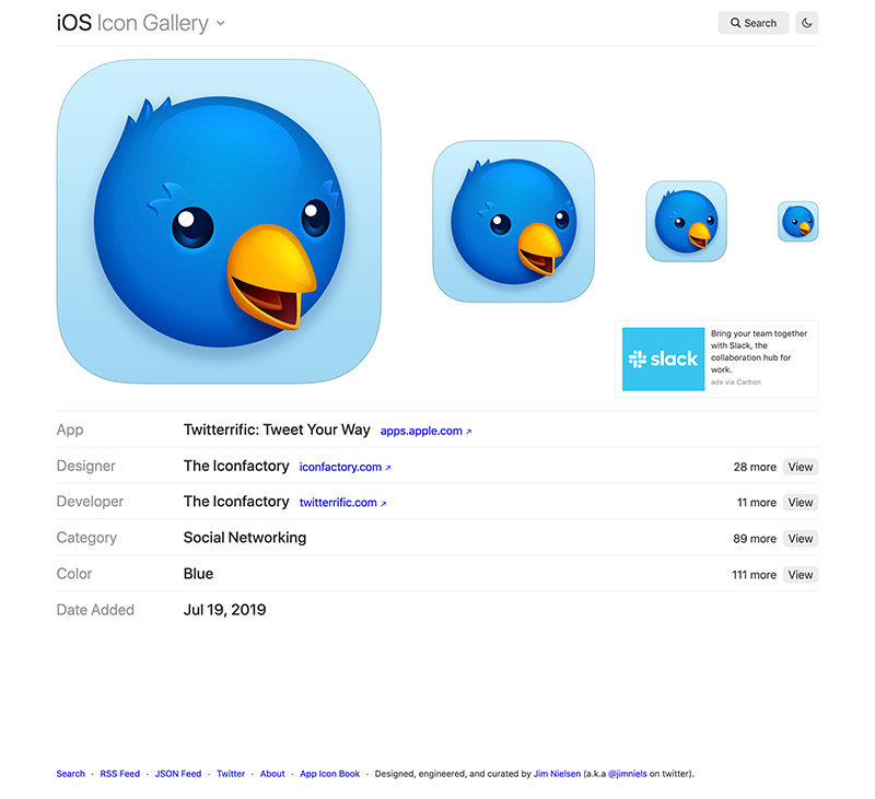
I like it! The design is simple and to-the-point. And there’s fewer <img> tags which means fewer resources on initial page load. I’ve taken away bloat by default. You can still get all those <img>s, but you have to ask for them with your clicks.
Sidenote: I’ve been approaching my free-tier bandwidth limit through my host (Netlify). Since my icon sites are easily the highest trafficed sites I run, I’ve no doubt it’s due in part to the large amount of additional icons being displayed every time someone views the page of an individual icon. Judging from a before/after comparison of page weight, I think my design changes are going to drastically reduce my bandwidth usage.
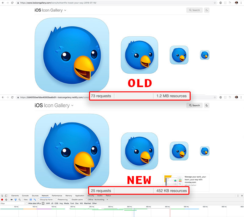
In particular, note the decline in resources requested: from 1.2MB to 452KB!
But even more than all this technical stuff (fast/slow load speed, high/low bandwidth, etc) this is a philisophical change. Rather than “here’s what you asked for, as well as a million other things just in case you’re interested”—i.e. the philosophy of engagement—this is “here’s the essentials, there’s more if you want it”—i.e. progressive disclosure. This is a restaurant now, not a buffet. You want more? Sure, I’ve got more for you, but you’ll have to ask (click) for it.
Oh, and it works this way on mobile too. You won’t download all those <img> resources unless you ask to by clicking “Show”.
The Technical Details
For anyone interested in how this is all working “under the hood” here’s a quick overview.
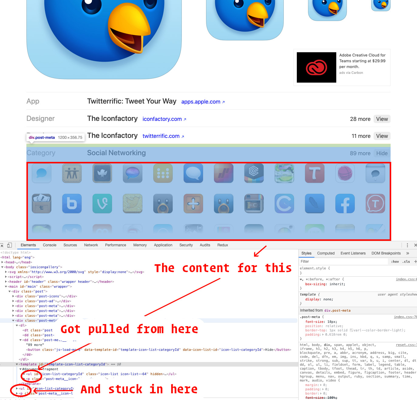
This is a static site generated from data. So every “icon page” (/icons/:id) is generated by running the data for that page through a template (in my case, I use react/JSX for templating). For each piece of metadata on the icon (category, designer, developer, etc) I look for related icons on the site. If they exist, I render a <button> that acts as the trigger to display the related icons.
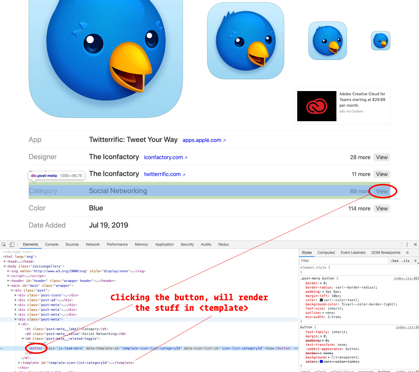
The actual markup for the icons that represents what the user sees when they click “View” lives in the DOM in a <template> tag. While the functionality to view the icons is dependent on JavaScript, I chose to stick the already-rendered markup in the DOM because:
- It allowed me to take advantage of already exisiting component templates I had on the server for rendering (I have a
<IconList>component for rendering a list of icons). This led to: - Less client-side JavaScript.
To point number two, the JavaScript to “reveal more” wasn’t loading data, rendering a template, and sticking it in the DOM. Instead it was pulling exisiting markup from the DOM (in the form of an inert <template>), sticking it in the DOM, and showing/hiding it. Much less complexity. Probably about 20 lines total, whereas doing all of it (data fetching, templating, etc.) on the client would’ve required a lot more code.
I’m not going to post all the code here, you can see it on Github if you really want. But in essence, this is what’s happening:
// Server-side templating code
const ServerSidePageTemplate = (props) => {
const relatedCategoryIcons = props.icons.filter(icon =>
icon.category === props.page.icon.category
);
return (
<div className="icon">
{relatedCategoryIcons.length &&
<React.Fragment>
<button className="js-show-more">Shore more</button>
<template id="template-related-category-icons">
<IconList icons={relatedCategoryIcons} />
</template>
<script src="./view-more.js" />
);
}
// Client side code
document.querySelectorAll(".js-show-more").forEach(el => {
el.addEventListener("click", () => {
// If content is not in the DOM,
// get it from the <template> and stick it in.
// Then show/hide the content when the user clicks
});
})
There are a couple of nice things about this approach. I really like that I can basically render all applicable markup on the server. Any client-side JavaScript is mostly just showing/hiding. Also, if you noticed, the functionality specific to this feature is in its own <script> tag which gets embedded on the page. That means other pages which don’t need this particular set of JavaScript logic (like the home page) don’t get it!
Conclusion
I’m pretty happy with how much I was able to cut out doing this exercise. My pages are more lightweight now, but without sacrificing access to related information. It was an adherence to the (rather obvious) principle mentioned in the article above:
The best way to make pages fast, is to have less stuff on them.
I’m also pretty happy with the way I achieved this from a technical perspective. There are a couple enhancements I’d like to add that, I think, would make these even more of a “progressively-enhanced” feature. But it’s good enough for now.