Redesigning and Engineering the UI/UX for Unauthenticated Users of Timshel’s “Admin”
At Timshel, we had an application called “Admin” which was used by clients to view and adminster data associated with their account. For example, a client would use Timshel’s platform API for a variety of activities: create and manage events, process payments, setup user profiles, etc.. Since these activities were tracked via the API, they could be analyzed and managed via the Admin application. This gave clients insight into how their customers were interacting with the technological aspects of their business/organization.
Exercise: It’s Good for You
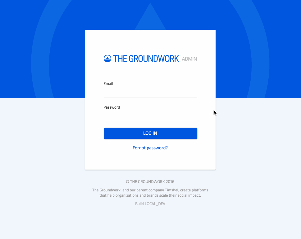
One day, after I had been doing a lot of coding, I felt like I wanted a design exercise. The login page for Admin felt like it could use a facelift to better match the UI and aesthetic that we were using “inside” of the app (i.e. once a user had authenticated). The application’s aesthetic had evolved since the initial work around the unauthenticated views, so I decided to take a stab at redesigning the login page and bringing it more inline with the UI/UX of the app’s authenticated views.

Piggy-backing on the material design aesthetic we were using inside our application, I opened Sketch and worked through some ideas. By the end of my exercise I had two mocks: one with a heavy usage of a solid color, the other with a lighter usage of it.


After completing this exercise, I kind of liked the direction. So I decided to present the mocks to the design team to see if there was any interest in pursuing the direction. Everyone seemed to like the lighter version of the login page and thought it would be worthwhile to invest more in exploring these designs.
Discovering and Designing Patterns
If I was going to pursue redesigning the login screen, I would need to also look at the associated views for unauthenticated users. This helped me approach my design exercises as part of a larger, holistic aesthetic realignment. I began by documenting all the views that were accessible to unauthenticated users of the application:
/Login to your account/sign-outLogout of your account/select-an-orgLogged in, now choose an organization/new-member-setupMessage saying you must have an invite/new-member-setup/:tokenSetup your account password/forgot-passwordEnter your email to reset your account password/forgot-password/:tokenSetup a new account password
I reviewed all the exisiting designs for these views looking for patterns I could leverage, reinforce, or break out and setup independently. Through the process I found various shared components. I decided to focus my efforts on creating a design for each of those component pieces which would then allow me to build all of the views with a consistent design – like building a house with preassembled pieces. These “pieces” included the following:
- Logo
- Message
- Secondary link
- Reset password form
- Copyright & other text

I was able to design these component pieces individually and put them together to build each unique view. This not only made for a consistent UX, but from an engineering perspective I could easily write customizeable components in React and leverage them across various views.

Individual View Designs
Based on my work around the new aesthetic and component patterns, I put together the following designs which I present here in contrast to the old page designs.
Design: /
Designs for the root view of the application when a user is not authenticated:

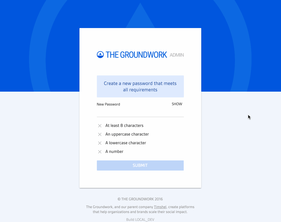
Design: /forgot-password
Designs for when a user clicked “forgot password” on the login page:


Designs for the screen a user would be directed to upon receiving an invitation to setup an account for the application:


The nuances of this screen can’t be communicated via a static mock. The design called for various interactions and graphical changes to communicate state. I designed and implemented these interactions on the front-end, resulting in a UX like this:
It’s worth noting that I designed and engineered this component for saving a password to work across various views, including the following:
- When an unauthenticated user clicks “forgot password” on the login screen and receives a link via their email to reset their password, they are taken to
/forgot-password:tokento create and save a new password. - When an unauthenticated user clicks “setup account” from an invitation email, they are taken to
/new-member-setup:tokenwhere they they would complete the setup process by creating a password. - When an authenticated user clicks “manage account” from inside the application, they are taken to a view where they can manage various aspects of their account including creating and saving a new password.
I designed and coded this component so it could be leveraged in all three of these different areas. This was not only beneficial from an engineering perspective, but it helped setup a consistent UX for creating and saving a password in the application.
Design: /new-member-setup
Designs for the screen a user lands on when following an invitation link via their email:


Designs for the new member setup page if a user somehow arrived on this page without a token (i.e. they didn’t follow an official invitation link via their email):


The Code
From a front-end perspective, this was all written on a stack including React, React Bootstrap, Redux, and CSS Modules. Because I designed the views around component pieces as patterns, it was simple enough to make configureable react components that served as building blocks for each view.
Take, for example, the /new-member-setup:token and /forgot-password:token. These shared very similar design patterns with configureable content. As such, I could abstract each component and make it configurable so that changes to patterns propagated across all views.
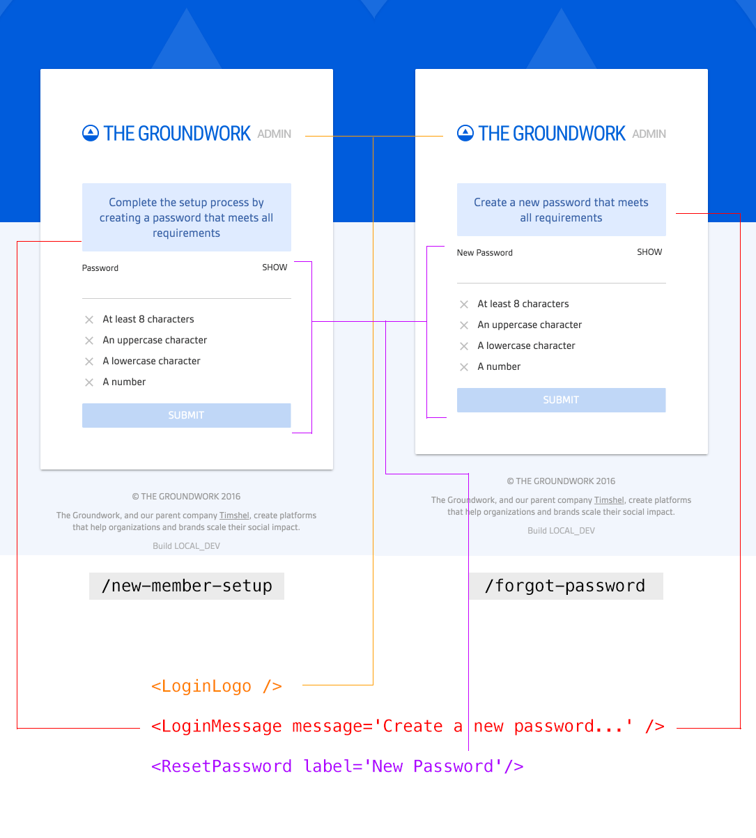
As you can see from the image above, <LoginLogo /> and <LoginMessage /> are example components used across all the unauthenticaed login views and configured to each unique view as necessary.
Conclusion
Because this is a dynamic application, there was more going on in these screens than just the static UI elements. I had to take into account error states, contextual messaging, animations, and more, both from a design and engineering perspective. The final result was all my work, from design to code.
Take a look at this gif depicting the following flow:
- Login screen ->
- Validation and error states on required fields ->
- Error message and animation on failed login ->
- Successful login ->
- Choose an org ->
- Sign out ->
- Forgot password ->
- Validation and error states on required fields ->
- Successful submission of forgot password ->
- Return to login