What’s an Icon in 2026?
As icons continue to change across Apple’s platforms, I have thoughts. They mainly revolve around two perspectives:
- What I think of icons as a long-time user of Apple’s platforms.
- What I think of icons as a digital collector and physical archivist of icons.
Let’s see if I can articulate my thoughts.
Apple Recommends Making Icons With Icon Composer For “More Expressivity”
In “Create icons with Icon Composer” from WWDC 2025, Lyan Bewry from Apple’s Design Team gives the rationale for why developers should use Apple’s new Icon Composer:
Icon design is moving from a past of simply static images, to a future of expressive, multi-layered artworks that respond to user input and adapt between appearances. They’ve become a much richer and more integrated experience on-device.
Catch that? Icons are moving from a “static” past to an “expressive, multi-layered […] much richer” future.
You may have noticed this in some of Apple’s latest OS releases, how lighting effects, customizations, etc., can all affect what an icon looks like at any given moment within the operating system.
So what are these .icon files made by Icon Composer?
Icons Are Software Now
In the Accidental Tech Podcast episode 699 “Not the Correct Squircle” John Siracusa talks about some of the technical details and differences between app icons in macOS 26 (Tahoe) and 27 (Golden Gate):
These
.iconfiles, this format that Apple came up with, it’s a bunch of resources and a recipe. So it’s like bitmaps, vector images, layers, recipes and effects. That’s what it is. And these icons are assembled on the fly by the operating system. It doesn’t burn up bitmaps of them. I take your ingredients, I assembled them, I composite them, I apply your layer effects, and then eventually it renders a bitmap that it keeps in memory somewhere.
Who is thinking about backwards compatibility in their icons?
Tahoe’s effects are different than 27’s effects […] And also, 27 has effects that 26 doesn’t support. And 26 won't even read the
.iconfiles from 27, which makes everything complicated.
Complicated indeed.
Schrödinger’s Icon
As noted, the days of a single, static image for icons are over. An app icon is no longer a PNG file.
It’s a bit of a Schrödinger’s icon if you will. There’s no longer a universal answer for “What does your app icon look like?” An icon is simultaneously light, dark, glass, tinted, etc.. Only once it is “observed” — that is rendered at runtime on a device with settings applied (user preferences, device angle, etc.) — can you really know what it looks like.
An icon now has a runtime.
My Two Cents
I don’t know.
Icons are effective because of their ability to be quickly recognizable and memorable. Visual simplicity and consistency support that.
Making something more “expressive” and “richer”, to me, means conveying more. But icons are meant, to a degree, to convey less. Only the essential. That’s what makes them effective. There’s definitely a point where, the more they convey, the less effective they are at their purpose.
The more you move away from a singular, visual representation, the more room there is for confusion and greater cognitive effort for discernment.
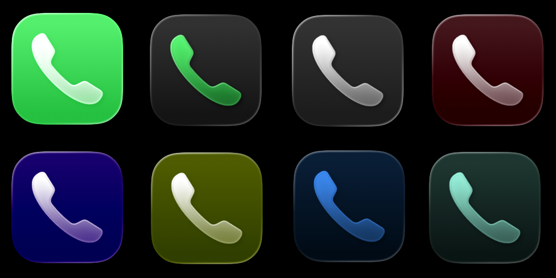
Take, for example, Apple’s Phone app. What’s the icon for it? Can you picture it in your head? It’s a green icon with a white phone glyph. That’s what it was in the original iPhone keynote (and it’s what the Phone app will always be to me). Iconic!
But wait! Now it’s also a black icon with a green phone glyph if you’re in dark mode. And there’s more! It’s a clear glass icon with a phone glyph if you’re in clear mode. And! It’s [insert color here] with a phone glyph if you’ve tinted it.
Consistent color is a strong ingredient in aiding memorability and recognizability. Look at Coke:
- Red can? Coke
- Black can? Coke Zero
- Silver can? Diet Coke
Simplicity matters. It aids recognizability and memorability. If you start making it more complicated and more varied, you lose what made it simple, recognizable, and memorable to begin with.
And what are app icons but visual tools for immediate recognizability?
Anyway, now that app icons have a runtime and will increasingly vary in their appearance, I’m not sure how to archive them anymore.
This story is still developing…