After publishing my Analysis of Links From The White House’s “Wire” Website, Tina Nguyen, political correspondent at The Verge, reached out with some questions.
Her questions made me realize that the numbers in my analysis weren’t quite correct (I wasn’t de-depulicating links across days, so I fixed that problem).
More pointedly, she asked about the most popular domain the White House was linking to: YouTube. Specifically, were the links to YouTube 1) independent content creators, 2) the White House itself, or 3) a mix.
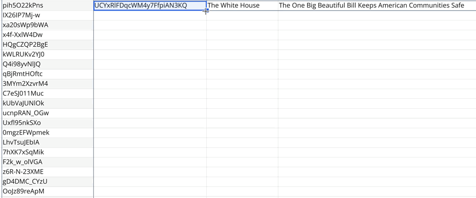
A great question. I didn’t know the answer but wanted to find out. A little JavaScript code in my spreadsheet and boom, I had all the YouTube links in one place.
![Screenshot of a table of data in a spreadsheet showing all the links to YouTube from wh[dot]gov/wire](https://cdn.jim-nielsen.com/blog/2025/whwire-followup-youtube-links.png)
I couldn’t really discern from the links themselves what I was looking at. A number of them were to the /live/ subpath, meaning I was looking at links to live streaming events. But most of the others were YouTube’s standard /watch?v=:id which leaves the content and channel behind the URL opaque. The only real way to know was to click through to each one.
I did a random sampling and found most of the ones I clicked on all went to The White House’s own YouTube channel. I told Tina as much, sent here the data I had, and she reported on it in an article at The Verge.
Tina’s question did get me wondering: precisely how many of those links are to the White House’s own YouTube channel vs. other content creators?
Once again, writing scripts that process data, talk to APIs, and put it all into 2-dimensional tables in a spreadsheet was super handy.
I looked at all the YouTube links, extracted the video ID, then queried the YouTube API for information about the video (like what channel it belongs to). Once I had the script working as expected for a single cell, it was easy to do the spreadsheet thing where you just “drag down” to autocomplete all the other cells with video IDs.
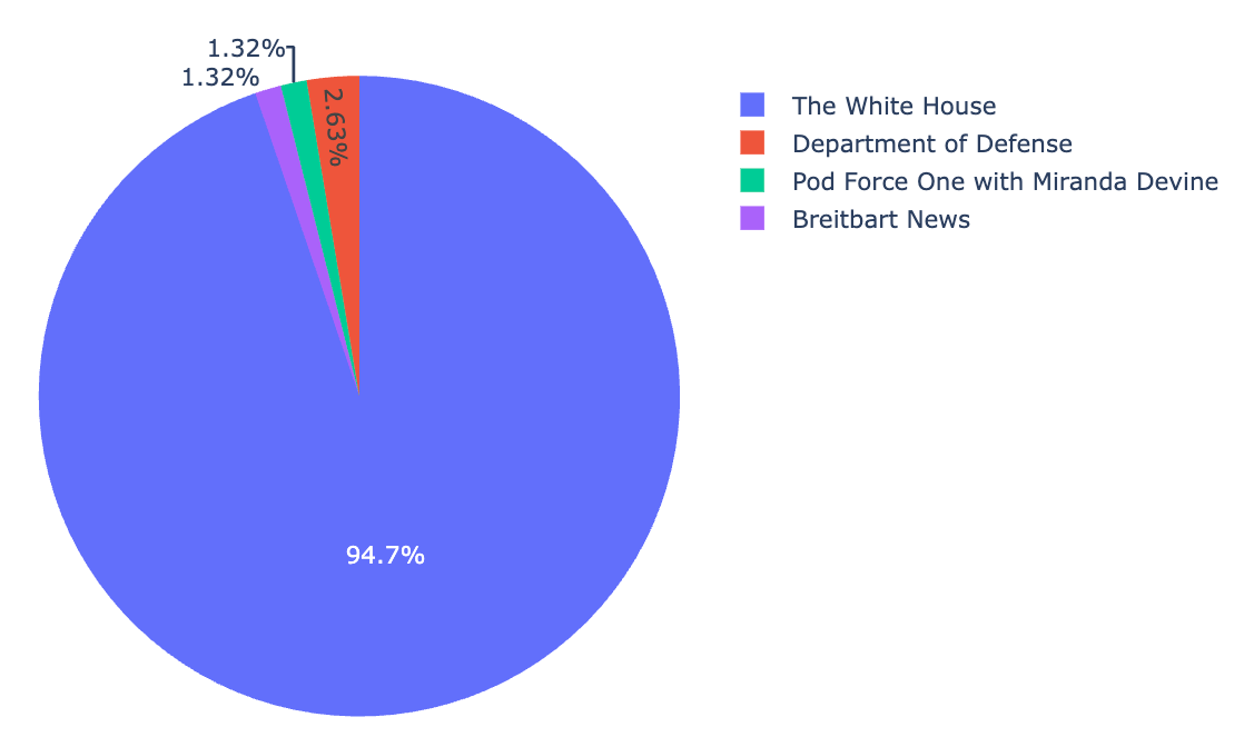
The result?
From May 8th to July 6th there were 78 links to YouTube from wh.gov/wire, which breaks down as follows:
- 73 links to videos on the White House’s own YouTube channel
- 2 links to videos on the channel “Department of Defense”
- 1 link to a video on the channel “Pod Force One with Miranda Devine”
- 1 link to a video on the channel “Breitbart News”
- 1 link to a video that has since been taken down “due to a copyright claim by Sony Music Publishing” (so I’m not sure whose channel that was)