Jeremy Keith, Chris Coyier, and others (see Jeremy’s post) have written about the idea of “pace layers” and now I’m going to take a stab at applying it to user interface primitives.
First, let’s start with a line of reasoning:
- Common user interface controls — such as checkboxes or radios — should be visually and functionally consistent. This provides users a uniform, predictable interface for common interactions across various applications (turning things on/off, selecting an option from a pre-defined list, etc.).
- Designers and developers should use the primitives afforded by the lower-levels they’re building on. This gives application and web site users a consistent, predictable interface within their context and environment.
- For web designers, every person accessing your site has a particular piece of hardware with a particular operating system and design language to boot. You can build on top of those primitives, rather than re-create them yourself, which gives end users consistency within their chosen environment.
- For example, a radio button on one website or in one native app is the same radio button on another website or in another app. (Rather than every single website and application rolling their own radios that might be identical, similar, or drastically different.)
To achieve this, user interfaces can be built in “layers” where each layer builds on top of the layer below it, providing a level of integration and consistency within its environment. And, where lower levels don’t provide primitives necessary for a user interface, designers and developers can create their own.
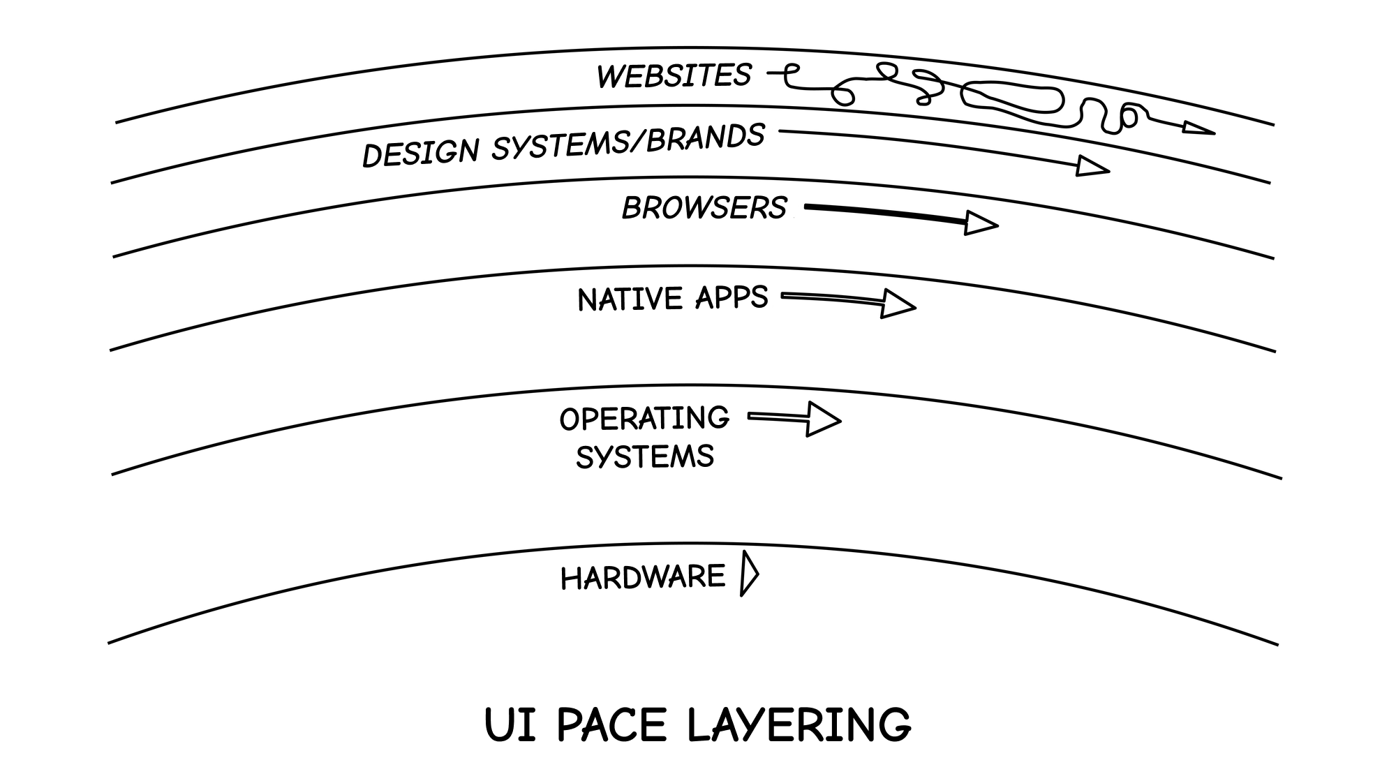
In this world, individual websites are free to explore patterns and interactions which don’t yet exist (or are only half-implemented by lower layers). However, where a lower-level dependency exists, they can leverage it which gives end users a more consistent experience in their chosen environment while also giving designers and developers more time to focus on building UI controls and patterns that don’t yet exist.
UI Primitives We Build Ourselves Are a Liability
Every UI control you roll yourself is a liability. You have to design it, test it, ship it, document it, debug it, maintain it — the list goes on.
It makes you wonder why we insist on rolling (or styling) our own common UI controls so often. Perhaps we’d be better off asking: What are the fewest amount of components we have to build to deliver value to our users?
When creating user interfaces, you can leverage the existing controls and patterns of the layers you’re building on top of.
This helps you build, maintain, and debug less because you’re using primitives built and maintained by the makers of levels below you (which are generally more stable and change less).
And it helps your users because the experience of your app or website is more consistent and predictable within whatever particular hardware and operating system they’re using.
Adopting UI Primitives: Addition or Subtraction
When designers and developers set out to create a user interface, they have to ask themselves: Are we going to use something that already exists, or create our own?
When you use a checkbox or radio control, are you adopting those controls by 1) leveraging existing APIs of lower-level layers, or 2) re-implementing them yourself?
Approach (1) makes it easier for you to maintain and easier for your users to use, as it’s a pattern consistent with the shared language and functionality of their bespoke computing experience.
Approach (2) does neither of these. It’s more work for you to build and maintain, and it’s more cognitive work for your users to learn yet another visual and functional variant of an otherwise standard UI primitive.
An Example: The Switch Control
For a long time, a checkbox was all you had on the web. So people built their own “switch” controls.
Eventually, browsers got around to providing an API to the existing switch control of lower-level systems.
So the question for many websites and design systems became: Do we adopt the switch control that the browser (and lower-level layers) now provide us? Or do we keep our hand-rolled switch?
In this sense, there are two approaches to building a design system:
- Build everything that’s needed.
- Build only what is not already provided by lower layers (and trade variance in your system for consistency in your users’ systems).
In approach (1) you build and maintain everything yourself. In approach (2) you build what isn’t provided and you maintain by deleting previous implementations now provided by lower layers.
Priority Says: Brands > People
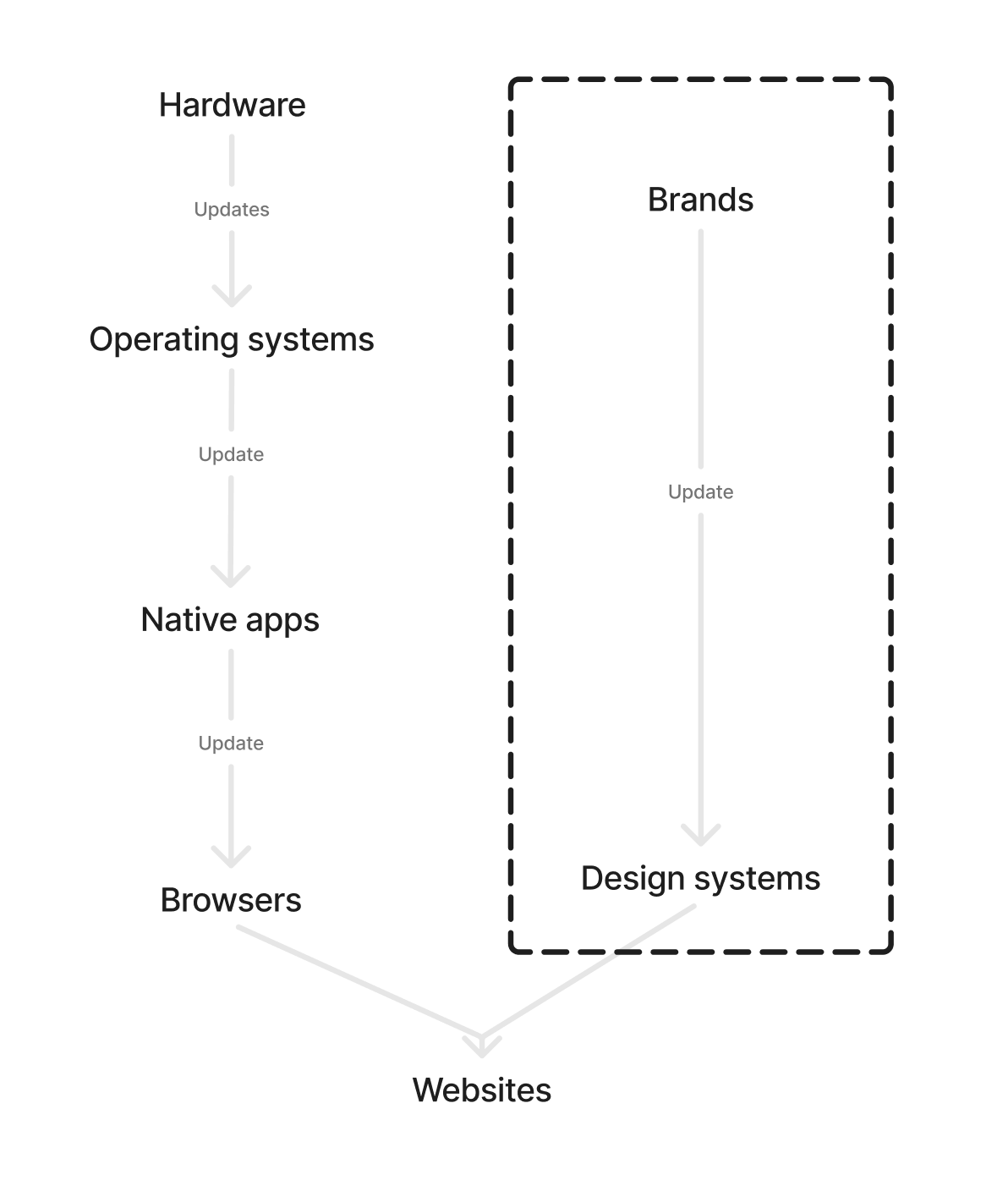
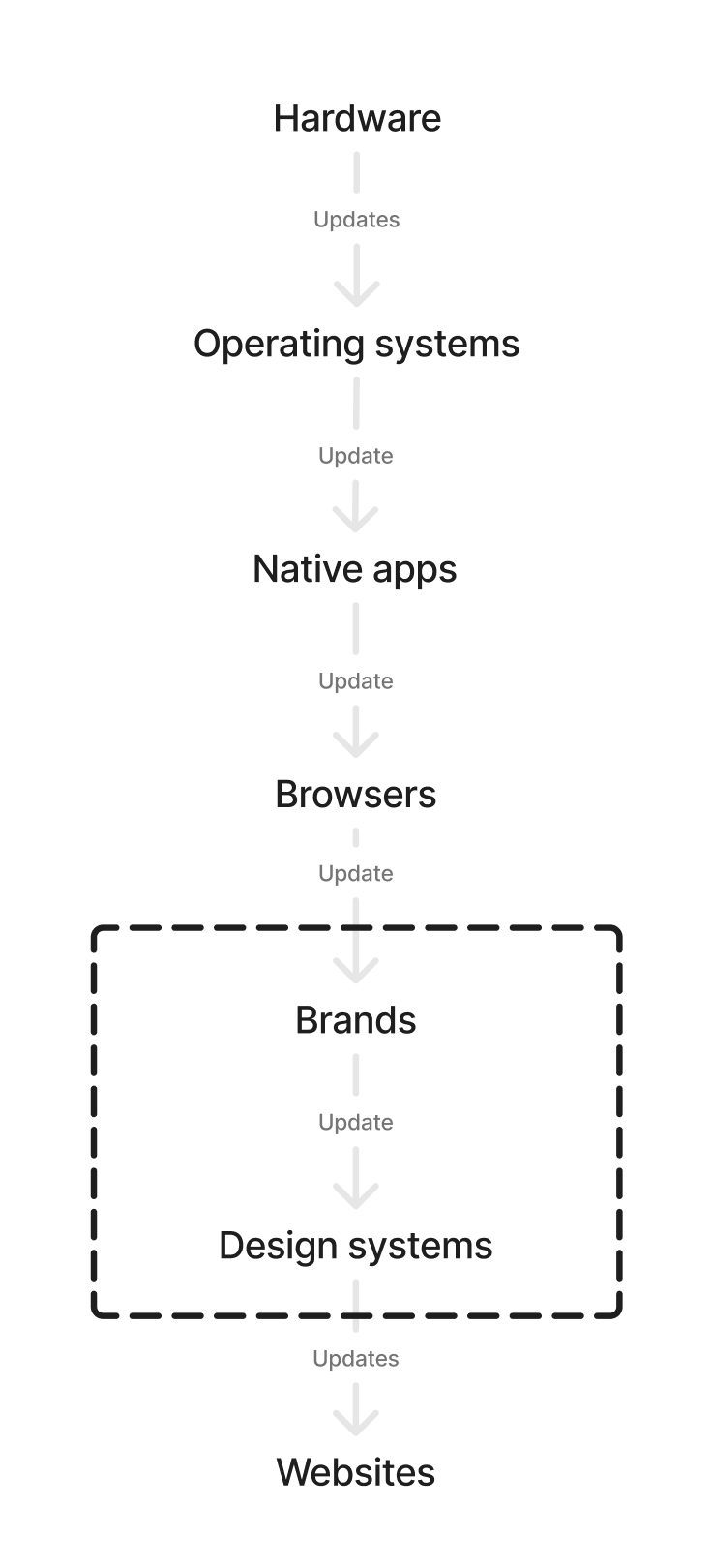
In a world of layers built on top of each other, you would see updates to UI primitives change in lower levels and “bubble up” to websites.
OS -> Native -> Browser -> Website -> Form control
However, the world we’ve constructed with many of our websites and design systems is outside of this flow of updates. There’s the OS-level stuff:
OS -> Native -> Browser
And then tangential to that stream of updates is this flow, which requires manual intervention and updates:
Design system -> Website -> Form control
For example, if the OS changes its radios, websites only get those updates if individual design system and website owners decide to pick up those changes, leaving users’ experiences inconsistent in their chosen computing environment.
In other words, the UI layering of operating systems and websites diverge from each other. We opt to make the experience of our brands primary over the users’.
Whereas we could be choosing to make our brands fit into users' choices.
But then we’d have to value honoring user choice over brand consistency, and I just don’t know if the world is ready for that because brands pay the bills.