Sanding UI, pt. II
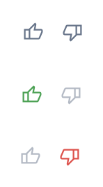
Let’s say you make a UI to gather some user feedback. Nothing complicated. Just a thumbs up/down widget. It starts out neutral, but when the user clicks up or down, you highlight what they clicked an de-emphasize/disable the other (so it requires an explicit toggle to change your mind).
So you implement it. Ship it. Cool. Works right?
Well, per my previous article about “sanding” a user interface UI by clicking around a lot, did you click on it a lot?
If you do, you’ll find that doing so selects the thumbs up/down icon as if it were text:
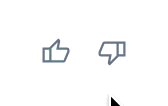
So now you have this weird text selection that’s a bit of an eye sore. It’s not relevant to text selection because it’s not text. It’s an SVG. So the selection UI that appears is misleading and distracting.
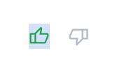
One possible fix: leverage the user-select: none property in CSS which makes it not selectable. When the user clicks multiple times to toggle, no text selection UI will appear.
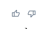
Cool. Great!
Another reason to click around a lot. You can ensure any rough edges are smoothed out, and any “UI splinters” are ones you get (and fix) in place of your users.