And by LLMS I mean: (L)ots of (L)ittle ht(M)l page(S).
I recently shipped some updates to my blog. Through the design/development process, I had some insights which made me question my knee-jerk reaction to building pieces of a page as JS-powered interactions on top of the existing document.
With cross-document view transitions getting broader and broader support, I’m realizing that building in-page, progressively-enhanced interactions is more work than simply building two HTML pages and linking them.
I’m calling this approach “lots of little HTML pages” in my head. As I find myself trying to build progressively-enhanced features with JavaScript — like a fly-out navigation menu, or an on-page search, or filtering content — I stop and ask myself: “Can I build this as a separate HTML page triggered by a link, rather than JavaScript-injected content built from a button?”
I kinda love the results. I build separate, small HTML pages for each “interaction” I want, then I let CSS transitions take over and I get something that feels better than its JS counterpart for way less work.
Allow me two quick examples.
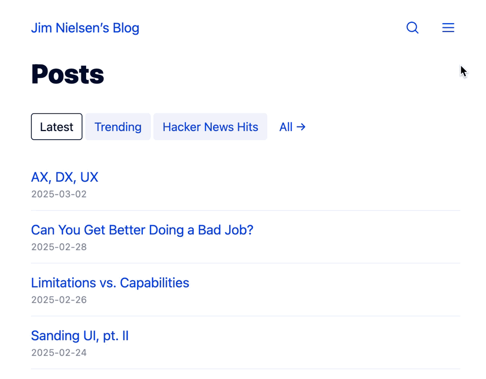
Example 1: Filtering
Working on my homepage, I found myself wanting a list of posts filtered by some kind of criteria, like:
- The most recent posts
- The ones being trafficked the most
- The ones that’ve had lots of Hacker News traffic in the past
My first impulse was to have a list of posts you can filter with JavaScript.
But the more I built it, the more complicated it got. Each “list” of posts needed a slightly different set of data. And each one had a different sort order. What I thought was going to be “stick a bunch of <li>s in the DOM, and show hide some based on the current filter” turned into lots of data-x attributes, per-list sorting logic, etc. I realized quickly this wasn’t a trivial, progressively-enhanced feature. I didn’t want to write a bunch of client-side JavaScript for what would take me seconds to write on “the server” (my static site generator).
Then I thought: Why don’t I just do this with my static site generator? Each filter can be its own, separate HTML page, and with CSS view transitions I’ll get a nice transition effect for free!
Minutes later I had it all working — mostly, I had to learn a few small things about aspect ratio in transitions — plus I had fancy transitions between “tabs” for free!

This really feels like a game-changer for simple sites. If you can keep your site simple, it’s easier to build traditional, JavaScript-powered on-page interactions as small, linked HTML pages.
Example 2: Navigation
This got me thinking: maybe I should do the same thing for my navigation?
Usually I think “Ok, so I’ll have a hamburger icon with a bunch of navigational elements in it, and when it’s clicked you gotta reveal it, etc." And I thought, “What if it’s just a new HTML page?”[1]
Because I’m using a static site generator, it’s really easy to create a new HTML page. A few minutes later and I had it. No client-side JS required. You navigate to the “Menu” and you get a page of options, with an “x” to simulate closing the menu and going back to where you were.
I liked it so much for my navigation, I did the same thing with search. Clicking the icon doesn’t use JavaScript to inject new markup and animate things on screen. Nope. It’s just a link to a new page with CSS supporting a cross-document view transition.

Granted, there are some trade-offs to this approach. But on the whole, I really like it. It was so easy to build and I know it’s going to be incredibly easy to maintain!
I think this is a good example of leveraging the grain of the web. It’s really easy to build a simple website when you can shift your perspective to viewing on-page interactivity as simple HTML page navigations powered by cross document CSS transitions (rather than doing all of that as client-side JS).