Sanding UI
One of the ways I like to do development is to build something, click around a ton, make tweaks, click around more, more tweaks, more clicks, etc., until I finally consider it done.
The clicking around a ton is the important part. If it’s a page transition, that means going back and forth a ton. Click, back button. Click, right-click context menu, “Back”. Click, in-app navigation to go back (if there is one). Click, keyboard shortcut to go back. Over and over and over. You get the idea.
It’s kind of a QA tactic in a sense, just click around and try to break stuff. But I like to think of it as being more akin to woodworking. You have a plank of wood and you run it through the belt sander to get all the big, coarse stuff smoothed down. Then you pull out the hand sander, sand a spot, run your hand over it, feel for splinters, sand it some more, over and over until you’re satisfied with the result.
With software, the fact is that sometimes there are just too many variables to know and test and smooth out. So I click around, using the UI over and over, until I finally cannot give myself any more splinters.
Just the other day, I was working on a list of radio options, pretty standard-fare stuff:
- Create a
<label>with an associated<input type="radio">. - Put them on the same row, center align them with a gap between the control and the label.
- Etc.
As an oldie who used to leverage floats in CSS, I’m still amazed when I can use flexbox to do this stuff — it’s so easy!
<div class="container">
  <label for="control">Foo</label>
  <input id="control" type="radio">
</div>

<style>
    .container {
      display: flex;
      flex-direction: row;
      align-items: center;
      gap: .5rem;
    }
</style>
As I was doin’ my thang — clicking around a bunch, trying to get some splinters — I realized there was a dead spot in the UI, a place between the radio and the label where clicking didn’t toggle the control like I expected.
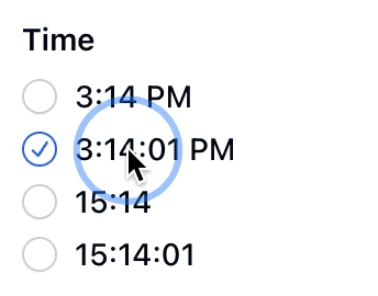
“What the?” I thought. “I’ve got my <label> and <input> and associated for attribute, why isn’t this working?” Then I thought, “gap in my flex display must be the culprit!”
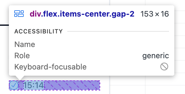
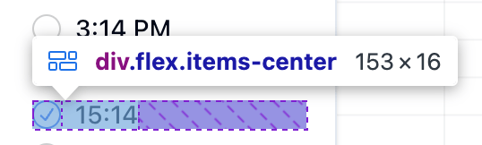
Sure enough, it was. While flexbox had made it super easy to add some visual spacing between the control and its label, that spacing had become a dead zone of interaction even though it wasn’t my intention!
There’s probably a million different ways to solve this problem — because CSS is awesome — but I just removed the gap and added some padding to my label, then voilà!
![]()
Putting padding on the label, instead of the containing flexbox, made the whole thing clickable without a deadzone.
A bunch more clicking around and things were working as expected.
It’s a small thing, but lots of small splinters lead to an agonizing experience.
So my recipe is: sand it, feel the grain, get a splinter, sand again, and repeat until smooth.