My Failed Personal Site Redesign
tfw when you have an idea for a personal website redesign, and then you build it, and then you hate it, and then you have to decide whether to ship it anyway or keep what you have
As you can probably guess from the title[1], I decided to keep what I have and throw away what I built.
But I felt really bad throwing it away, so I decided to archive the work I did as a blog post.
The Inspiration
Whenever I ship an update to my personal website, my “days since starting a redesign” counter resets.
The day after I ship a personal website redesign, I begin fielding inspiration for my next redesign.
Two motifs that’ve been stuck in my mind for a while are:
- Anh’s comic-book style website
- Dave’s homepage with the giant “DAVE” hero text — just so you’re sure whose website you’re looking at.
While I know my execution will be nowhere near as awe-inspiring as Anh’s, I still want to give the “hand-drawn comic” style a shot. I think it’s such a great form for storytelling. Plus what better way to create your own personal style that’s unlike anyone else’s than to use elements of your own handwriting?
The Iterations
Ok, first go around. I want to get some of my own hand drawings on screen along with some text telling a story, just to see if it even seems promising.
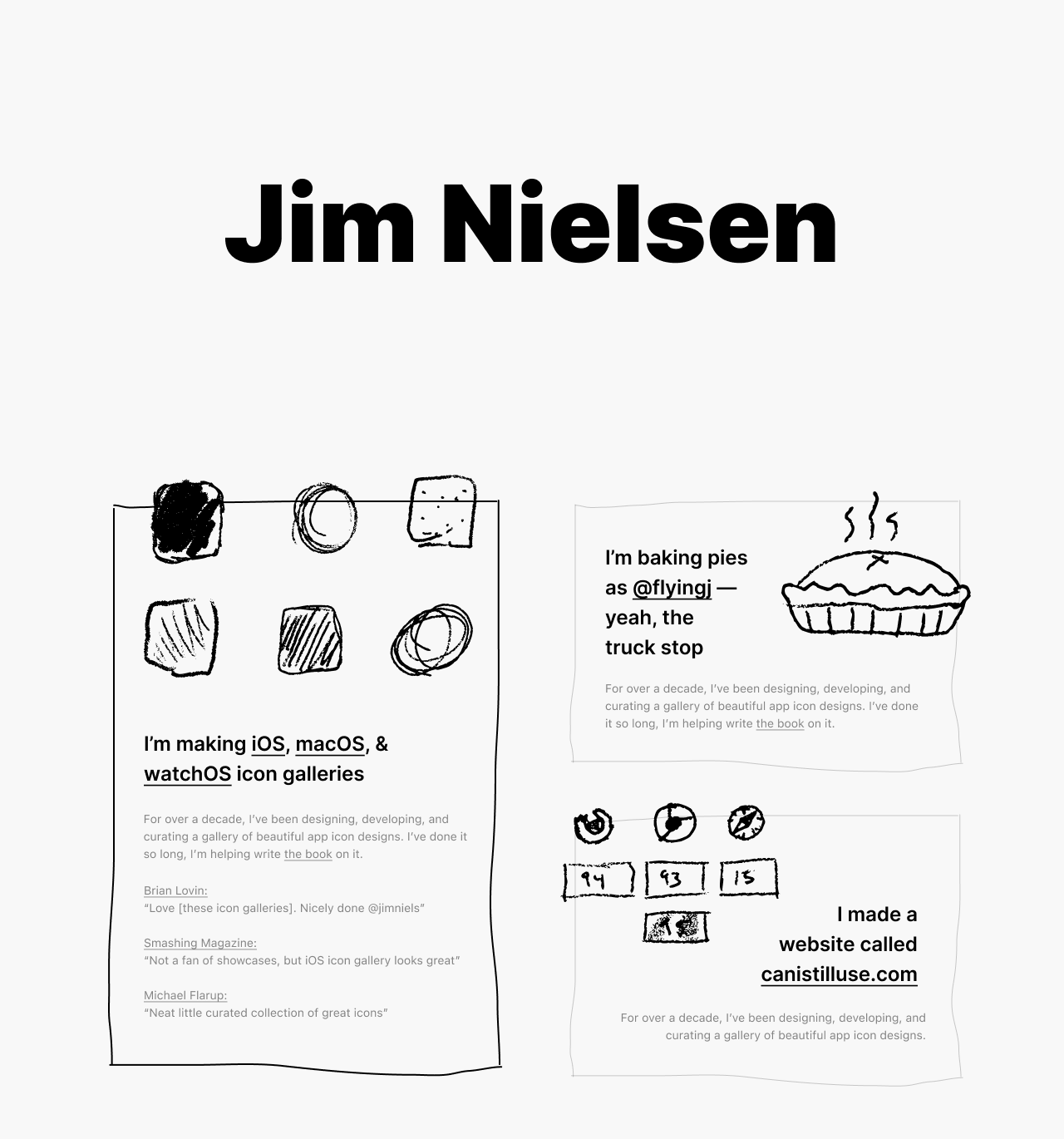
Ok, ok. That’s…ok. Maybe this can work. But I really want to differentiate between stuff I’ve done (past work I’ve shelved) and stuff I’m doing (current stuff I still work on). Maybe I need some sections? Also I’ve got way too much text.
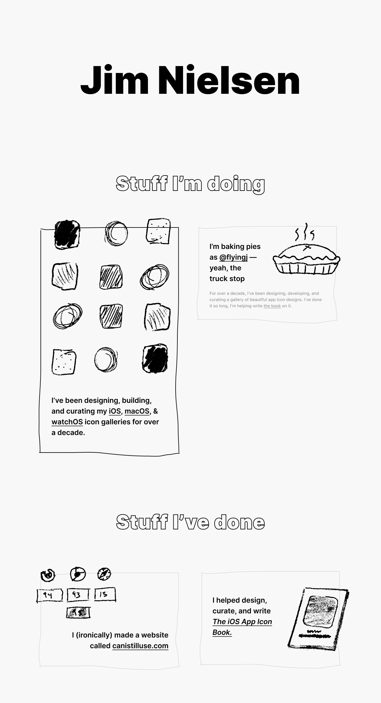
Hm. Ok. I think I need to fill it with more examples to see if it’s gonna work. And I still need less text. I need to get across the idea of each strip in one or two sentences. And maybe throw in an attempt at some more hierarchy.
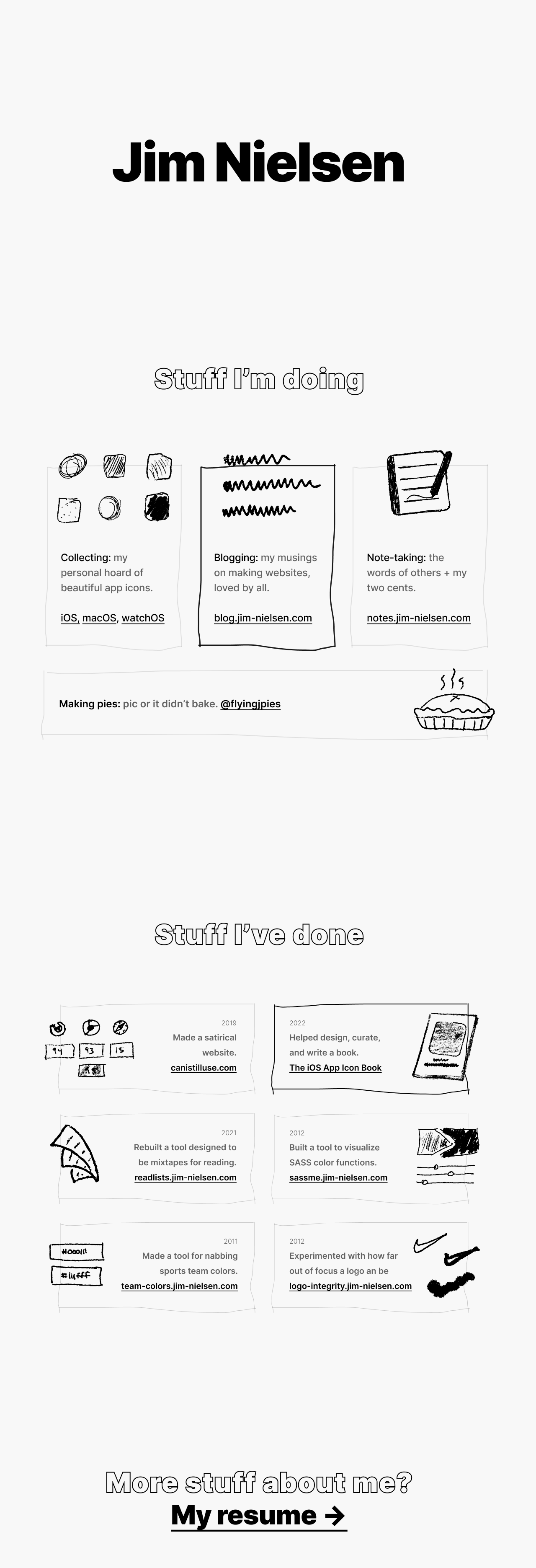
Ok, that’s getting better. But I’m also realizing I want to try and get something out the door and if I try to create a hand drawing and description for everything I’ve made, that’s not gonna take forever and stall this work.
Let’s try starting with just the stuff I’m currently working on. Maybe some social links. Then somebody lands on my personal website and they can see what I’m currently working on and where I can be found on the internet. Oh, and try doing the “DAVE” thing. Big name you can’t miss.
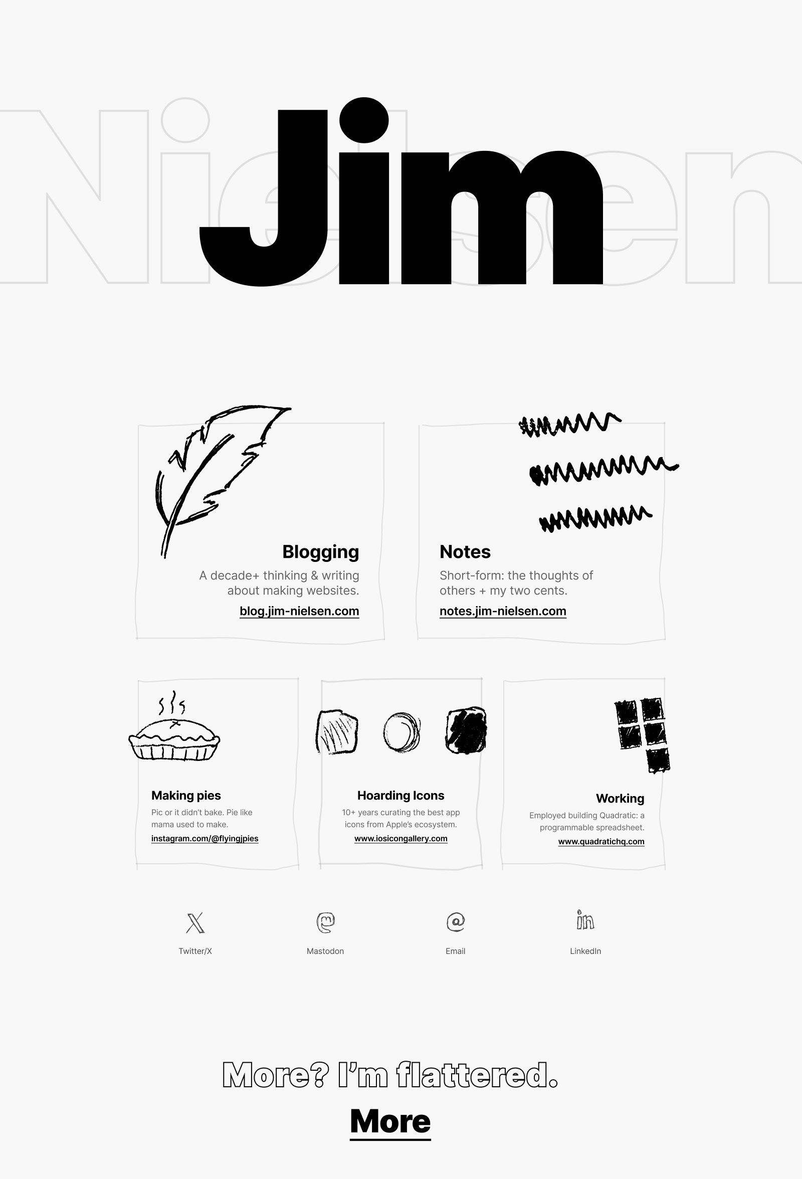
Ok, I can dig that. That feels like something I could build and ship without losing too much steam on side quests. Let’s go!
Building
I want to avoid as much tooling as necessary, so I just starting writing this as a plain HTML file. I don’t even have a server running to view it and preview my changes. Just a file:/// URL in the browser pointing to the file on disk.
I stick everything in that one HTML file: styles, markup, even the SVGs themselves are embedded directly into the HTML file (I copy/paste the SVG code from Figma). It’s a bit messy, but as as soon as I export the SVG files to disk as discrete files and begin to reference them with <img>, then my file:/// workflow breaks (browser won’t load external resources from a file:/// URL). At that point I would need a server.
Not a huge deal to set one up, but I’m trying really hard to not need any tooling, including the need to fire up a development server before making edits. Just find the file on disk and drag it to 1) VSCode for editing, and 2) the browser for viewing. I want to keep myself from being distracted by the ceremony around building website and focus just on the building so I can get this out the door (a lot of good that did me, eh?)
How do I do the drawings? I brainstorm on an idea each strip by making drawings on my Remarkable tablet[2].
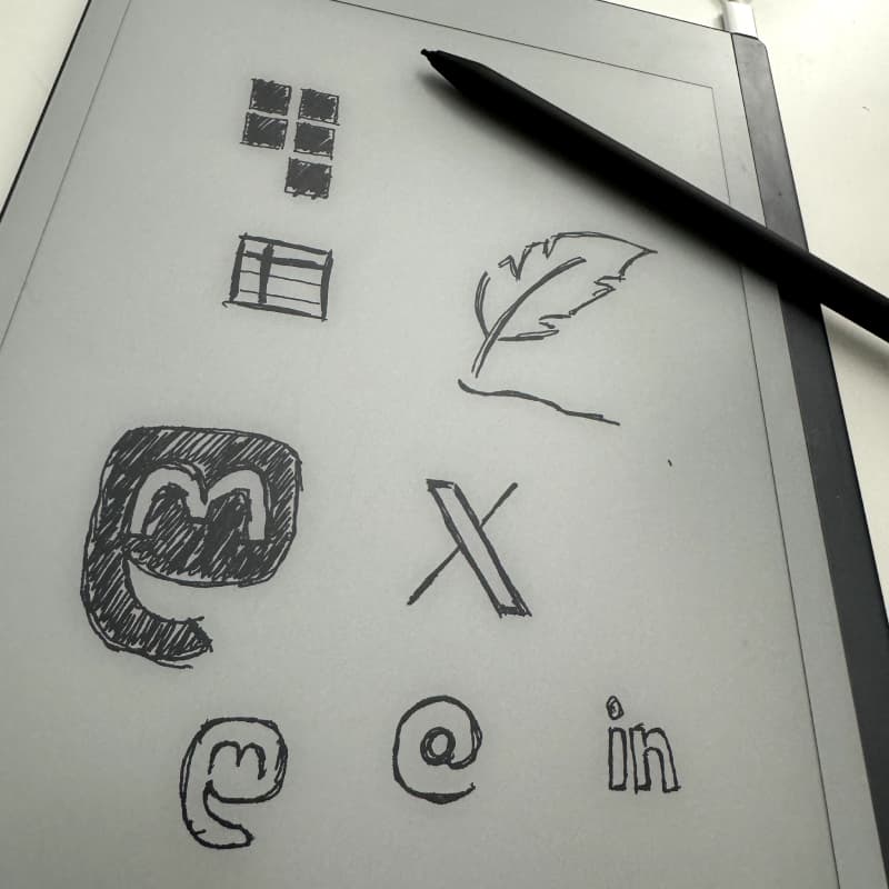
Then email them to myself (as SVGs) from the tablet and drop them into Figma where I can play with their paths size, rotation, etc., and drop them into my website design.
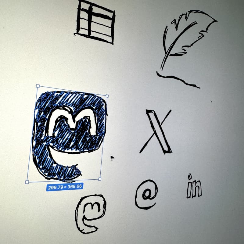
From there I use Figma’s “Copy as SVG” and then paste it right into my HTML markup (and change the fill colors to be the ones I have defined in my CSS).
The Failure to Ship
I never really got this to a place where I liked it. I liked it pretty good on desktop, but mobile was an afterthought in the design phase and it shows in how I tried to make the design fold down to narrower screens.
I still really like the style. And I might try it again. But this exercise made me realize how hard it is to pull of something that seems so simple (I already knew that, but it was re-emphasized yet again).
But hey, there’s an upside to this story.
Because what I did build is all self-contained in a single HTML file, I can just put that on a file server and link to it here for posterity’s sake.
So, in the end, I kind of shipped something via this blog post. I get some credit for that, right? RIGHT?!
The half-finished, never-fully-shipped, redesign of jim-nielsen.com →