Making o(m)g:image, Part II: As Little JS As Possible
This is part two of my series of posts describing how I made my quiz game o(m)g:image.
- Project Announcement
- Pt. I: Design Iterations
- Pt. II: As Little JS As Possible
- Pt. III: The HTML
- Pt. IV: URLs
One of my goals when making this project was to use as little JavaScript as possible.
In retrospect, I have to admit that was a pretty ambitious goal. Not because it was hard from a technical point of view, but because it was hard from the point of view of human nature.
Allow me to explain.
I write a lot of JS for my day job. And I write a lot of JS for other small projects (not necessarily websites, but scripting data, tools, etc.) And when you have the great and might hammer of JS, every solution looks like a nail.
So it required a lot of self-discipline to avoid mindlessly falling into the practice of throwing JS at every problem I wanted to solve.
For example, I could’ve made this whole site as a “single page react app”. But I’ve done that on prior personal projects and now I don’t want to ever touch any of those projects (I also hope I won’t have to). I mean, we’re talking projects with React before its major version jump, like React 0.14.x with webpack/babel/etc. (Oh young Jim, you didn’t understand as well back then.) But I’m a little smarter now, so my goal on this project was: as little JS as possible.
But JavaScript is like a smartphone: as much as you don’t want to use it, you can’t help yourself. Again, it required a constant, mindful willingness to keep stepping back and asking myself, “Can I do this without JavaScript — if possible?”
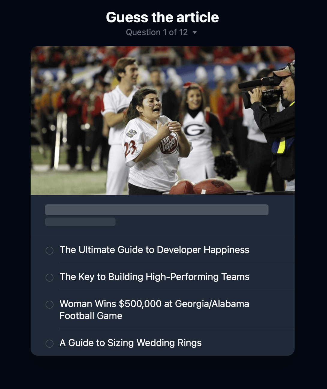
In the end, I like where I landed. Every “question” is an HTML page. Every “answer” is an HTML page. Even the “navigation” where you can see how all the questions, is an HTML page.
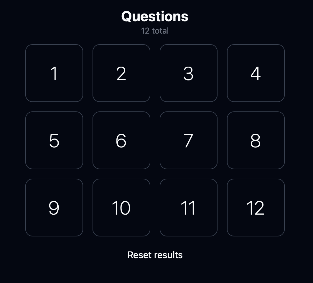
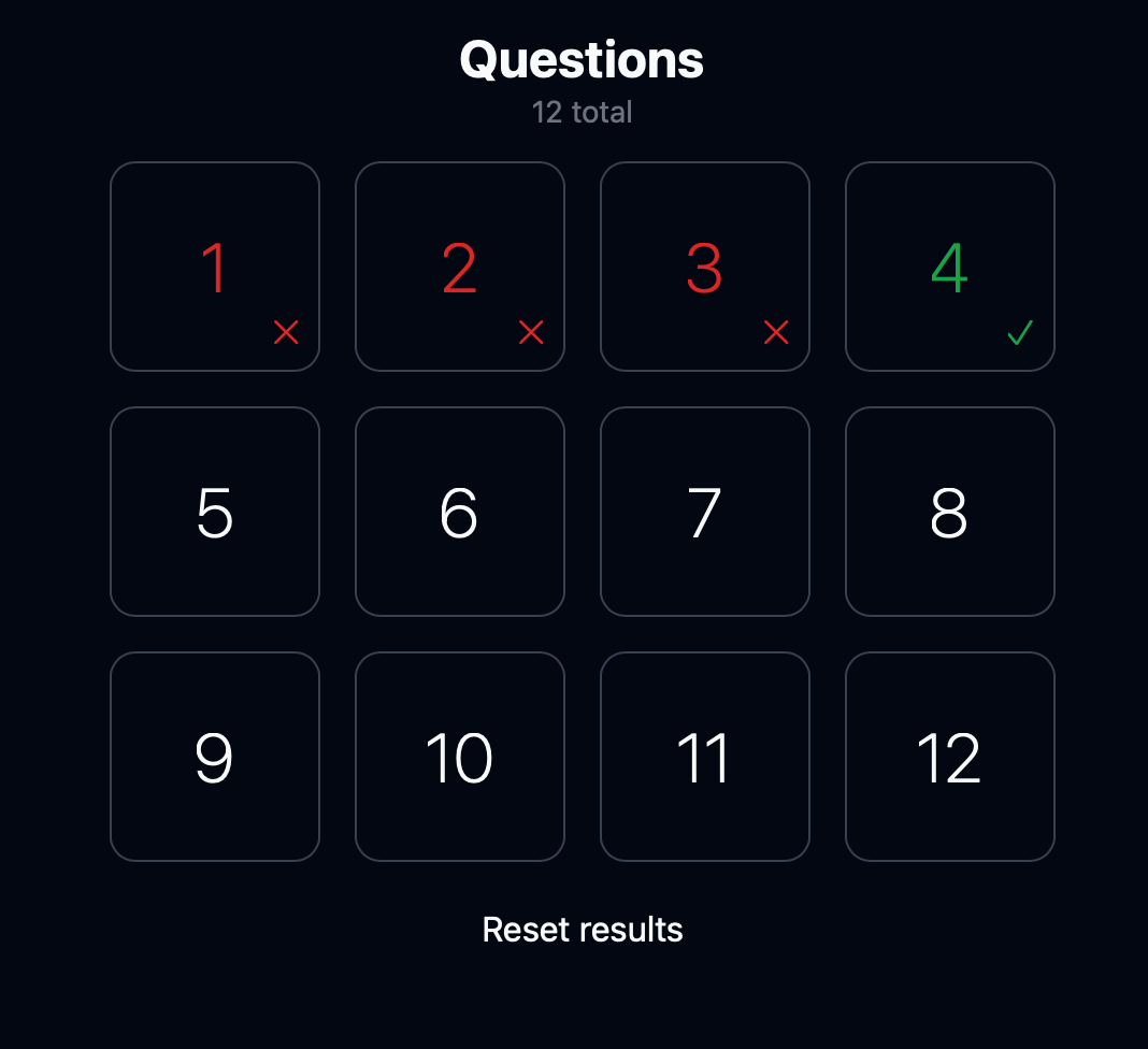
For example, at one point I wanted to have some navigation on each page. My first thought was something interactive on the page, like a widget that says “Question 4 of 12”, you click on it, then it expands and shows you all the questions on the quiz, including which ones you’ve answered and whether you got them right or wrong.
How do you do that without using JavaScript?
At first I thought, “Use a <details> element, it won’t require JavaScript!” But as I thought through the ramifications, I wasn’t in love with the solution.
The more I thought about it, the more I wanted to reach for JavaScript: a fancy slide out drawer, a slick popup menu, an in-place expand. So! Many! Options!
But I wanted to avoid JS as much as possible — ”only for what’s absolutely critical” I told myself. Could I show/hide navigation with only HTML?
What I landed on was navigation as an HTML page. Every page has a little piece of information that tells you what question you’re looking at, e.g. “Question 1 of 12”.

If you click on it, rather than expanding the navigation inline, or popping out a drawer with the navigation, or doing something else that requires JavaScript to reveal the information, it simply takes you to a new HTML page with the information. (The browser’s back button serves as the equivalent of a “close drawer” or “collapse this” JavaScript solution.)

The only enhancement to the game that actually uses JS is the part that keeps track of which questions have been answered and whether the answer was correct or not. If you have JavaScript enabled, you will see this information additionally layered onto this navigational page’s UI.

With this approach, I’m truly using JavaScript for what JavaScript alone can do which is keep track of client state (you might argue I could have a server with a session here, but another constraint of the project was no server, so yeah).
This HTML-first approach really drove the design of the site. I had to ensure that navigational elements always stayed at the top of the page in consistent places across pages to ensure the UI didn’t jump as you navigated around (from the top of the page). My goal was to make the site so lean and so fast, that multi-page navigations felt as close as possible to in-place, on-page interactions.
I’m pretty happy with where the project ended up technically. I think it holds a great tension of low-cost maintenance for me over time, but still a great, solid experience for end users across a wide variety of devices — and, hopefully, across a long period of time.
The whole exercised really impressed on me once again that sometimes we just need to build simpler UIs. If your frontend is hard to build, it’s probably hard to use. If you make it easier and simpler to use, it’ll likely be easier and simpler to build and maintain.
That said, the irony here is that it’s actually quite hard to build something like this because you have to make ruthless choices about cutting things that aren’t absolutely necessary.
In other words, building websites backed by MBs of JavaScript is hard. You know what’s even harder? Questioning whether you actually need to build what you’re building, and cutting it down to the essentials. (HTML is really good at essentials.)
It reminds me of that old saying about how shorter writing requires more time, except for websites, i.e. “My website is lots of JavaScript. If I’d had more time, I would’ve made it lots of HTML.”