A little while back I created notes.jim-nielsen.com and wrote about why I made it. I want to write a little more about some of my favorite parts of the site.
First: It’s Really a Page, Not a Site
I’m not sure I should call it a “website”, as I think of a website as a collection of web pages.
But my “notes website” is just a web page, a single HTML document.
That was intentional. My vision is to keep the page as pure text — no <img> tags, <video> tags, etc. — because it keeps the site simple and lightweight. It’s one HTTP request, that’s it.
Do I need to build keyword search? Nope, just CMD + F in the browser.
Do I need to build a tagging system? Nope, just CMD + F with # prefix.
Do I need to build a system to find links by outbound domain? Nope, just CMD + F and then the domain name.
You can inspect the raw HTML using the devtools. Or, if you want to see the source code that generates that single HTML page, it’s on GitHub.
Second: “Shuffle” Is My Fav Feature
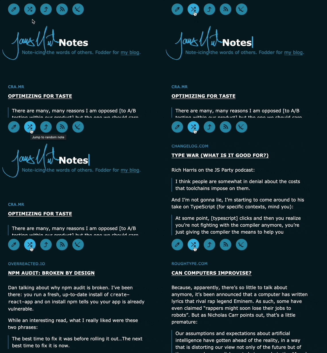
I enjoy occasionally pulling up my notes and hitting the “Shuffle” button.
It’s sort of like those “On this day” features from a photo album but for notes, where you look back and think, “Oh yeah, I forgot about that article, that was a good ‘un!”

And because it’s a single HTML page, the code for this is really simple: I have a <button> on the page which, when clicked, runs code like this.
const articles = Array.from(
  document.querySelectorAll("article")
);
const min = 0;
const max = articles.length;

document
  .querySelector(".js-shuffle")
  .addEventListener("click", () => {
    const rand = Math.floor(Math.random() * max) + min;
    articles[rand].scrollIntoView();
  });
Third: Themes Are Fun
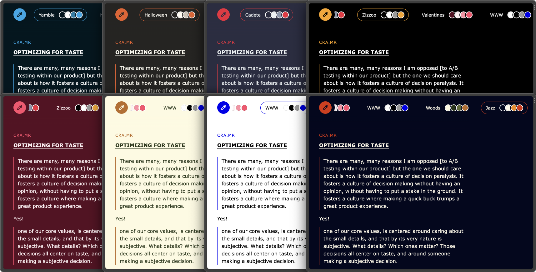
I wanted to have different color schemes for the site, so with help from my 6y/o son, we made a theme switcher. We browsed coolors.co together, he pointed out the color combinations he liked, and I put them into the theme.

My favorite part is the names. I needed a name for each of the color sets, so I asked my son to help me name them. Now whenever I visit the site and change the theme, I think of that time we sat at the computer together trying to name variables. His contributions were: Yamble, Halloween, Cadete, and Zizzoo.