Justify Space Between Individual Items in Flexbox
This is a seemingly trivial thing but I’ve probably looked it up at least three times now, so it’s time to write a blog post about it in hopes that I’ll finally remember the solution.
tl;dr when aligning a flat hierarchy of items with flexbox, you can use margin: auto to get the effect of justification between individual items.
The Problem
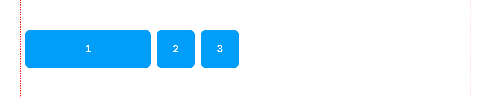
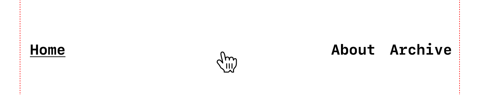
Sometimes you have a list of nodes and you’re using flexbox to lay them out. For example, let’s say you have a set of navigation links.
<nav>
  <a href="/">Home</a>
  <a href="/about">About</a>
  <a href="/archive">Archive</a>
</nav>
<style>
  nav { display: flex }
</style>
Those will lay out on the horizontal axis.
But let’s say you want (a relatively standard) layout where you have the primary item on the left and secondary items on the right.
There are a couple of ways to achieve this, some better than others.
👎 Solution 1: Extra Markup
Alter the markup by wrapping the stuff on the left in a <div> and the stuff on the right in a <div>, then justify the space between them.
<nav>
  <div>
    <a href="/">Home</a>
  </div>
  <div>
    <a href="/about">About</a>
    <a href="/archive">Archive</a>
  </div>
</nav>
<style>
  nav {
    display: flex;
    justify-content: space-between;
  }
</style>
That gets you what you want, but you’re adding markup solely for styling purposes.
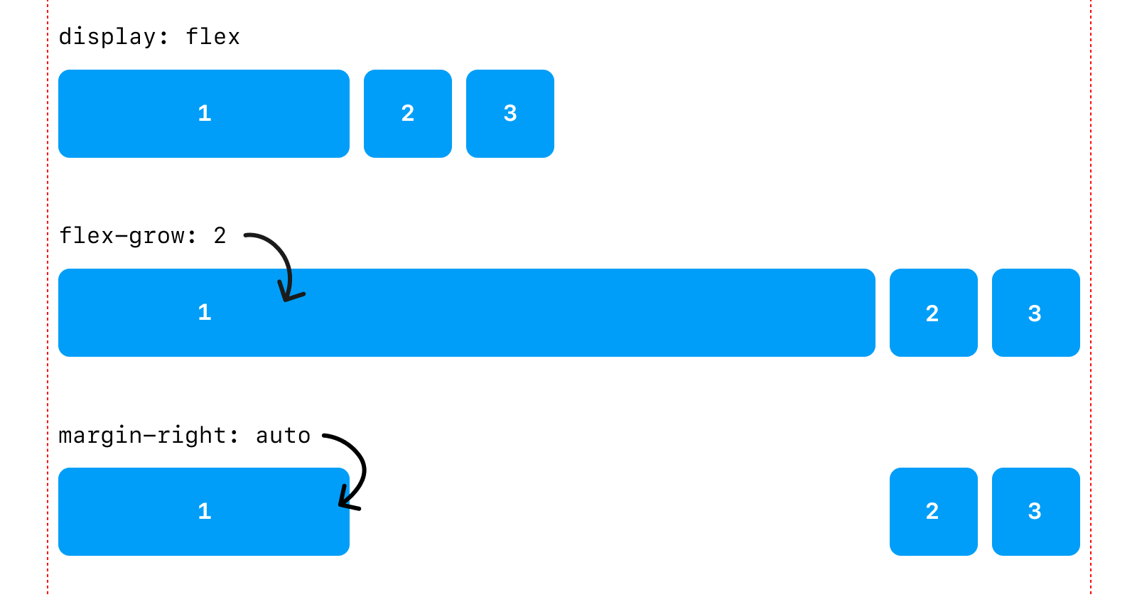
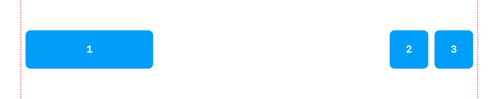
👎 Solution 2: Flex Grow
You can tell the item on the left to grow and take up the remaining space.
<nav>
  <a href="/">Home</a>
  <a href="/about">About</a>
  <a href="/archive">Archive</a>
</nav>
<style>
  nav { display: flex }
  nav > :first-child { flex-grow: 2 }
</style>
That gets you what you want, but it makes the first child grow the entire length of the box.
From a visual standpoint, this space-filling effect might be unnoticeable for something like simple text.
However, from an interaction standpoint the link on the left grows to fill the unused space and will be clickable when you hover the entire space, not just the text. This results in a strange behavior where whitespace is interactive.
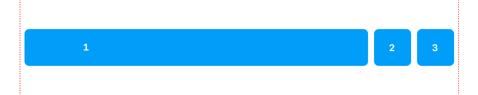
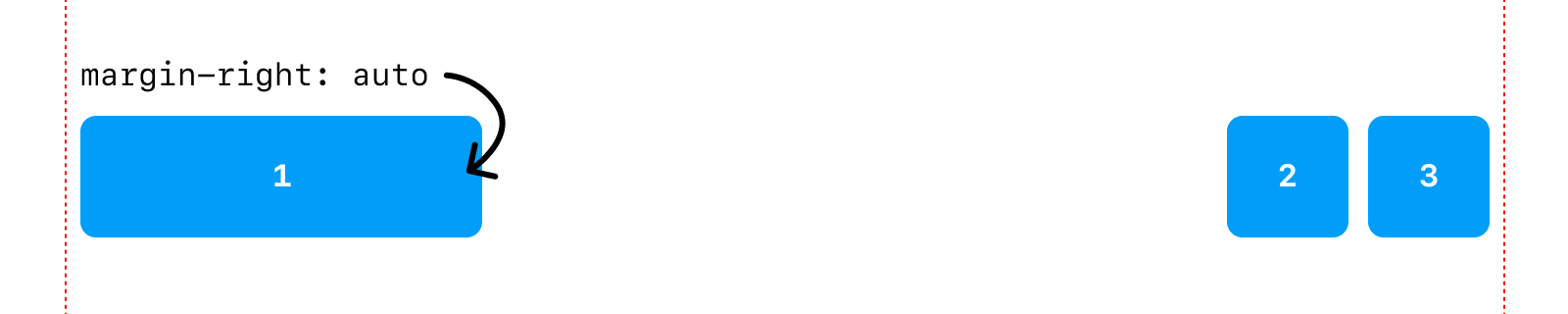
👍 Solution 3: Margin Auto
So, using only CSS, how do you justify the space between a set of individual items in a flat hierarchy of many items?
With the right keyword search, I was led to this StackOverflow question which reminded me, once again, that you can use margin in flexbox to your advantage!
In our example, margin: auto will make the first link on the left fill the space between it and the following items without making the link itself fill the left over space.
<nav>
  <a href="/">Home</a>
  <a href="/about">About</a>
  <a href="/archive">Archive</a>
</nav>
<style>
  nav { display: flex }
  nav > :first-child { margin-right: auto }
</style>
There you go, a whole blog post just for that. If you came here from a search engine, I hope that was helpful.