The following was originally written by me and published as a chapter in “The iOS App Icon Book”. I am republishing it here on my blog (with slightly modified imagery) for posterity’s sake.
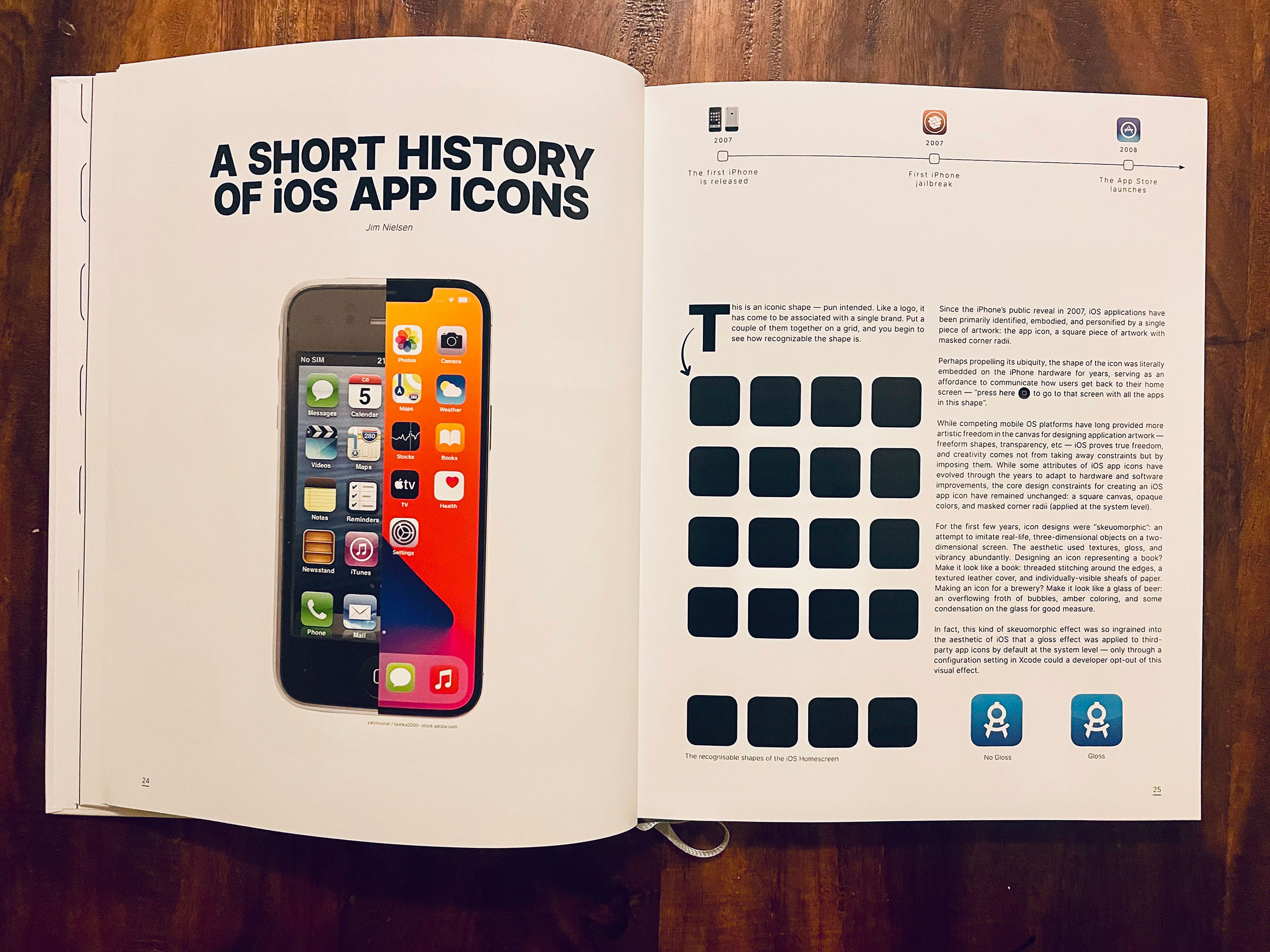
This is an iconic shape — pun intended. Like a logo, it has come to be associated with a single brand. Put a couple of them together on a grid, and you begin to see how recognizable the shape is.

Since the iPhone’s public reveal in 2007, iOS applications have been primarily identified, embodied, and personified by a single piece of artwork: the app icon, a square piece of artwork with masked corner radii.
Perhaps propelling its ubiquity, the shape of the icon was literally embedded on the iPhone hardware for years, serving as an affordance to communicate how users get back to their home screen — “press here to go to that screen with all the apps in this shape”.

While competing mobile OS platforms have long provided more artistic freedom in the canvas for designing application artwork — freeform shapes, transparency, etc — iOS proves true freedom and creativity comes not from taking away constraints but by imposing them. Some attributes of iOS app icons have evolved through the years to adapt to hardware and software improvements, but the core design constraints for creating an iOS app icon have remained unchanged: a square canvas, opaque colors, and masked corner radii (applied at the system level).
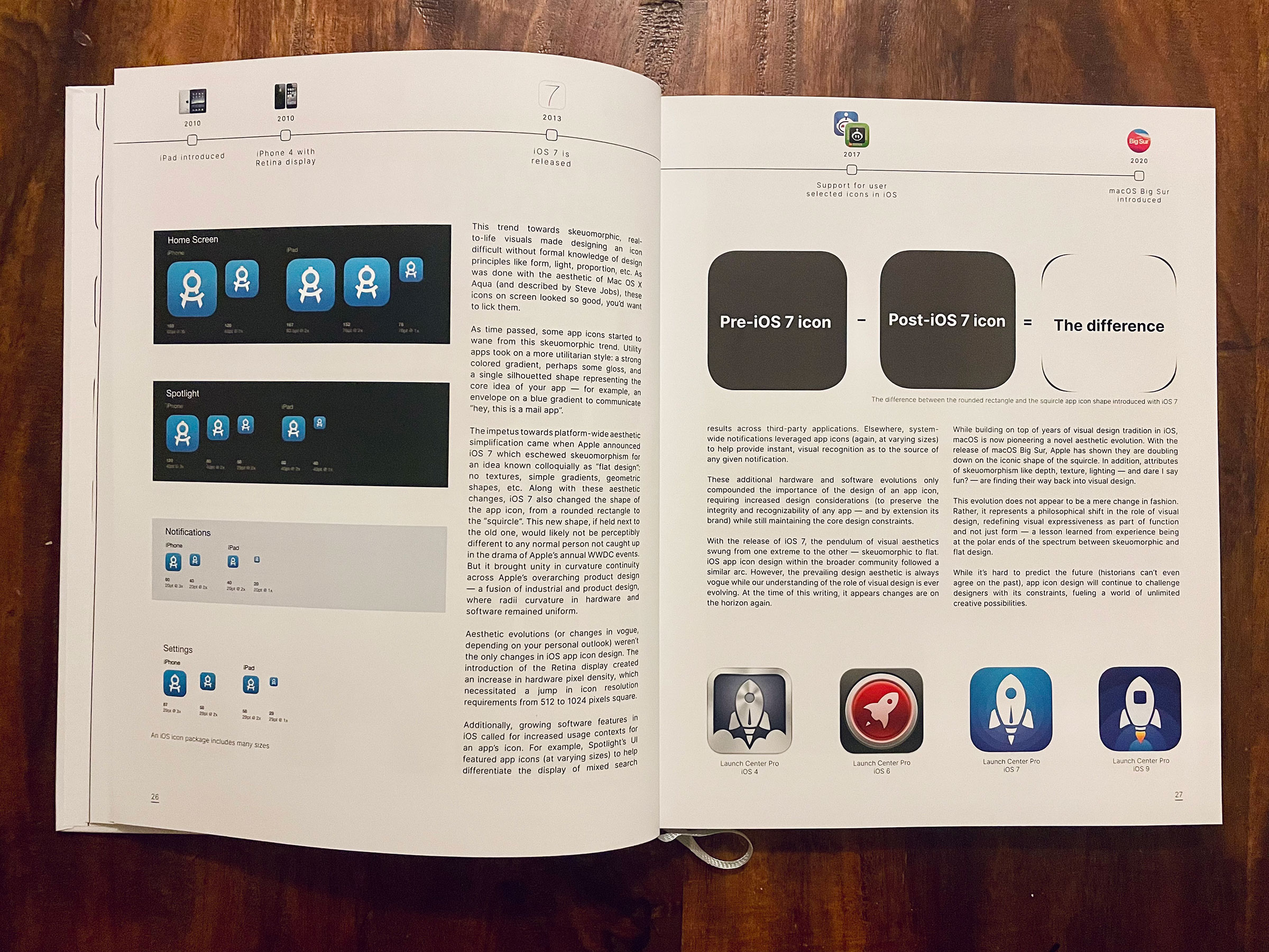
For the first few years, icon designs were “skeuomorphic”: an attempt to imitate real-life, three-dimensional objects on a two-dimensional screen. The aesthetic used textures, gloss, and vibrancy abundantly. Designing an icon representing a book? Make it look like a book: threaded stitching around the edges, a textured leather cover, and individually-visible sheafs of paper. Making an icon for a brewery? Make it look like a glass of beer: an overflowing froth of bubbles, amber coloring, and some condensation on the glass for good measure.
In fact, this kind of skeuomorphic effect was so ingrained into the aesthetic of iOS that a gloss effect was applied to third-party app icons by default at the system level — only through a configuration setting in Xcode could a developer opt out of this visual effect.
This trend towards skeuomorphic, real-to-life visuals made designing an icon difficult without formal knowledge of design principles like form, light, proportion, etc. Similar to the aesthetic of Mac OS X Aqua (and described by Steve Jobs), these icons on screen looked so good, you’d want to lick them.
As time passed, some app icons started to wane from this skeuomorphic trend. Utility apps took on a more utilitarian style: a strong colored gradient, perhaps some gloss, and a single silhouetted shape representing the core idea of an app — for example, an envelope on a blue gradient to communicate “hey, this is a mail app”.
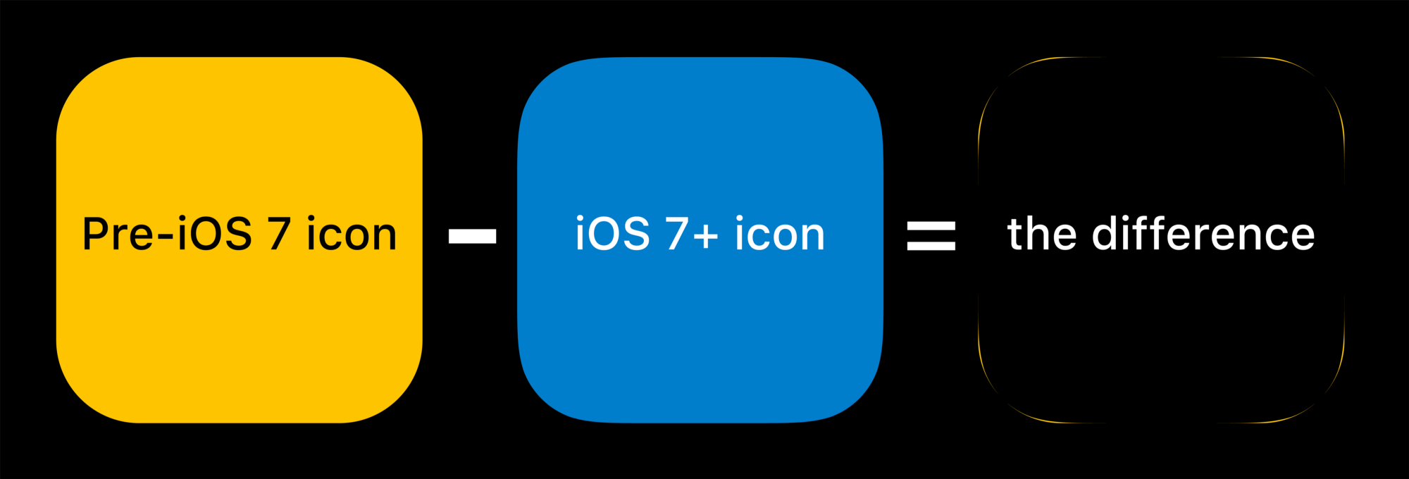
The impetus towards platform-wide aesthetic simplification came when Apple announced iOS 7, which eschewed skeuomorphism for an idea known colloquially as “flat design”: no textures, simple gradients, geometric shapes, etc. Along with these aesthetic changes, iOS 7 also altered the shape of the app icon, from a rounded rectangle to the “squircle”. This new shape, if held next to the old one, would likely not be perceptibly different to any normal person not caught up in the drama of Apple’s yearly WWDC events. But it brought unity in curvature continuity across Apple’s overarching product design — a fusion of industrial and product design, where radii curvature in hardware and software became uniform.
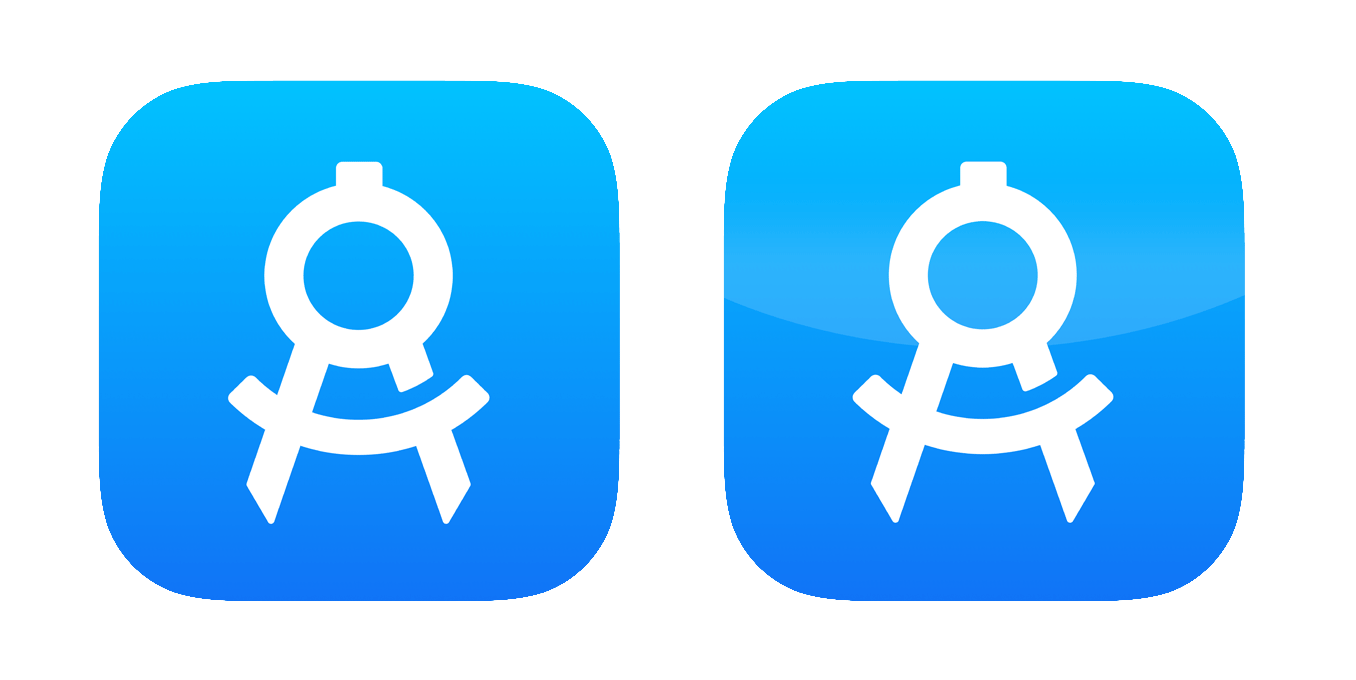
Aesthetic evolutions (or changes in vogue, depending on your personal outlook) weren’t the only changes in iOS app icon design. The introduction of the Retina Display created an increase in hardware pixel density, which necessitated a jump in icon resolution requirements from 512 to 1024 square pixels.
Additionally, growing software features in iOS called for increased usage contexts for an app’s icon. For example, Spotlight’s UI featured app icons (at varying sizes) to help differentiate the display of mixed search results across third-party applications. Elsewhere, system-wide notifications leveraged app icons (again, at varying sizes) to help provide instant, visual recognition as to the source of any given notification.
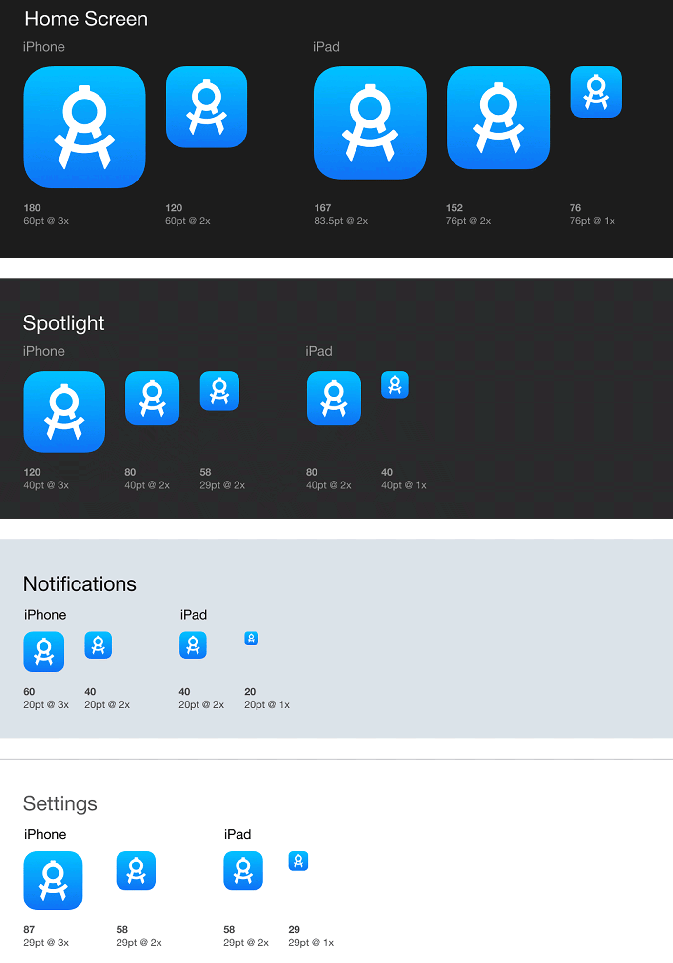
These additional hardware and software evolutions only compounded the importance of the design of an app icon, requiring increased design considerations (to preserve the integrity and recognizability of any app — and by extension its brand), while still maintaining the core design constraints.
With the release of iOS 7, the pendulum of visual aesthetics swung from one extreme to the other — from skeuomorphic to flat. iOS app icon design within the broader community followed a similar arc. However, the prevailing design aesthetic is always vogue while our understanding of the role of visual design is ever evolving. At the time of this writing, it appears changes are on the horizon again.
While building on top of years of visual design tradition in iOS, macOS is now pioneering a novel aesthetic evolution. With the release of macOS Big Sur, Apple has shown they are doubling down on the iconic shape of the squircle. In addition, attributes of skeuomorphism like depth, texture, lighting — and, dare I say, fun? — are finding their way back into visual design.
This evolution does not appear to be a mere change in fashion. Rather, it represents a philosophical shift in the role of visual design, redefining visual expressiveness as part of function and not just form — a lesson learned from experience living at the polar ends of the spectrum between skeuomorphic and flat design.
While it’s hard to predict the future (historians can’t even predict the past), app icon design will continue to challenge designers with its constraints, fueling a world of unlimited creative possibilities.