It’s very common to have a <div> somewhere whose contents are the output of a markdown file. This can result in a flat structure of elements whose hierarchy has semantic meaning — the best kind of HTML!
<div class="prose">
<h1>Document Title</h1>
<p>…</p>
<p>…</p>
<h2>Secondary Heading</h2>
<p>…</p>
<p>…</p>
<h3>Tertiary Heading</h3>
<p>…</p>
<ul>…</ul>
<h2>Back to a Secondary Heading</h2>
<p>…</p>
<blockquote>…</blockquote>
<h3>Tertiary Heading</h3>
<p>…</p>
<pre>…</pre>
<h4>Quaternary Heading</h4>
<table>…</table>
</div>
I have fun styling these kinds of documents because they are often authored agnostic of styling considerations and you don’t get to hook into the parser for customization. As a result, you don’t get the chance to say “ah, but I want to style this thing x way, so I need to wrap content pieces y and z in a <div>”. You have to work with what you’re given, which makes you reach deep into your bag of CSS selectors.
I was dealing with a document like this the other day which had an internally-consistent structure to its format in markdown:
# Document Title

A paragraph of text

Another paragraph of text.

---

## Heading

With another paragraph of text.

- And a bulleted list
- Of items
- [And a link](#)

[A call to action →](#)

---

## Another Heading

Yet another paragraph of text [and a link](#).

[Another call to action](#)

---

The end.
The HTML resulting from this markdown looked like this:
<h1>Document Title</h1>
<p>…</p>
<p>…</p>

<hr>
<h2>Heading</h2>
<p>…</p>
<ul>…<li><a href="#">…</a></li></ul>
<p><a href="#">A call to action →</a></p>

<hr>
<h2>Another Heading</h2>
<p>…<a href="#">…</a></p>
<p><a href="#">Another call to action →</a></p>

<hr>
<p>The end.</p>
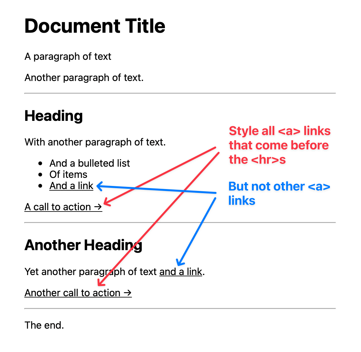
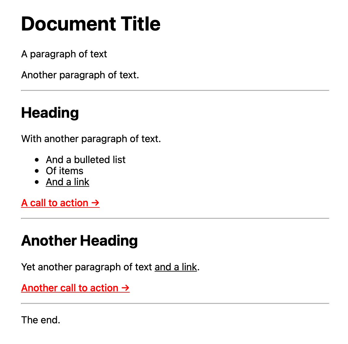
The tricky part? With no control over the parser, I needed to style every one of the “call to action” links a specific color while leaving all other <a> links inheriting their color from the document.

In natural language, what I wanted was: “select every <p> element that directly precedes an <hr> element and style the <a> link inside of it.”
I know how to select the next sibiling of an element with div + p.
And I know how to select any adjacent sibling of an element (which follows it) with div ~ p.
And I learned how to select an element when it only has one child with p:only-child a (even though they are the only element on their line, markdown will wrap the [link](#) elements in a paragraph tag).
But how do I select the previous sibling of an element? Something like p:before(hr) which would select all paragraphs that precede an <hr> element.
I found a question about a “previous sibling selector” on StackOverflow. While the top-voted answer basically said “there is no such thing”, a few answers down I found this gem which said you can do it with the new :has() selector!
(Aside: some folks say don’t call :has() the “parent selector” — even though it does let you select elements with a specific parent — and this particular case illustrates why: I’m targeting a sibling not a parent!)
Here’s the selector I ended up writing:
p:has(+ hr) a:only-child {
It only works in browsers that support :has() (Safari at the time of this writing), but that was ok for my use case (this style is an enhancement to the page after all—if it’s not there, no big deal because nothing breaks, but with each passing day it’ll become more likely that browsers will have :has() support). Want to see an example in action? Check out the Codepen.

I can remember a time when it was difficult to find selectors that would target all your use cases. But now-a-days, with the powerful new selectors we’re getting in CSS like :where(), :is(), :not(), and :has(), I rarely need to target something for which I cannot find a selector. It’s amazing!
Update 2022-08-04
I got an email from a reader asking for a little help getting the previous sibling selector working on a Codepen example. I sent back my tweaks to their example, which is now pretty neat.

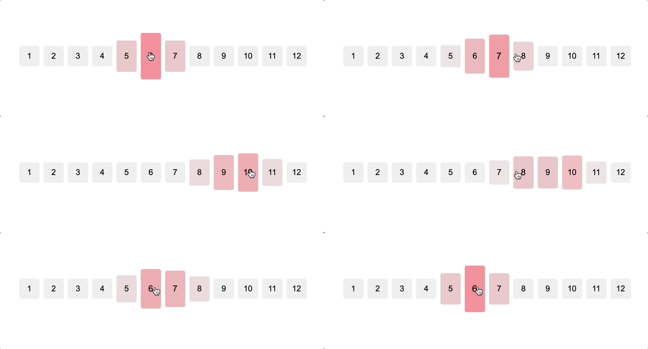
Chris also tweeted a similar Codepen example and, well, it’s pretty cool the effects you can get.