React Router 6.4 recently launched which includes a number of ideas brought over from Remix as well as a new docs site.
I’m not going to cover what’s in the release (you can visit the blog post for that). Instead, I want to document a my involement in the new site design for reactrouter.com.
A Quick Note on Site Architecture
Ryan looped me in on the work for designing the site anew. He came with the ideas for how to structure the site, e.g. how it will be hosted, how it will scale in response to an increase in requests, how it will refresh with new/modified content, etc.
I’m not going to cover the details here, but suffice it to say the new site takes the idea of JAMStack and shifts it back up the stack a nudge. Instead of the classic static site generator approach which pre-compiles every page at build time and puts it on a CDN for request by users, this approach uses a long-running server as an incremental static site generator which compiles each page at request time (if it’s not already in a CDN or LRU cache).
It’s an intriguing model I was enthralled to learn about. Hopefully Ryan writes about it sometime, at which point I’ll link to it.
The Design
MVP for the new design was pretty standard website stuff:
- Layout: global nav on top, page navigation left, content on the right.
- Typography: system typefaces (fast) with a scale of sizes for structured hierarchy.
- Color: neutral grays with a brand highlight, structured semantically for use in a light and dark scheme.
There were also, as you might guess, components — elements re-used enough to merit an abstraction, like popovers.
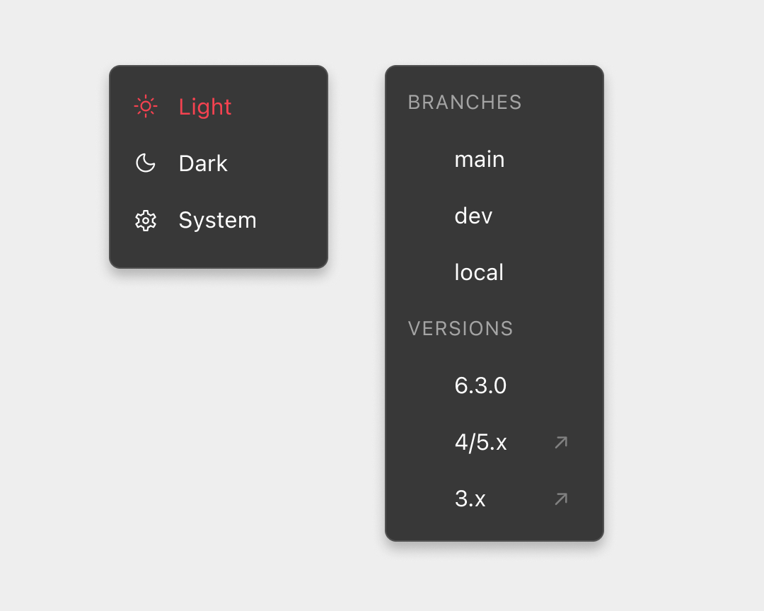
Docs callouts:

And code samples:
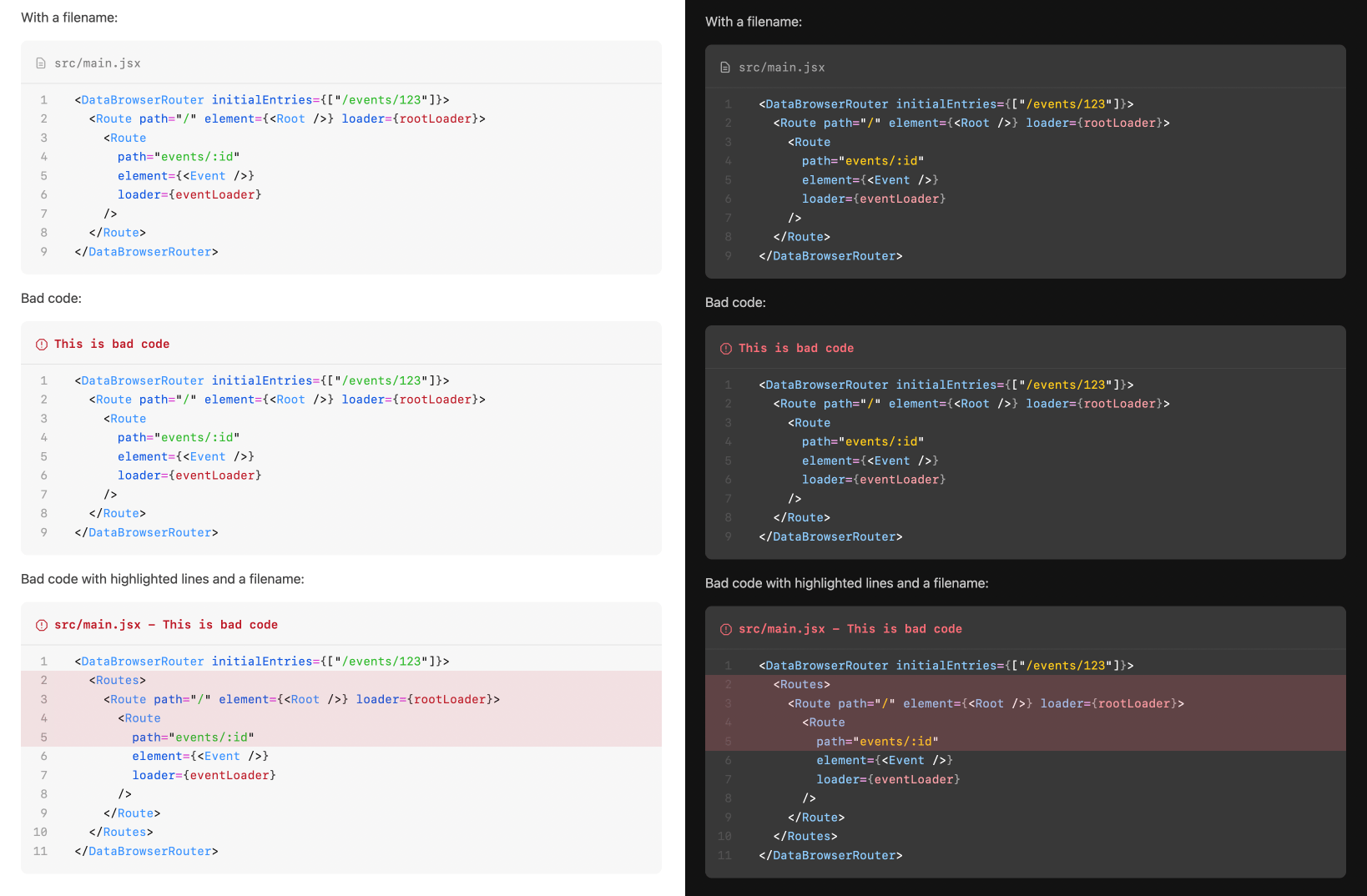
The summation of these individual details and elements resulted in the new reactrouter.com.
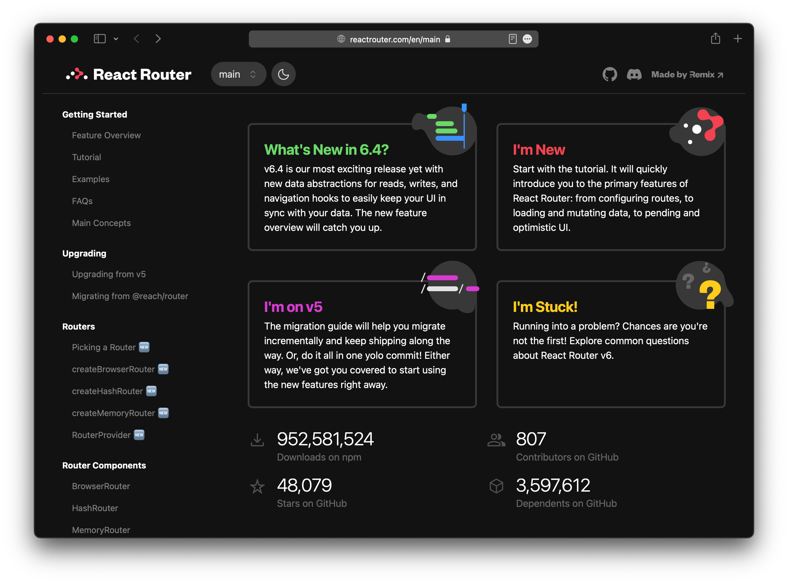
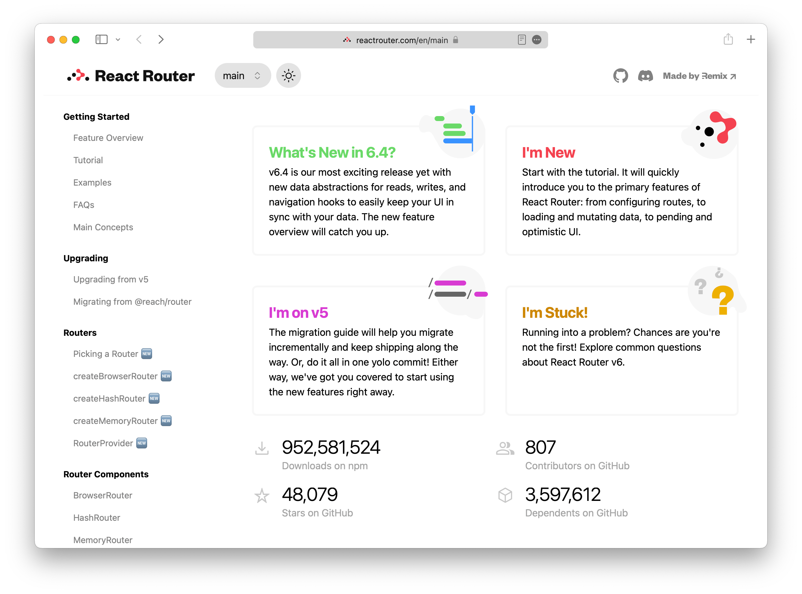
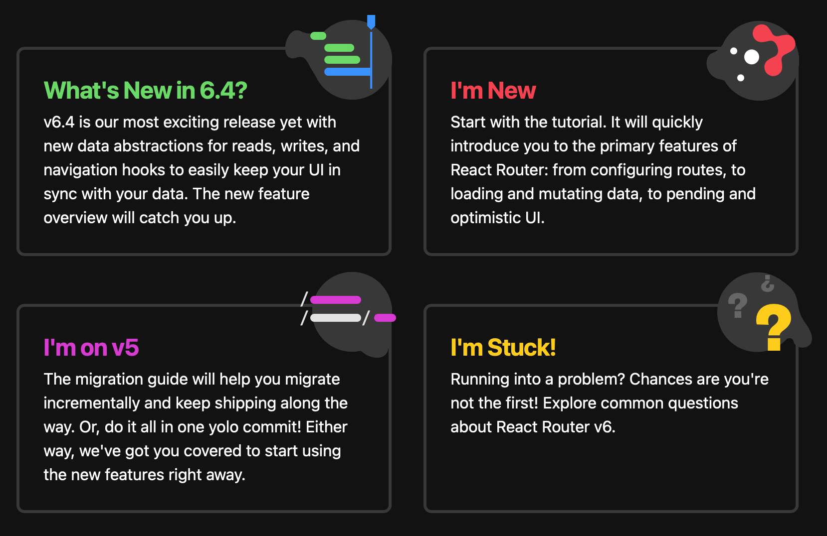
For the home page, the idea was to have it function as a kind of “switchboard” for people arriving to the site, e.g. “Welcome to React Router, what would you like to do?”
It was particularly fun to create and code the supporting imagery of each option. The little blobs were meant to encapsulate the textually-communicated idea in a graphic, abstract form while also providing visual weight and interesting-ness.
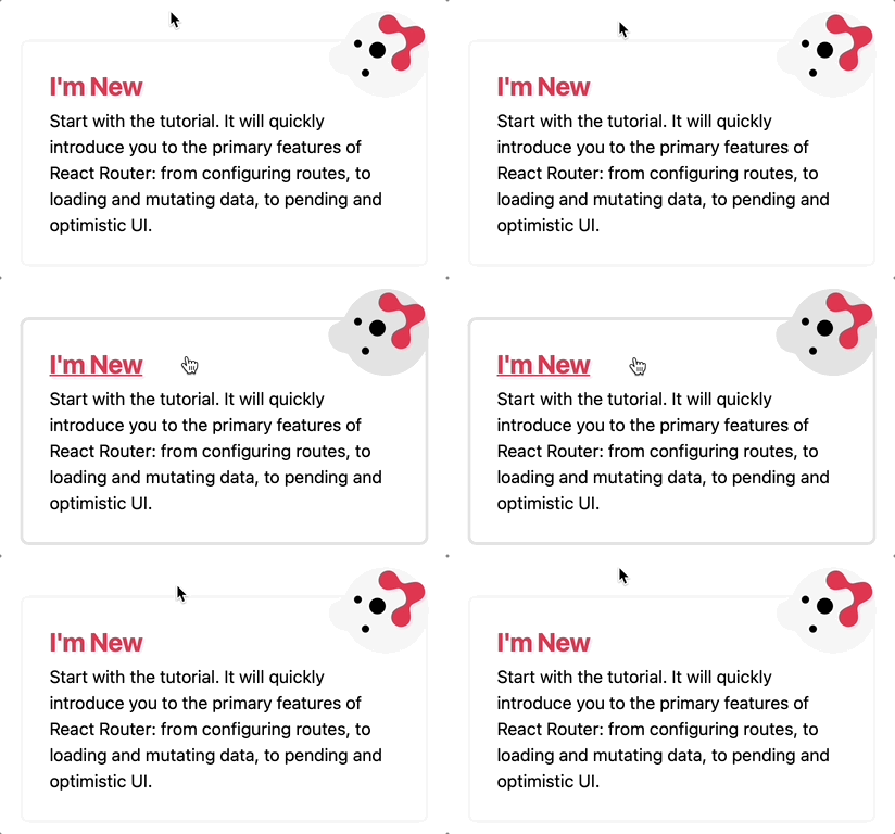
The little blobs were drawn with the pen tool in Figma then implemented as SVGs in the code, drawing on dynamic colors which allowed them to support light/dark mode variations as well as simple hover effects to help communicate interactivity.
Brand Assets
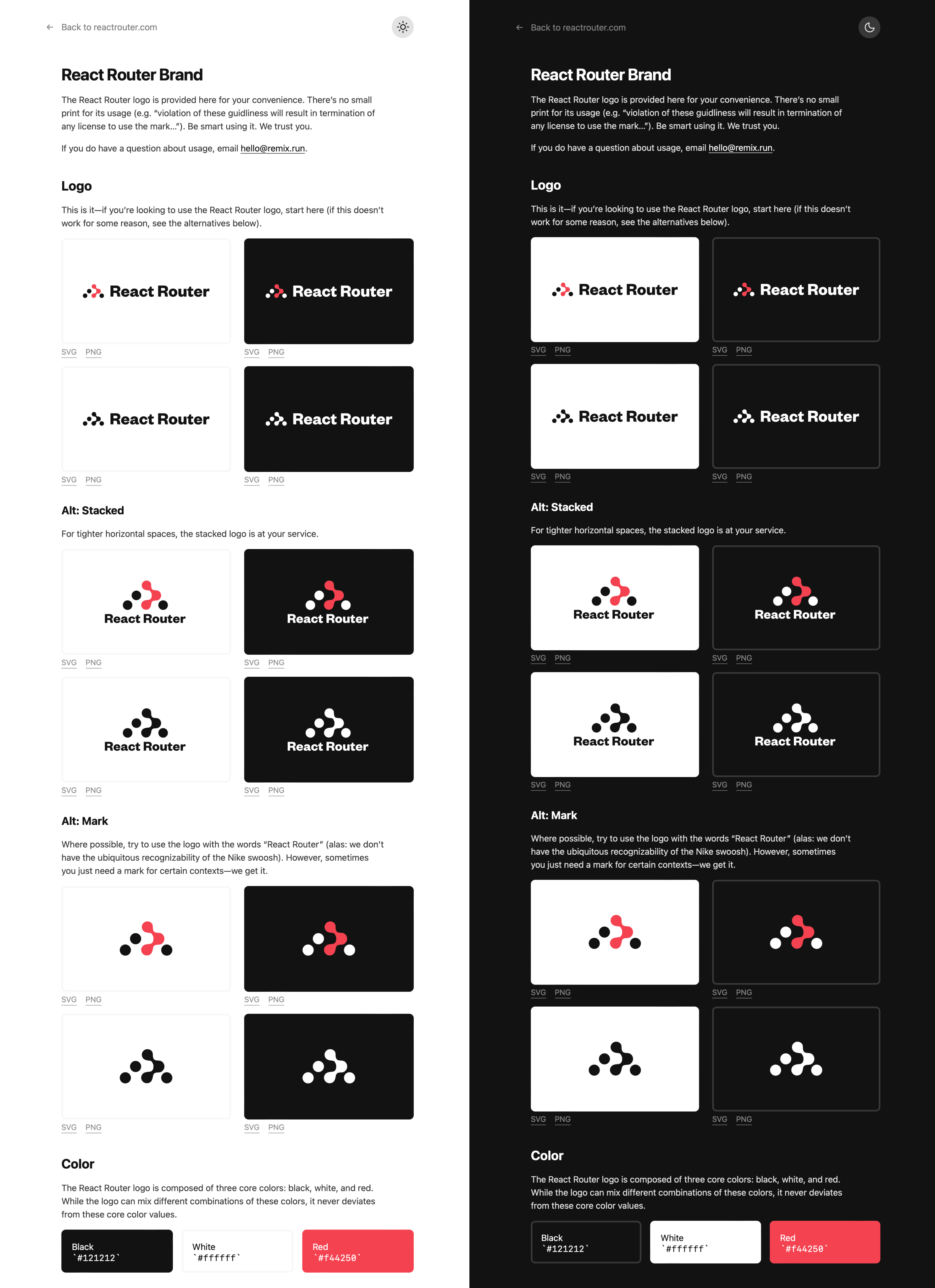
I also created a “brand” page so folks can easily grab the React Router logo for use in educational materials and otherwise (PR is not yet merged — coming soon to a web near you).
The Docs Demo App
v6.4 of the router comes with a tutorial to showcase the new APIs for data loading, mutations, etc.
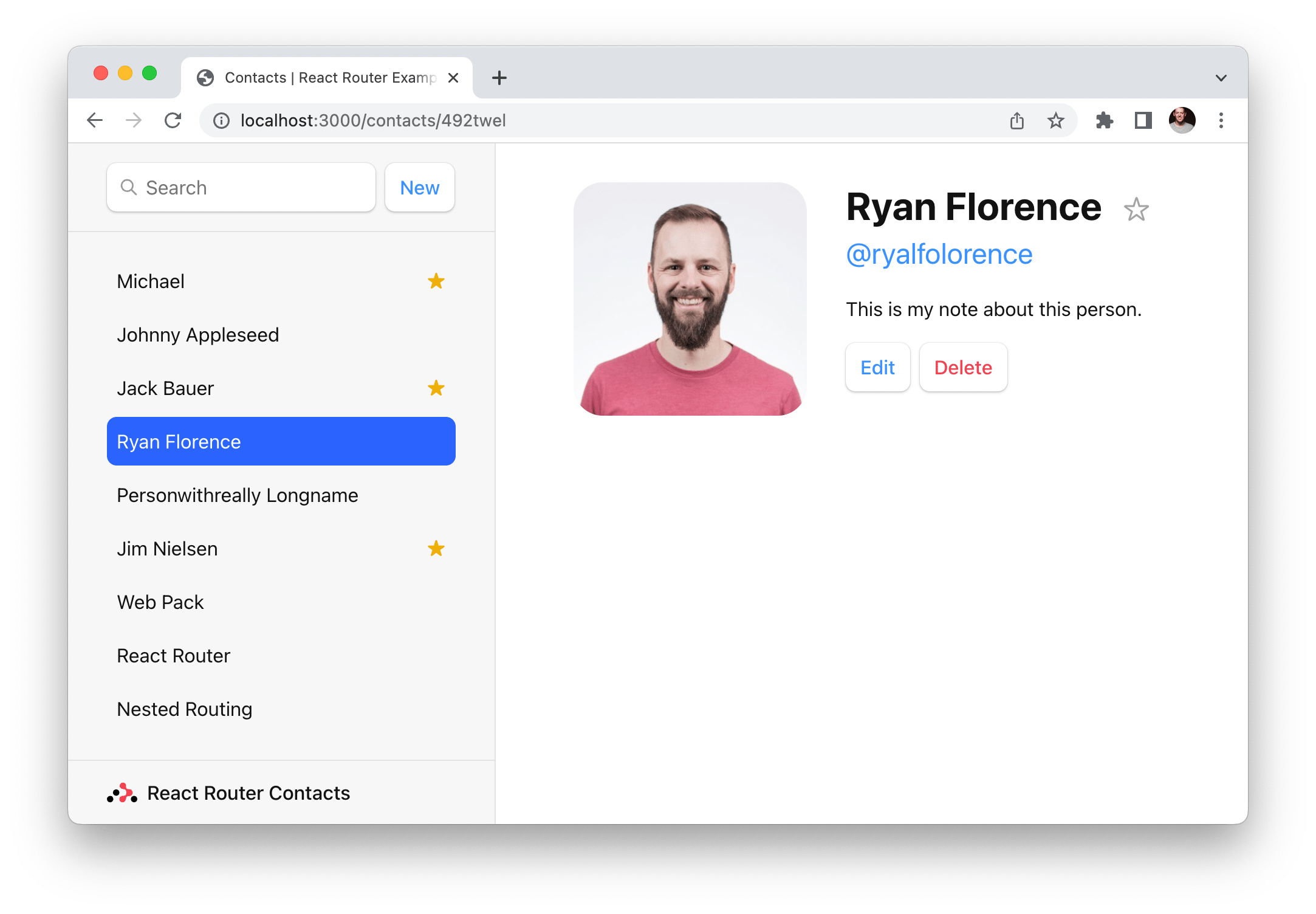
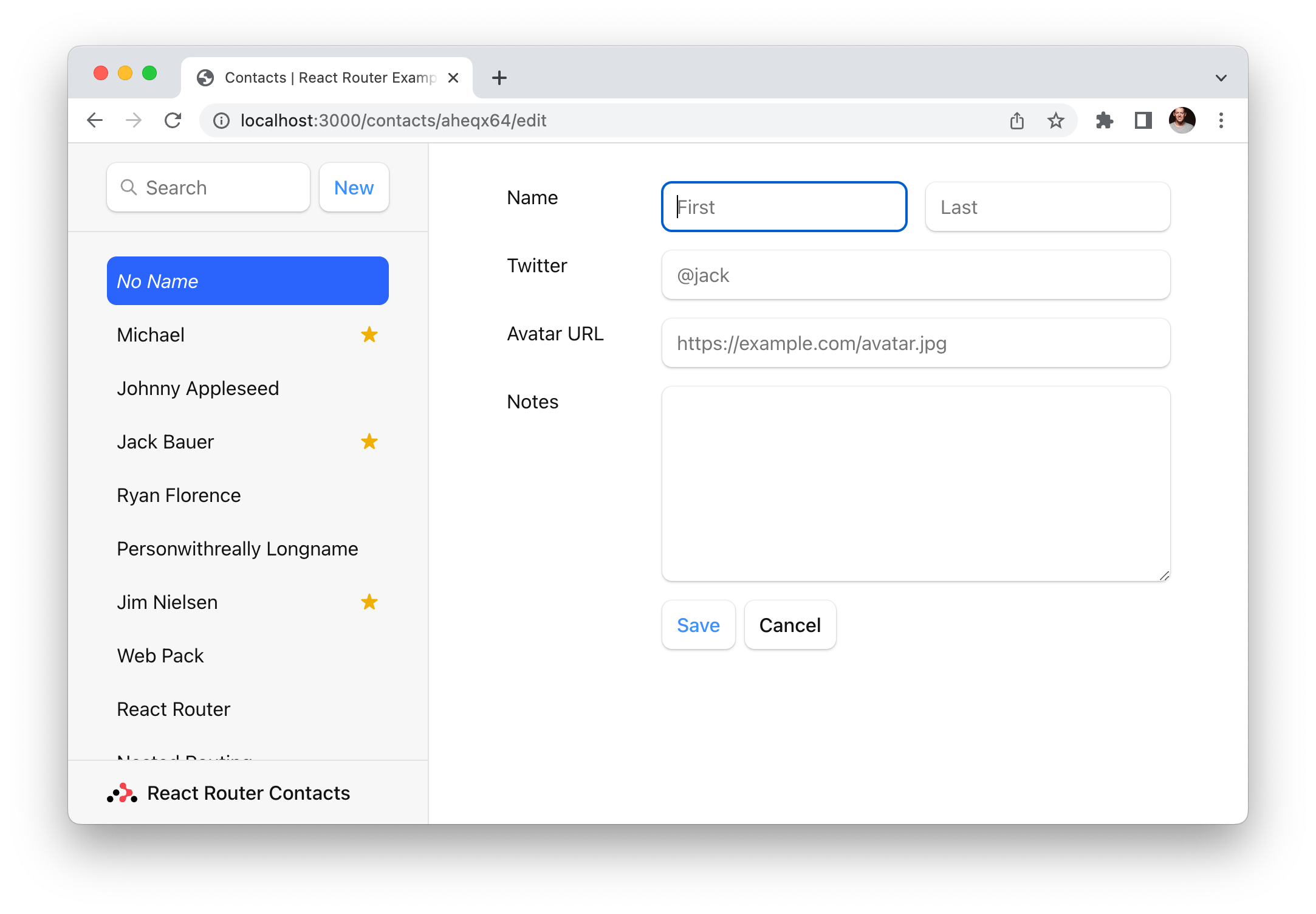
Ryan created the tutorial and, in the process, created a “Contacts” demo app to illustrate how to build a simple app with the new APIs.
He asked me for an afternoon to style the thing. So I jumped into the code with my templating/styling nunchucks and shortly had something looking a bit more refined.
The Code
The styling was done with Tailwind. This was my first time really using Tailwind which helped me understand the hype. The experience helped me see where (in comparison to stylesheets) Tailwind excels but also where it breaks down. (Fortunately for me, I didn’t have the hurdle of setting it all up — Ryan handled making sure all the tooling was in place so when I hit “Save” everything recompiled and reloaded in the browser.)
As part of the home page design, I also carved out some space for designing a bit of social validation in the form of project statistics like GitHub stars and npm downloads.
After shifting around different layouts and configuration of numbers, I eventually landed on a design in Figma that looked like this:
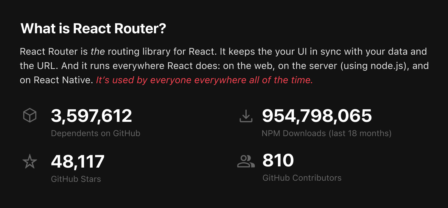
That felt good enough to jump into the browser. But then came the big question: how and where to pull those statistics?
I looked around the internet and found ways to pull live numbers for each statistic, then wrote a function for each stat which would fallback to a hard-coded number I retrieved myself from each service’s respective online UI.
The code for each stat looked something like this:
async function fetchStatFromService() {
try {
const res = await fetch();
return liveNumber;
} catch (e) {
console.log("Failed to fetch stat for ___", e);
return hardCodedNumber;
}
}
To be honest, I was pretty surprised by some of the numbers. React Router’s npm downloads is approaching 1 billion! And that’s only since npm started keeping track. At the time of this writing, it’s tracking around 8 million downloads per week.
Conclusion
That’s a quick overview of my involvement on the new reactrouter.com. Of course, while shipping a v1 design for something is always exciting, seeing what it morphs into after the initial MVP is just as exciting. We’ll see how it evolves going forward. (Here’s to hoping Ryan will publicly document the site’s architecture elbow, elbow.)
I really enjoy this kind of work — doing conceptual/visual design and evolving it through implementation with working code. I even got a nice compliment from Jacob in our Discord while posting about some of my design/code work on the project:
Jim, you’re a special type of designer. IDK if people appreciate it enough so wanted to say it! I mean what other designer is going to write a regex?????
Thanks, Jacob. Always nice to get a compliment. Though I have to admit, whenever I reach for a regex, I usually take that as a sign I need to step away from the computer and consider whether there’s a simpler, more straightforward approach 😂.