I’ve wanted to share these thoughts for a while, but stitching them into a coherent piece of writing seemed too much to overcome. However, with some prodding I decided to go ahead and hit “publish”.
I’ve been in the world of HTML emails lately so the wounds are still fresh — maybe too fresh. Perhaps these are more feelings than thoughts. But I don’t care, it’s how I feel.
Maybe you do too.
Star Wars is full of advice on HTML emails.
In her words to Governor Tarkin, Princess Leia warned how the ironic result of trying to exert more and more control is that you lose more and more of it.
The more you [tighten your grip to style an HTML email], the more [pixels] will slip through your fingers.

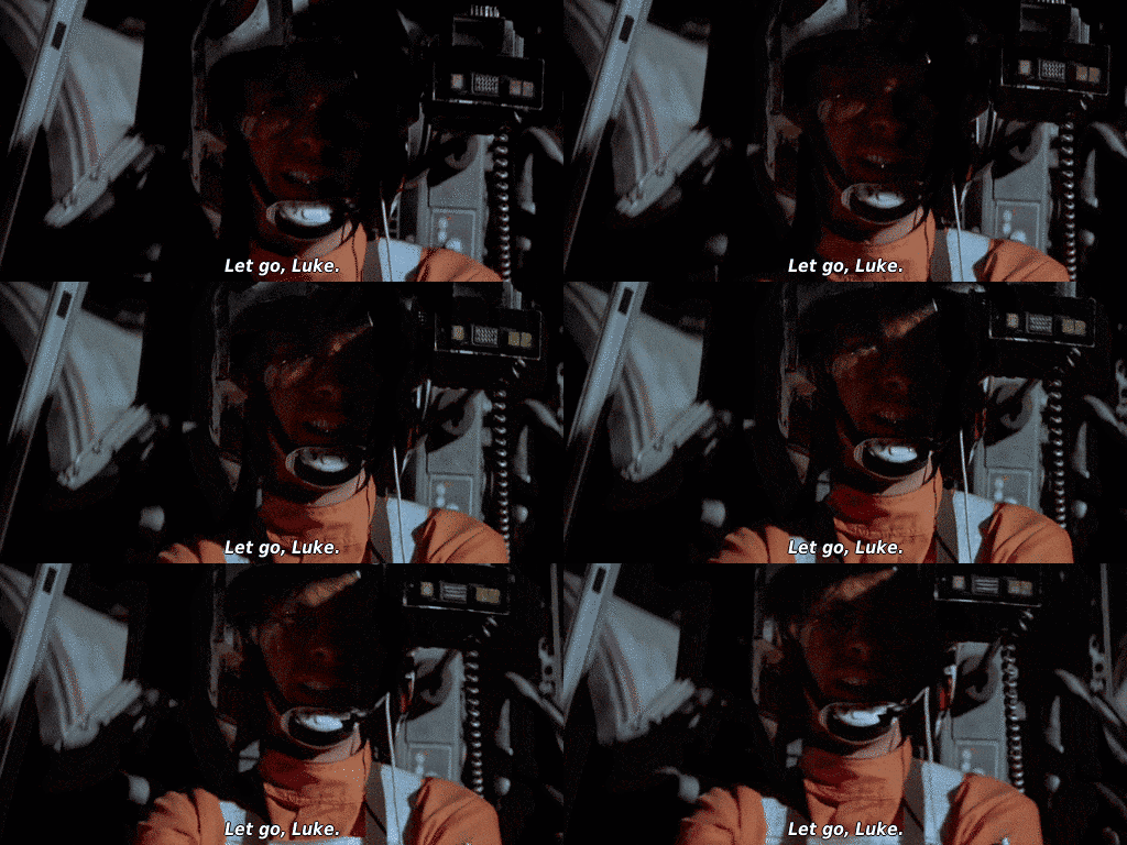
And Obiwan witnessed Luke trying too hard to destroy the Death Star design an HTML email when he said, “Let go, Luke.”

Buddhism teaches about making HTML emails.
Here’s Thich Nhat Hanh:
Buddhism teaches that joy and happiness arise from letting go. Please sit down and take an inventory of [your HTML email practices]. There are things you’ve been hanging on to that really are not useful and deprive you of your freedom. Find the courage to let them go.
“The Zen of HTML Emails”. That’ll be my book about learning to let go. It is, after all, part and parcel of working with web technologies. Here’s Jeremy on control:
The web is filled with uncertainties—browsers, devices, networks. You can’t possibly account for all of the possible variations. On the web, you have to relinquish some control.
For you — the person closest to the work of designing, implementing, and QA’ing HTML emails — it’s easier to let go and embrace the variable nature of HTML emails than it is for folks in the marketing department.
The dirty secret is: a lot of standard HTML email practices make trade-offs. They trade respect for a user’s context (device, email client, accessibility preferences, etc.) for their own penchant for visual fidelity and aesthetic consistency.
If you envisioned it as a sliding scale of where the default choices tend to take you, I think it would look something like below.
HTML emails:
       |--X------------------------------|
Visual fidelity                 Respect for end-user
Plain-text emails:
       |------------------------------X--|
Visual fidelity                 Respect for end-user
Are HTML emails for us, the senders, or for them, the recipients? At what proportion? What are the trade-offs?
Maybe it’s just me, but I hate looking at my email late at night with dark mode on and that one HTML email comes through at full-on white and blinds me.
Again, me venting on Twitter:
Email “design”:
Does it respect the user’s preferences (light/dark mode)?
Does it respond to their device size?
How’s the content?
& lastly, what’s it look like?
Being “on brand” isn’t just the aesthetics. Content and respect for the user’s context are part of your brand too
The “design” of an email is so much more than how it looks in a fixed-sized Figma mock. It’s easy to design one artifact, show it to others and say, “Hey, here’s what it looks like. It’s on-brand and looks nice, right?” And everyone agrees.
We agree because a Figma mock is a model in a clean room. It’s only a shadow of the thing it represents, divorced of the constraints and dirtiness of real-world context.
Maybe don’t even bother showing others what the email “should” look like. Show them variations of what it might look like. Don’t show a tree, show a forest. And start with the worst screenshots you can find to temper expectations :)
Josh wrote a great article recently about how he does HTML emails. It’s a great article and I’ve followed a similar route on HTML emails I’ve made.
However, I do find myself stopping to wonder: what am I doing? I want to author a great HTML email that’s good across email clients, but to do that, I need node.js, and React, and MJML, and…?

Here’s a thought: what if we spent as much time writing, editing, and rewriting the content of our HTML emails as we do designing and implementing their visual details across multiple clients? Would both parties get more of what they want?
To paraphrase the popular Mark Twain quote: I didn’t have time to write you a good email, so I designed and coded an HTML one.
While about design systems, Robin’s article of correctness vs. usefulness feels relevant to HTML emails.
The usefulness of the content of the email is more important than the correctness and consistency of its visuals. Whether we like or not, HTML emails cannot be uniform — “pixel perfect”. The sheer vastness in diversity of client implementations is beyond us as mortals, though many companies have been founded to make you believe, in exchange for some of your money, that this Shangri-La can exist.
What if, instead, we recognized the beauty and opportunity in this diversity? You ever stop stop reading an email from a friend because they didn’t style it nice with a proper CTA? Content is king.
Gruber made the point — I can’t remember where, I think it was an episode of Dithering — that plain-text has won the battle of communications. All the big messaging and chat platforms are, essentially, plain text. The day we started to allow email clients to be full-blown web browsers (but without the protections of browsers) was the day we lost — time, security, privacy, and effectiveness. Now we spend all our time fighting with the materials of an email (i.e. color and layout) rather than refining its substance (i.e. story and language).
Humans are incredibly creative when constraints are put on us. Imagine if HTML emails were considered deprecated tomorrow, with a plan for feature removal a few years into the future (like what happened with flash). Imagine how interesting and creative the space of plain-text emails might become.
After all, there is some support for the assertion that plain-text email is better than HTML email.
Aside from proper list segmentation, nothing boosts opens and clicks as well as an old school, plain-text email.
Not only might they perform better, but they might have a smaller payload, fewer privacy concerns, a respect for user preferences by default, better accessibility, and…shall I continue?
“But they don’t look as good,” we will say.
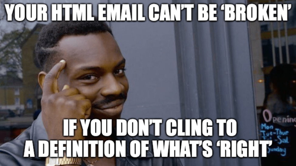
Maybe it’s time we let go. As Buddha said, you can only lose what you cling to.
Update 2022-07-29
Shortly after publishing, I began to notice the bell curve meme making the rounds with commentary on technology choices (todo lists, notes, php/js, etc.).
That meme captures quite well what I was trying to get across in this post, so I had to make one for HTML email and include it here.
