I finally got around to diving deeper on Utopia, “a way of thinking about fluid responsive design”, by watching the introduction video.
Everything about Utopia resonated with me, and I’m already playing around with using it here on the ole’ blog — but that’s a post for another day.
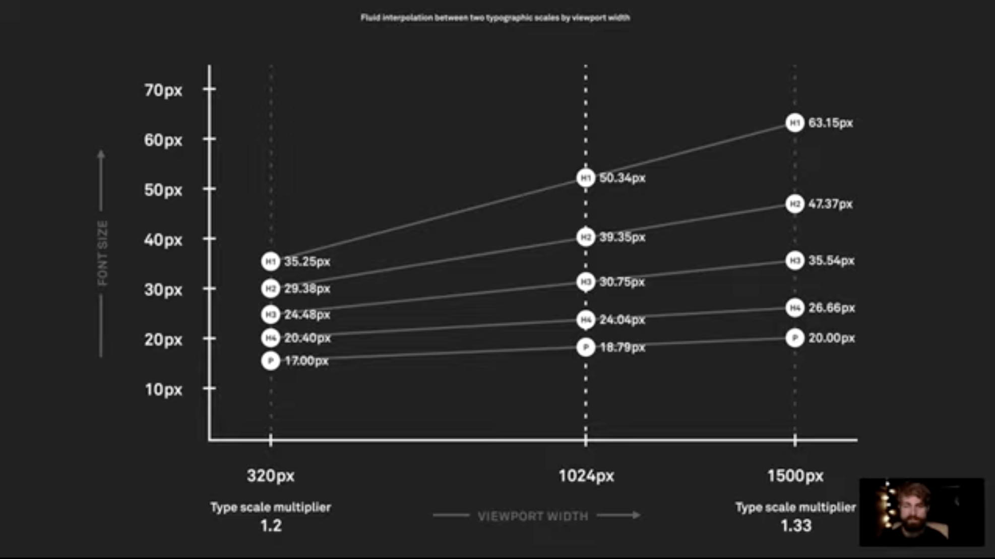
Today I want to share some thoughts spurred by an excerpt from Utopia’s introduction video, where the presenter is talking about the problems inherent to sizing type when you’re doing responsive design:
At some viewport size between small and large is a point where one type scale is swapped for the other. This approach is quite blunt and can result in undesirable layouts, especially when a viewport is just a bit narrower than the closest breakpoint. We might end up with a relatively small device showing a typographic scale designed for a larger machine. Or two similar devices unintentionally showing quite different layouts.
The common solution to this today would be to define more breakpoints to exert more control. I would describe that as another form of fragmentation. Remember: we want to embrace the ebb and flow [of the web].
This phrase struck me: “The common solution [is] to define more breakpoints to exert more control”.
🙋♂️ Guilty as charged on this count.
When I dive right into coding a responsive design, media queries end up feeling like a can of Pringles: once you pop you can’t stop. It’s one rule after another after another after another, until I eventually say “meh, that’s good enough”.
The problem is these whirlwind breakpoints end up feeling incredibly brittle. They remind me of wrestling with JavaScript build tooling: I set it all up, then come back in six months and can’t understand anything that’s going on. It all feels so brittle, one change can break everything — a house of media query cards.
This all got me thinking.
We say CSS is “declarative”, but the more and more I write breakpoints to accommodate all the different ways a design can change across the viewport spectrum, the more I feel like I’m writing imperative code. At what quantity does a set of declarative rules begin to look like imperative instructions?
In contrast, one of the principles of Utopia is to be declarative and “describe what is to be done rather than command how to do it”. This approach declares a set of rules such that you could pick any viewport width and, using a formula, derive what the type size and spacing would be at that size.
This “declarative” approach stands in contrast to an approach where you reactively stitch together innumerable media query instructions to describe discontinous break points along the web’s expansive viewport continuum.
This approach might feel like relinquishing control, but a better perspective might be to see it as a shift from trying to control everything (which, good luck) to embracing the flexible nature of the web’s grain.
Instead of writing innumerable instructions for how a design should change across discrete viewport states (imperative), you write rules based on a formula to guide how a design will respond across the continuum of viewport states (declarative).
- At 752 pixels, I want you to change from type size
X to type size Y (imperative). - Here are the rules for sizing. You, browser, figure out what the type size is at 752 pixels (declarative).
This feels closer to the essence of responsive design and letting the web “ebb and flow”. Rather than write innumerable instructions at fixed unit sizes — "at X pixels do this, at Y pixels do that, at Z pixels do this" — you create a system for managing the relationships between things using flexible, relative units like percentages and ems. From there, you let things flow. If something is off, you don’t add another media query. Instead, you reconfigure your system of relationships and test the reflowing of things again.
A systematic set of rules designed to allow flexibility in a design feels much more understandable and maintainable than a distinct set of instructions intended to keep a design from breaking.