Jeremy has all the right words for getting at nebulous concepts in the industry. This time he’s writing about declarative design systems:
another person says “design system” and means a predefined set of boundary conditions that can be used to generate components.
I like this definition of a design system: a set of boundaries. It’s about saying “don’t go there” rather than “you can only go here”. This embraces the idea of constraints as the mother of invention: it opens the door to creativity while keeping things bounded.
Declarative design systems are about setting boundaries and then ceding control to the individual elements (replace “elements” with “children” here and this starts to sound a lot like parenting…)
The systematic approach is at the heart of declarative design; setting up the rules and ratios in advance but leaving the detail of the final implementation to the browser at runtime.
We might not see ourselves as creating a system of authoritarianism, but if we’re trying to dictate and control every aspect of design that can (and “should”) happen in a system, well, that’s precisely what we’re doing. We might think of our system as a benevolent tool we endow on others, but it’s very possible that’s not how they see it.
One of the hardest parts of embedding a design system within an organisation is getting people to adopt it. In my experience, nobody likes adopting something that’s being delivered from on-high as a pre-made sets of components. It’s meant to be helpful: “here, use this pre-made components to save time not reinventing the wheel”, but it can come across as overly controlling: “we don’t trust you to exercise good judgement so stick to these pre-made components.”
We really need to check this impulse for control. Again, I think a declarative design system doesn’t try to prescribe what can and can’t happen, but rather provide boundaries to circumscribe an area within which anything can happen — or at least be explored.
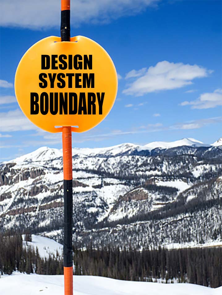
It makes me think skiing. There’s the groomed runs if you’re starting out and just want to get familiar with the territory. There’s the (often forested) area between groomed runs if you want to explore new areas rarely trodden. And then there’s the ski area boundary: beware all ye who enter here, you’re on your own.

I see good design systems a bit like ski resorts: they groom well-trodden areas, make room for and encourage exploration around the groomed areas, and set limits for exploration beyond logical boundaries which prevent a unified cohesion of the overall whole.

Lastly, I really liked this this observation from Jeremy about design tools:
My gut feeling is that the imperative mindset is a good match for most of today’s graphic design tools like Figma or Sketch. Those tools deal with precise numbers rather than ranges and rules.
The declarative mindset, on the other hand, increasingly feels like a good match for CSS
We shape our tools and our tools shape us. In a way, tools are a part of design system too, in that they define and set boundaries on what’s we think of as possible (or controllable).
As an industry, we love Figma and what we can make with it (I know I do). But it’s worth asking: what does Figma make with us? Where does it limit our creative vision of what’s possible and what we can or even should build?
We often choose to build what we can given the tools we have. But what’s possible beyond the boundaries of our tools? What can we build that our tools don’t yet support? Not only because they haven’t been built into the tool yet, but also because they simply haven’t been imagined yet?
An imperative design system doesn’t entertain these kinds of questions — or at least it creates a lot of friction to asking them. In contrast, a declarative system builds space for this kind of questioning as an exercise in the design system’s process, architecture, and essence.