Giving Style to Select Option Values
tldr; <select> inputs and their corresponding <option> elements exclusively allow text. Emoji is text. Therefore, in some cases, you can use emoji to style select inputs without reinventing the wheel of dropdown inputs. But it would be cool if browsers and OS makers allowed more in the future.
I have a small project where I want the user to be able to choose from an enumerated set of colors.
Right now I have a <select> menu with <option> elements to represent each color choice:
<select>
  <option value="blue">Blue</option>
  <option value="red">Red</option>
  <option value="orange">Orange</option>
  ...
</select>
While I could use <input type="color"> with a predefined list of values, those ultimately remain suggestions for input while any color can still be chosen.
![Screenshot of the input[type='color'] on macOS.](https://cdn.jim-nielsen.com/blog/2021/select-input-color.png)
For my case, the <select> makes sense because its a limited set of options.
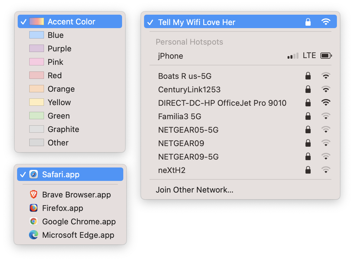
However, it would be nice if I could make the options more visual. For example: prefix every color’s textual value with a visual representation of the corresponding color, like what you see in the macOS settings for “Highlight color”:
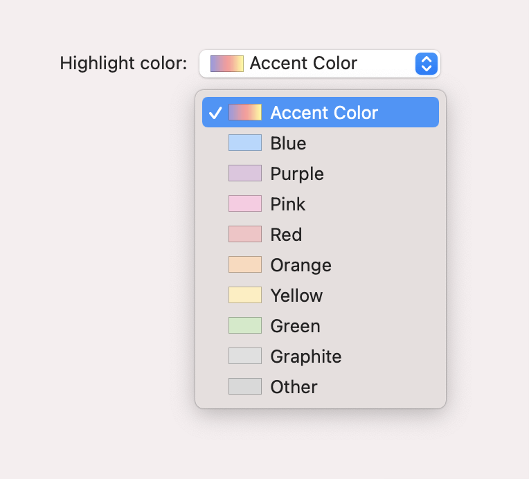
Wouldn’t it be nice if the <select> option in HTML allowed this kind of flexibility? Say, the ability to provide an image or icon?
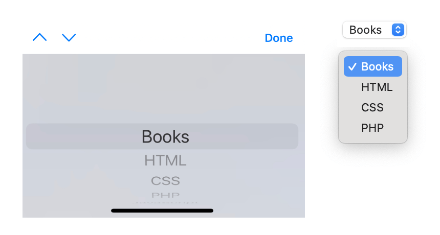
Of course, you have to remember that the native <select> dropdown is not a “dropdown” in all scenarios. Different devices and operating systems handle this input differently. On macOS, for example, you see a dropdown when triggering a <select>. However, on iOS, you don’t see a dropdown appear on screen below the <select> but rather a kind of virtual keyboard tailored for handling this type of input:
Granted, you can re-engineer the <select> menu as a customizable on-screen dropdown across all devices and inputs by using a third-party JavaScript implementation like react-select. This would allow the kind of flexibility one might be looking for in a “select dropdown”.
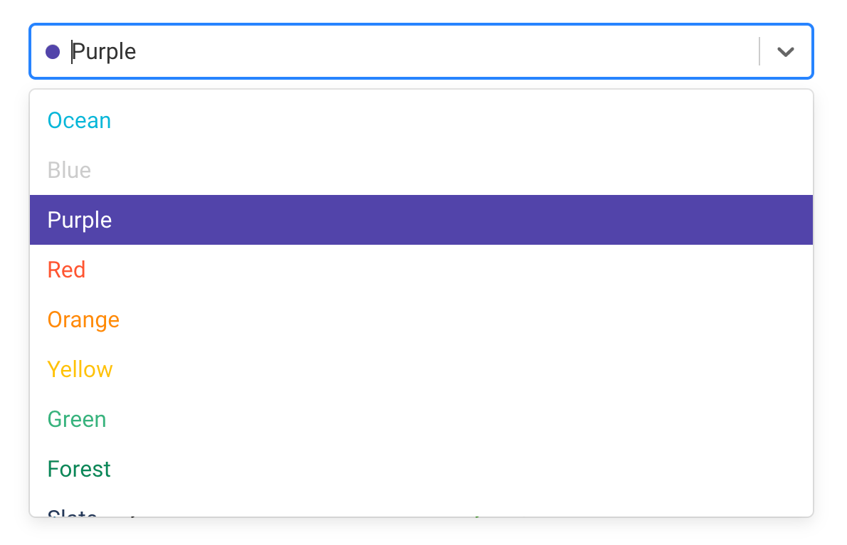
It’s worth remembering, however, that these implementations aren’t equivalent, one merely being more customizable than the other. And once you opt to “roll your own” HTML element, you lose all hard-won considerations learned over decades that’ve been baked into HTML to deal with accessibility, usability, resiliency, etc.
So, back to my original problem. Is there an easy win where I can A) leverage existing HTML semantics and native input controls, while B) still getting an enhanced visual cue of some sort, without C) using a library or rebuilding a <select> input from scratch?
The biggest constraint is how limited the <option> element is. Text is the only valid content. <option><span>text</span></option> is technically invalid. Even option::before is invalid. It’s characters only.
While searching for how to add some flare to the <option> elements, I stumbled on this Stack Overflow which points out the ability to leverage code points in combination with custom fonts to get custom glyphs.
And that’s when the light bulb went on in my head: emojis are characters! Why not use emojis as my color cues? For my particular case, surely there must be emojis of the basic color enumerations I’m working with?
A quick search on emojipedia reveals there’s an emoji for each color I need. If I put all these ingredients together, I get a native <select> with color values as options and small visual representations of each color in tandem with the text.
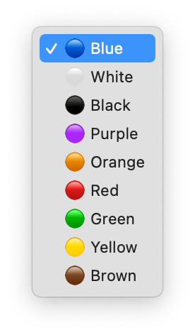
At first, since the emojis were intended to be purely stylistic, I thought I’d implement them with CSS. For example:
<style>
  option[value="red"]::before {
    content: "🔴";
  }
</style>

<select>
  <option value="red">Red</option>
</select>
The problem, as I mentioned earlier, is that this isn’t considered valid and doesn’t actually work. The only way to see the emojis is to put them directly into the markup:
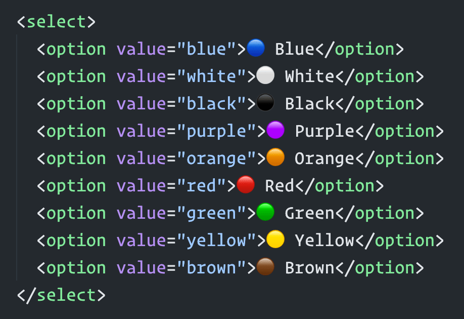
<select>
  <option value="blue">🔵 Blue</option>
  <option value="white">⚪ White</option>
  <option value="black">⚫ Black</option>
  <option value="purple">🟣 Purple</option>
  <option value="orange">🟠 Orange</option>
  <option value="red">🔴 Red</option>
  <option value="green">🟢 Green</option>
  <option value="yellow">🟡 Yellow</option>
  <option value="brown">🟤 Brown</option>
</select>
Because of how emojis work across different systems and applications, the code sample above might render different than what you see in the <select> screenshots I posted earlier. It also might look different than what you see in VSCode:
Anyway, this solution works decent, although putting the emoji first sort of breaks quick keyboard navigation, i.e. hitting “Y” on the keyboard when the dropdown menu is open doesn’t jump you down to “Yellow” as the selected option because the first character of that <option> isn’t “Y”. It’s the yellow emoji. If you wanted to support that functionality, you’d have to put the emojis last.
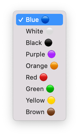
It’s a shame I couldn’t get the pseudo element solution to work in CSS! That would’ve been the best of both worlds.
Anyhow, now I’ve got some nice <select> inputs with color-coded emojis as visual cues for the textual values. Even works in dark mode!
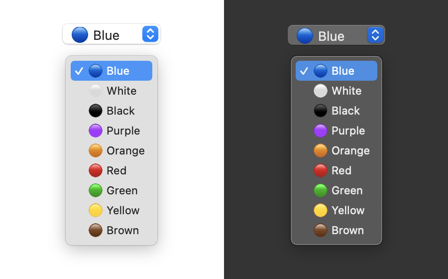
What would be neat is if browsers and OS makers could extend the HTML <select> element so that web developers could take advantage of the same kind of UI controls native OS users have:
