Shadow DOM and Its Effect on the Unofficial Styling API
I enjoyed listening to Shop Talk Show #451 where Dave and Chris talk to Nolan Lawson about web components and Nolan’s emoji picker (which is implemented as a web component).
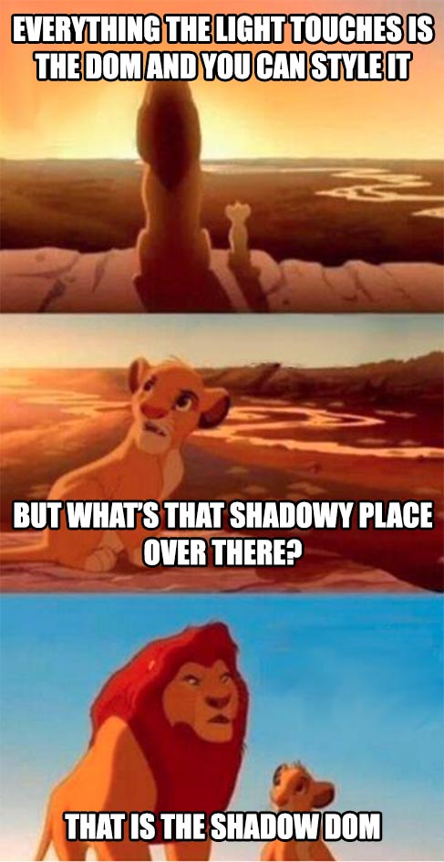
At one point, they discuss the topic of styling web components, namely: how do you make styles configurable to consumers of your component if you’re using the shadow DOM? (Nolan has written in depth on this subject.)
Chris makes an observation that’s been rattling around in my head. He points out how the shadow DOM breaks the self-documenting style API we’ve had on the web for years.
What style API? If you want to style an element on screen, you open the dev tools, look at the DOM, find the element you want, figure out the right selector to target that element, write your selector and styles, and you’re done.
That’s pretty remarkable when you stop and think about it. If you want to style someone else’s thing, you don’t have to find and read their documentation. Instead, you merely open the dev tools, find the thing you want to style it, and write some CSS. That is the API (albeit an unofficial one without any kind of semver contract).
This self-documenting style API is why custom style sheets work. Every website in the world doesn’t need to provide written documentation on how and what can be styled. The API for styling—however unstable and subject to change—is consistent across every single website in the world.
The shadow DOM breaks this self-documenting API. With the shadow DOM, people can’t peer into your component and write selectors that target the things they want to style. It’s possible you’ve never considered officially writing API documentation for styling what you provide, but with shadow DOM you might have to.
I find this a bit ironic because we’ve been fighting against unstyleable UI controls for ages.
For years developers have clamored for more styling control over native browser controls, like the <select> element, because you can’t peer into them, target specific things, and override their inherent styles (like so many other HTML elements).
To a degree, web components with shadow DOM perpetuate this custom styling frustration because consumers of the web component are prevented from style anything from outside the shadow DOM unless given explicit controls to do so.
To Chris’ point on the podcast, this upends the otherwise standard style contract we’ve come to expect on the web.
In the land of shadow DOM, the only way to provide consumers the ability to style things is to follow advice like Nolan gives. As an author, you have to spend time and effort thinking about, architecting, and then documenting a styling API for your component. And as a consumer, you have to read, understand, and implement that API.
Additionally, web components can’t guarantee any consistency in style APIs from one component to the next (though there are attempts at standardization).
Anyhow, that’s a long-winded way of re-explaining a short insight Chris gives in the podcast. If you use web components and shadow DOM, be advised that you might be perpetuating the same styling frustrations you’ve had in the past with elements like <select>.