CSS Gap
I finished watching the Apple’s Safari 15 video and learned a couple things along the way.
One standout item: Safari now supports the gap property for flex layout in CSS.
I’ve seen this property used on other sites before, but never leveraged it myself. To be honest, I didn’t even know precisely what it does. I figured it was some aspect of the implementation around grid—which I’m still a novice at—but in watching the Safari 15 video I realized it has an amazing use in flex layouts.
Tell me if this sounds familiar: you setup a flex layout for a set elements, like navigation links. Everything aligns amazingly in a few lines of CSS, but then you have a problem where elements end up touching each other when spacing gets tight.
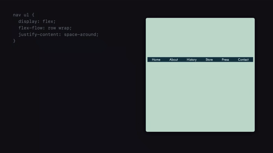
“Shoot, that’s gonna need some margins/padding,” you might say. But then you have to figure out the right margin/padding strategy. Do I use margin, padding, or both? Do I apply it on the right side of the element, the left side, or on both? Oh, sometimes I get that extra spacing on the outside edges which I have to remove with the likes of :last-child and :first-child.
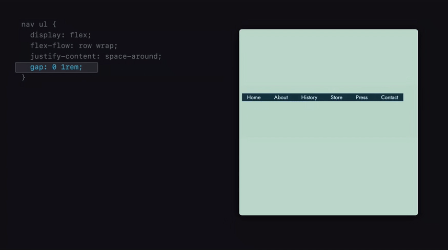
gap in flexbox makes this much simpler. Adding spacing between elements is now possible in the way you (commonly) expect with a single line in CSS.
nav ul {
  display: flex;
  align-items: center;
  justify-content: space-around;
  gap: 0 1em;
}
Support is pretty good now that Safari is in the game (a phrase I feel I’ve been saying frequently as of late).
I’m going to start using gap everywhere.