Visual Design Inspiration from Agency Websites–And Other Tangential Observations
So I was on Twitter the other day (this is how all great blog posts start) and I saw a tweet from @steveschoger—of Tailwind UI fame—seeking links to agency websites for design inspiration. He ended up with a bunch of bookmarks in his browser. Then @carsonjonze graciously made a Notion page with all of his links.
I’m a sucker for stuff like this. I’ve always found it interesting to browse through other people’s work. In fact, I used to keep bookmarks like this myself but I stopped a few years back because agency websites were always changing. I’d bookmark an agency for one reason or another (“oooh, I like those fonts...”) but by the time I revisited any of those links the site would’ve changed (a redesign, agency got acquired, or the URL was flat out dead).
I began realizing the best way to quickly bookmark a website that struck me as inspirational was to take a full-page screenshot. Even that, however, was kind of a sad bookmark. Websites are more than static pixels. They are to be experienced and felt, not just looked at. Nonetheless, this seemed like the best way to capture at least the inspirational nature of the visual aesthetics of a site.
So, seeing as how Steve has a great eye for this kind of thing, I wanted to check all these agency sites out. I figured I’d screenshot them all and put them in a blog post, which is how I ended up writing this.
As you’ll see, a few other things stuck out to me along the way.
How I Did It
I opened up Chrome and attempted to take a full-page screenshot of each agency’s website. There are a number of plugins that will do this for you, but I used Chrome’s internal “Capture full size screenshot” which is available in the DevTools (CMD+SHIFT+P on Mac opens up the command menu where you can search for it).
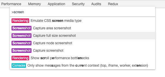
How exactly Chrome does this under the hood, I’m not sure. But the way a website is built most definitely has an effect on how well Chrome does at taking a screenshot of the entire page. I went through 43 different agency websites and, when attempting to take a full-page screenshot, here’s how it broken down:
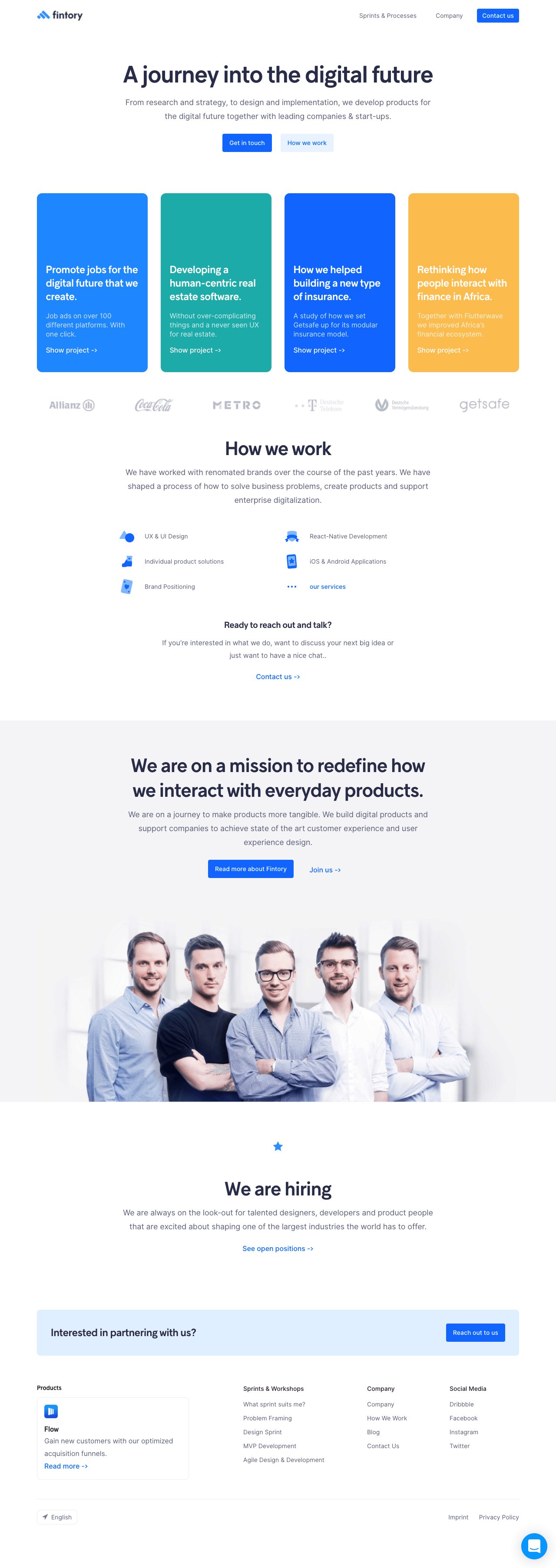
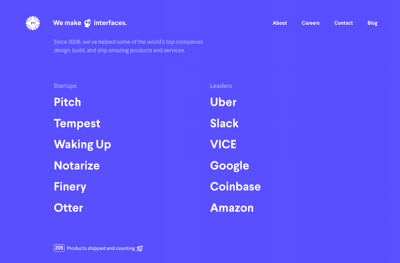
- 11 sites worked (a full-page screenshot turned out as expected)
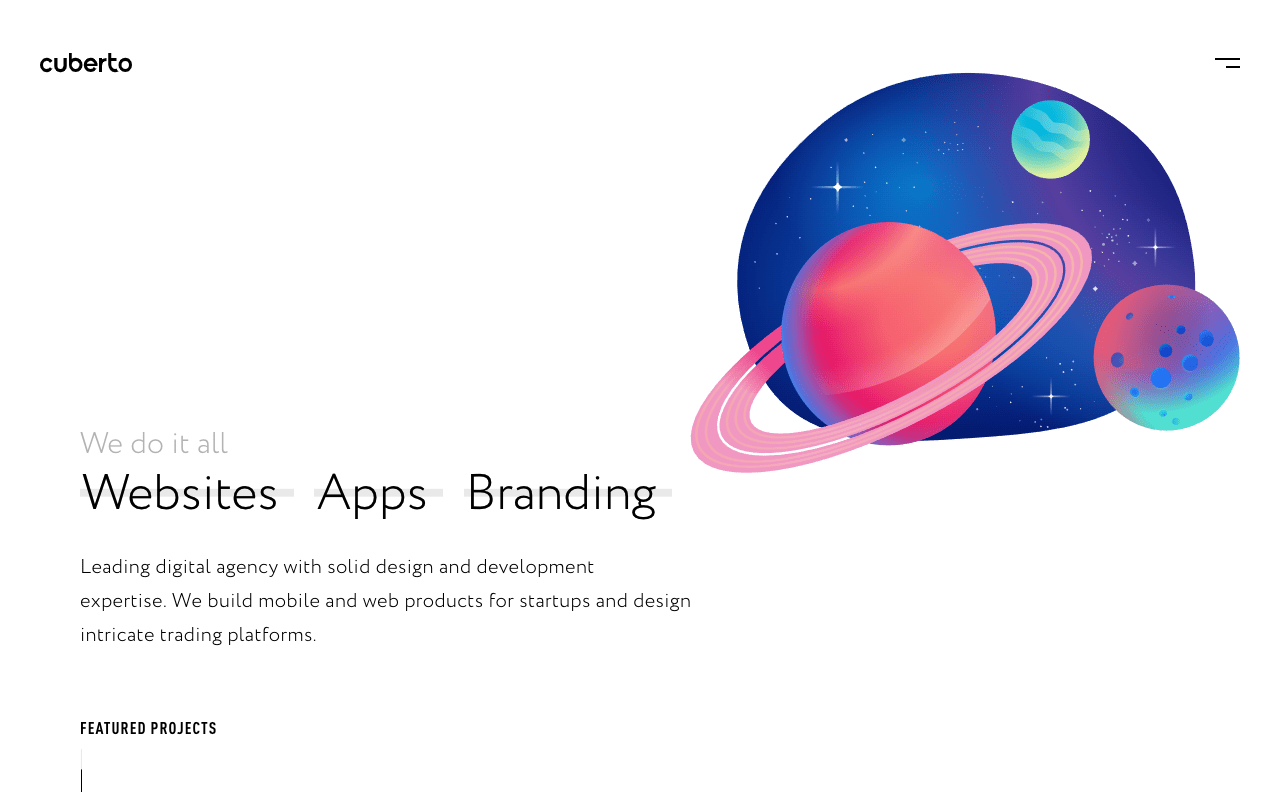
- 11 sites kind-of worked (a full-page screenshot resulted in a screenshot of the visual viewport only, even if there was more content on the page)
- 21 sites didn’t work (a full-page screenshot didn’t look anything like the real website)
Sites That Worked
When using Chrome’s screenshot tool to capture the entire page, these sites resulted in a full-page screenshot as expected.






Sites that Kind-of Worked
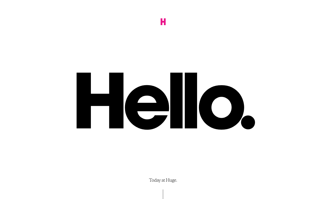
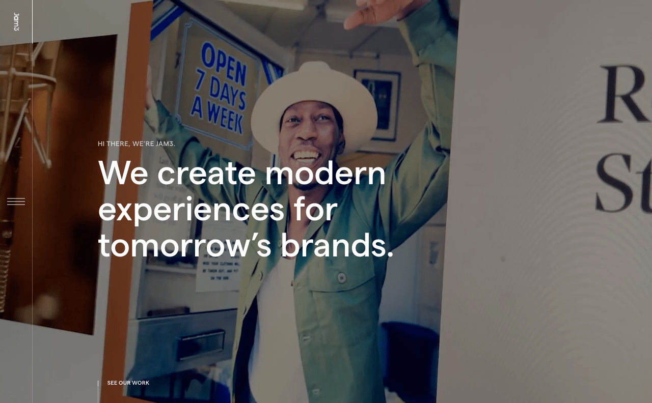
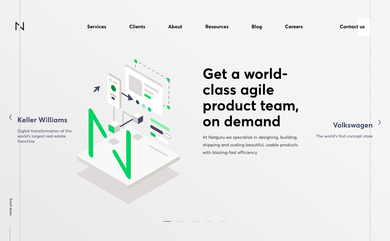
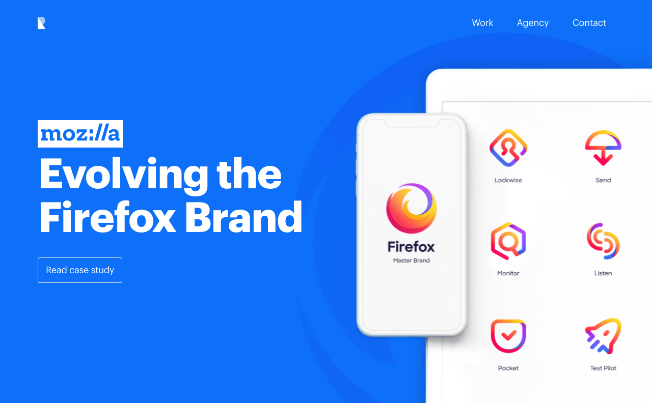
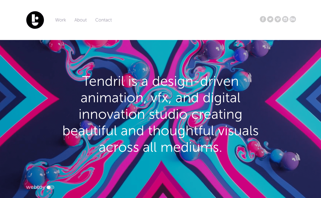
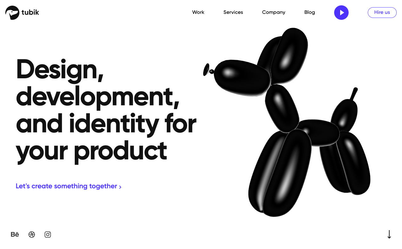
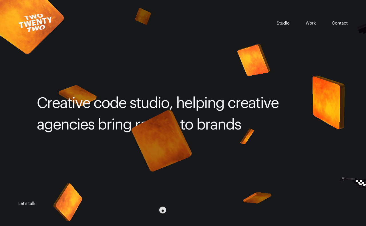
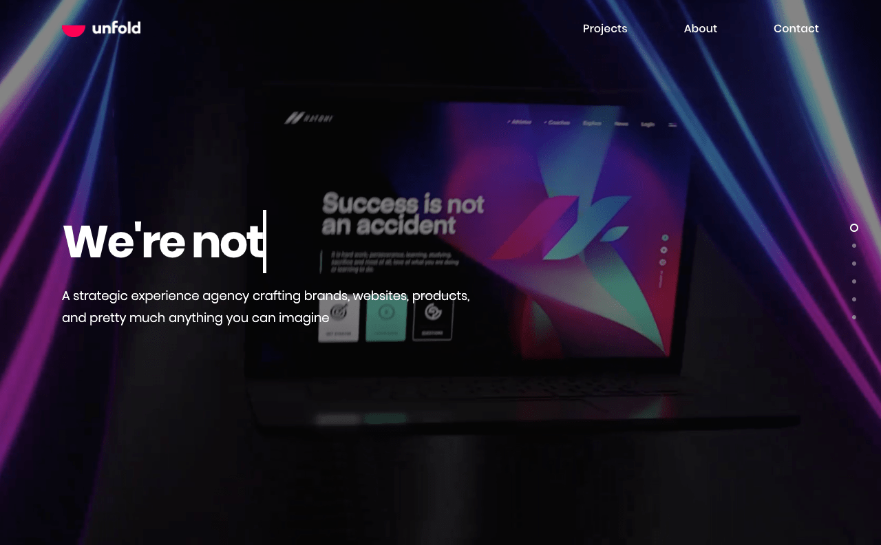
When attempting to use Chrome’s full-page screenshot tool, these sites resulted in screenshots of only the visual viewport (a lot of these sites appeared to have been designed to fit full screen on page load, then hijack as you scroll, which is probably why Chrome could only capture the currently-visible viewport).


Sites that Didn’t Work
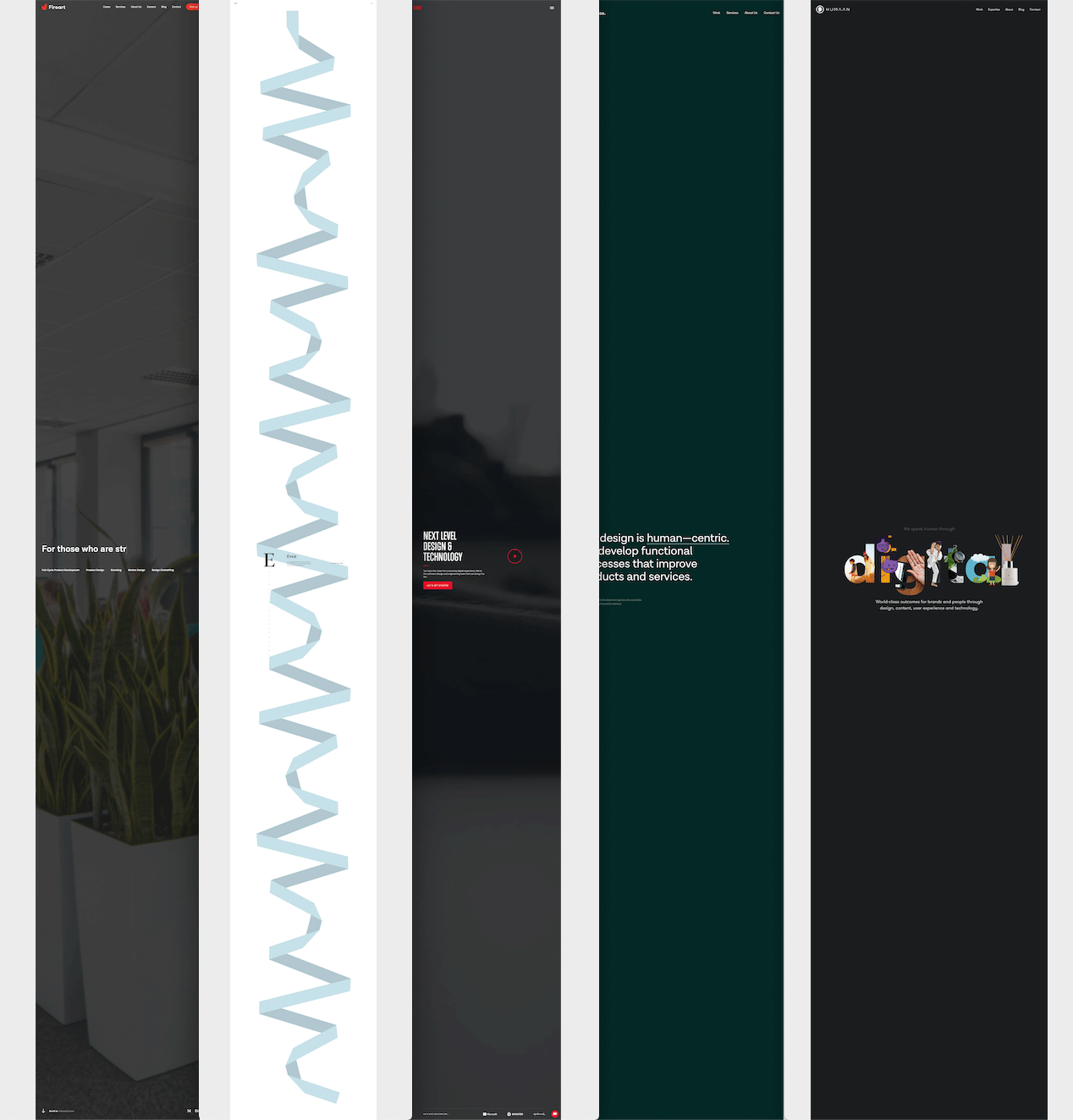
When attempting to take a screenshot with Chrome’s DevTools, these sites failed completely. A large majority of them resulted in a screenshot that was the length of the content of the page, but only a small portion (usually the visible viewport) of the content was actually captured and then usually stretched the length of the screenshot.
- fireart
- balkan bros
- rallyinteractive
- underbelly
- strv
- cubstudio
- Handsome
- BASIC
- ueno
- Dogstudio
- Humaan
- Instrument
- Work & Co.
- Z1
- Briteweb
- 9elements
- Upstatement
- Locomotive
- Purple Rock Scissors
- Super Top Secret
- Parallax
Some Observations on the Side
As I went through and took a screenshot of each of these websites, I had the DevTools open which meant I saw the DOM for all them too. I started to pickup on a common pattern across many of these sites, so I began screenshooting the DOM. Here, let me show you what I found.
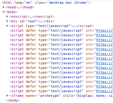
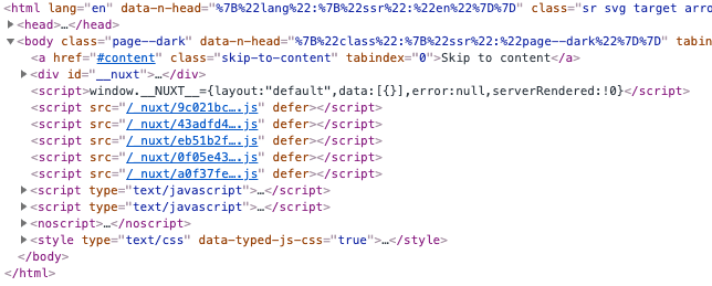
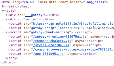
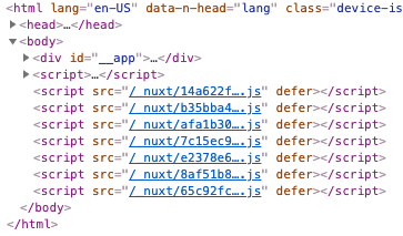
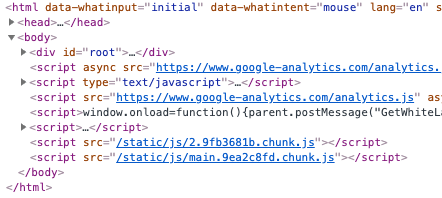
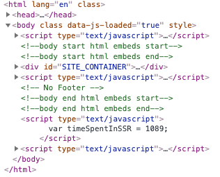
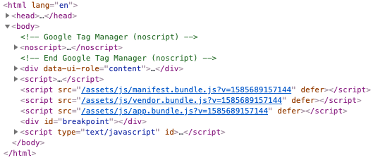
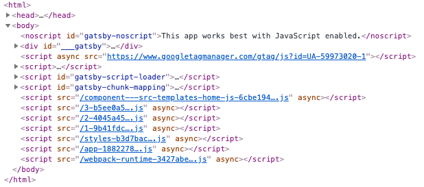

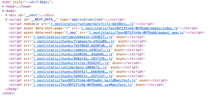
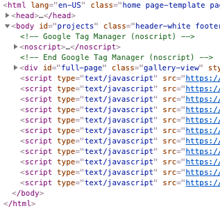
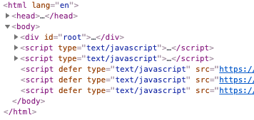
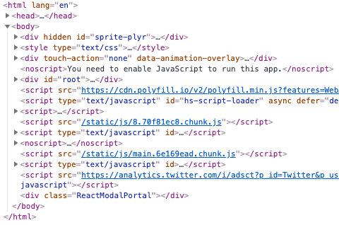
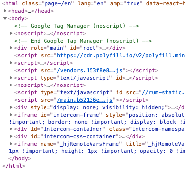
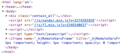
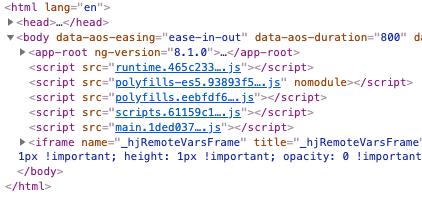
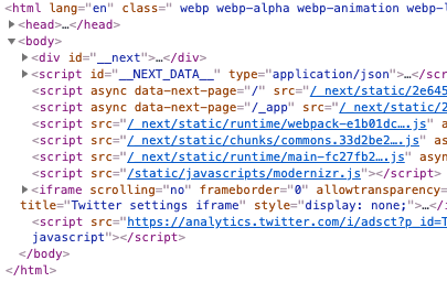
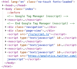
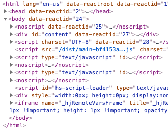
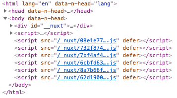
For what it’s worth, I stopped taking screenshots of the DOMs that looked like this when I reach twenty of them. I could’ve kept going. As you can see, shipping a root element and then a large number of scripts is a very common pattern today.
Now don’t get me wrong, all of these agency sites were inspirational in terms of visual aesthetics and style. And that’s half of what interests me. But the other half of what interests me—building semantic, universally-accessible, progressively-enhanced websites—found many of these sites woefully underwhelming (not to mention the copious examples of tactics like scrolljacking, cursor hijacking, video autoplaying, etc.).
Granted, agencies are usually the ones pushing the boundaries. “Pop” and “pizazz” are what sell for many of them (i.e. “look what we can do!”) Many of these sites pushed the boundaries of what you can do in the browser, and that’s cool. I like seeing that kind of stuff.
But if you asked me what agency websites inspired both parts me, I’d point to something like Clearleft or Paravel. To me, they strike a great balance of visual design with the craft of building for an accessible, universal web. I mean, just look at dat DOM from Paravel:
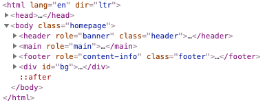
That, too, is inspirational!