Dark Mode on the Web via OS-Level Preferences
This morning, I saw this tweet from @rafahari who is a designer at Netlify teasing what a “dark mode” of Netlify’s user interface could look like. What was more compelling than the dark mode, though, was how the display of dark and light mode mode in the web browser was being controlled not by a JavaScript button in the browser, but by the macOS system preferences.
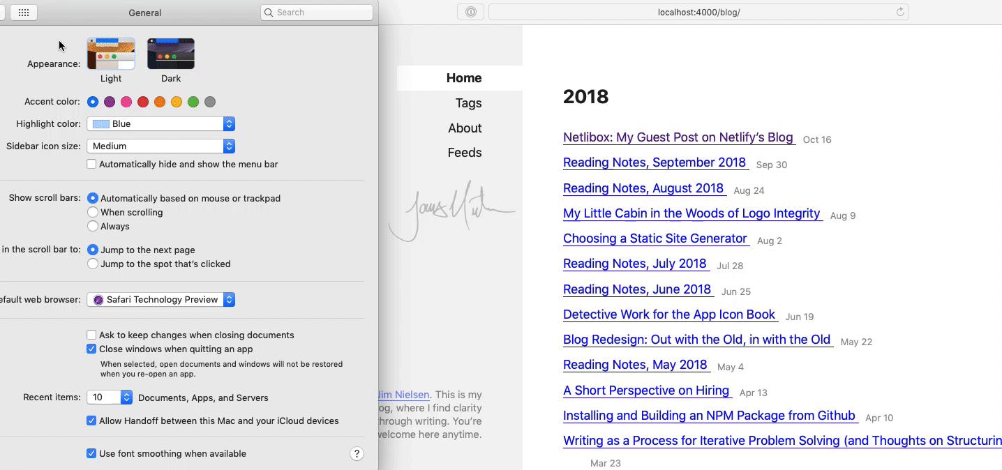
When I first installed macOS Mojave, like anyone else I too took dark mode for a spin. After a few days of using it, one of the things that stood out to me the most was the fact that, as someone who was on the web all day, my screen was still white most of the day. Granted this is understandable because most webpages are styled to be essentially in “light mode”.
In light of this fact (pun intended), what I found really intriguing about @rafahari’s tweet was how a user’s preferences at the OS level could cascade down into the browser to control styling. This felt like a throwback to some of the old ideas of the web where user settings and preferences should be taken into account when displaying websites (looking at you font-size). I love that idea! Web browsers, seize the means of styling!
I really wanted to see this work on my own computer, so after doing some digging, I installed Safari Technology Preview, made this quick codepen, and got it up and working on my own machine. Magic!
This felt so right to me, a simple codepen wasn’t going to be enough. I had to get this working on some of my own web real estate, and my blog was the perfect candidate. What was really neat is that it didn't take too much effort. In essence, you’re just swapping out one set of CSS variables for another:
/* Light mode by default */
:root {
  --color-text: #444;
  --color-bg: #fff;
}
/* Dark mode at the system level via a media query */
@media (prefers-color-scheme: dark) {
  :root {
    --color-text: #ddd;
    --color-bg: #222;
  }
}
body {
  background-color: var(--color-bg);
  color: var(--color-text);
}
After making my site’s colors controllable via CSS variables (something I should have already been doing honestly) I had everything working the way I wanted in about 20 minutes.
I don’t know about you, but there’s something incredibly satisfying about this. A user preference at the OS-level is cascading down into the browser and hooked into by the website’s CSS, which is leveraging the power of the cascade along with variables to change color modes. And the OS adds an animation on top when transitioning. I love it!
Throughout the day, I began to see more write-ups about this on twitter and found this insightful post from the good folks over at The Iconfactory. They note how this is another aspect of “responsive” web design — responsive, in this case, not narrowly meaning responding to changes in browser viewport but a more broad term encompassing the idea of responding to changes in a user’s environment:
Dark Mode now becomes another aspect of responsive web design. As with device dimensions or color, the user’s environmental choices must be taken into account.
Apparently, you can respond to these settings via JavaScript as well, but I have to admit, I think this is a win for CSS. The power of the cascade here via CSS variables and media queries makes this so easy and elegant. If my styles were all applied via JavaScript, I’m not even sure how I would go about architecting a system of color modes (granted, that could be because I don’t have as much experience in that regard, so nothing comes to mind immediately, but I still think this is a win for the cascade).
The Iconfactory post touches a little more on this idea of how to approach creating a system for styling light and dark modes:
The problem now becomes logistical: there are a lot of color and image properties in our CSS. Do you really want to duplicate all those definitions for a dark theme? Or make changes in two places? Hell no. The solution is to start thinking about color differently. One of the things that made the switch to Dark Mode easier in macOS was its semantic treatment of color. There are variables like labelColor, windowBackgroundColor, and controlTextColor used to represent color values. Without knowing anything about macOS development, you can probably guess what these definitions look like. You’ve just started thinking semantically.
If you do implement this for your own site (or something more sophisticated than a simple codepen) and you do it in JavaScript, let me know. I’d be interested in seeing the implementation.
Web browsers, seize the means of styling!