Designing and Developing the DCP Application
My most recent project had me designing and developing a new web application for Time Inc. called the “DCP” or “Digital Content Production” application. Using the framework we built for the Assignment Desk application, I designed and built roughly the entire view layer of this application in less than two months.
The main goal of this project was to transition from an antiquated internal application at Time Inc. called “Athena”, to the new D.A.M. (Digital Asset Management) platform. I had already helped build the Assignment Desk application which served as a framework for building other application’s that would interface with the backend D.A.M. layer, so the initial work around application architecture and tooling was largely in place. We had a boilerplate framework built on Node.js + React.js that could create, revise, update, and delete information from the D.A.M. Because of this, much of work entailed translating the existing application’s functionality into a web-based application.
Stage 1: Conceptualization
From the outset of this project, I was given a few resources to help me in designing and building:
- A 23-page PDF titled “Workflow Requirements”
- Screenshots of the existing application (“Athena”) we would be replacing
- Rough Axure wireframes from the project lead
- Flow diagram of user roles and responsibilities
- Screenshots of other TIME applications (for aesthetic direction)
Athena Screenshots
Time Inc. had an existing application named “Athena” that was being used internally for all digital content production related tasks. I suppose one would call this a “legacy application”, though I can assure you that name does not accurately describe the age of this application. Take a look for yourself:


Having screenshots of the existing application was actually quite useful in clarifying vagueness around data representation, user actions, etc.. In being given these screenshots, I was explicitly mandated to not “borrow any of the application’s UI or aesthetics”. They didn’t have to tell me twice (I actually didn’t really need to be told that once).
Workflow Requirements PDF
Because there was already an application in place with specified functionality, we were given a 23-page PDF that specified (sometimes in a rather convoluted way) the minimum required functionality of the application we were building. In some ways, this made my task easier because I would not have to go through the old application and write down how the application worked, what data was presented, which buttons completed what actions, and so-forth.
For example, rather than having to discover by myself that “Issues” in the system had nine different states and how those states affected the progression of issues through the system, this information was (mostly) documented in the PDF. The PDF ended up serving as more of a starting point for conversations and wireframes than it did as a concrete blueprint of what we would be building. A lot of the specifications changed through the course of the project. As I designed and developed the application’s UI/UX, we brought materials back to the stakeholders to ensure we were on the right track. Those conversations gave rise to existing pain points for end users of the application, which compelled us to revise and edit the requirements PDF to build a better application. The printed document also served as a trusty reference and checklist for feature design and development.

Flow Diagram
Probably the most useful piece of information I initially received was the flow diagram showing how data was supposed to flow through the system and how the application’s end users were tied to this data flow.
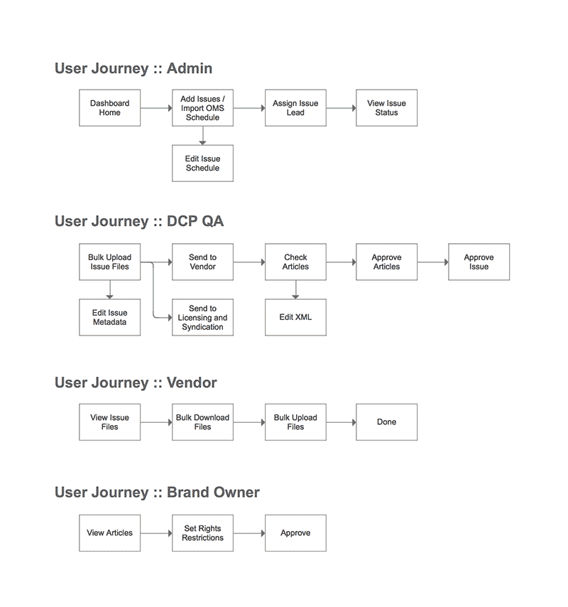
This helped me scope out user roles and responsibilities while also helping define the eventual URL structure of the application.
Axure Wireframes
I was provided some rough (let me emphasize the word rough) wireframes around the UI/UX for each user in the application.

They weren’t really wireframes so much as they were half-formed thoughts around what the application’s data would look like and how it should be displayed, edited, and manipulated. For example, here was a wireframe for representing the view for an issue:
")
Note that this wireframe, while representing what data we needed to show, did not take into account any of the nuances of user roles and responsibilities (who could see and edit what data). Contrary to the flow diagram, not all users were supposed to be able to add or edit data in form fields as seen in the screenshot above. Some of the additional roles and responsibilities for different user types were accounted for in other wireframes, but it was never totally clear how (if at all) these screens were related to one another. For example, here were three other wireframes which were supposed to represent the view of an individual issue but with varying actions depending on user role:


Contrary to what many wireframes do, these wireframes didn’t convey any sense of navigation or hierarchy. It was left completely unclear how a user would get around from one thing to another in the application while understanding the relationship between those things.
Screenshots of Other Time Inc. Applications
One of the only points of direction I was given in regards to the aesthetic direction of this new application is that I try to align it with the aesthetic direction of other applications being developed at Time Inc. (for obvious reasons like internal brand consistency, end user application experience continuity, etc.). Although there wasn’t much for me to go off, I was given a few mocks around a publishing tool being developed within Time Inc. along with verbal direction that it be “clean and minimalistic”.

Stage 2: Sketches, Wireframes, and UX
I began my design work by looking at the user flow diagram which helped me organize the application into three distinct user experiences and responsibilities:
- Outsourcer users: responsible for converting issue assets into XML files
- Brand Owner users: responsible for setting rights restrictions on issue articles
- QA/Adimin users: responsible for progressing issues through a predefined workflow and ensuring the other two users complete their tasks
Because each user had such a specifically-tailored task, I devised three different application user interfaces that fit the responsibilities of each user type.
To understand how users would navigate through the application, I began by sketching out ideas around a URL structure. This helped me understand how users would navigate from one item to the next while also revealing that the application would need to serve different content at each URL endpoint depending on the logged-in user’s role. Here’s an example of my notes:
/   [dashboard]
  - Custom depending on user. Gives overview of what needs to be done next.

/issues   [issue list view]
  - Shared layout, custom column/data depending on user role.

/issues/:id   [issue view]
  - Custom depending on user
    - If vendor, show XML uploads UI
    - If brand owner, show rights UI
    - If QA/admin, show issue info and edit controls

/issues/:id/assets   [issue view tab]
  - QA user view/edit assets

/issues/:id/articles   [issue view tab]
  - QA user view/check/approve articles
Defining these URLs helped me better understand the application architecture and allowed me to begin sketching through rough ideas of user interfaces and navigation.


Once I had developed solid ideas around the structure and layout of shared URL views, I moved on to refining navigation and layout patterns for views unique to each user role.

Once my sketches had provided me with enough concrete ideas, I took to Sketch app to form low-fidelity wireframes around layout, structure, and navigation for each of the three different user experiences:


My notes for URL structure in conjunction with my hand-drawn sketches and digital wireframes led me to solid ideas I could begin developing as higher fidelity mocks.
Stage 3: Aesthetics and Visual Mocks
My basic workflow in this stage was to mock each view and export it to Invision App where I linked up each view to produce a basic, interactive prototype of the application that could be shown to stake holders for feedback and/or sign-off.
As mentioned previously, I divided the application into three separate experiences based on user roles. This meant I had to design three different screens for each URL endpoint. For example, the home screen could display one of three views depending on the type of user logged in. I made sure to examine each view and, where possible, share design and layout patterns that could be leveraged across user experiences. As an example, the home screen dashboard for “Brand Owner” and “Outsourcer” user roles was a simple list of outstanding issues. As such, they could easily share a template with minor differences in data.

However, the home screen dashboard for QA/Admin users was a categorized list based on issue status that was designed to communicate more of a workflow than a simple to-do list, so its design and implementation were unique.

Through the creation of static mocks and linking them in Invision, I was able to create a prototype of the application’s vital screens and interactions for review and feedback. Here’s an animated .gif overview of each of those screens based on the experience of each user role:
Brand Owner Experience

Outsourcer Experience

QA/Admin Experience


Stage 4: Building in React
As noted in the earlier design process, I took the time to carefully consider shared patterns and components across each screen and user experience. The primary goal of these shared patterns was to make the application easy-to-use by introducing only a minimum number of UI elements, thereby increasing the ease with which users could familiarize themselves with the applications spectrum of interactions. This simplification of patterns not only enhanced the user’s experience of the application, but my experience in designing and developing the application. I could easily create shared symbols in Sketch and shared components in React which, when changed, would reflect across the application as a whole.
As an example, for the outsourcer and brand owner dashboards, the designs shared the same patterns with minimal differences in textual labels. So composing these UI elements as sharable components was made relatively easy. To see this, look again at the shared design pattern between the outsourcer dashboard and the brand owner dashboard:
As you can see, the layout and styles are very similar. The only real differences are the textual labels. So, first I defined the parent container for each of the dashboard lists that I would later include as a component in each individual file. The props this component needed were the data (issues) and the textual labels and their corresponding data keys for later composition:
// shared/components/DashboardList.js
render() {
  const {
    issues,
    dashboardLabel,
    issueSublabel,
    issueSublabelKey,
    issueProgressLabel,
    issueProgressLabelKey
  } = this.props

  return(
    <div className='dashboard-list'>
      <h3>
        Issue Dashboard · {`${dashboardLabel} ({issues.length})`}
      </h3>
      <ul>
        { issues.map(issue =>
          <DashboardListItem
            sublabel={`${issueSublabel}: ${issue[issueSublabelKey]}`}
            progressLabel={`${issue[issueProgressLabelKey]} ${issueProgressLabel}`}
          />)}
      </ul>
    </div>
  )
}
With the parent component in place and accepting all the props I needed to compose the UI labels, I passed them into the child <DashboardListItem /> as strings, which made the child component easy to read:
// components/shared/DashboardListItem.js
render() {
  const { issue, sublabel, progressLabel } = this.props

  return(
    <li className='dashboard-list-item'>
      <h4>
        {issue.publication_date} - {issue.publication_name}
      </h4>
      <img
        src={issue.cover_thumbnail}
        alt={`Cover image for ${issue.publication_name}: ${issue.publication_date}`} />
      <p>
        {sublabel}
      </p>
      <p>
        {progressLabel}
      </p>
    </li>
  )
}
Because the content of the dashboard parent and children were abstracted into separate props, I could easily have a OutsourcerDashboard.js file and a BrandOwnerDashboard.js file which fetched the data I needed and passed it in as props along with the info needed for composing the textual labels specific to that component:
// OutsourcerDashboard.js
<DashboardList
  issues={this.fetchIssues()}
  dashboardLabel='XMLs not submitted'
  issueSublabel='XML due by'
  issueSublabelKey='xml_due_date'
  issueProgressLabel='XML files uploaded'
  issueProgressLabelKey='xml_upload_count'
/>

// BrandOwnerDashboard.js
<DashboardList
  issues={this.fetchIssues()}
  dashboardLabel='Rights incomplete'
  issueSublabel='DCP Lead'
  issueSublabelKey='dcp_lead'
  issueProgressLabel='articles have restrictions'
  issueProgressLabelKey='restirctions_count'
/>
This is a good example of how I was able to share components across views which made styling and debugging very simple because views with shared patterns were sourced from a single file. Change once, see everywhere.
Stage 5: Celebrate!
The design and development on this project worked so well together, like a ying-yang relationship, that the time it took to ship this project was considerably fast. It really was a pleasure to work on. And, perhaps more importantly, has been easy to debug because of the separation of concerns coupled with tight modularity. Celebrate DCP!