Team Colors 2.0
About two years ago, as part of the Arc90 Hackathon, I built Team Colors: a single-page website which serves as a reference for discovering the HEX color values of professional sports teams.
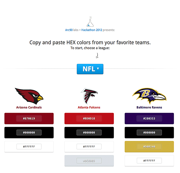
I wrote a quick overview of the original project’s conception, design, and coding back when it launched in early 2013 (which you can read here).
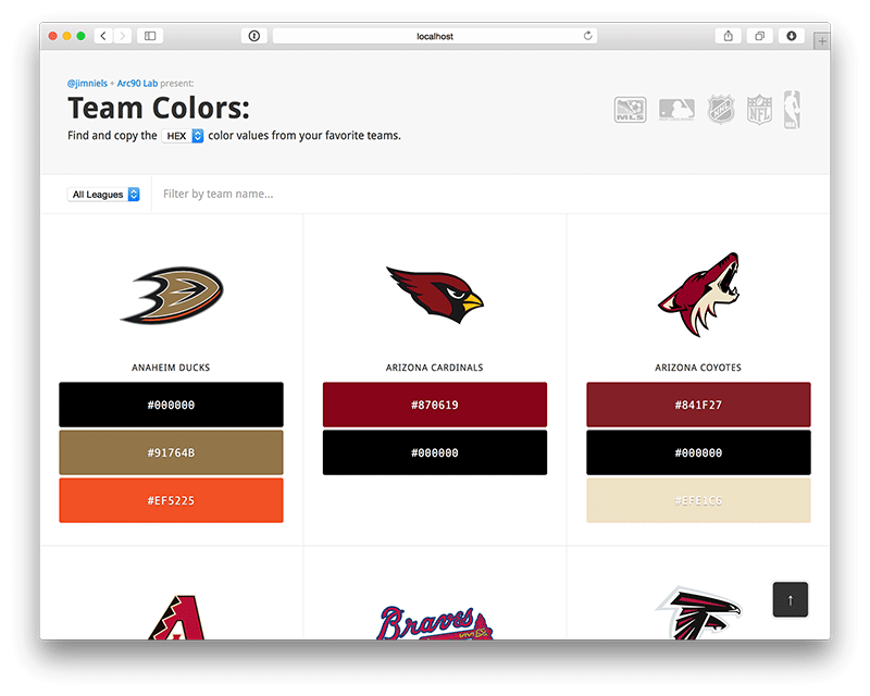
Throughout these past two years the page has continued to receive content updates (new teams, colors, logos, etc) from both myself and a few voluntary contributors on Github. It has proved to be a viable resource for a variety of people on the web. But it has never received a face lift...until now! So, without further ado, I present Team Colors 2.0:
Design Goals for 2.0
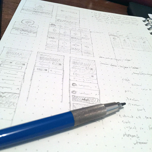
After sketching some initial ideas and reviewing feedback, I made a small list of goals I wanted to achieve with a 2.0 redesign from both a technical and UX perspective:
- Universally accessible
- Optimal responsiveness
- Filter functionality
- Simple deploy process
Accessibility
Borrowing from the design vision of the web itself, I wanted to ensure this site remained universally accessible. To achieve this goal, the initial page load serves a simple, coherent HTML document listing teams and corresponding colors categorized by league:
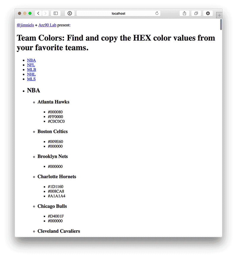
As you can see, the initial HTML document is a giant list with a kind of key/value structure. Additionally, at the top of the page are anchor links to each part of the document, making browsing easier while simultaneously making it easier to quickly grasp the content and structure of the document as a whole.
Table of Contents

- Anchor link to League 1
- Anchor link to League 2
- Anchor link to League 3
- Anchor link to League 4

Content

- League 1
    - Team 1
        - Color 1
        - Color 2
    - Team 2
        - Color 1
        - Color 2
        - Color 3
    - [...]
- League 2
    - Team 1
        - Color 1
    - Team 2
        - Color 1
        - Color 2
    - [...]
- League 3
    - [...]
As noted, a goal of 2.0 was to provide a search/filter mechanism so users could quickly and easily find the exact team they were looking for. Because this primary experience would be achieved using javascript, I could have selected to initially serve the HTML page empty and then retrieve and render all the data with javascript. This, of course, would leave out anyone with javascript disabled.
So, with the goal in mind of accessibility, I decided to serve a bare bones HTML document without styling yet full of content. Thus users who have javascript disabled get a simple, easy-to-browse text document listing all teams and associated colors. Users who have javascript enabled, however, get a much improved experience as javascript is leveraged to inject styles, paint colors, load team logos (lazily, I might add), convert color values, and much more.
Thus the site provides an progressively enhanced experience. Accessibility? Check.
Responsive
Team Colors 1.x was already fully responsive. I wanted to keep this as a clear goal for 2.0. I also wanted the experience to be slightly modified, yet still superior, depending on the screen size. This led me to the decision which informs the design you see today: an expanded list of team colors on larger screens and a collapsed, but interactively expandable, list on smaller screens:

Responsive site, optimized for screen dimensions? Check.
Search
I realized that having (what aspires to be) a vast compendium of information meant a search mechanism was a necessity. This would allow users to quickly find the exact team they were looking for irregardless of league categorization.
The original 1.x version of Team Colors presented a simple tabbed view of the teams categorized by league. So the browse experience went something like this: the initial page load would render the default league (NFL), if the team you’re looking for is not in that league, you’d have to browse to the tabbed league view of the team you’re looking for and then scroll until you found it.
With 2.0, the initial page load lists all teams by default. Then you can filter the teams by league or simply search for the specific team you’re looking for by keyword.
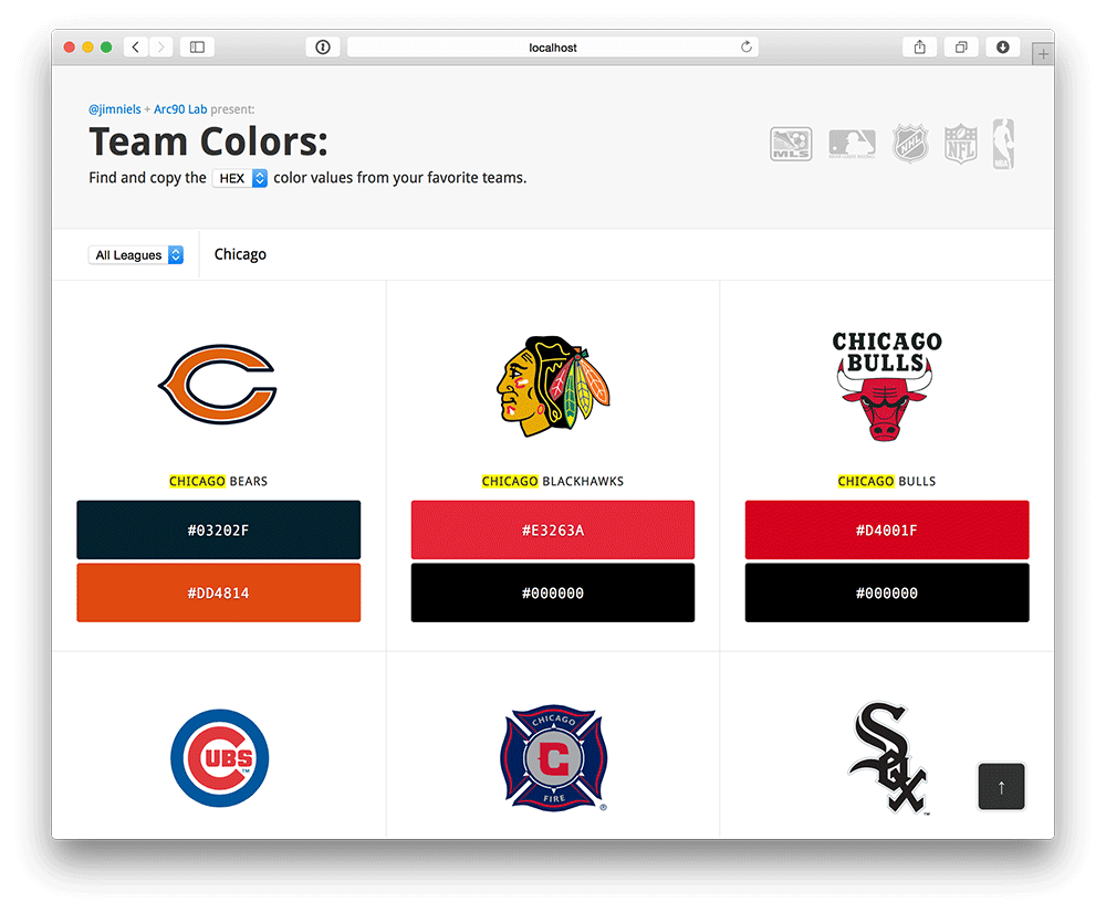
Search-able, filter-able, and browse-able experience? Check.
Deploy Process
The previous deploy process for Team Colors was somewhat convoluted. Any time a change was made, even something as simple as changing one team’s HEX value, I had to send an email to someone at Arc90 who had access to their servers. They then had to grab the code from Github, run a deploy script, and dump the results in S3.
A much easier way to manage the deployment of major or minor changes was to switch to Github Pages. Now the process is simple: anytime anyone makes a commit and pushes it to Github the changes are deployed by Github’s build process and reflected almost instantaneously. This required transferring ownership of the Team Colors repo from Arc90’s Github to a new Team Colors organization. It also required providing a CNAME on Arc90’s subdomain teamcolors.arc90.com to teamcolors.github.io.
Push code, instantly see changes live? Check.
Conclusion
I love the new Team Colors. I find it easier to use and more feature-rich (including simple interactions like ‘click to select’ for color values). I think it also encourages serendipitous discovery of teams across leagues.
Do you want a more detailed look at the code? Do you want to make your own contribution? Check out the Team Colors repo on Github.