At Kindling I’ve recently been experimenting with an aesthetic that mixes hand-drawn imagery with digital typography, illustration, and photography. It has been going rather well thus far, even though the last thing in the world I would consider myself is an “illustrator”. We decided our blog would be a good place to begin playing with, testing, and possibly introducing this aesthetic into our brand because it allows us to easily abandon the idea in the future.
I believe this approach has worked rather well so far, in part, because Kindling’s business revolves around ideas and ideas are often rough and best expressed through scribbles on a napkin or drawings on a white board. However, at the same time we are a software company that deals in digital so interweaving hand-drawn and digital visual imagery feels like the right fit for our brand.
The Process
The process for creating these visuals is usually pretty straightforward (FYI–I use Paper by 53 in combination with their stylus as my digital canvas for drawing, it’s an incredibly polished tool that I absolutely love working in). Usually I’ll get a rough draft of the blog post to read or a conceptual overview of the topic from the author. This allows me to wrap my head around what is trying to be communicated and what kind of visuals will help convey that message. This part, the figuring out how to supplement the author’s message in visual form, is definitely the most difficult part of the process. Sometimes blog posts will have topics which lend themselves very easily to visuals. Other times I find myself really straining to create a visual that will support rather than detract from the message.
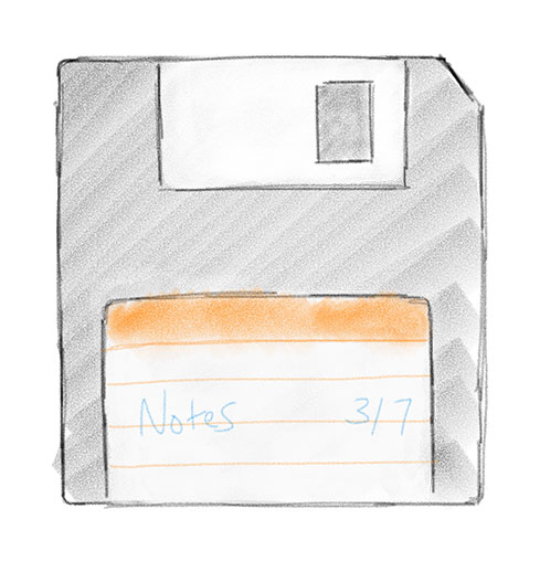
For example, Tim Meaney wrote a blog post about questioning legacy tools and ideas. He used the example of a floppy disk throughout his article to serve as an example of a legacy tool in the modern age. This made conceiving artwork easy: the blog post leveraged the idea of a floppy disk throughout the post, so I could just draw a floppy disk.

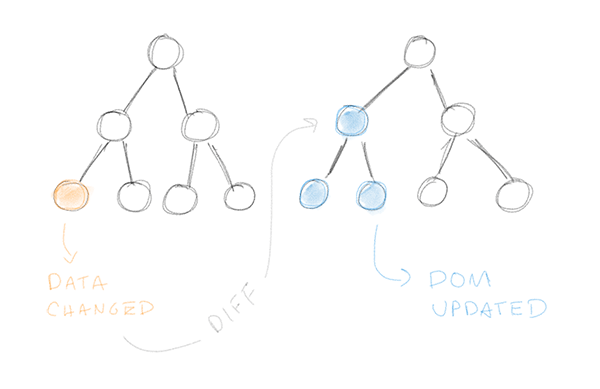
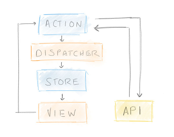
However, not all blog posts lend themselves to artwork so easily. As an example, Christopher Pappas wrote a more technical piece explaining why we use React.js at Kindling. His post delved into engineering explanations that did not lend themselves to ubiquitous imagery people outside of technology would recognize. Instead, I created a conceptual drawing to illustrate the core technical concepts the article was trying to communicate. This produced imagery more akin to what you’d see on a white board as opposed to some real-world object.


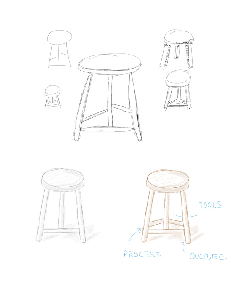
Of course, I never get these visuals right the first time. Usually I have to start with simple point-to-point sketches and then expand on details and color as I go. For example, a blog post is being written right now about the essential parts of an innovation program. The author is leveraging the metaphor of a barstool with three supporting legs throughout his writing and requested a visual to go along with it. So, to accommodate this request, I started by sketching simple lines. From there I tried expanding those into shapes, then looked at possible shadowing, and finally redrew the stool more precisely with colors and what not.

I’m kind of excited to see where this type of imagery leads us. It has a unique style which can be refined and polished in some contexts, while also rough and conceptual in others—a trait that perfectly represents the state of ideas in the world...and Kindling is all about ideas.