As part of an effort to bring relevant video content to existing and potential customers, we produced and edited in-house a set of video conversations on innovation. When the idea was born, we called it “Kindling Academy Live” because, well, we needed a name for it and one of the employees in the videos was the head of Kindling Academy. So that name seemed sufficient.
Once the videos were in post-production and we began to think about where they would live on our marketing site, we ran into some architectural issues. Because we were referring to these videos as “Kindling Academy Live” there was an unspoken assumption they would live within the top-tier section of our website called “Kindling Academy”. But in the implementation phase, we realized it wasn’t quite that simple. The more we talked, the more we realized this new content wouldn’t fit into the Kindling Academy architecture at all. Our innocent naming choice had not been innocuous. It held subtle and misleading connotations which had led us down a road of wrong assumptions where we kept trying to fit a square peg in a round hole.
Since the videos had already been shot, we looked at their content and began talking again about their nature and function. Who are they for? What’s their purpose? What do they consist of? The more we talked, the more we realized the scope of these conversations was larger than just the Kindling Academy (which housed content for existing customers only). After discovering this problem in naming, we devised a new working name for the video conversations: “Let’s Talk Innovation”. This new name helped us understand that these pieces of content merited a top-tier spot on the website.
The Actual (Visual) Design Part
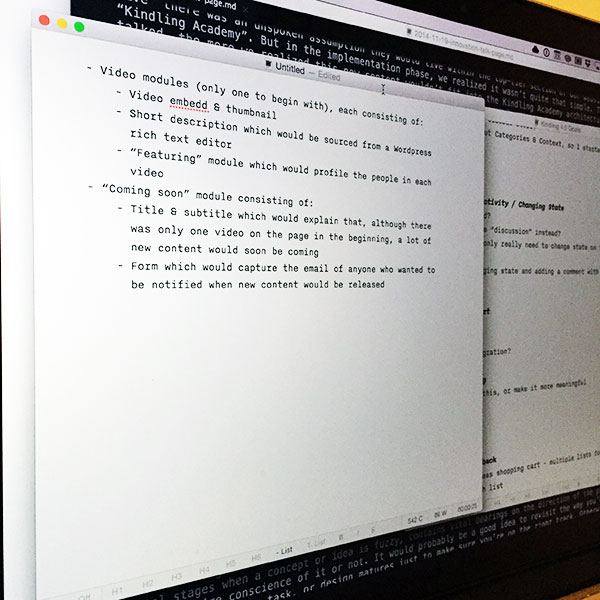
A new name and a new top-tier spot meant we needed a new page design. This fell to me. My first tool wasn’t jumping into Photoshop. It wasn’t even sketching on paper. My first tool was a text editor.

I needed to determine what content modules would make up the page and what their respective elements would be:
- Video modules (only one to begin with), each consisting of:
- Video embed & thumbnail
- Short description which would be sourced from a Wordpress rich text editor
- “Featuring” module which would profile the people in each video
- “Coming soon” module consisting of:
- Title & subtitle which would explain that, although there was only one video on the page in the beginning, a lot of new content would soon be coming
- Form which would capture the email of anyone who wanted to be notified when new content would be released
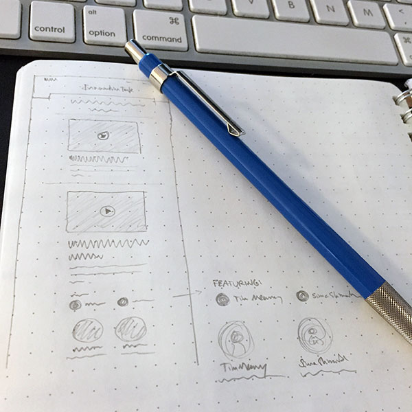
Based on this content, I sketched a few initial ideas within the framework of the existing marketing site.

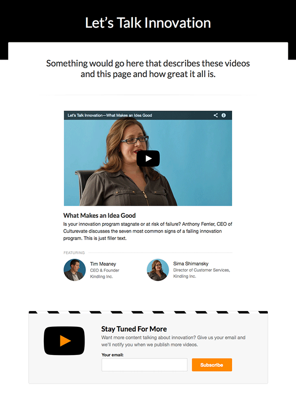
From there I jumped into Sketch to layout the design of the content modules. The design came together rather quickly.

Lesson? Naming is important and should be revisited as you iterate. The way you name something, even in the initial stages when a concept or idea is fuzzy, contains vital bearings on the direction of the project—whether you’re consciousness of it or not. It would probably be a good idea to revisit the way you’ve named a project, task, or design as it matures. This would help ensure you’re understanding of the thing hasn’t deviated from the original conception (and if it has, make sure it’s for good reason). Otherwise you’ll eventually hit a wall and wonder, “why isn’t this thing working? It seemed so clear at first...”. It could be because the words you use to talk about the thing you’re creating hold subtle assumptions which may be slightly incorrect.