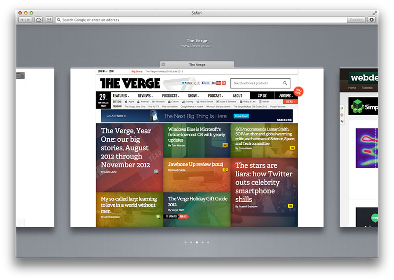
Apple's Safari 6 introduced a new tab switching experience. By activating the feature, Safari presents you with a bird's-eye view of open tabs. 100% of the active tab is previewable while only about 15% of it's left and right sibilings are previeweable.

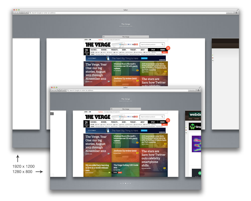
This experience of previewing your tabs is consistent no matter the application's viewport size. You always see 100% of the active tab and about 15% of it's left and right siblings.

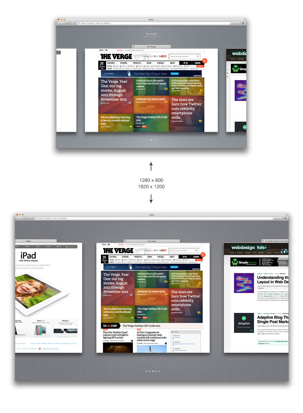
Wouldn't it be neat to see the preview of the active tab's siblings grow as the viewport grows horizontally? Essentially, if I had a large monitor I would be able to see more of the sibling tabs' previews.

As you can see, as the window grows in size horizontally it would reveal more of the sibling tabs' previews rather than increase the tab preview sizes. Visually this would help form a more cohesive mental model of the spacial relationship between tabs. It would also help tremendously for any site-comparison a user might be doing.