Visualizing SF Font Variations
I recently watched Apple’s WWDC2022 video “Meet the expanded San Francisco font family”. In it, Vincenzo talks about the design of Apple’s new San Francisco font families and how you can use these new variations in your designs to help provide emphasis, contrast, and style.
Some of these [new] styles are more neutral; others are more expressive. Every style is functional in its own right, but depending on the design intent, some will perform better than others.
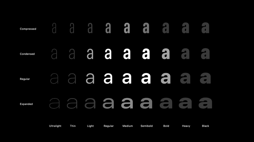
At one point, he shows a slide that displays the character “a” set in various families and weights on a grid. The x-axis denotes the family (Regular, Condensed, Expanded, etc.) while the y-axis denotes the weight (Regular, Bold, Light, etc.). It’s a “stylistic map” of the San Francisco font. He explains:
There are no absolute rules in typography, but you can expect the styles that gravitate towards the center of the stylistic map of San Francisco to have a more neutral voice, while the styles around the perimeter of the map, which feature more extreme weight and width proportions, to be more expressive, have a stronger voice, attributes that can be useful if you want to draw people's attention towards a certain area of the UI or strengthen a typographic hierarchy.
What really intrigues me is the visualization that accompanies his presentation.
What he’s describing I sort-of know intuitively from years of setting type in designs. When working on a design, I’ll often step through variations of a font until I hit the right amount of attention or emphasis that I want to provide for a given element.
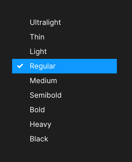
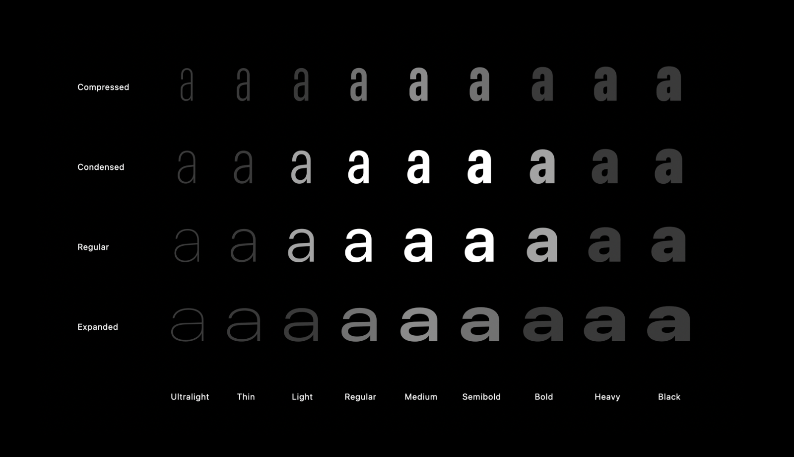
However, my mental model for stepping through variations in type is tied to the font picker UI in my design tools: a dropdown list. For example, I might go up or down the list of weights to see if I like the outcome:
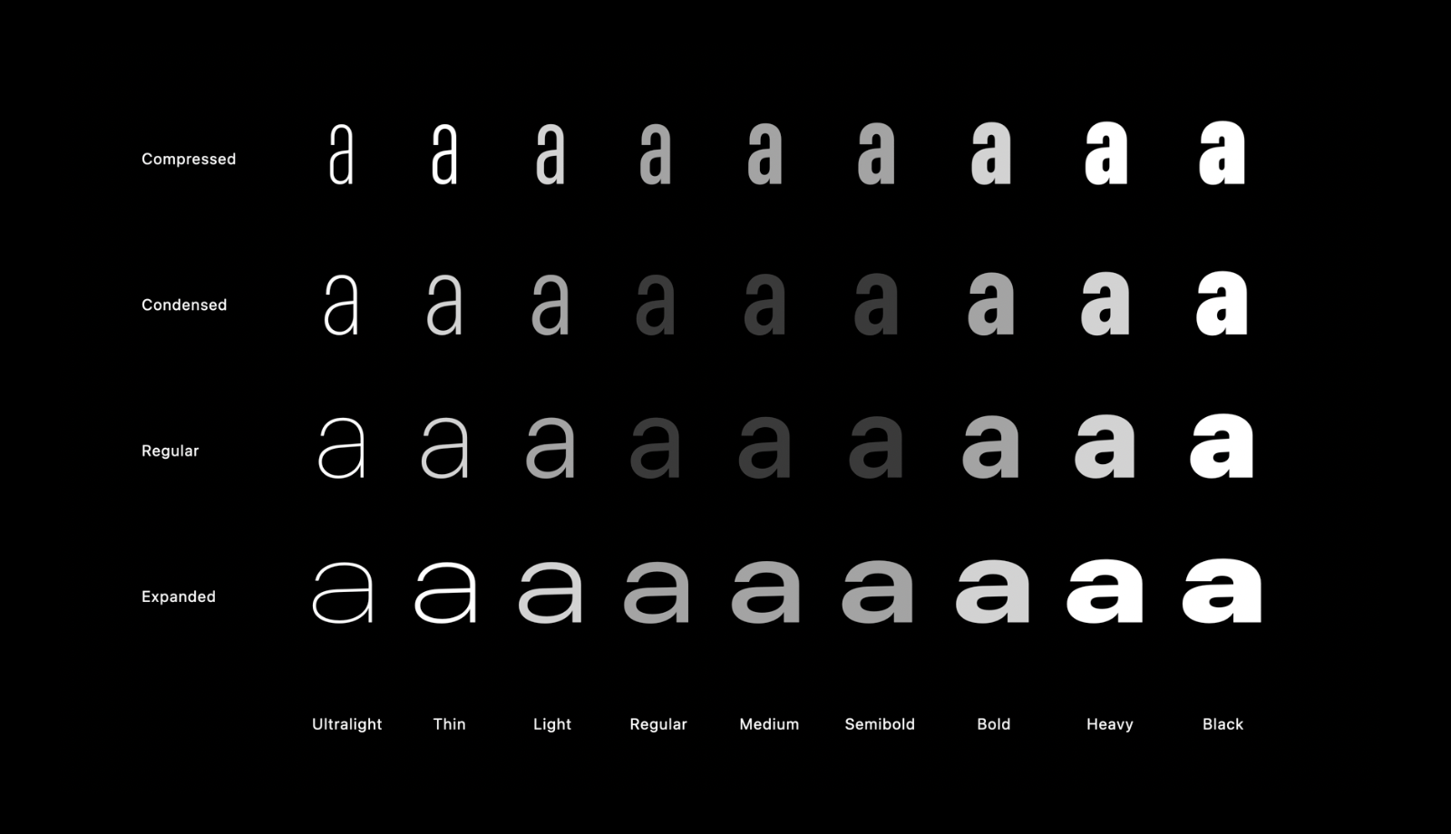
If that’s leaving me unsatisfied, I might switch to going up or down the list of families:
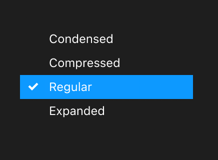
Ultimately, what I have in my head is two distinct, one-dimensional scales from which I alternate choosing.
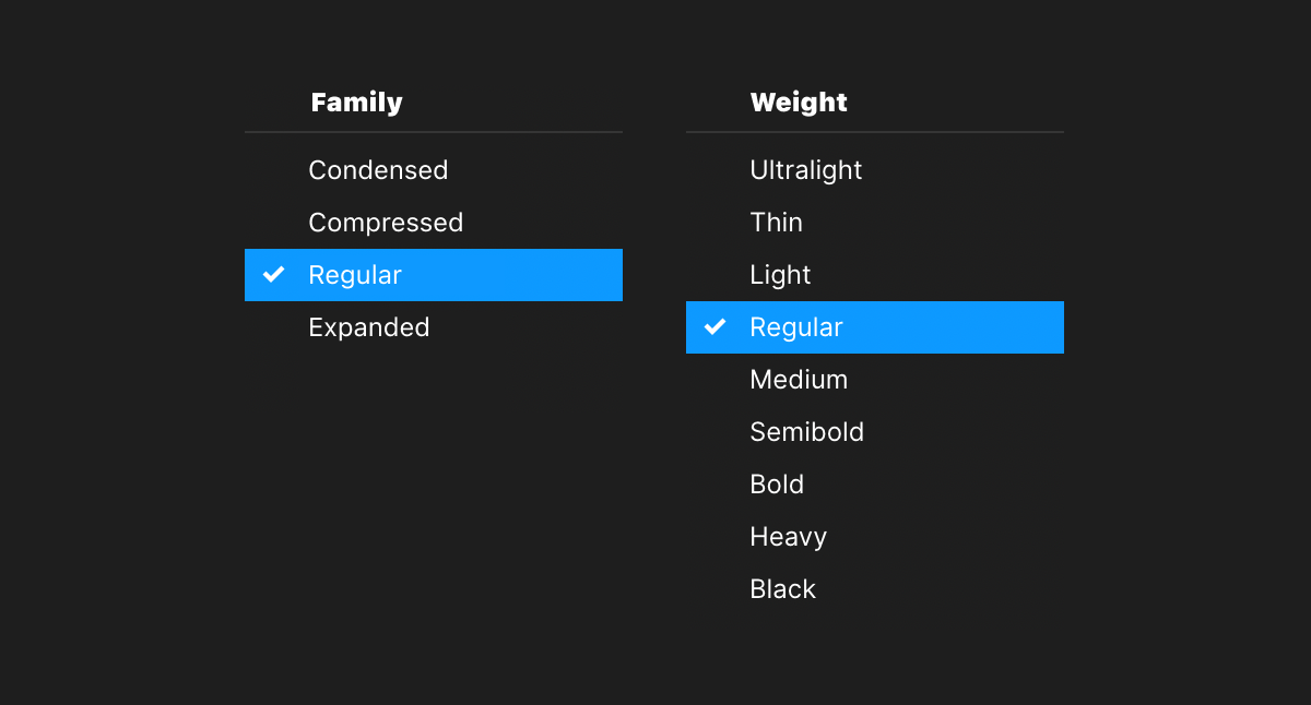
You may understand, now, why putting these options in a two-dimensional grid was so intriguing to me: it visualizes a concept I only ever grasped intuitively — this is what great graphic design does!
You have a two-dimensional grid of stylistic type choices.
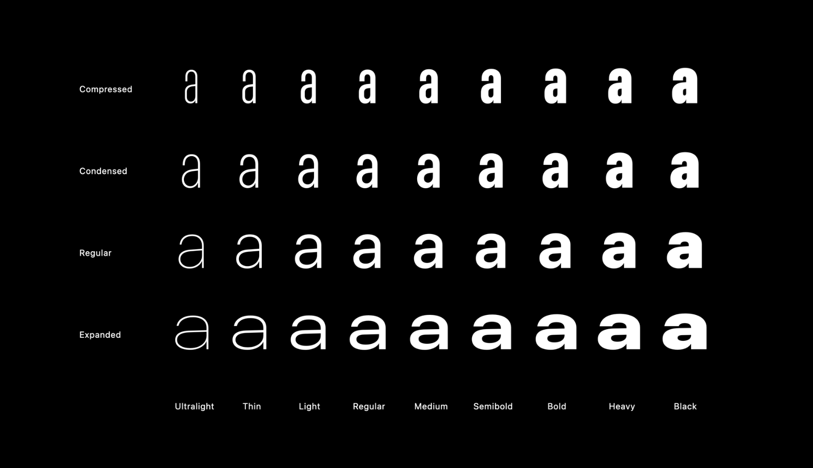
The center focal point of the grid represents design choices for a more natural voice.
While the outer edges of the grid represent more extreme design choices, granting more expressiveness and garnering more attention.
This visual depiction illustrates the spectrum of selecting type. The more drastically you step between family and weight variations, the more contrast and visual emphasis will show up in your designs.
For example, if you start with type towards the center of the grid you can then jump one row or column to an adjacent cell for subtle but effective type variation in some design contexts.
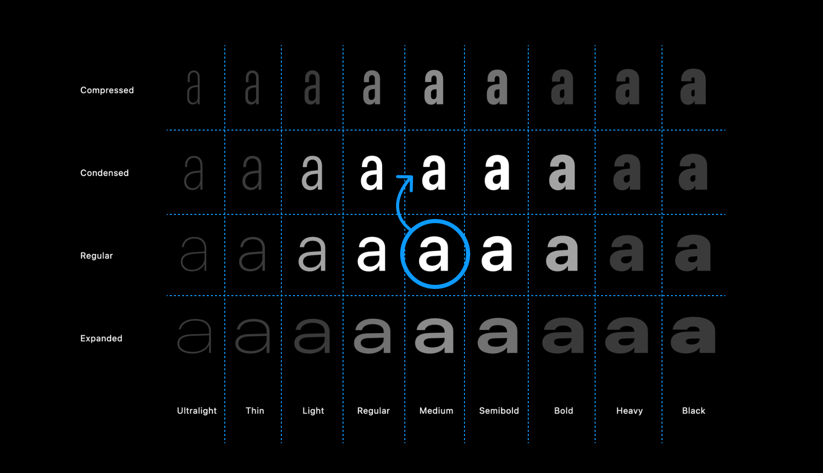
The further you cross cells, the more juxtaposition your text will have.
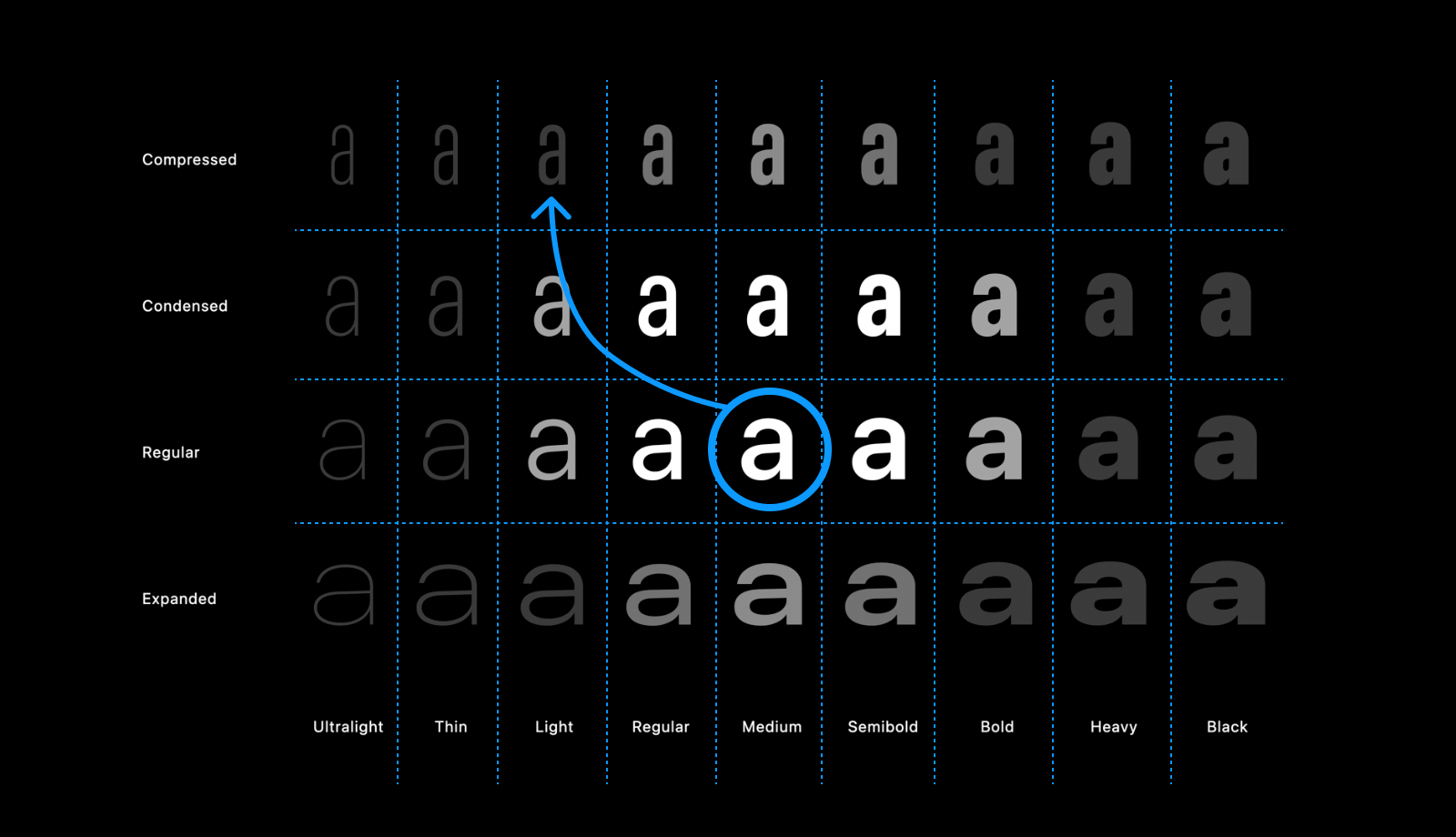
Until ultimately, you reach the outer boundaries of the “stylistic map” and can’t go any further; thus providing the most contrast and variation possible short of switching to a new font entirely.
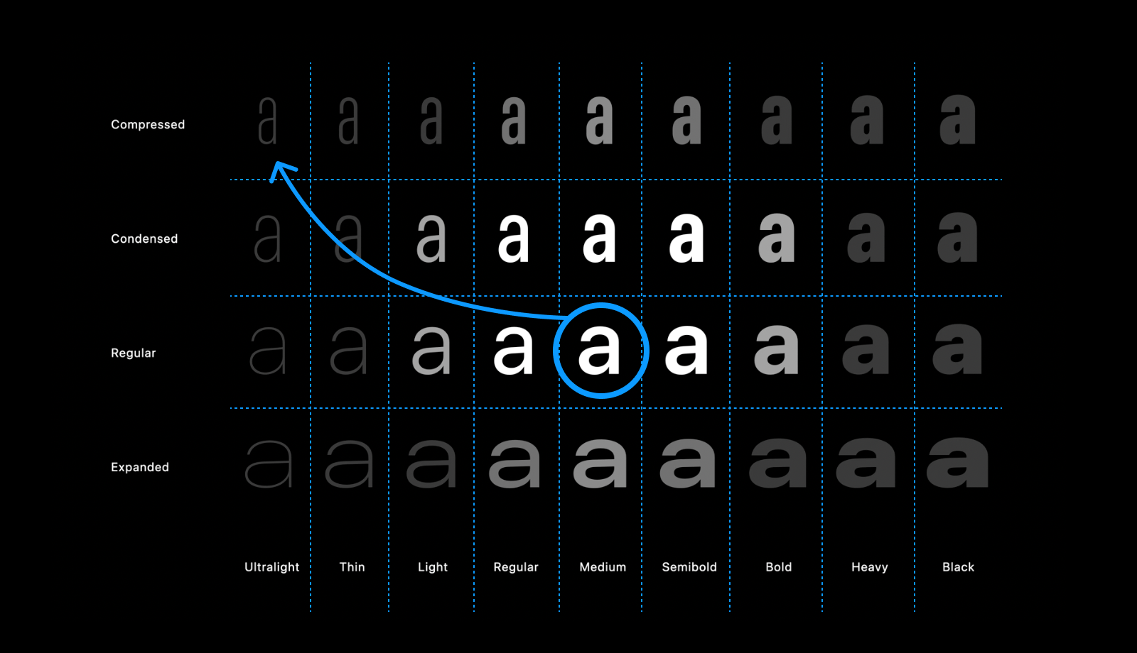
Seeing the character “a” laid out on a grid with radial variations expanding outwards in a continuum of expressiveness and contrast is an intriguing visualization that resonates with my own intuition for picking fonts. Somehow I’d never really seen this kind of visualization. So here I am blogging about it.
The end.