The Cluttered Web: A Scrapbook of Sreenshots
A little while ago, Ethan wrote a piece that started like this:
I’ve noticed a recent trend on the web — or at least, on the parts of it I’ve visited. Maybe you’ve noticed it too.
He then enumerates website screenshots with app banner prompts.
The post resonated with me because every single one of those screenshots felt so exasperating familiar.
And the exasperation isn’t limited to app banners. I immediately thought of something I’d tweeted prior:
I feel like it’s cliche at this point to post screenshots of how difficult it is to read anything on the mobile web sometimes. And yet, I can’t help myself. – @jimniels, July 2021
I know it feels like a trope to talk about how cluttered, and frankly user-hostile, the mobile web can be. But something about Ethan’s post—something about screenshot after screenshot after screenshot—made me want to collect my own scrapbook of screenshots.
I wanted to try and capture the exhausting yet common patterns Christian and Max describe when you follow a link on the web today. Here’s Max’s outline:
- Cookie consent pops up, intentionally confusing. (You're tired - just hit "Accept All".)
- App download banner asks you to install the native app. (Dismiss.)
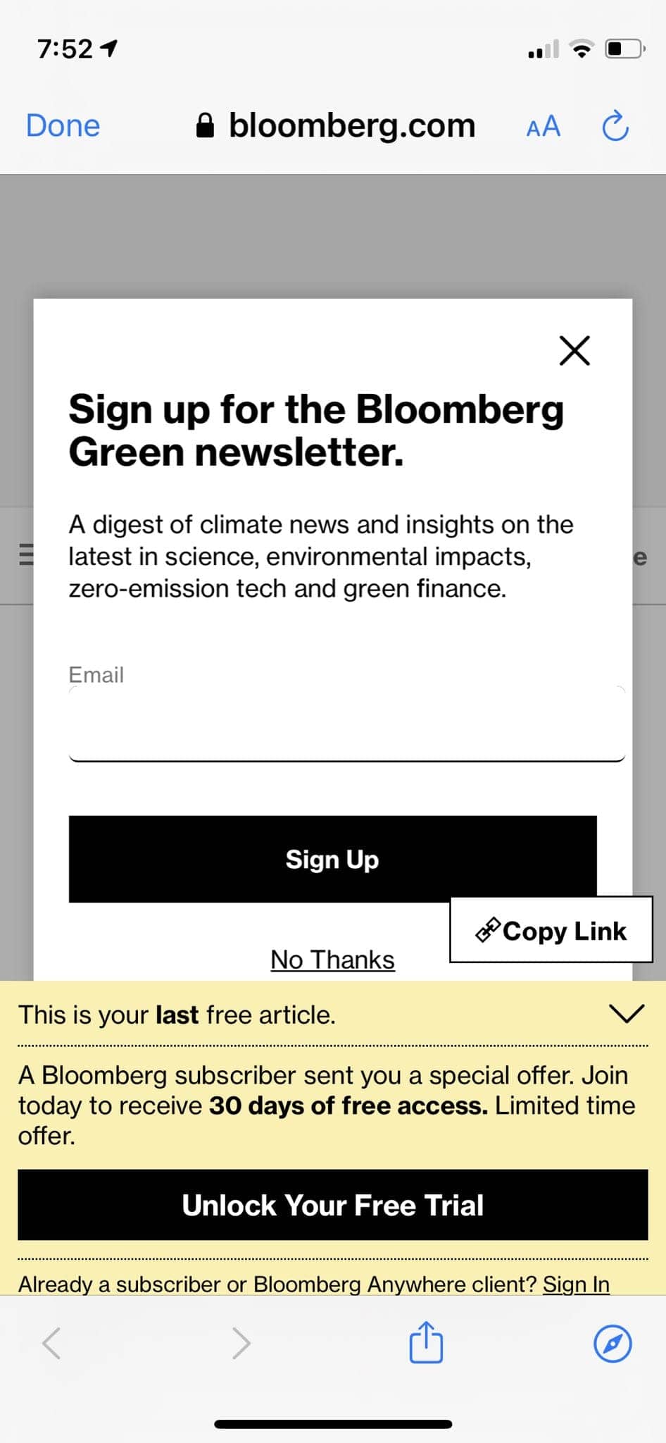
- Newsletter modal blocks the site, asking for your email address. (Close it.)
- Start reading a few paragraphs, before another modal requires you to create an account. (Leave site, frustrated.)
As Ethan noted, these kinds of design choices give you insight into a company’s design priorities and business posture towards the web.
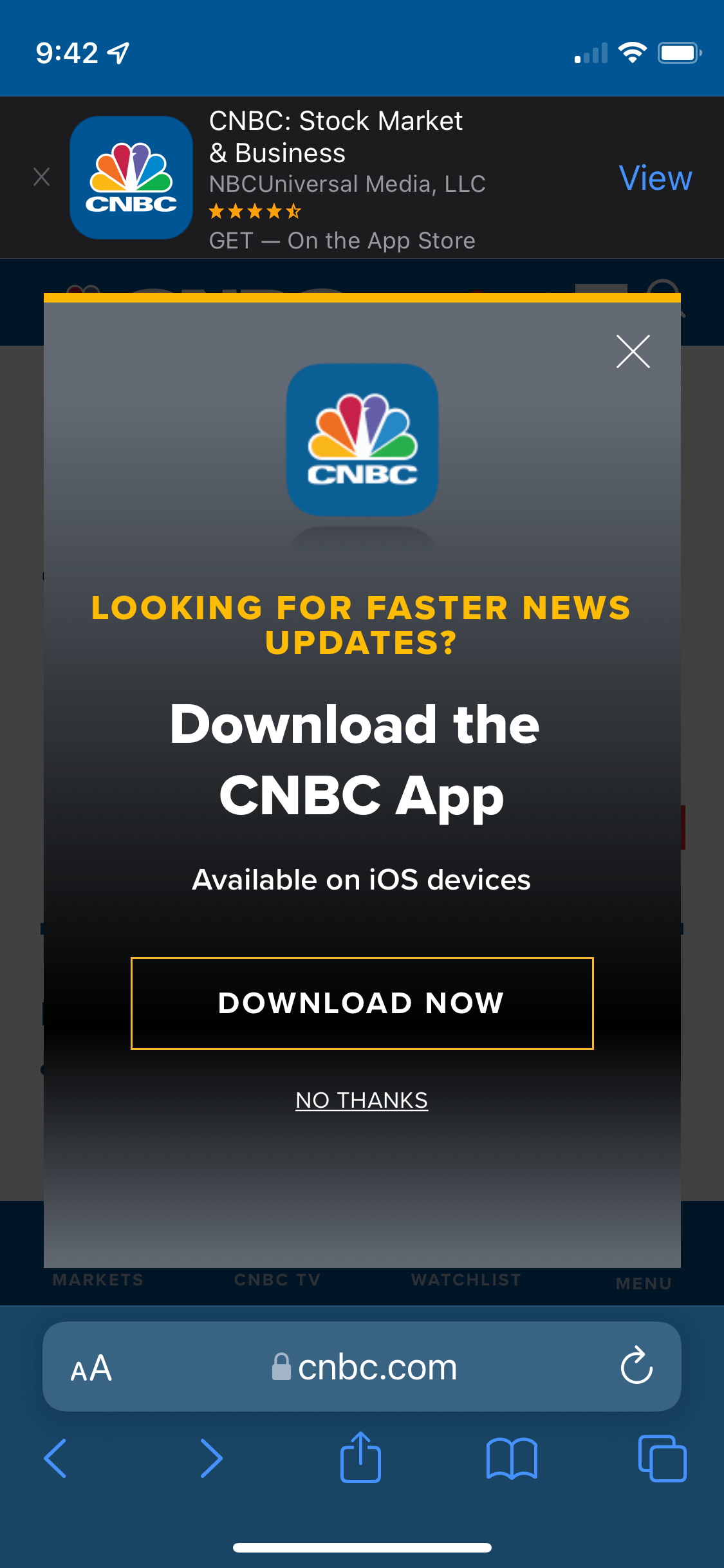
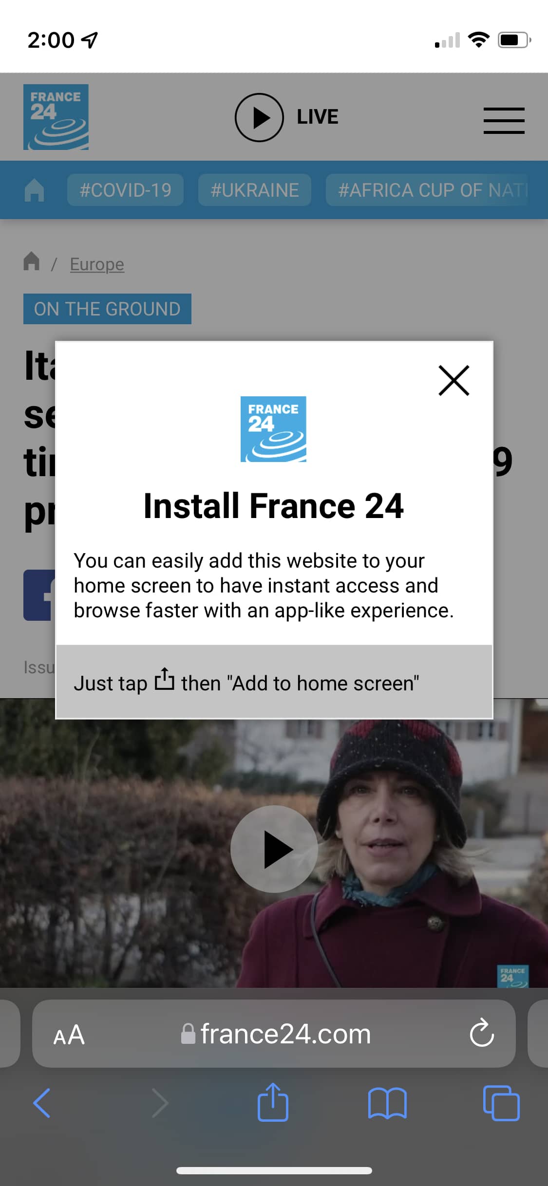
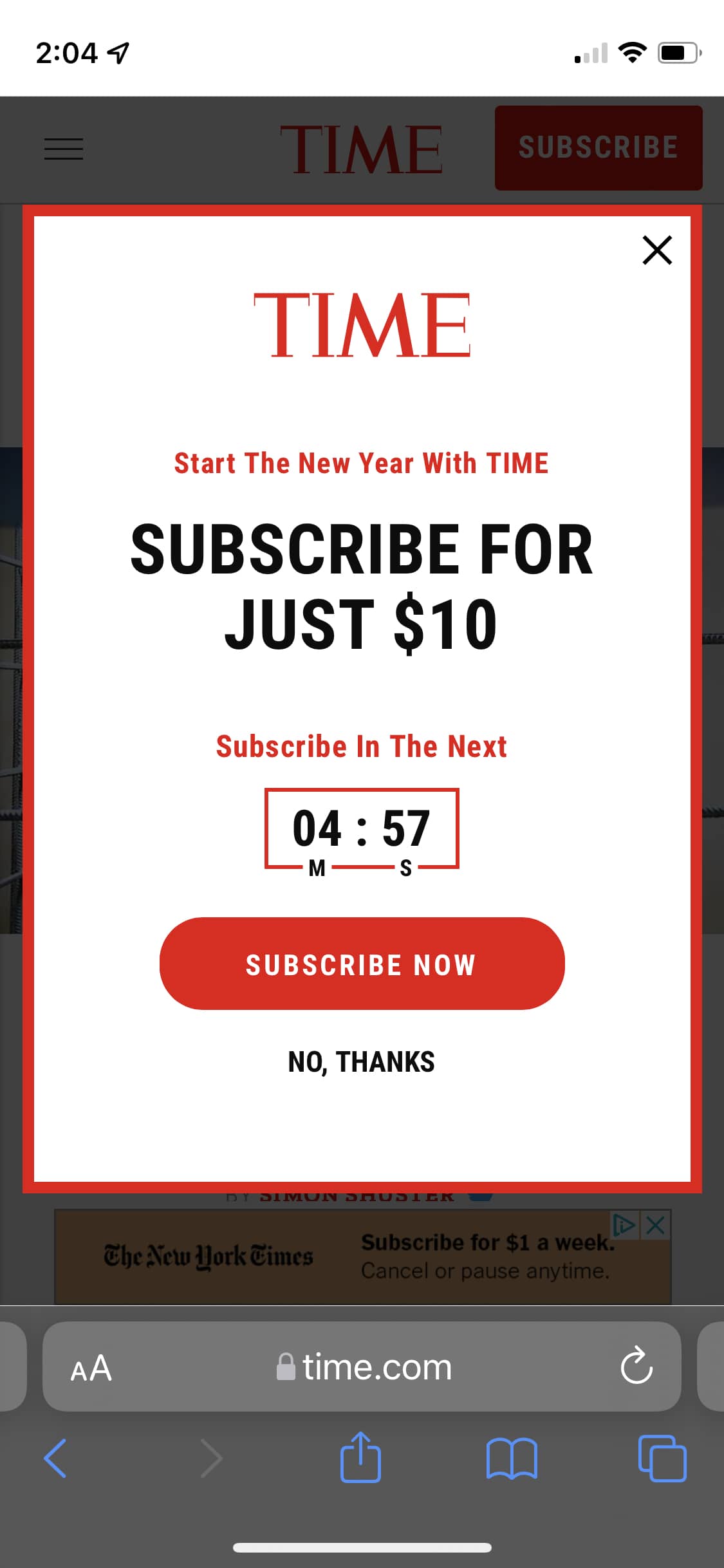
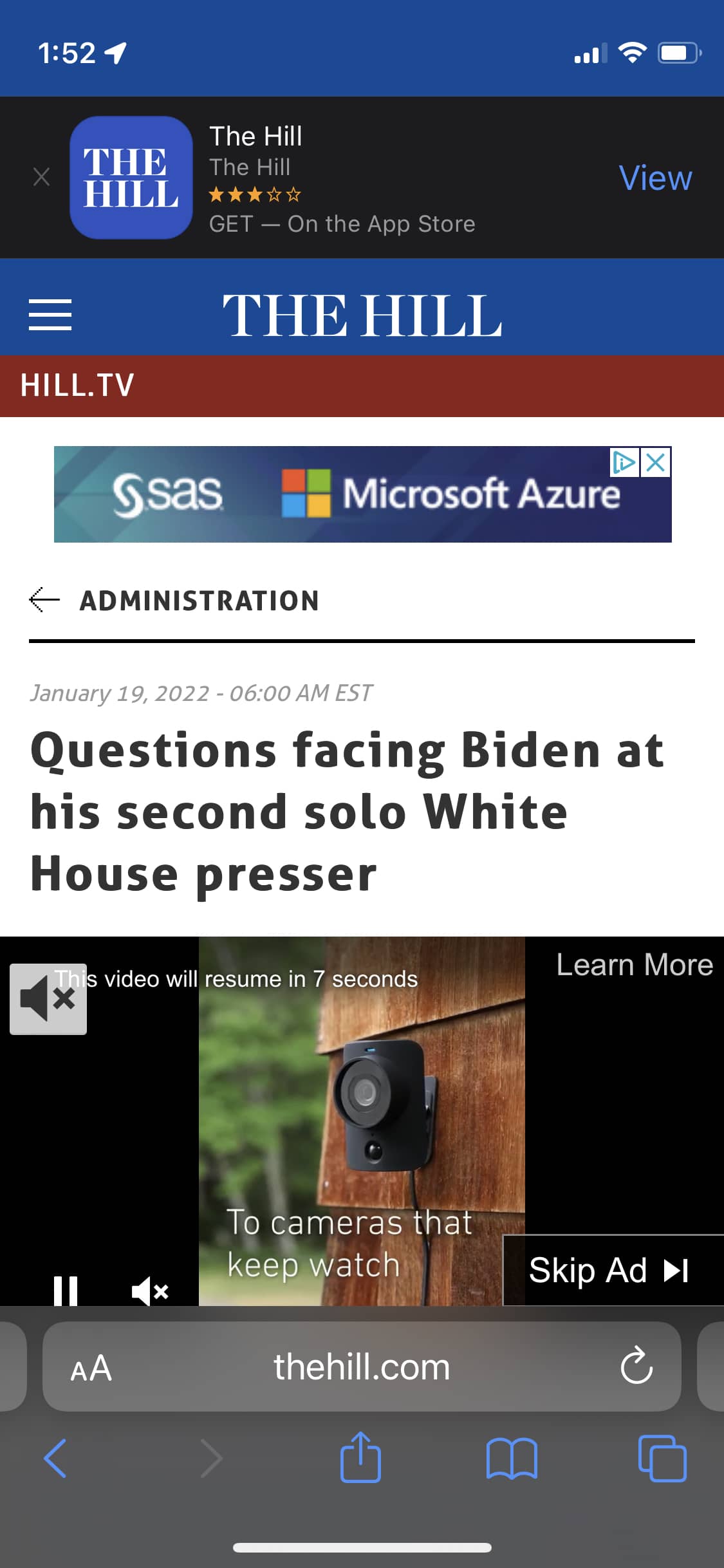
So I’ll start where Ethan left off: app banner prompts. There are app banners which make small asks, and then there are app banners which nigh make demands.
And it’s not solely native apps asking this way, it’s web apps too:
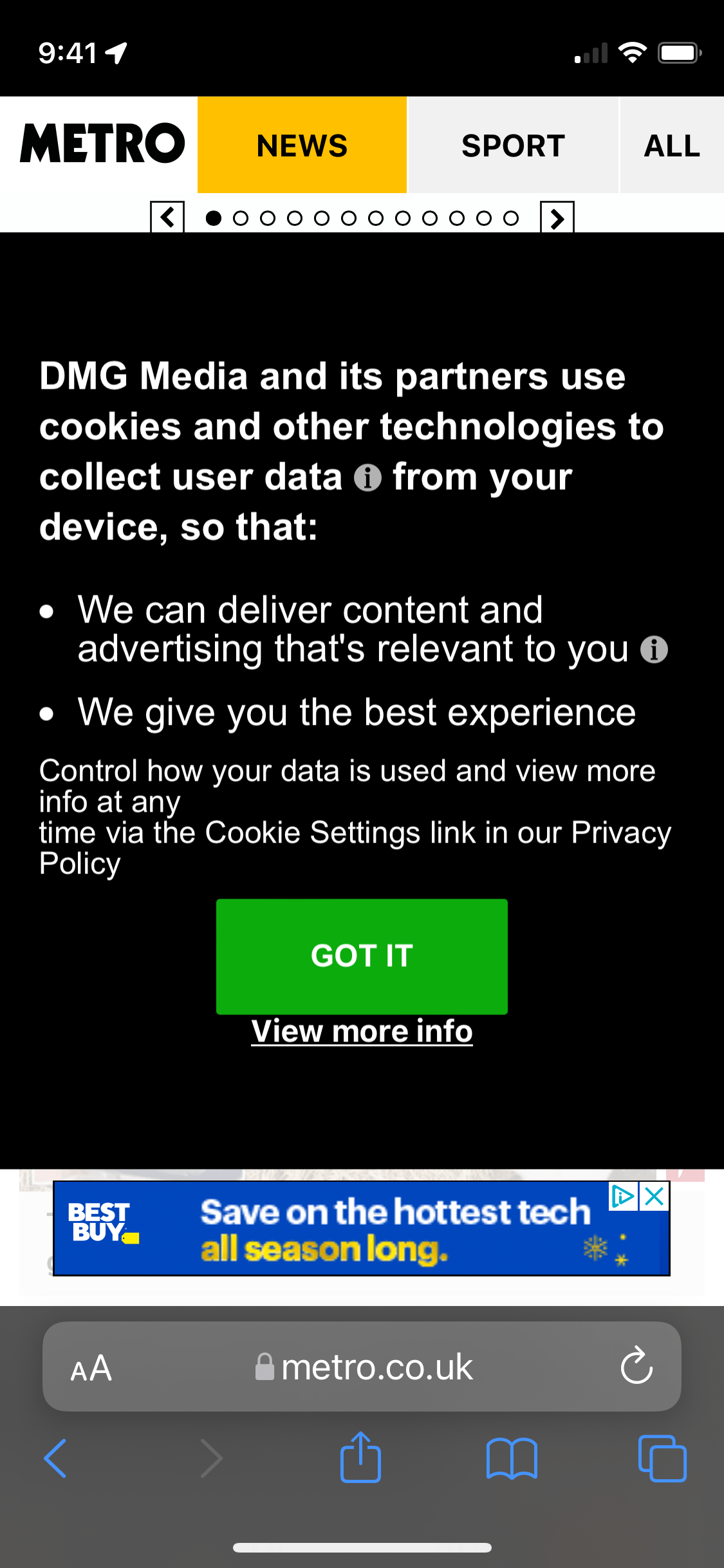
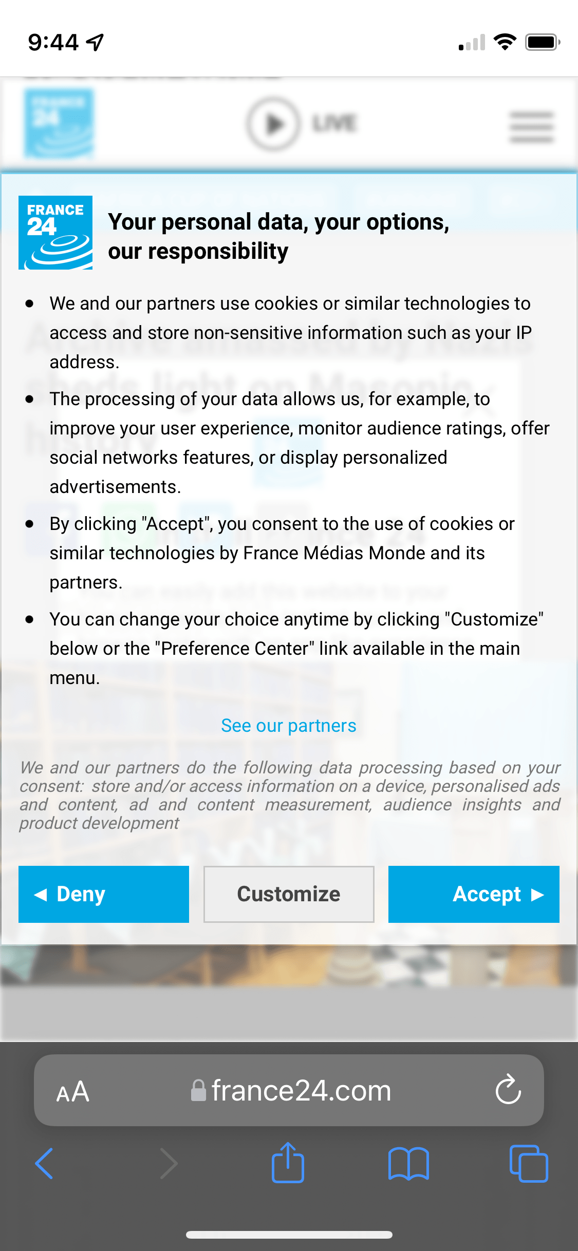
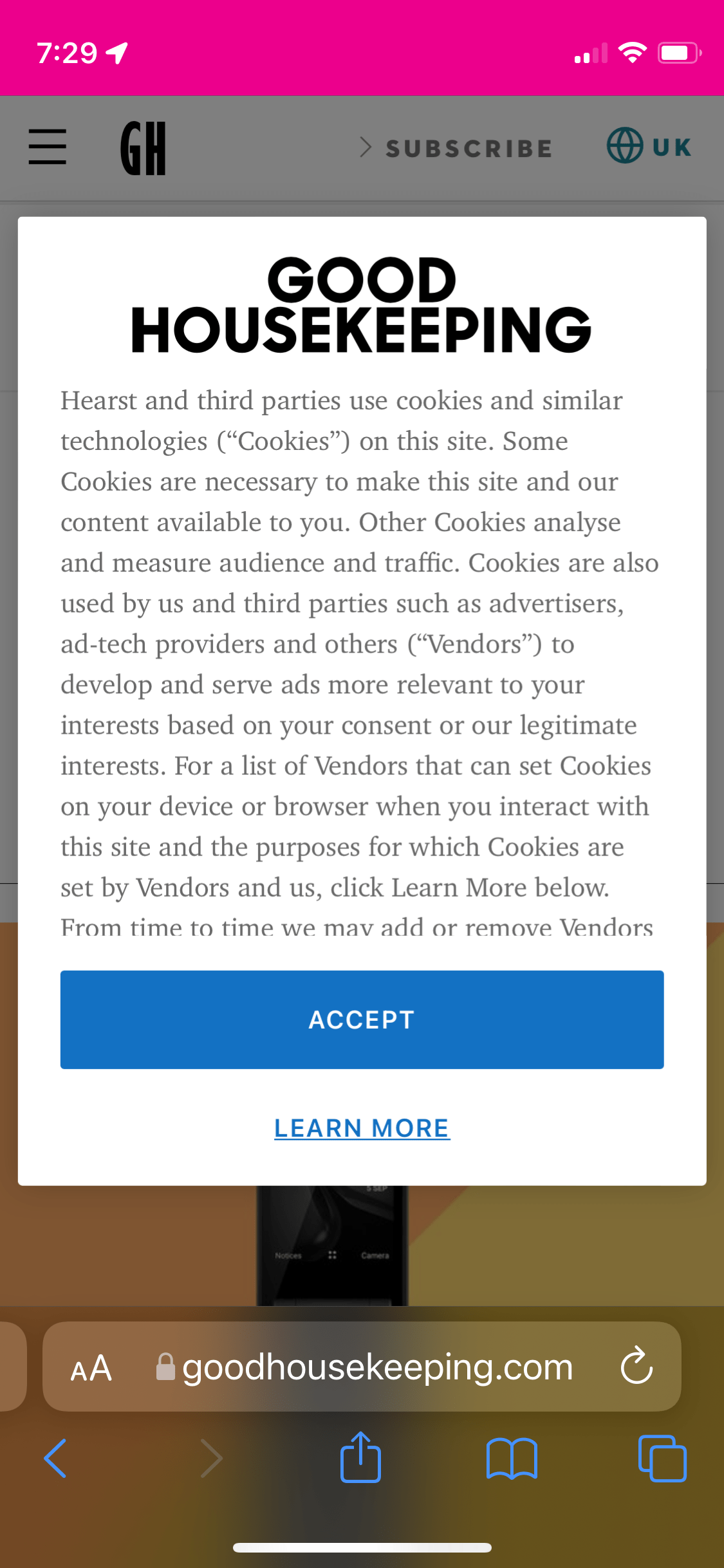
Then there’s the GDPR acknowledgments we all know and love:
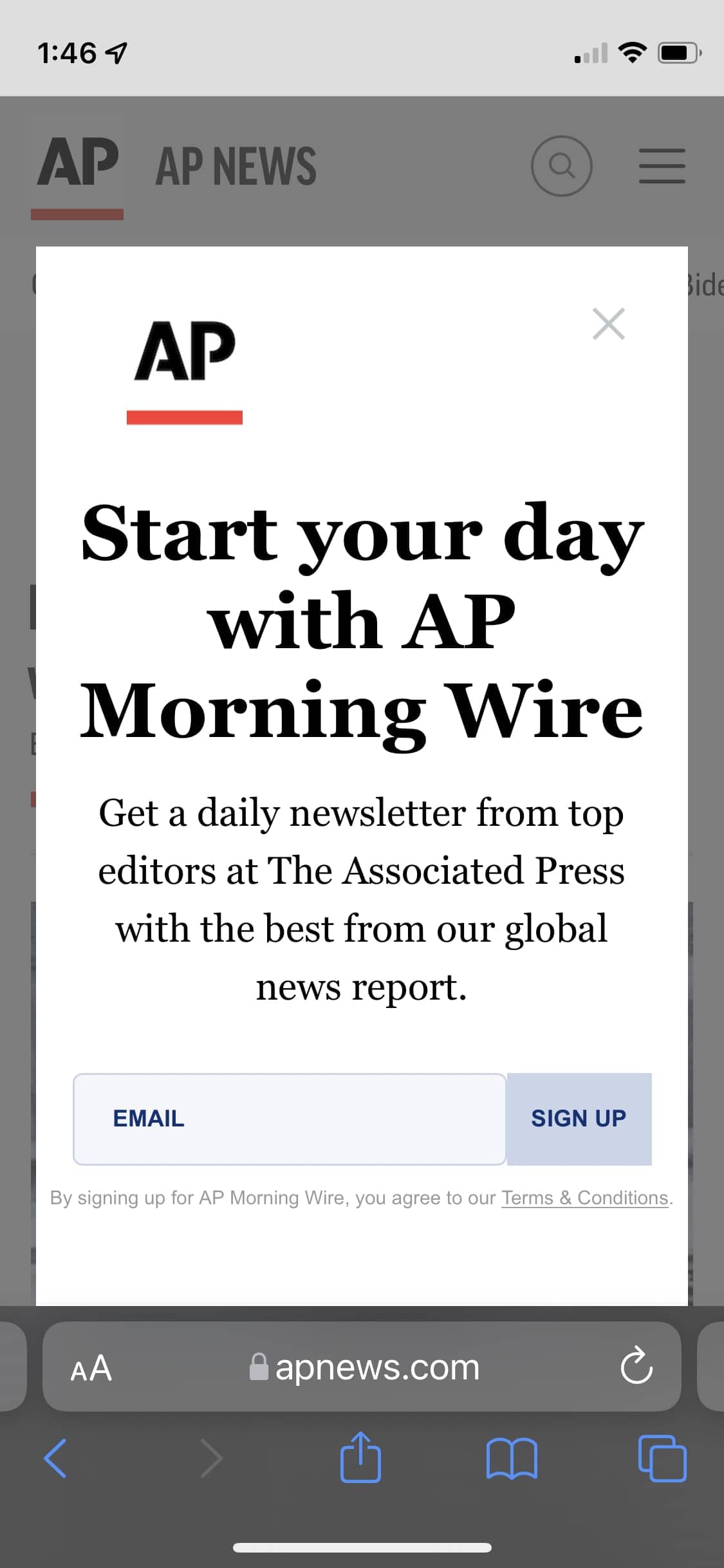
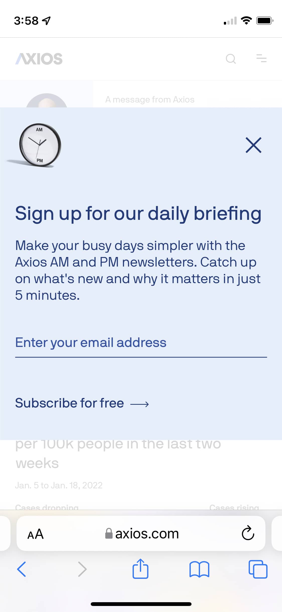
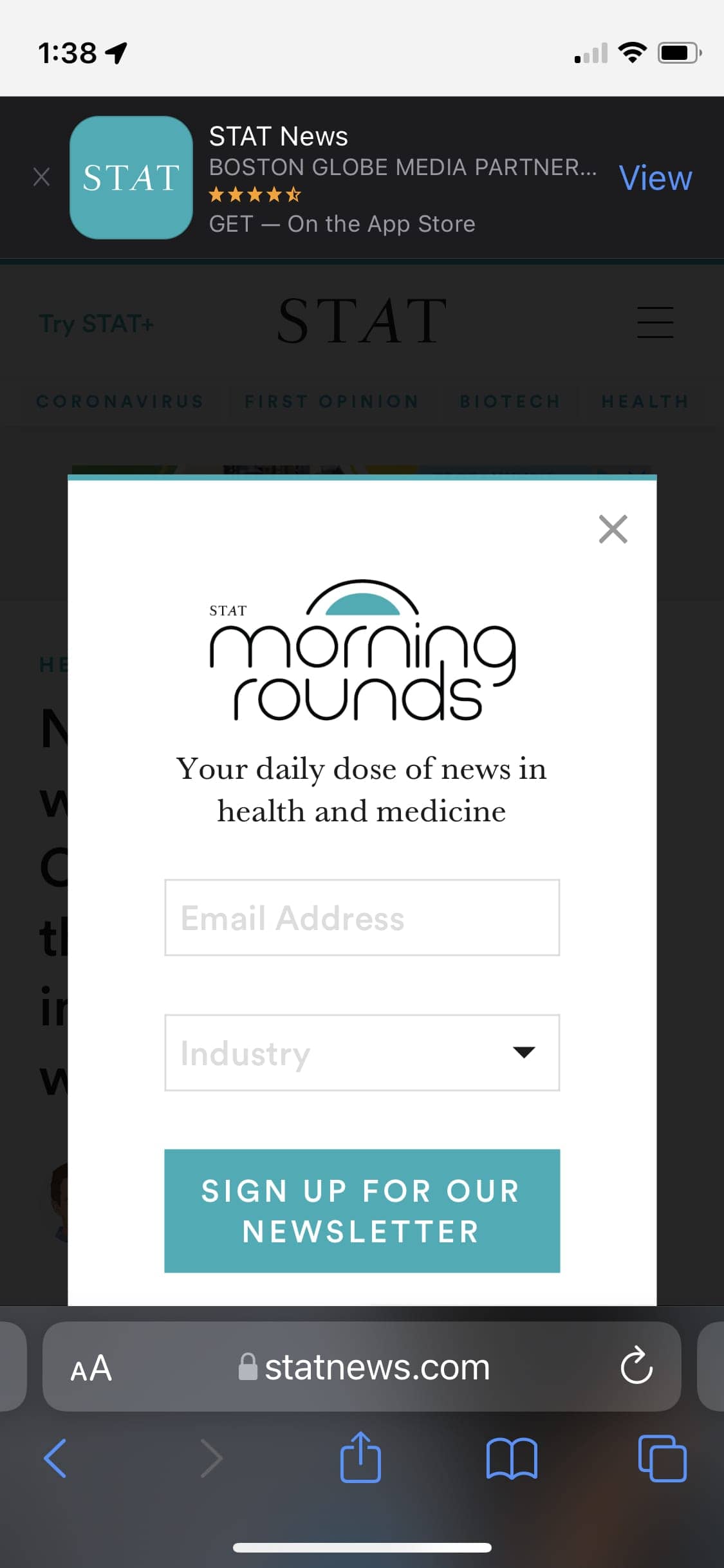
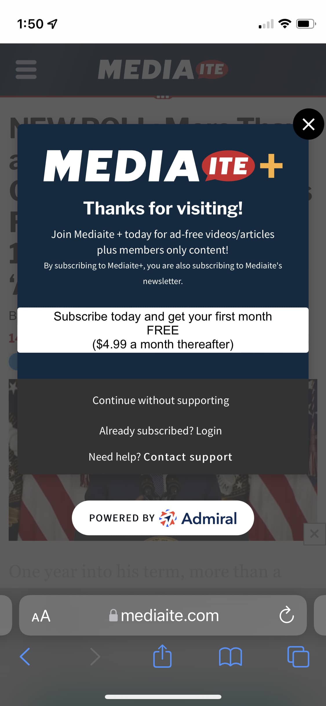
And don’t forget about the newsletter signups (before you’ve even read anything).
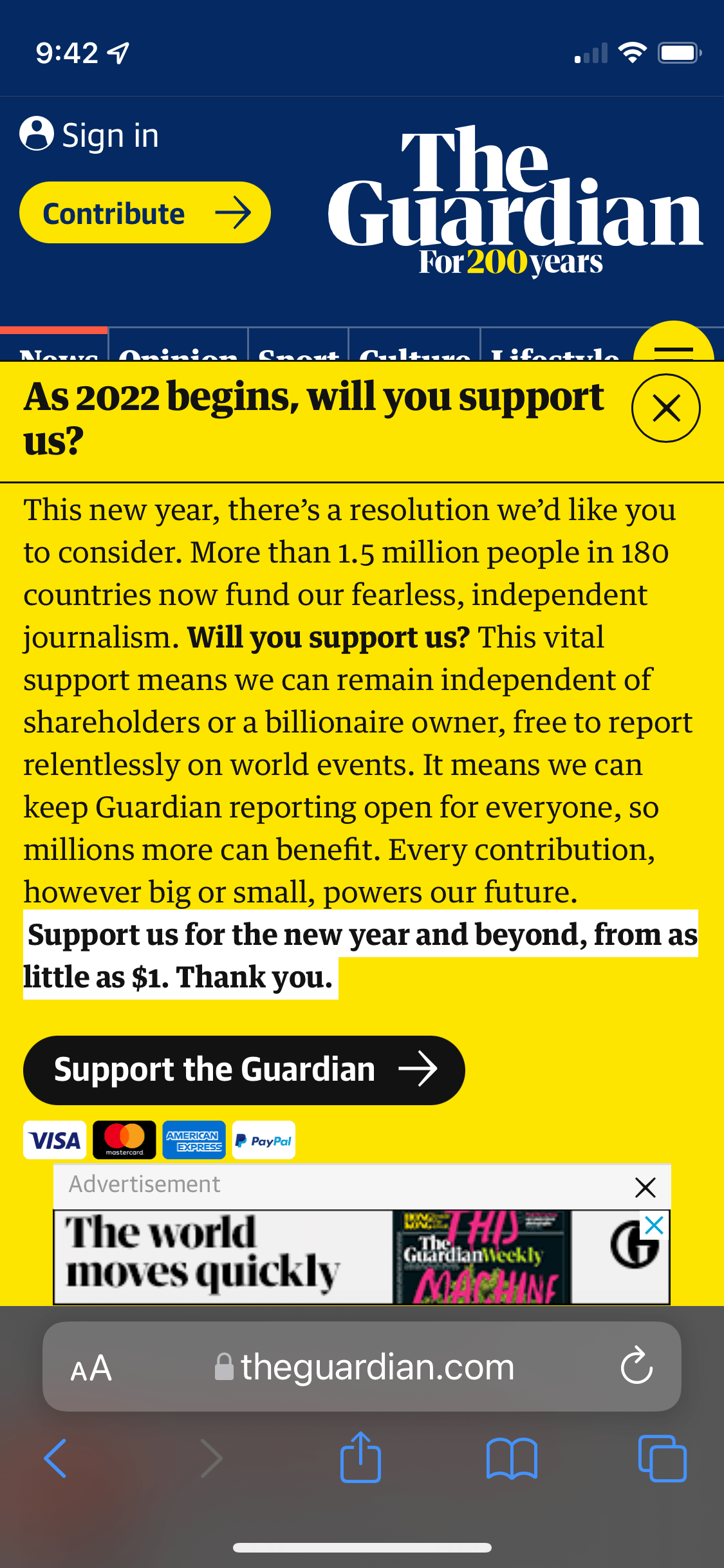
And then there’s bypassing the whole “let me get your email” and instead come right out and ask for support the very first time someone visits a website:

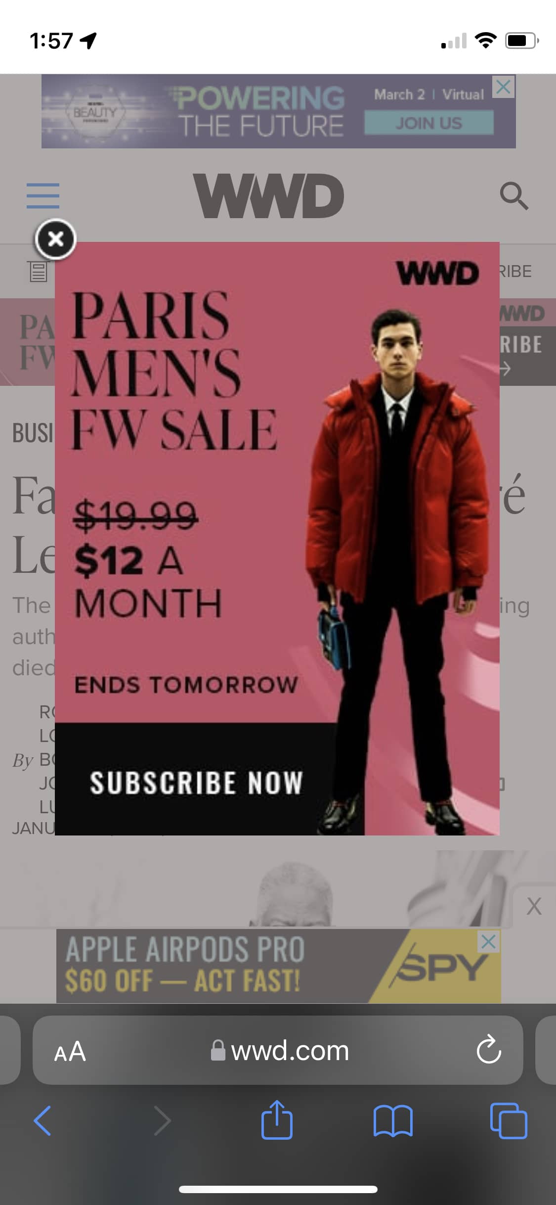
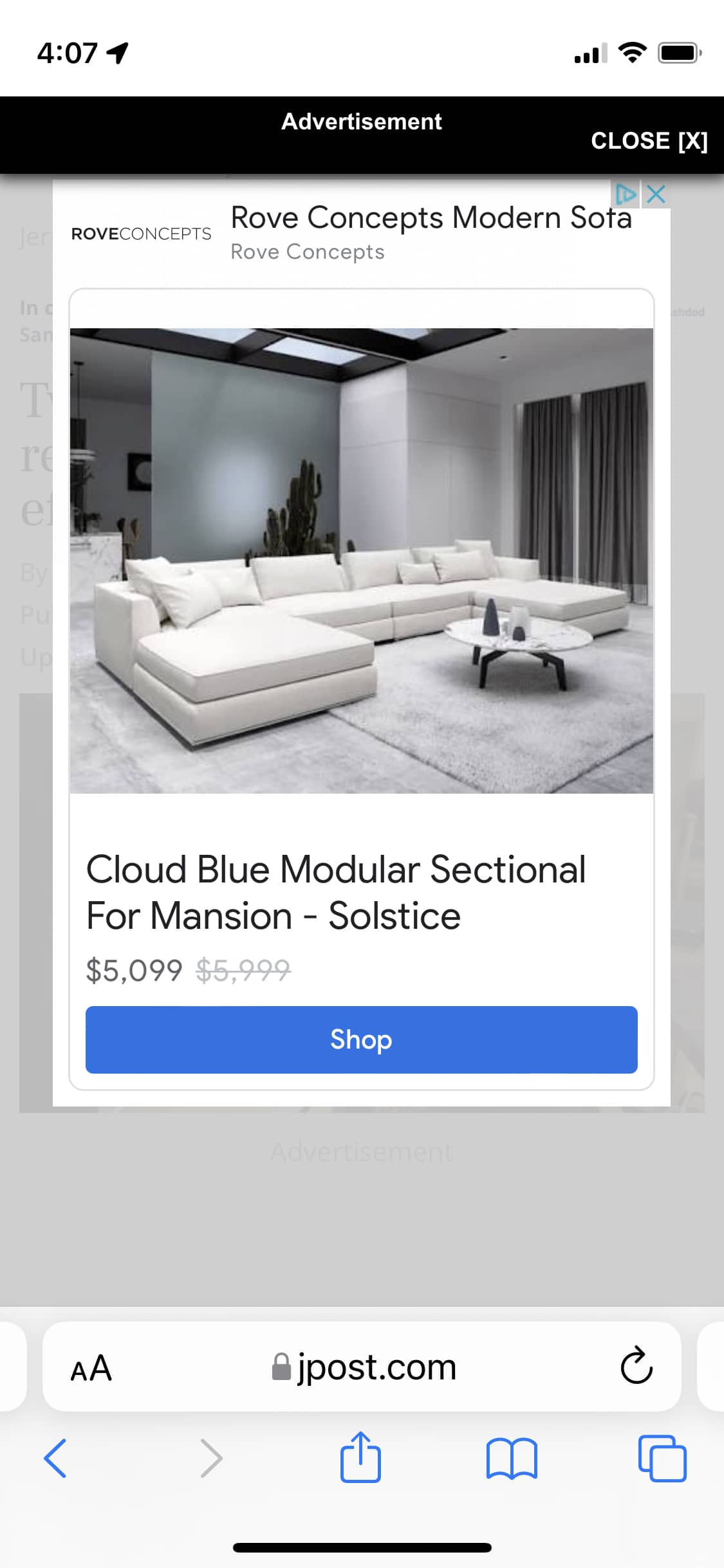
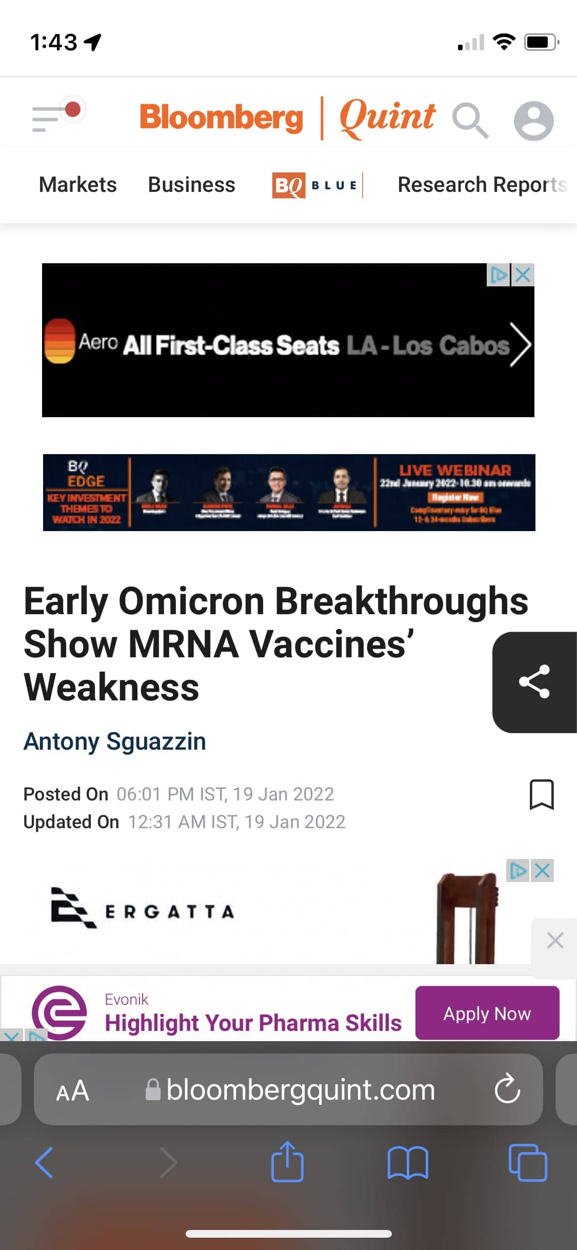
And, of course, there’s always the ads:
Sometimes instead of one giant ask taking over the screen, you get a large number of small asks which, in sum, end up accomplishing the same thing: a wholesale page takeover which obscures the primary content of the page.
And when you combine all the above—app banner prompts, GDPR acknowledgments, newsletter signups, support solicitations, and ads—with your own UI in the form of sticky navigation and the like, you get a website whose first impression is…let’s just say much to be desired.
What’s even nuttier is the interactive experience of these sites which can’t be captured in static screenshots. There’s often so much layout shift on these pages it’s disorienting. The initial load often comes in displaying the page’s primary content, but give it a few seconds for all those third-party scripts to load and the primary content is soon obfuscated. I would hazard a guess that “First Contentful Paint” gets satisfied as a metric, but doesn’t convert to a good website experience (imagine that—metrics are met but outcomes are lacking).
I suppose it’s no wonder people are interested in the idea of “web3” and trying to find more efficient ways of monetizing everything. I would venture to guess all of these design decisions are being made with revenue as the primary motivator. It’s hard, I get it. Maybe we’ll figure this out. In the meantime, I have a scrapbook page capturing the current state of the mobile web in 2022.