With all the hubbub around AI art lately, I’ve been thinking about how it relates to the design and creation of iOS app icons.
I came across Michael Flarup’s quip about using AI art generators for app icon work and it made me want to try generating a few variations.
For this experiment, I’m pulling icons from my iOS icon gallery and using Dall-E to upload the original icon and generate variations.
To start, I figure I’ll go with one of Michael’s apps: Conduct This.
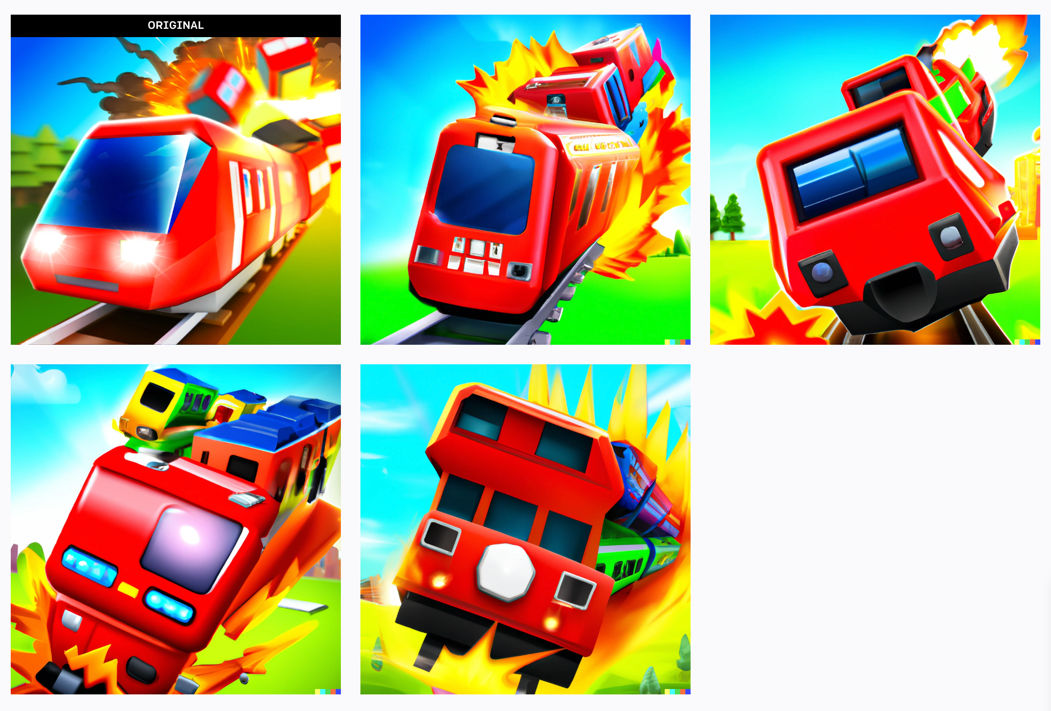
I’m actually quite surprised by the results here. While some aren’t entirely as visually intelligible as the original, they weren’t goofy (which I expected).
Interesting…let’s try another one: a Mark Jardine classic, Tweetbot (6).
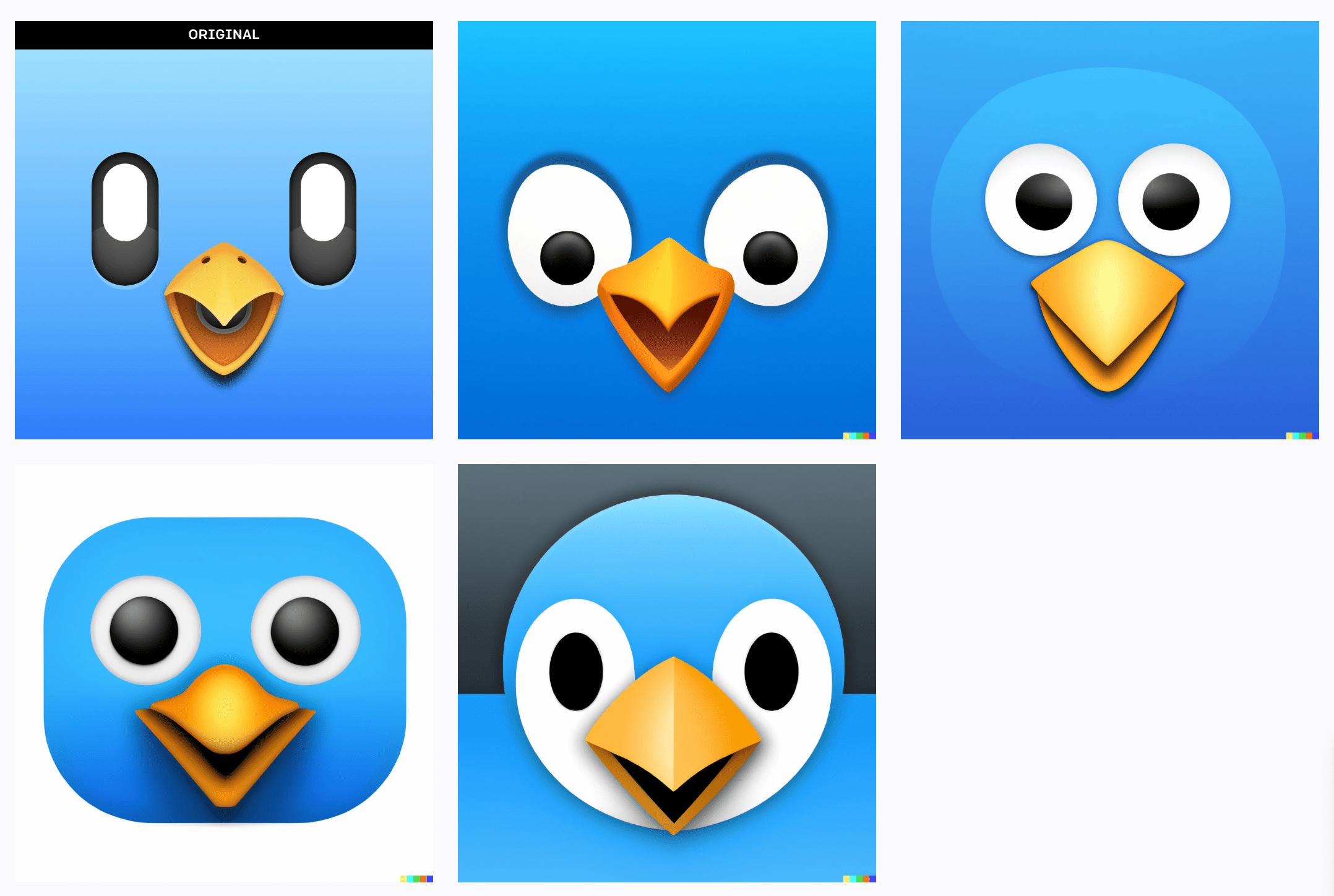
Lol, given a hand-crafted icon from a venerable designer, that’s more what I’m expecting from an AI art generation tool.
Perhaps Michael’s variations are higher quality because the AI model has lots of game graphics in its model, whereas artwork similar to Tweetbot is less common? That’s a totally uninformed shot in the dark.
Anyhow, this gets me thinking I should try something more simplistic. I try Apple’s Photos icon.
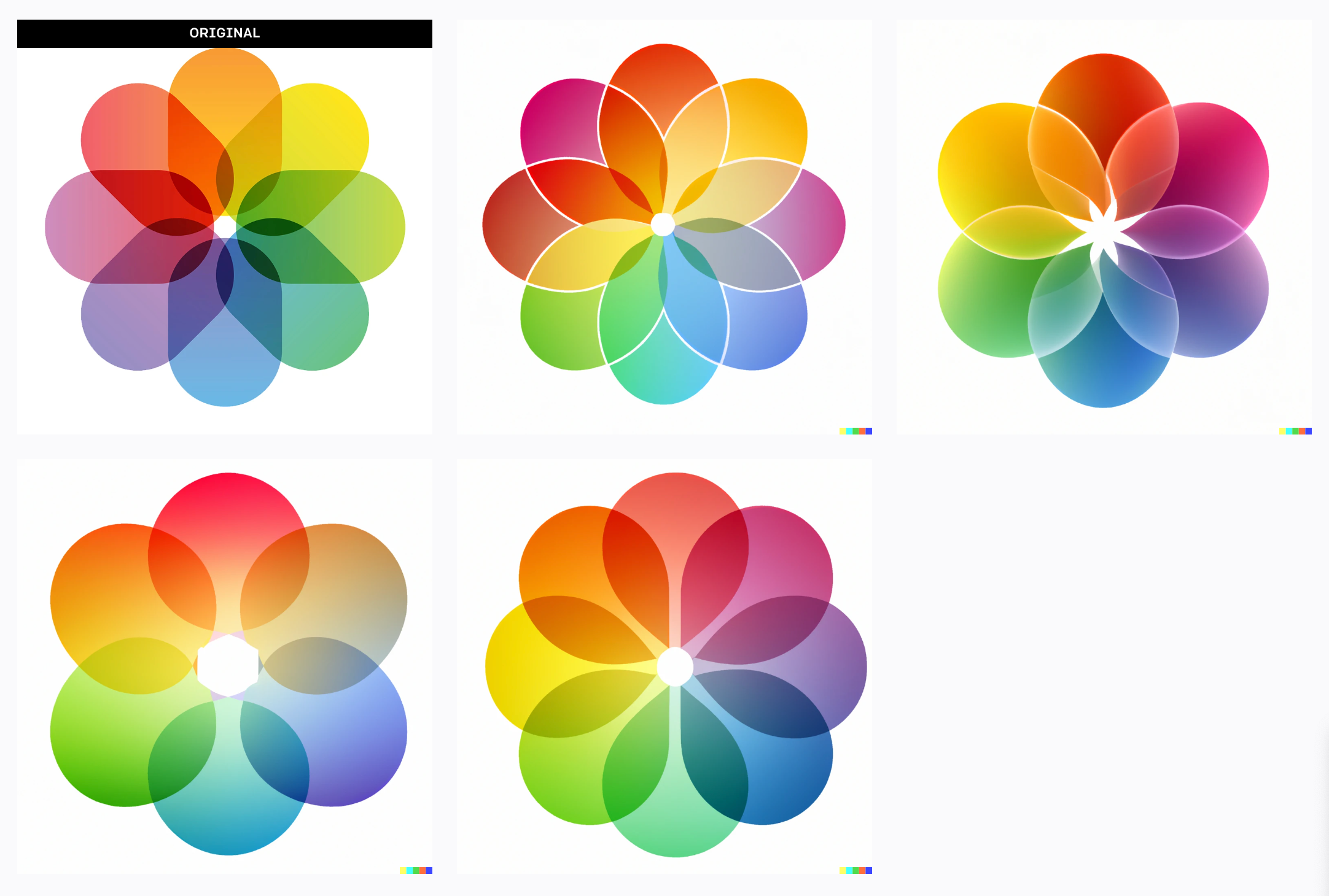
Not bad, not bad. Some interesting ideas there. In a similar vein, how about Apple’s Weather icon?
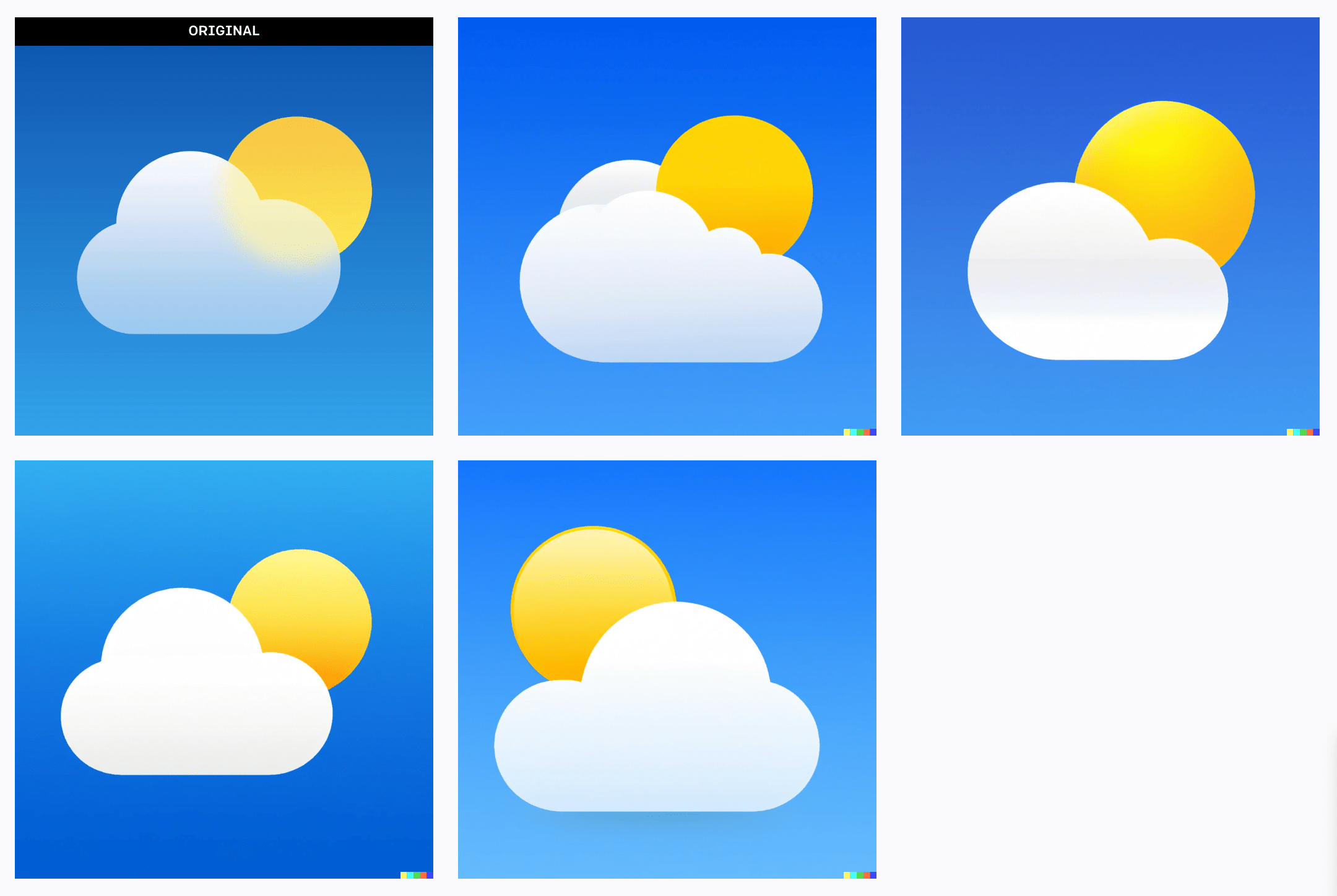
Pretty good. Complete rip-offs obviously, but in theory some shippable-quality in there.
What if we go with something a bit more complex from Apple’s repertoire, like Maps.
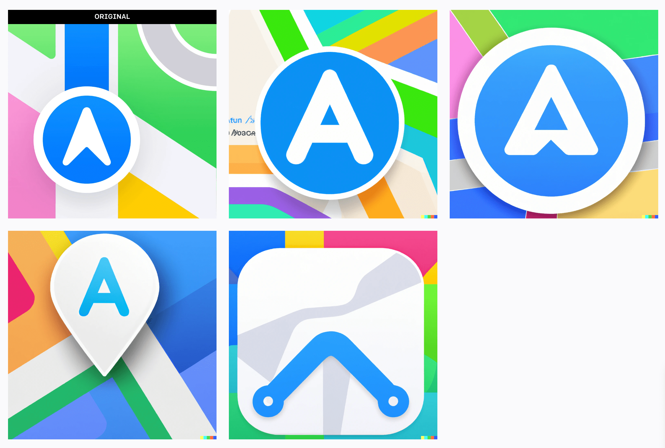
Not surprising. Funny how the AI took the arrow indicating direction and movement in the original design and turned it into an “A” in some cases.
Let’s go back to pulling random icons from solid app icon designers I’m familiar with, starting with Weather Line from Louie Mantia
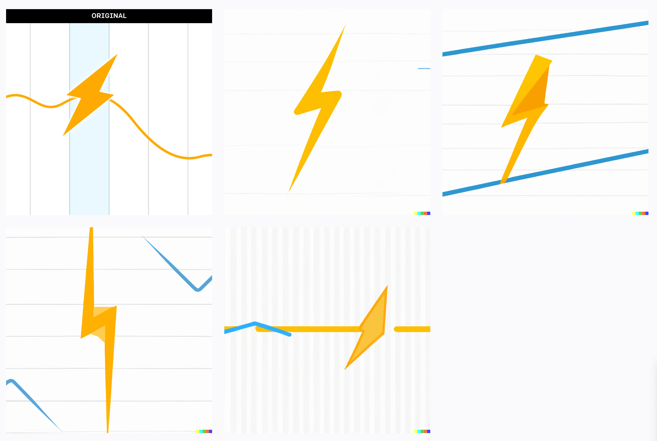
Oooff. I think that was a hard AI for the AI (app icon for the artificial intelligence).
What about Headlines from Matthew Skiles?
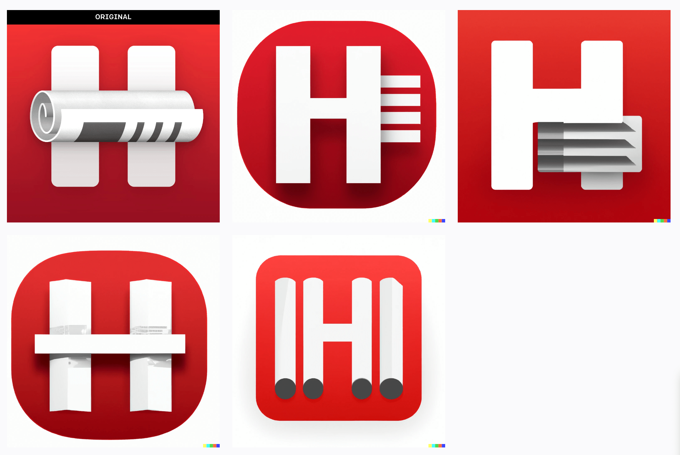
Octave from Yannick Lung?
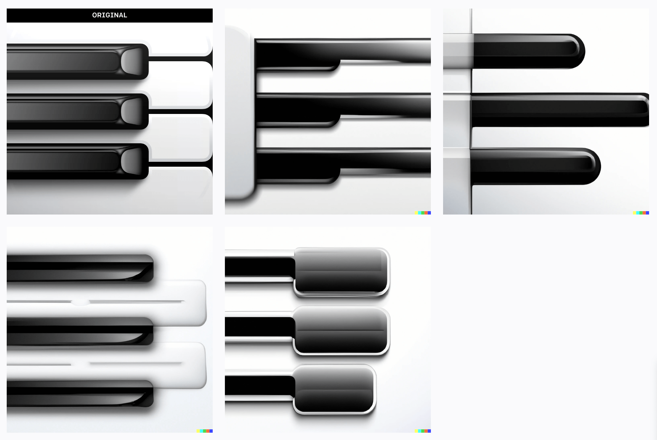
Quill Chat by Max Rudberg?
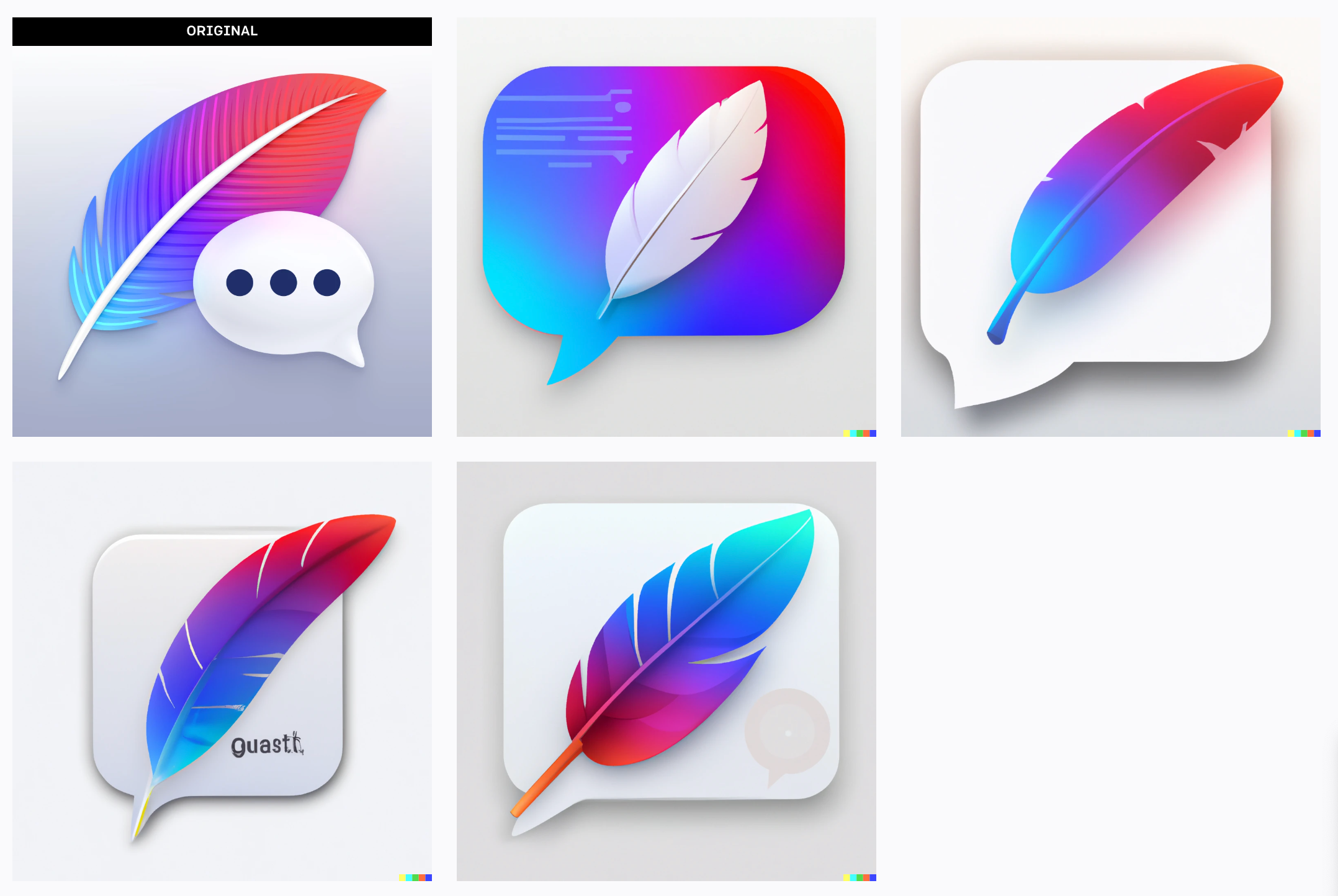
Not a lot of interesting stuff here when you work back from the finished product. I suppose that makes sense, these tools are probably more about ideating in a case like this.
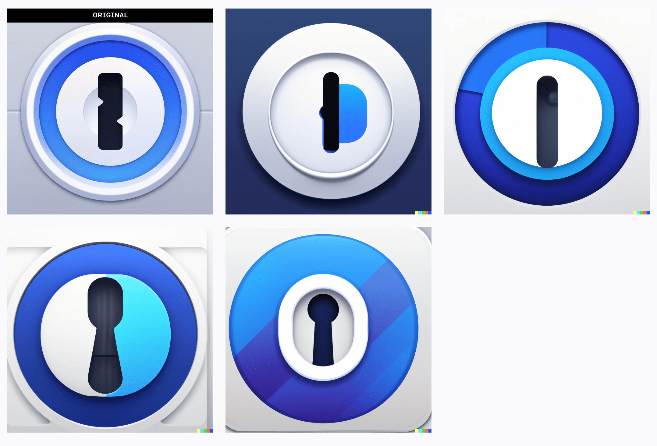
This version of 1Password icon by Gavin Nelson is interesting because even though rounded corners are not in the original image, somehow the AI is trying to insert them on the corners — perhaps that pattern is in the model from lots of other iOS icon artwork?
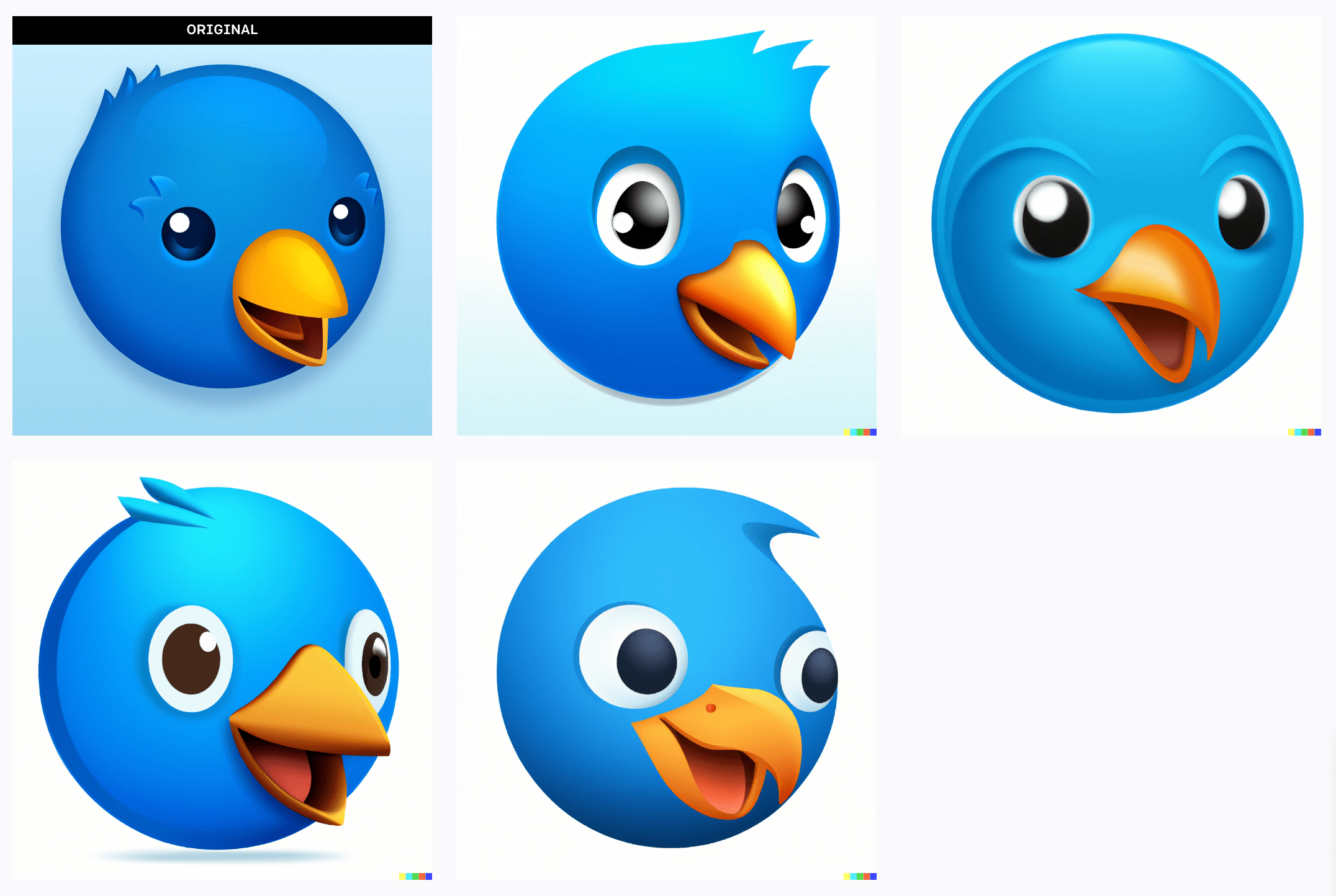
Let’s end by circling back to Twitter-related icons. The folks at The Iconfactory have the wonderful Twitterific app, I wonder how it fares?
Not too shabby. Let’s run some more variations on Tweetbot. Here’s Tweetbot 5.
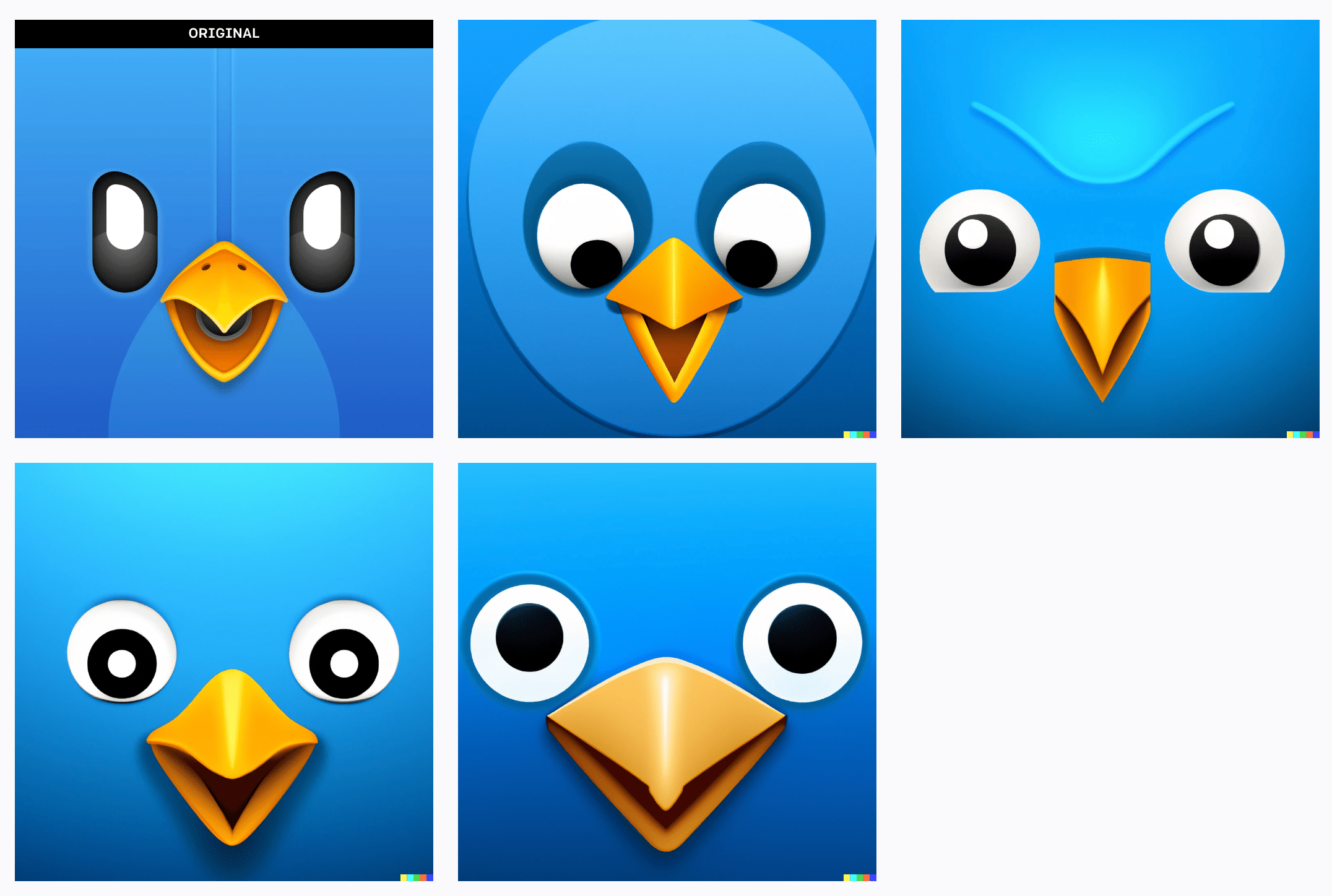
And Tweetbot 4.
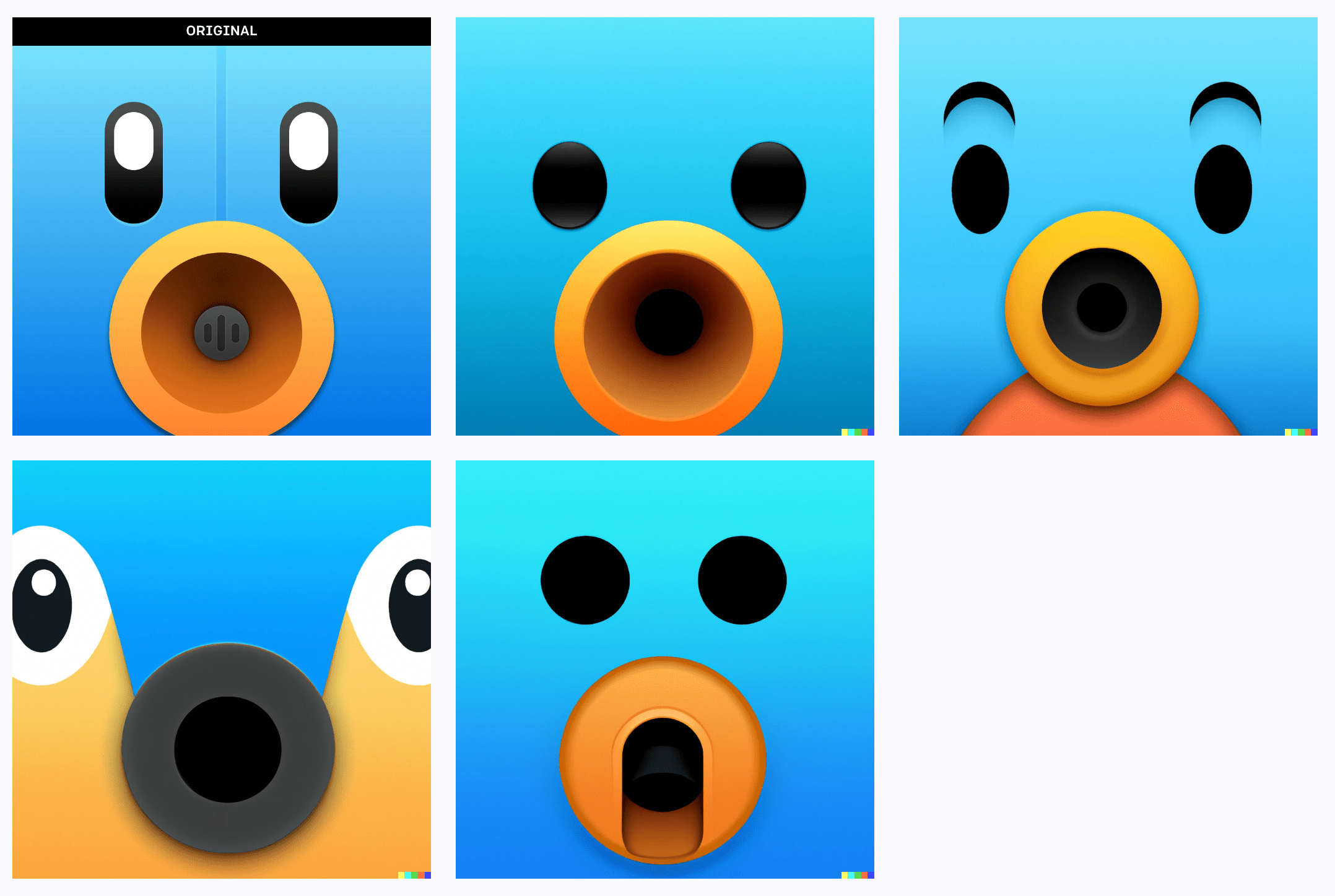
And the original Tweetbot.
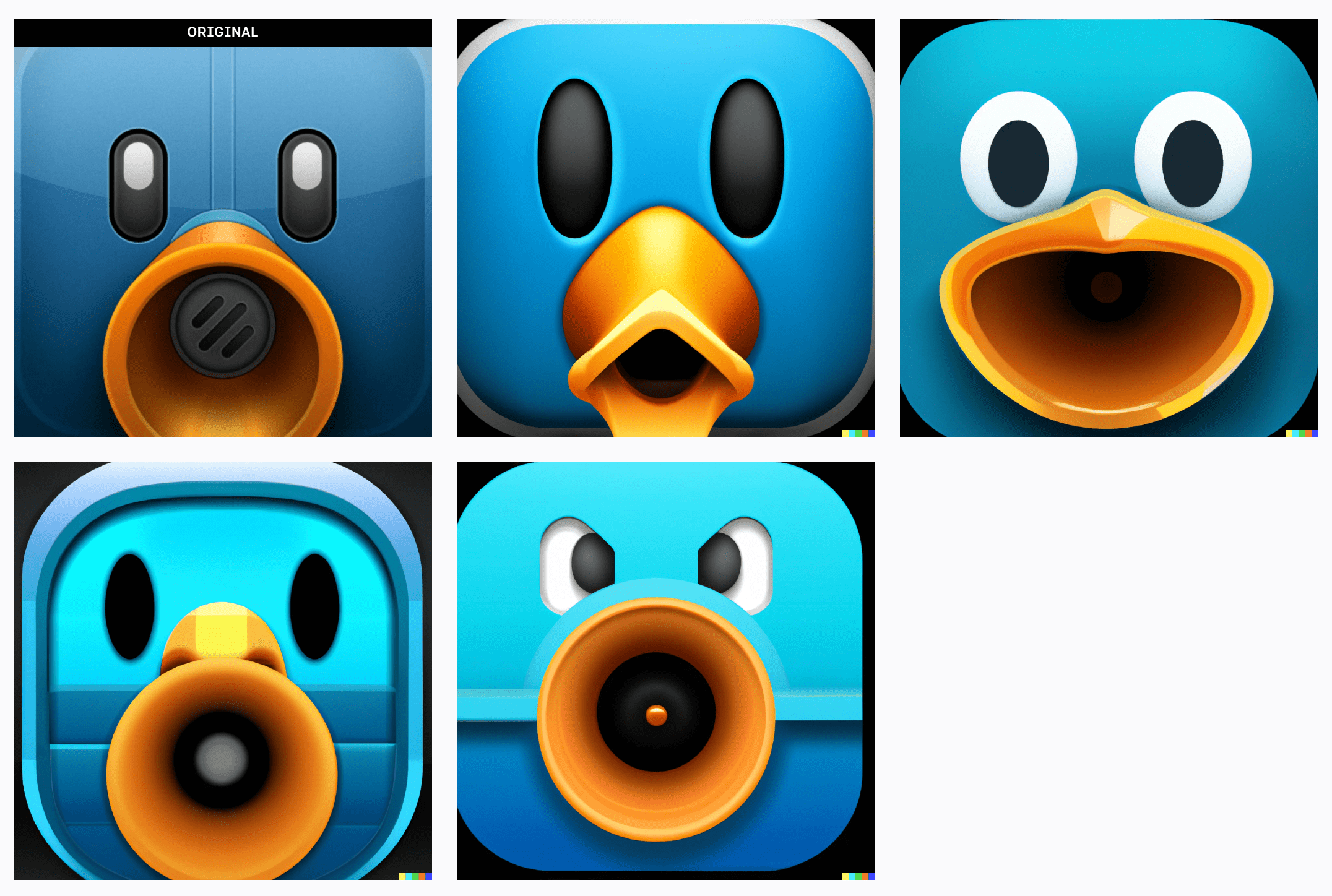
If nothing else, this is a fun exercise. I hope you enjoyed the eye candy. And if you don’t know them already, follow the icon designers listed above — they’re experts at their craft.