Reflecting on My Own Experience Using the Web to Get the Vaccine
There’s been some folks reflecting on the strength of the web to deliver a simple, low-friction, and highly-effective experience with technology.
Robin talks about his experience using GOV.UK—and its plain yet functional design system—to book an appointment for a driver’s license:
It was one of the most shocking experiences for me as a web designer because there was no cruft, no junk, and no messing around with the experience in any way. It was fast, didn’t break down, crash the browser, or confuse me at all. The form inputs were big and clickable and the correct keyboard was selected when I viewed it on my phone. All of this accessibility work that they’ve poured into making things just work is a joyous thing.
Additionally, Jeremy talked about his experience encountering technology to get vaccinated. He got a text with a URL, visited the page, clicked a button to book an appointment, filled out “a sequence of short forms, clearly labelled”, and was good to go. Reflecting on the experience, he says:
Give me a URL—either by SMS or QR code or written down—and make sure that when I arrive at that URL, the barrier to entry is as low as possible.
Maybe I’ll never need to visit that URL again. In the case of the NHS, I hope I won’t need to visit again. I just need to get in, accomplish my task, and get out again. This is where the World Wide Web shines.
I had a similar experience getting the vaccine and figured I’d pile on to these narratives with reflections of my own.
Signing Up
I don’t know a lot about the initial sign up process. My wife got a text from her sister-in-law saying they were opening up registrations to everyone over sixteen in our area, so she immediately got on her phone and signed us both up. That’s where my experience begins.
After she signed me up, I received a text message with information on the date, time, and address to get the vaccine, as well as a link to a “VaxPass”:
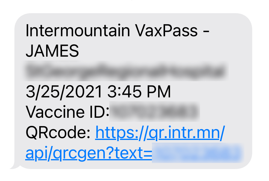
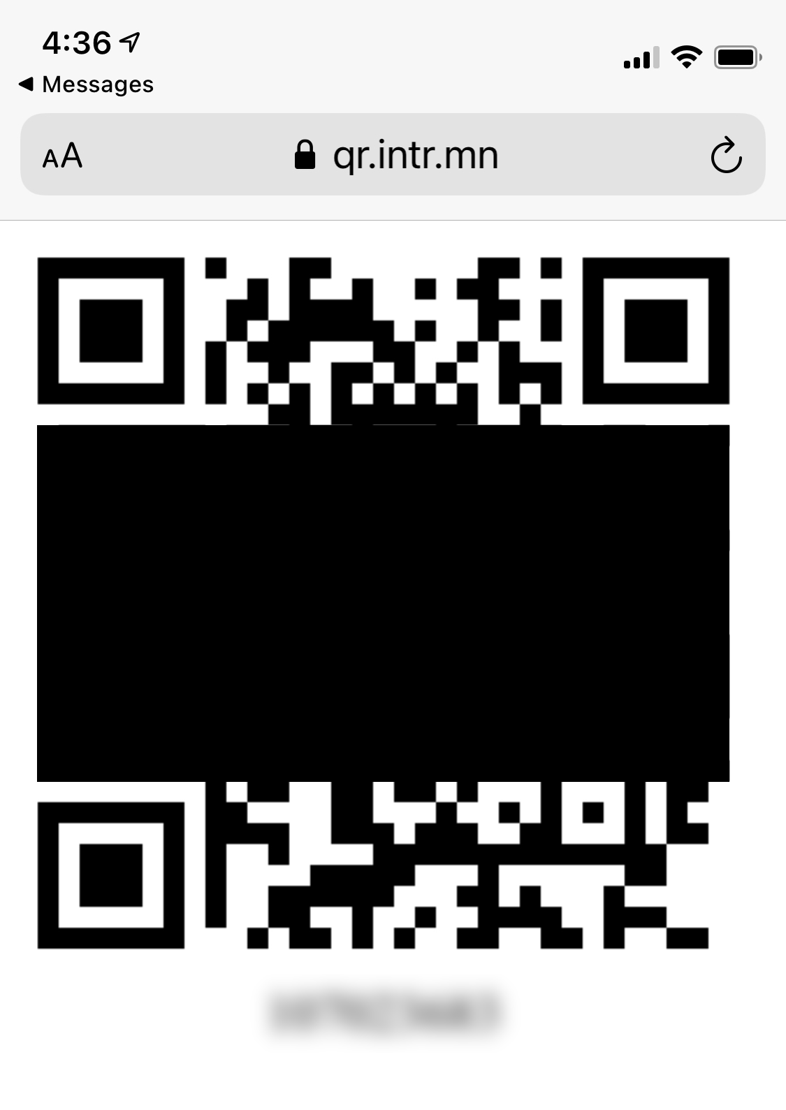
I was a bit afraid of what the link to this branded “VaxPass” might be. However I was relived to find it was nothing more than a QR code. That’s it. No branding. No colors. No nothing. A QR code and a number, that’s all.
I also got an email that had more info in it, but it was supplementary. Not core to the experience.
The Big Day
On the date of my appointment, I arrived at the hospital and was asked to show my QR code. They scanned it and printed a sticker with a barcode and my name on it. I stuck it on my shirt and was sent to get jabbed.
After the shot, I sat in a room to wait for side effects. While waiting, I got a text with a URL to sign up for my next appointment.
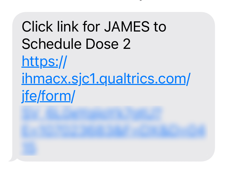
The page was simple. The experience painless. There was little branding, plain form inputs, and some text. I signed up for round two and was done. No downloading of apps. No authentication or login info to remember.
Daily Check Ups
While still under watch for side effects, I looked at my brochure about signing up for “V-Safe” which would allow me to log data about my symptoms.
At first I thought “nah”. I didn’t want to download some app I’d eventually have to delete, register for an account, blah, blah, blah. But then figured I’d do it for the sake of contributing to the dataset.
However, upon closer inspection of the brochure, I found it was much simpler: go to a URL, enter my info (name, phone number), get a confirmation code, and boom, I’m enrolled.
From there, it’s been daily texts to log info about how I’m feeling.
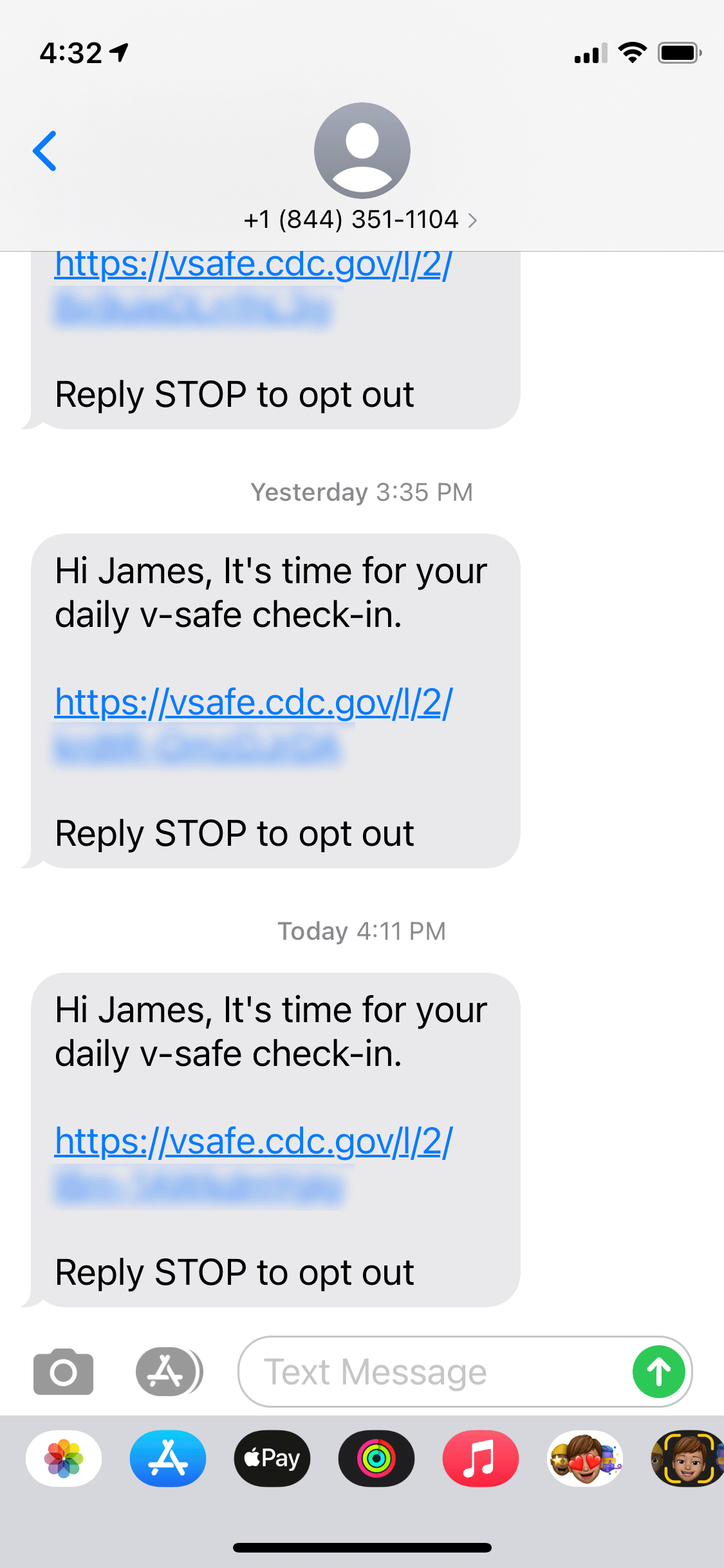
The daily check ins have been surprisingly simple. Each day I get a text message. I click the link. The page loads fast. I navigate the surprisingly sparse yet clear form inputs. And complete the whole thing in less than thirty seconds.
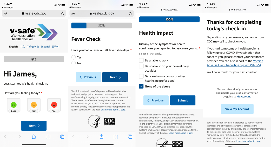
That’s it. Opt out when I want, no digital cleanup necessary.
Conclusion
The simplicity of these experiences was incredibly refreshing.
SMS to a URL. Fast page loads. No authentication or login. Simple forms with clear labels. Little to no branding being shoved down my throat. No array of colors, big logos, or overly-customized UI components.
If I had to make a critique, it would be the pages weren’t bland enough—go with native input controls rather than styled ones. But whatever, it worked simple and effectively, so I’m happy.
It really makes me want to rethink so many corporate things I’m involved in.
Last note: it a shame that push/pull notifications on the web aren’t there yet. Notifications had to come via SMS. Not sure how to get around that, but maybe one day we’ll get there.