Font Size and Control
I recently read an engaging article by Nikita titled “Font size is useless; let’s fix it”.
The article starts with a question—“What happens when you set "font_size": 32 in your favorite editor?”—then then does a deep dive into the peculiarities of working with fonts on computers.
32 is not what you think it is. In fact, any font size declaration is not what you think it is. As Einstein discovered, it’s all relative:
16 pt text on Windows is ⅓ larger than 16 pt text on macOS. Fun! ... [A] user requesting 32 pt font is actually requesting 32 px on macOS and 43 px on Windows.
I find it fascinating to see how the historical aspects of font development remain incredibly relevant to how fonts work on computers today:
In a digital type, though, an “em square” is (and I’m quoting Wikipedia): “a grid of arbitrary resolution that is used as the design space of a digital font.”
Meaning, if I open Fira Code and draw em square, it will not align with anything at all:
Long story short, this square is what you actually control when setting font size. This square will be 32/43 px tall/wide if you set the font size to 32 pt. Too bad it’s invisible and no element in font matches it.
Historical constraints are very real! It’s why we call the computers in our pockets “phones”.
It’s crazy to think that with all these computers, font-wise we’re still stuck with so many quirks from the metal era of fonts.
So what are the implications for working on the web?
Given that you can’t always control which fonts will be used to render your webpage, the lack of a tool to align text reliably seems like an oversight.
It’s true. I think the lack of reliable control in working with text on the web is well known. Extensive posts have been written on very specific font-related subjects, like working with line height.
And yet, part of me wonders: is that lack of control (for web authors) a bug or a feature? How much can we embrace the variable nature of the web where users are afforded the power to wield control over appearance?
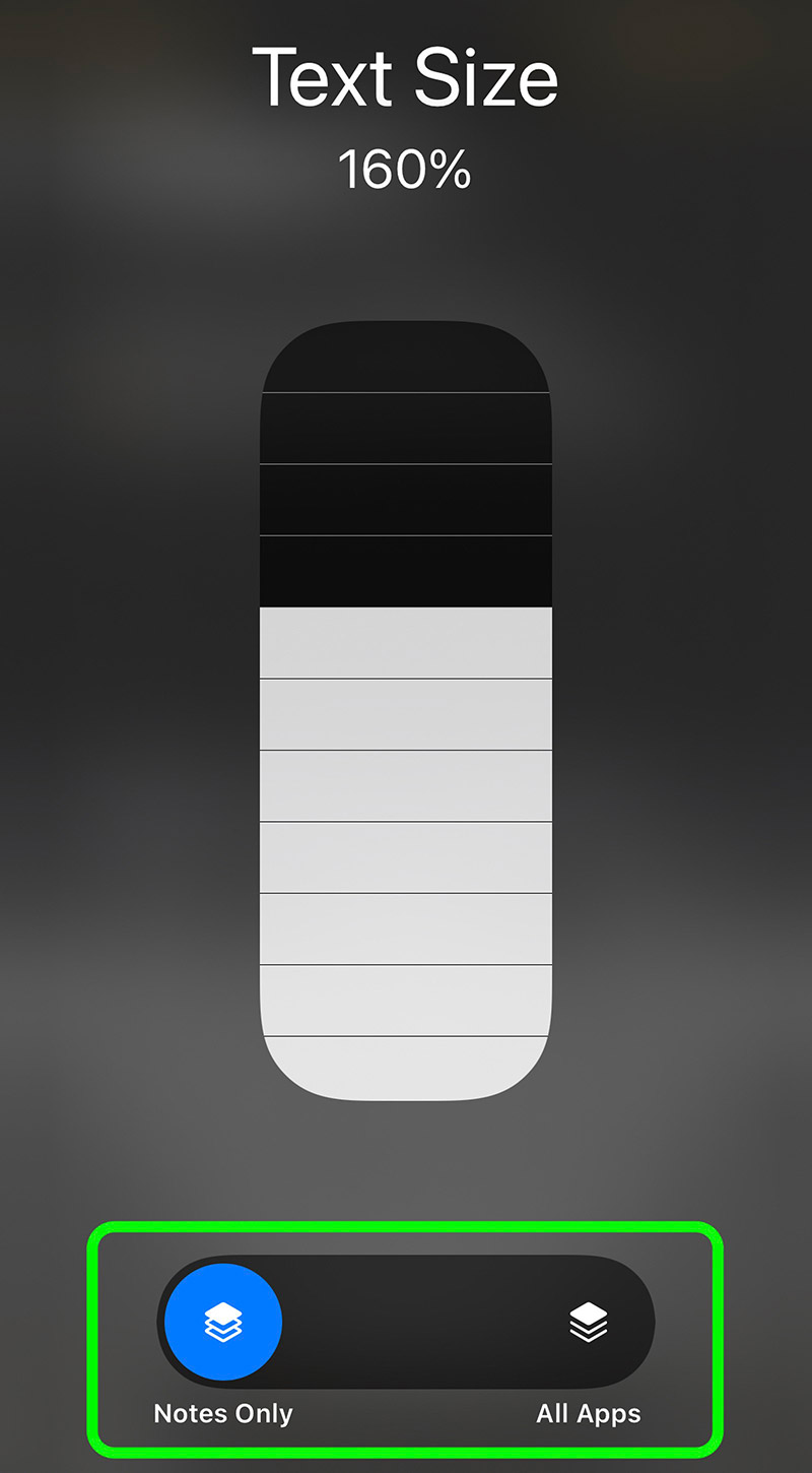
I find it interesting that Apple’s latest operating system, iOS 15, is now providing users with the ability to control font size on a app-by-app basis (courtesy of macrumors):
Empowering the user with control like this has long been a feature on the web. I, as a user, have an agent (the browser) who retrieves information for me. You, as an author, make suggestions about appearance via styles. But my agent gives me the control to make final decisions on appearance, based on my own environmental factors (i.e. hardware, software, physical capabilities, etc.). I am not merely a passive subject in your world. We are participants together.
I’ve never been a super famous athlete or movie star, but I do have an agent who works for me with my best interests and preferences in mind. Their name is browser.