Make Me Think
For many years now, the rallying cry of digital designers has been epitomised by the title of Steve Krug’s terrific book, Don’t Make Me Think. But what happens when that rallying cry is taken too far? What happens when it stops being “don’t make think while I’m trying to complete a task” to simply “don’t make me think” full stop? — Jeremy Keith, “Seams”
Steve Krug’s book “Don’t Make Me Think” is a wonderful book. Unfortunately, I’ve often seen its contents narrowly distilled to a slogan revered as the great commandment of software design: don’t make people think.
Have you heard of the the cognitive reflection test? It’s a test “designed to measure a person’s tendency to override an incorrect ‘gut’ response and engage in further reflection to find a correct answer.” More from Wikipedia:
According to Frederick, there are two general types of cognitive activity called "system 1" and "system 2" (these terms have been first used by Daniel Kahneman). System 1 is executed quickly without reflection, while system 2 requires conscious thought and effort. The cognitive reflection test has three questions that each have an obvious but incorrect response given by system 1. The correct response requires the activation of system 2. For system 2 to be activated, a person must note that their first answer is incorrect, which requires reflection on their own cognition
Here are the three questions from the test:
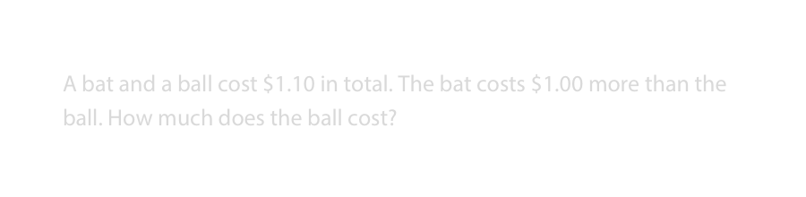
- A bat and a ball cost $1.10 in total. The bat costs $1.00 more than the ball. How much does the ball cost?
- If it takes 5 machines 5 minutes to make 5 widgets, how long would it take 100 machines to make 100 widgets?
- In a lake, there is a patch of lily pads. Every day, the patch doubles in size. If it takes 48 days for the patch to cover the entire lake, how long would it take for the patch to cover half of the lake?
The intuitive answers are:
- 10 cents
- 100 minutes
- 24 days
The correct answers are:
- 5 cents
- 5 minutes
- 47 days.
What’s interesting, Malcolm Gladwell points out in his book David and Goliath, is that there is an easy way to raise peoples’ grades on this test: make the test questions difficult to read.
The psychologists Adam Alter and Daniel Oppenheimer tried this a few years ago with a group of undergraduates at Princeton University. First they gave the CRT the normal way, and the students averaged 1.9 correct answers out of three. That’s pretty good, though it is well short of the 2.18 that MIT students averaged. Then Alter and Oppenheimer printed out the test questions in a font that was really hard to read—a 10 percent gray, 10-point italics Myriad Pro font...
Translated to digital, that would mean a question that looked roughly like this:
What happened when the questions received this kind of visual treatment?
The average score this time around [went up to] 2.45. Suddenly, the students were doing much better.
Wait, but I thought we were supposed to not make people think? Present things to people clearly and simply and they’ll do better. Why is the opposite happening here? The typographic treatment of the question made reading difficult. You likely had to squint, possibly even read some words (or the entire question) multiple times. Interacting with the question in this way required you to stop and think. It made you work. Gladwell comments on this interesting result of the study:
As Alter says, making the questions “disfluent” causes people to “think more deeply about whatever they come across. They’ll use more resources on it. They’ll process more deeply or think more carefully about what’s going on. If they have to overcome a hurdle, they’ll overcome it better when you force them to think a little harder.” Alter and Oppenheimer made the CRT more difficult. But that difficulty turned out to be desirable.
Look at that: purposefully making something more difficult turned out to be desirable.
A Product Example
A little while ago, I knew some folks building a product touted as an “anonymous job platform for your ideal next role”. I was able to get a sneak peak at using the app and one of the things that struck me was how difficult it was to use. Not “difficult” in a human/computer interaction kind of way, but rather in a critical thinking kind of way. It was hard because it required me to stop and think. It required introspection. I half-jokingly noted to the the designer in my feedback “I probably thought harder...when creating a profile than most any other time in my life.” He responded by saying, “We heard that same feedback...I’m loving that part of it. I think we're gonna try to encourage that even more.”
What I found ingenious about the product was that it didn’t shy away from being difficult. Again, it’s not that the product was difficult to understand or the UI tricky to use. No. In fact, the UI and instructions were quite clear, helpful, even empathetic to the task at hand. There were moments of suggested pause, followed by probing questions meant to draw out the best kinds of thought, which would then power the product to deliver the best kinds of value.
After more use of the product, I wrote my feedback to one of the owners:
[To do this right] I realize that I'd really need to sit down and think about:
- What do I want? And not just a general “what do I want out of life?” but a very precise set of details “I want to be doing this kind of work, on this kind of team, with this kind of business”...
[I think you’ve done a] really good job on the way the app makes me think. I found myself multiple times thinking “this is too hard. You people who made this app, you’re making me think too much!” But then an inner voice said “hey stupid, this stuff that’s hard, it’s for YOU. It’s for YOUR benefit. Are you telling me you don’t want to work hard for YOURSELF? You get what you put into it.” And then I was like “ok I’ll spend whatever amount of time this takes.”
Turns out, this “disfluency” I was picking up on was a kind of intentional friction by the product designers, one of whom responded to my feedback in this manner:
We’re hearing similar things from other folks. I’m a little scared we’re gonna lose people because it is difficult, but that might be OK? It’s the antithesis of most internet things these days. Instead of go-go-go, fast-fast, more-more, we’re asking [people] to slow down, take their time...[I think we’ll] reiterate as much as we can that...it’s OK that it’s hard.
Conclusion
Why am I writing all of this? I don’t know. I guess as a reminder to myself. “Hard things are hard”. Great software allows people to do the actual thinking of the task at hand. If computers really are a “bicycle for the mind” we should make sure we don’t remove what makes bicycles great: human-powered motion. Too often our propensity is to make software that turns bicycles into motorcycles: all that’s required of you is to twist your arm on the throttle and boom, automated motion.
The removal of all friction should’t be a goal. Making things easy and making things hard should be a design tool, employed to aid the end user towards their loftiest goals. As @dhh has stated
Instead of always chasing the erasure of friction, it's worth thinking about how friction can help people