Designing the “Quick Quote” Experience in Agent Portal
Note: I originally wrote this in August of 2017 but for some reason never published it. Figured I’d better ship publish it. It’s probably worth noting that this particular feature, as represented in this post, is basically gone now. We’ve since iterated and improved significantly on it. It’s a good historical piece nonetheless.
A few months back, I got the task of designing a new “quick quote” interface for our insurance quoting application. We’re currently on a legacy platform where the primary quoting experience of the application is played out through our flash player. The problem is flash is dying...fast. So one of the goals of our platform has been to incrementally draw out primary application pieces built in flash and rebuild them in web technologies. One of the most frequently used features of our flash player is the “Start a New Quote” experience, so we decided to rebuild that experience in web technologies. Now, rather than having to do 100% of the quoting experience through the flash player, users only have to do about 90% of it in flash (the first 10% being the experience i’ll outline below).
Iteration No. 1
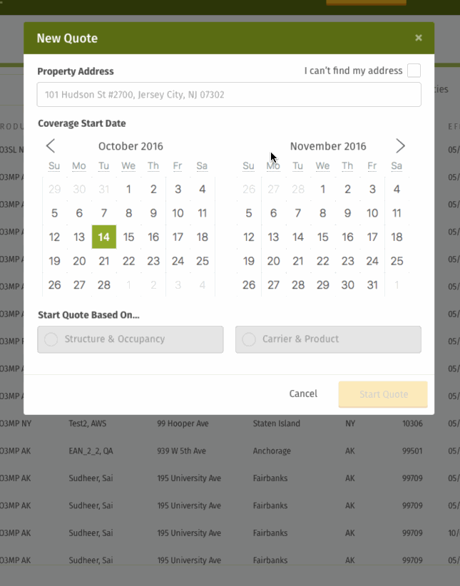
We have enough information to start providing a quote to users once we have one thing: the address of the property. Everything else we can guess at, then we provide a “recommended” insurance product. However, we figured that if users prefer, they can always choose the insurance product themselves. That reasoning is how we arrived at the first iteration of the quick quote experience, which went something like the following.
In the header of the application there is a “New Quote” button which opens our quick quote experience in a “zero state” like this:
")
If the user (agent) chooses “By Property”, we provide an address autocomplete that leverages the Google API to lookup in address in natural language.

Once an address is found, the rest of the form will render with “smart” defaults so they can quickly be on their way to starting a new quote.

At this point, the user would be allowed to submit the form. The server would do its work and respond back by informing the client whether or not a product was available. In some cases there would be more than one product, so we would provide the option to choose which product they preferred.

There was also a case where no products would be available. For this edge case we asked the user to provide us more details so we could learn more about what they were looking for, which would help us as a business ask why we are not providing products customers are looking for.

As an alternative to starting a quote with an address (or if an address couldn’t be found) I designed a toggle that served as a way to quickly “switch” between the two primary methods for starting a new quote. The “By Product” toggle would render a different UI.

Once you chose a carrier, you’d be provided the associated options for choosing your product. From there, you could start a quote (and you’d fill in the rest of the details inside the flash player experience).

Iteration No. 2
As we reviewed these mocks and talked about how this all played out, we realized that we were unnecessarily breaking up the flow into two categories (“By Property” and “By Product”). Why couldn’t they just be the options of the form, without the user having to be aware of the distinction? That’s what we tried to do in a quick second iteration. We allowed the different options to play out dynamically in a single form.

Note that these are the same choices from the first iteration. They are merely presented in a single form without the extra overhead of categorization. The categories didn’t really matter to the end user. We realized the UI categories we had created were really an outworking of us coming to understand our own internal systems and processes. So we stripped them out.
Here’s an example of how this played out depending on form choices:
Iteration No. 3
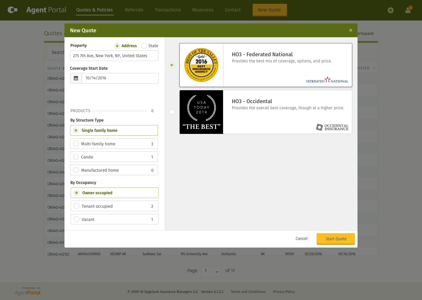
In the third iteration, our biggest breakthrough was a simplification of how to choose an insurance product. Rather than make the user submit the form and then return a list of products, we realized we should just do that interaction in real-time. We also figured it would be nice to have more graphical, “marketing”-type representations of each product.
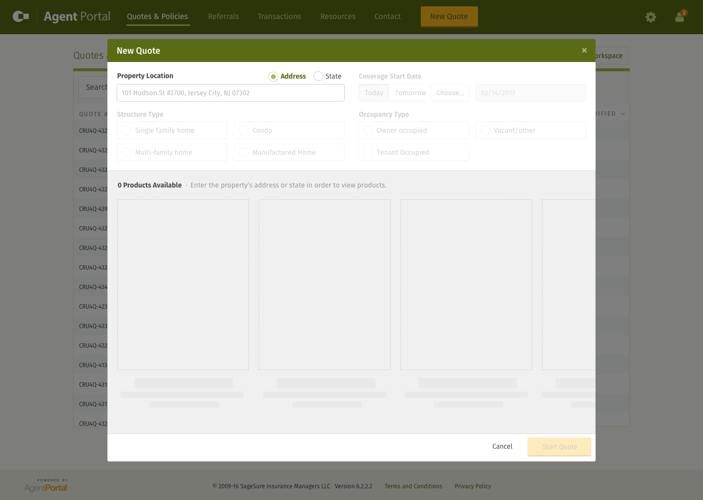
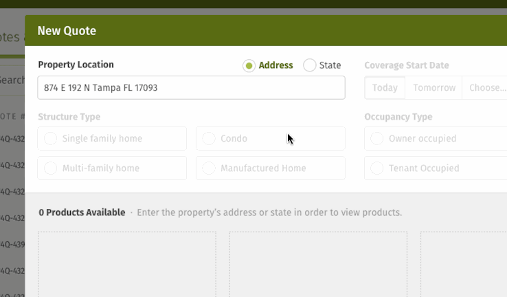
For the initial go around I mocked this out without a lot of thought into what the graphical representation of the product would be. I just used big colors so we could wire it up to an Invision mock and click around and see if it felt right. The process was mostly the same in the sense that the user still had to enter an address first. If they didn’t have an address, we would fall back to letting them choose the state. Then based on the “smart” defaults (or whatever the user changed them to) the UI would dynamically draw the list of available products.


Iteration No. 4
After playing around with this approach, it really felt like the right direction. So I invested some more effort into the layout and visual aesthetics of the flow we had arrived at.
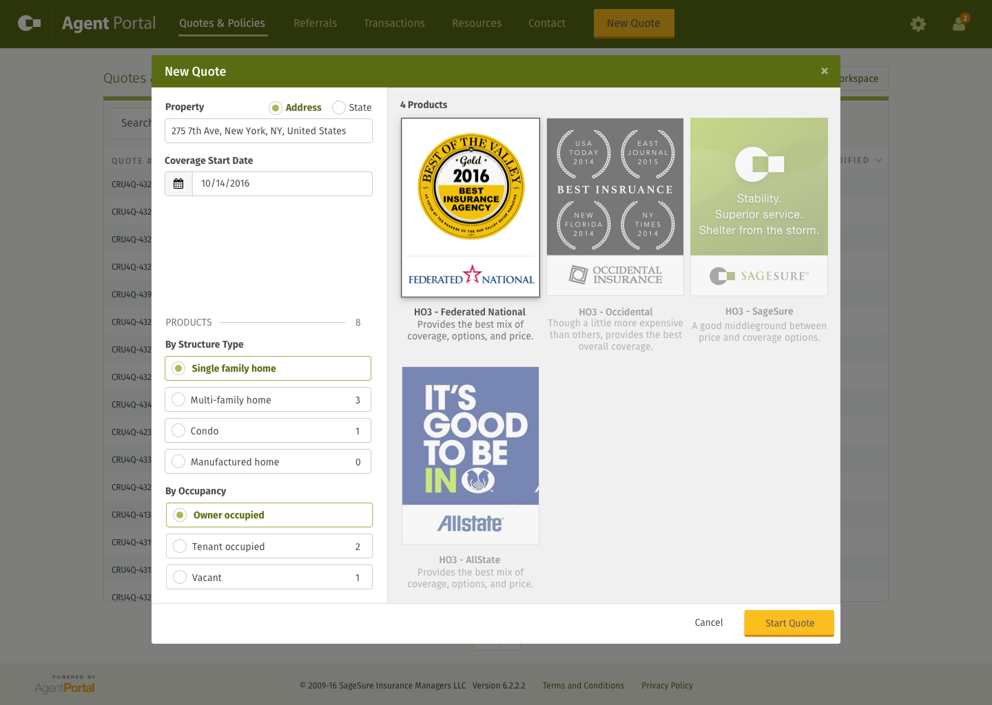
The first iteration was similar to where I had arrived in iteration no. 3, but I tried making room for more products while shrinking the space for form inputs.
That didn’t quite feel right, so I tried redrawing the insurance products as smaller thumbnails.
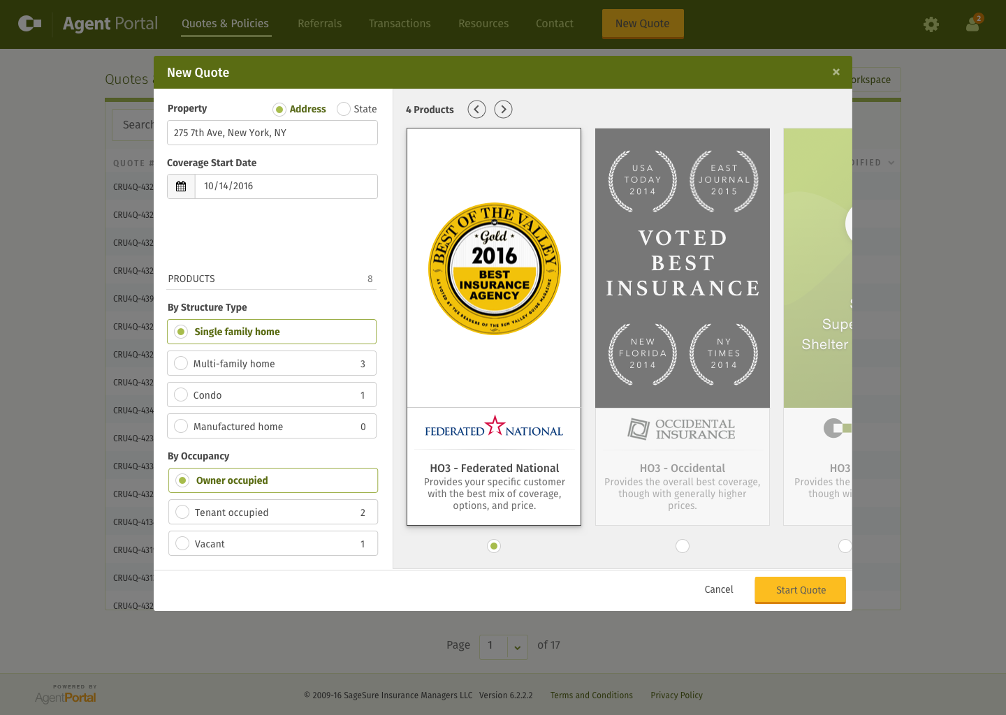
That felt like I was getting closer, but I figured what the heck, why not try them as large thumbnails that would horizontally scroll off the screen?
Through all of this, I never really loved what was happening with the form inputs on the left. So I decided to try a version where I stuck the form inputs on top and leave the space on the bottom for drawing the dynamic product selection UI. That’s when I arrived at my final iteration of this screen:
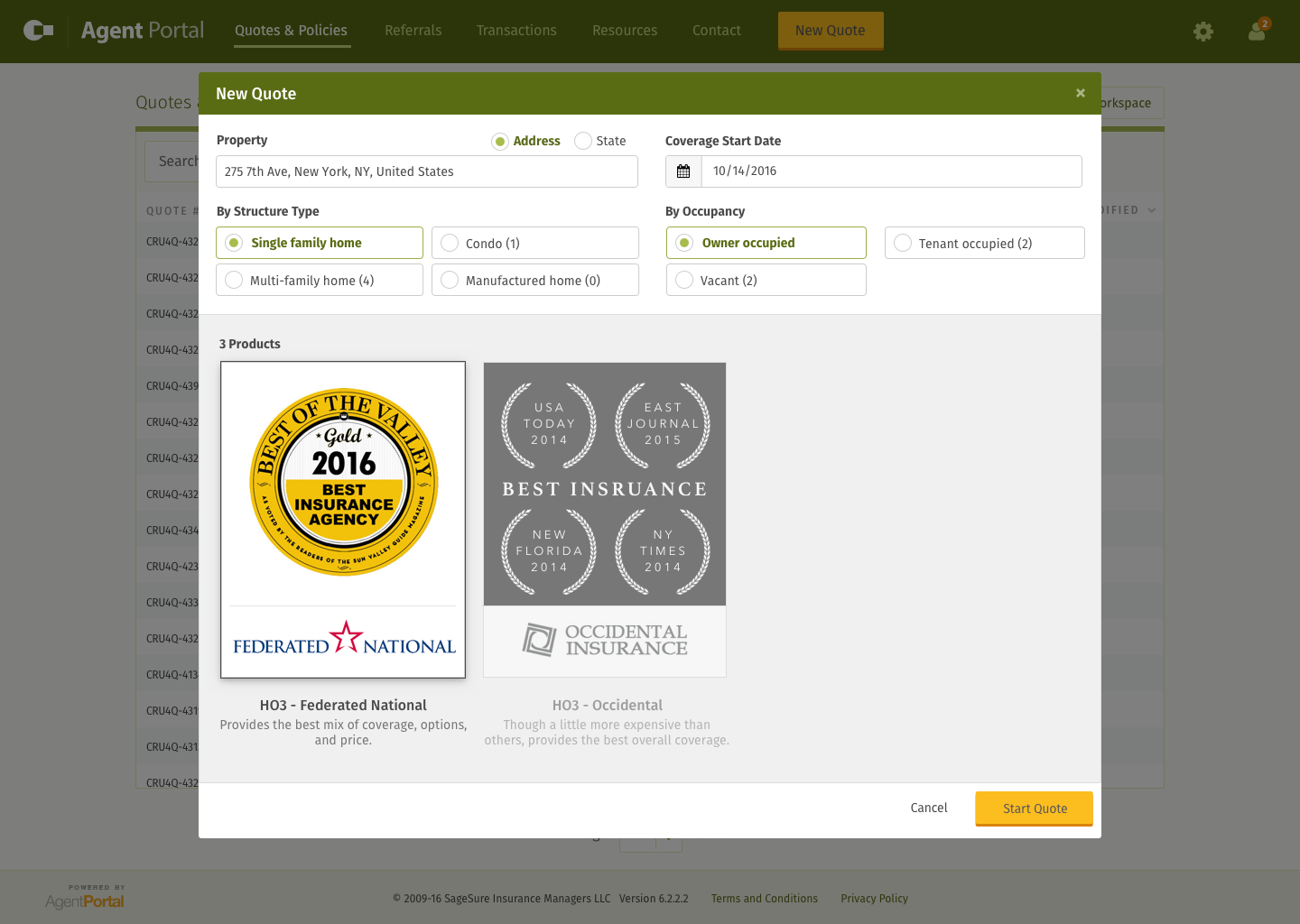
Final Iteration
Once I had arrived at the final view for starting a new quote, I finalized the mocks for some of the edge cases, like when no address was found, when no products were available, or when products were available but not accessible based on the user’s rights.


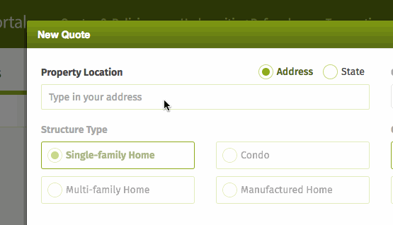
Oh, and in case you’re curious, there was the initial screen that the user would see when no data had been entered yet.
Implementation and Iteration
Most of the implementation for this was handled by the application’s core developer. Once we actually got it built and released to prod, we found a subtle bug that was ailing some of our users.
The Bug
After release, the problem we discovered was that the addresses being entered by some users were not showing up in the autocomplete. We thought we had properly accounted for this edge case during the design phase by providing an action in the case of zero auto-suggested addresses. This action allowed the user to continue getting a quote by entering the state of the property rather than the address. However, we discovered a hole in our process which looked like this:
- Hit Google’s place autocomplete API, which allows you to enter a natural language address and get back the component parts of an address (verified through Google), i.e. "760 E 3rd Ave Salt Lake City" will give you back "address: 760 E 3rd Ave; city: Salt Lake City; state: UT; zip: 84103" broken into their respective pieces for ease of handling from a programatic perspective.
- Using the address given back by Google, we would then hit the geocoding API to get the lat/long values for a particular property.
The problem we found was that sometimes users couldn’t find their address through step 1 but their address would be found through step 2. I will spare the technical details of how this is possible, but suffice it to say that it happened more frequently than you would think.
What we decided to do was allow the user to fully enter an address and do a manual search for it. So if you started typing in an address and you saw yours come up in the autosuggest, you would choose it, which then does steps 1 and 2. But if you didn't see your address show up, you could still enter your full address and then do a manual search (step 2). If an address came back, great, we would use that. If it didn’t come back through a step 1 call or a step 2 call, then we would fall back to the state option.
Initially I think our product team thought we were going to have to add a couple more forms to the entire screen just to accommodate for this edge case, but that felt like a lot of overkill. The view was already large enough and we wanted to keep the perceived complexity of the form UI to a minimum. So I sketched through a couple ideas of how to incorporate this action all within the address field.

I mocked out a few screens through Invision that walked through how this process would work in the UI, which ended up looking like this:
When this actually got wired up, it looked something like this:
As you can see, doing the actual second search (most of the time) only took a split second and either returned some result(s) to choose from or returned nothing. If nothing was returned, the user could still start a quote. They’d just have to do it by specifying the state instead of the address (then validating the address later through our servicing team).
Once we got this to production, the bug reports stopped. Success! This thing has been purring along in prod ever since.