Designing Cross-Application Login Screens (and Business Relationships)
One of the tasks I’m tackling at Insight is bringing coherence and consistency to the plethora of user-facing applications that the company offers to its customers. A few of my colleagues dedicatedly worked on officially documententing what exactly our offerings are as a company and how those offerings relate to each another. Once those definitions began to take form, I was able to enter the scene and start playing with the visual aspect of product defintion in order to sell the future direction of the company’s product lines to company stakeholders. It’s easier to communicate to stakeholders the importance and value of internal product consistency with visuals than it is with words; truly an image is worth a thousand words.
One of my overarching design goals at Insight has been to unify all applications under one consistent visual aesthetic, making the company’s software offerings look like a consistent, cohesive set of tools. Taking into account this goal of a new consistent visual direction for the company in concert with the newly-documented product definitions from my colleagues, I decided to try laying down a cross-application design direction for our products’ login screens. Why login screens? Login screens were a good place to start formulating a design system of patterns and brand hierarchy that could be back-ported into existing products as well as carried forward into future products (i.e. if we created a new web application, we would already have a template for its structure and layout).
At the outset, we knew we had a few different “brands” that would need to be represented across all of our web application products. These included:
- The product brand itself
- The product’s parent brand
- The customer’s/partner’s brand
The product login screens provided a great workspace to explore the relationship between these brands as well as defining common login features and functionality.
v1: Playing with Brand Hierarchy
Designing the login screens dictated that I spend time thinking about how Insights applications would be branded, both to internal and external users. Product name, product family name, and partner/customer brand all had to be taken into account and represeted somehow in each application.

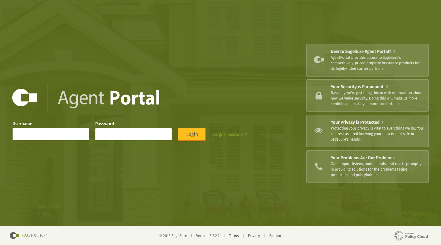
After sketching through some ideas, I took a stab at mocking the login screen for one of our exisiting applications whose aesthetic (mostly) aligned with my overarching vision for visual design at Insight. I chose to represent the product brand front and center on the login, while the customer brand was represented below the login box (as well as in the footer, which would be a persistent UI component across all views of the app). Additionally, I enhanced the representation of customer brand by introducing color as a theme.


Doing these design exercises helped me confront and raise questions about brand hierarchy and business relationships—questions that hadn’t really been broached within the organization. We realized we had not yet fully developed a vocabulary for talking about what our products are. The design process helped us uncover the right questions to ask, which helped us further refine the definition of our products, their business relationships, and their future design, UX, and engineering direction.
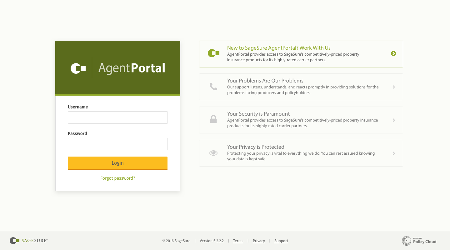
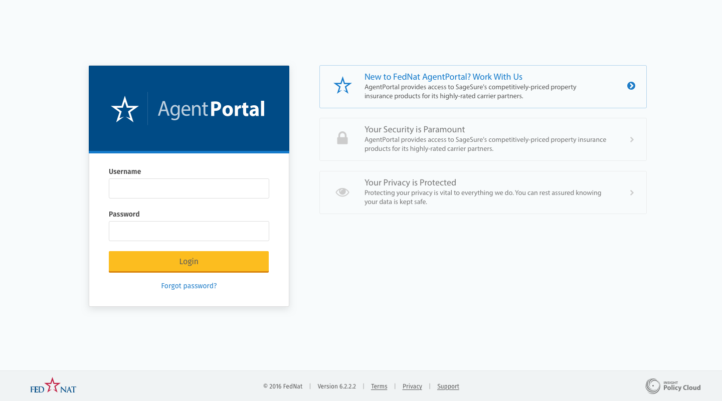
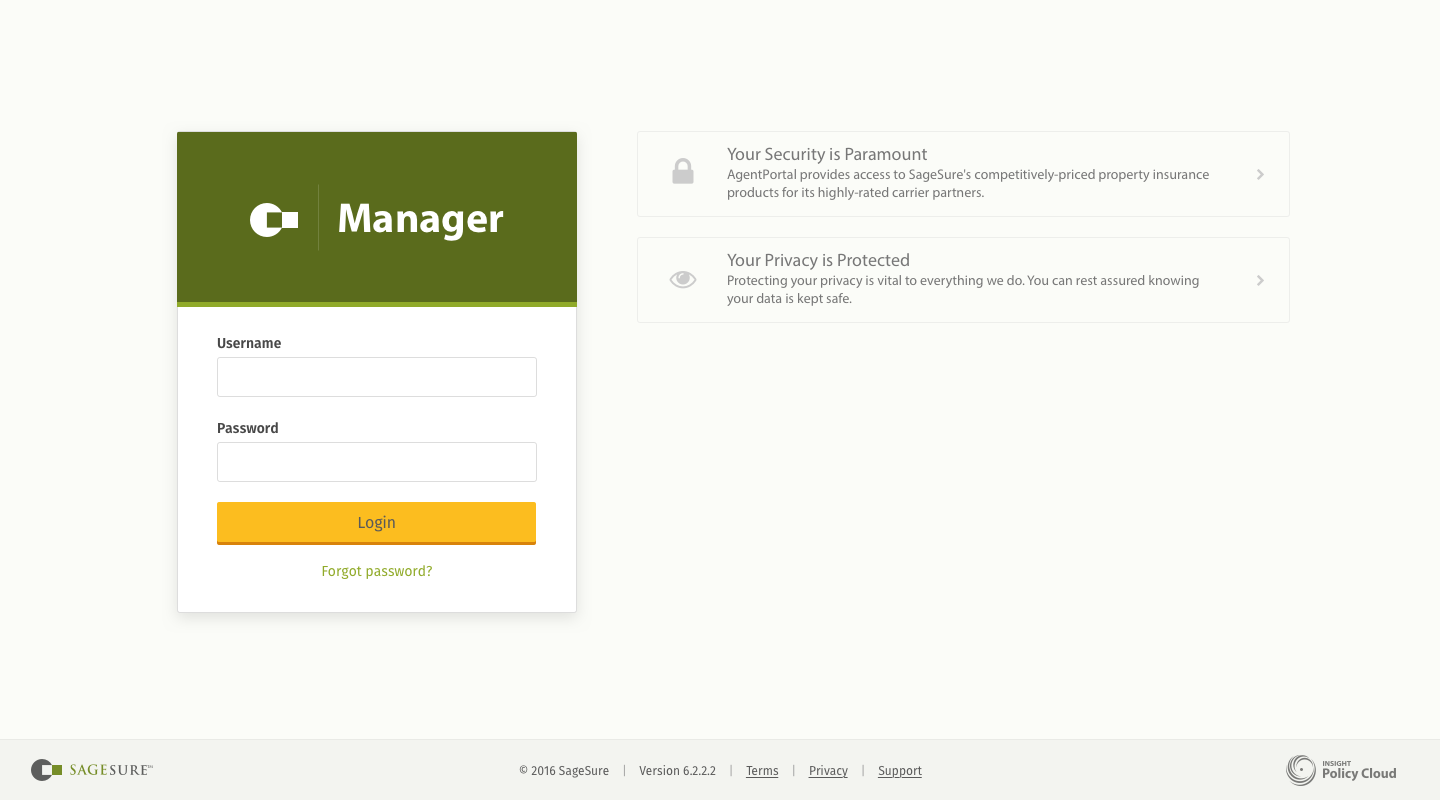
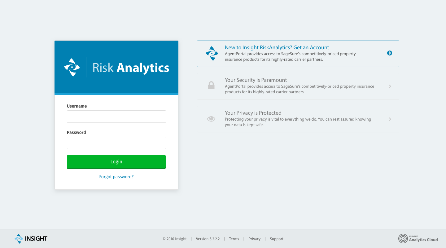
v2: Nailing Down Brand Hierarchy and Content
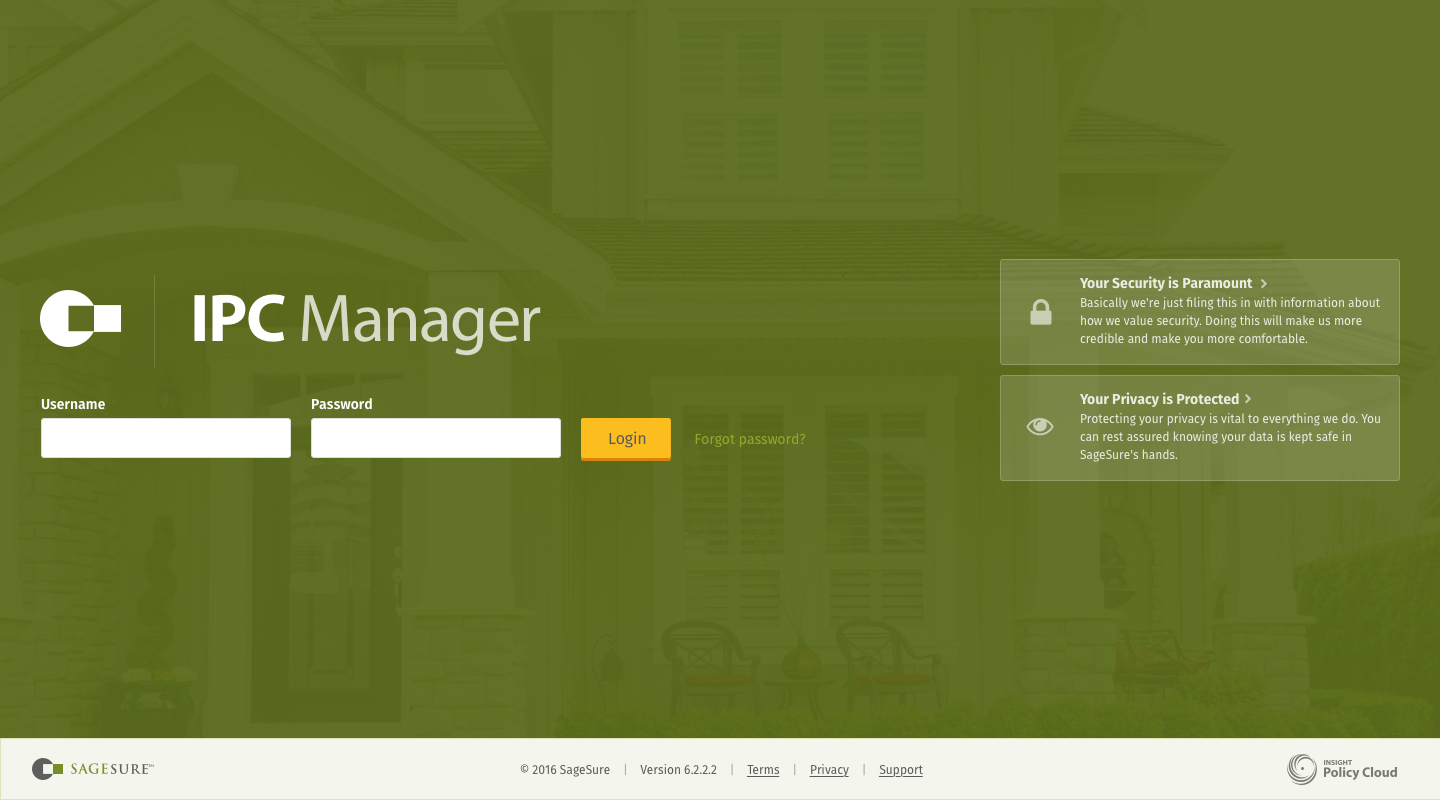
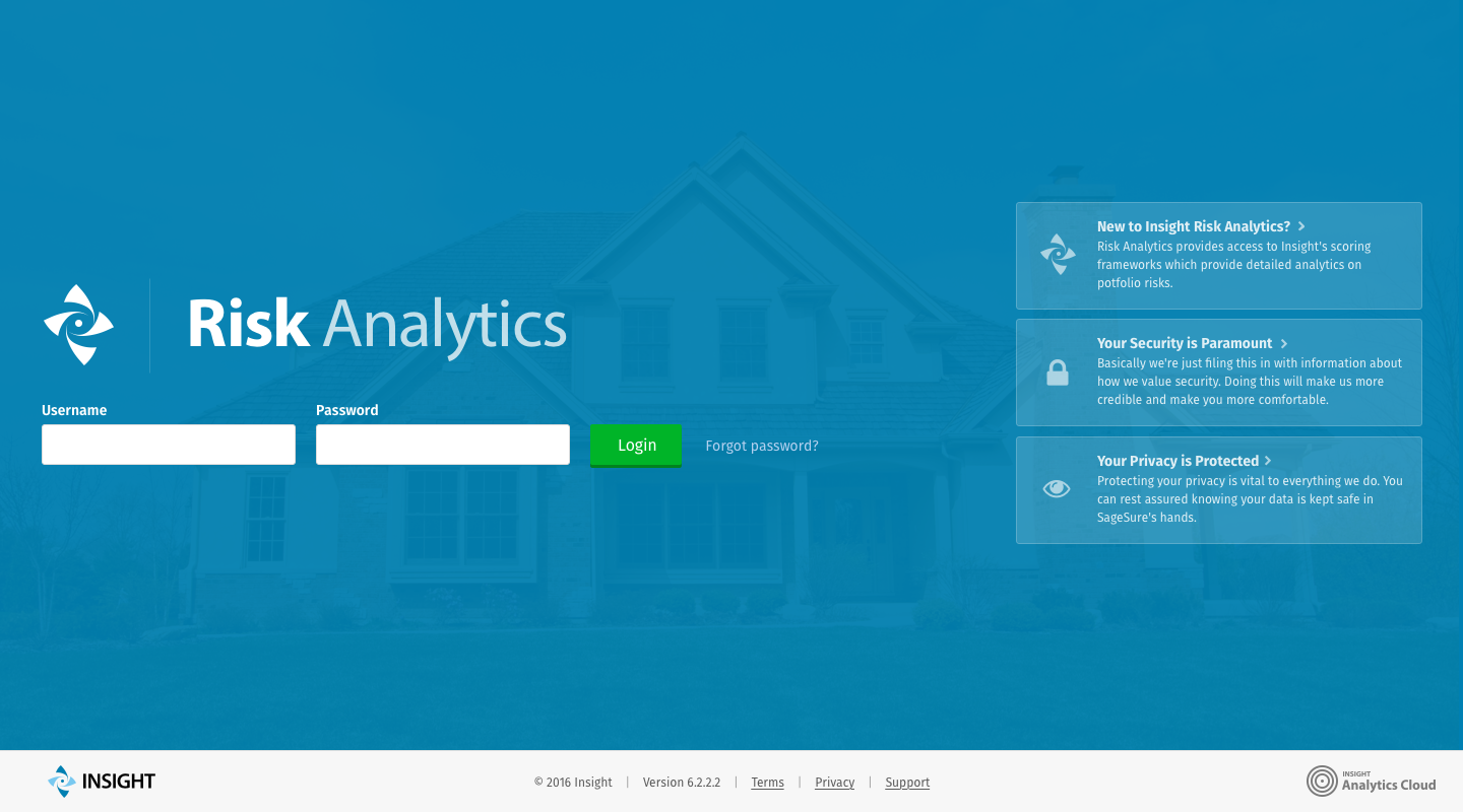
After discussions, feedback, and relevant business context from the CEO, we did another round of iterations on the login screens. This time we had more clear direction around the relationships between Insight’s applications, its customers, and the respective end users. This allowed us to more clearly define visual hierarchy because we gained a better understanding of how our applications related to each other and how they should be perceived by customers as part of a larger business offering. These relationships were reflected in the hierarchy of the new login screen mocks (as well as in the designs for customizable content modules that would be configurable on a per-application/per-customer basis).
These screens were designed in a modular fashion where their component parts could be extended to work for exisiting internal applications as well as future applications the company might offer. This got us one step closer to a coherent, consistent UI/UX for our product offerings.
Working through the visual hierarchy of differing brands really helped us talk about and discover our product and business relationships as an organinzation.
In addition to being portrayed in the application’s theme, the customer brand was married graphically with the product brand, allowing it to be read graphically from left-to-right as two component brand pieces: “{customer-brand} {product-brand}”. It reads in the mind’s eye as: “Company X’s Agent Portal”. Additionally, the product’s family is represented in the footer as a “powered by” or “part of” tag line. In practice, this graphic links to our company’s marketing site where customers can discover similar products within that family of software.
v3: Refining Aesthetics
By this point, we felt we had correctly defined the relationship between our products, their product families, and our customer/partner brands. However, we got some internal feedback contrary to the aesthetic direction we had formulated. So that meant back to the aesthetic drawing board. However, because we already knew the hierarchical relationships of elements on the page, changing the aesthetic was the easy “design” part. After some thought, I came up with the following screens:
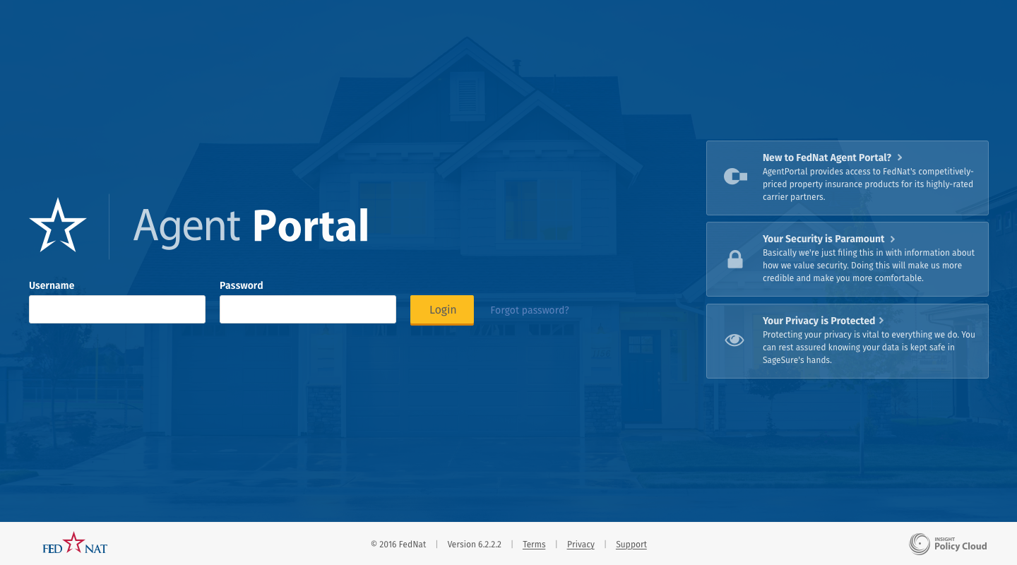
These screens achieved full buy-in from all stakeholders because they better represented and accentuated the product, product family, and customer/partner brands in a hierarchy which reflected our business goals. Additionally, from the CEO’s perspective, the designs better represented an aesthetic based on our business’s market position and customer relationships.
Conclusion
Not only did these logins provide more concrete visual direction for our products, but they drove internal discussions about the company and it’s relationships with internal employees, external partners, and customers/partners. It was exciting to see the design work for a set of software products be more than just static mocks, inteded to be passed on to a developer for implemenation in a future sprint. These mocks were part of the driving force behind discovering and concretely defining an identity for the business, its goals, its products, and its relatiohnships with customers, partners, and end users.