Text as UI
Years ago, Cameron Moll wrote a post describing what separates good design from great design. One of the things he talked about, which has stuck with me through the years, is the idea of treating text as UI. This is most aptly described by an image Moll used in his presentation:
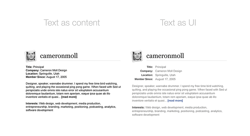
When desinging applications, which primarily exist to present sets of dynamic information, presenting text as UI (instead of merely content) aids users because it sets up expectations around information intpretation: “these things are important, these less-so”. You can leverage design principles like sizing, color, and white space to provide an interpretation of the text. This simplifies the cognitive overhead for the user because the interface is providing an interpretation on the text, like what information is important and what information is related.
A Real-world Example
When I started at Insight, one of the first design problems I solved was accomplished by treating text as UI (and not just as content). Let me frame the problem I was given.
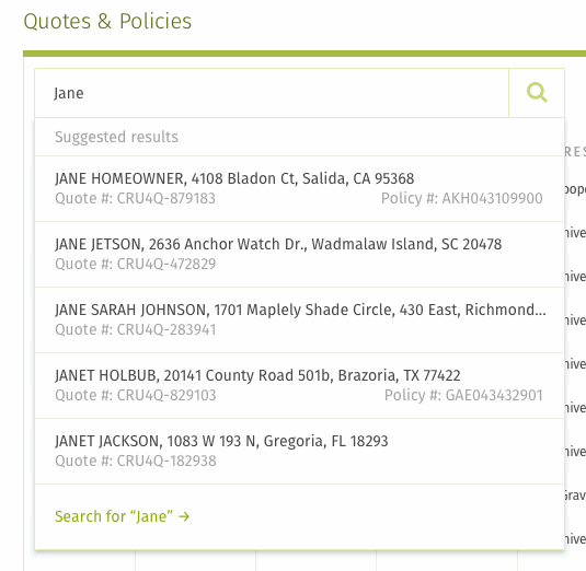
Before I arrived, a new feature was developed that gave users the ability to search the system for any item they needed.
Users reported the following problems with this interface:
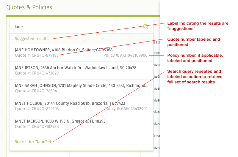
- Functionally the dropdown was a suggestion of key results based on user input (along with a few other factors). However, users didn’t appear to realize that the search dropdown was merely a suggestion of results. They thought it was the “full” list of results.
- The search results being returned were comprised of two primary types: quotes and policies. It was important to users that they be able to differentiate between the two types, but the textual results did not make that clear.
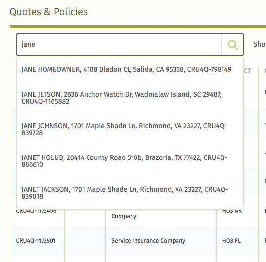
Based on this feedback, I took the exisiting UI and came up with this new design:
Here’s a quick overview on the reasoning behind my design choices:
- Hierarchically, the dropdown results were prefixed with a label indicating they were suggestions. Next came the results users could click on. Finally came an additional link that communicated: “not the results you were looking for? Do a full search.”
- Every result had a quote number, so every result showed that unique identifier along with a descriptive label. However, not every result had a policy number, so those unique identifiers were labeled and aligned on the right. In other words, every policy was a quote but not every quote was a policy. This design made it easy to scan the right column of the results to differentiate between what was a quote and what was a policy.
The original iteration of this UI treated text as content: the search results were merely bits of information concatenated into strings of text. My new design did not even require changes to the server. Instead, I treated the content being returned from the server as textual UI rather than textual content. This provided an interpretation of information that more clearly aligned with users’ mental model of the data they were interacting with. It made the information more parseable, understandable, and functional.
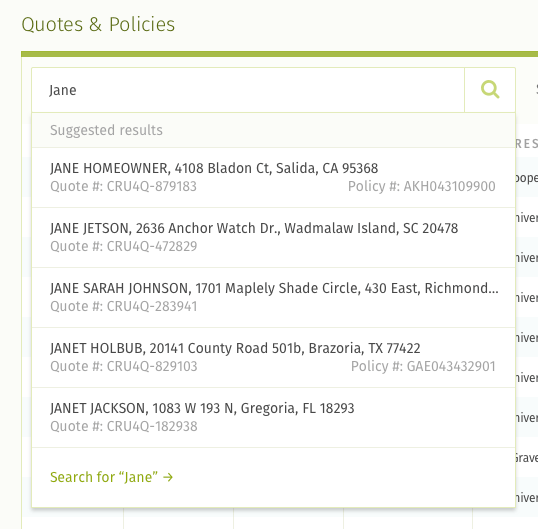
Here’s a comparison between the old and the new UI: