SassMe v2.0
Version 1
Back in 2012, when I was working with the folks at Arc90, the idea for SassMe hit me. Let me explain how.
If you were around in 2012 you’ll remember that skeuomorphic design was king. So lots of UI buttons looked like this (button design from an article by Pete Orme):

Creating buttons like that wasn’t always easy. Sure the button looks orange, but there are a lot of tiny color variations in there which provide the skeuomorphic effect. There was orange, but then there was a slightly lighter orange, and a slightly darker orange, and a slightly warmer orange, and a slightly cooler orange, etc. etc..

So to style a single button similar to the design above, you might end up with CSS like this:
.button {
  background: linear-gradient(to bottom, #FD892C 0%, #F4771A 50%, #EC6409 100%);
  border: 1px solid #CB5404;
  border-bottom-color: #B34A04;
  box-shadow: 0 0 0 1px #FD9B4B inset,
              0 3px 0 #CB5404;
}
See what we’ve got there? We have six different colors for that one button. It could get tricky keeping track of and maintaining consistency for all those different colors.
Enter My Idea
Back in 2012 I had been working a lot with Sass and I was discovering all its neat functionality for color usage in your stylesheets, like the Sass color functions. These functions were great because with a single color (usually your brand color) you could produce countless color variations, which would help you achieve whatever effect you needed for your UI, i.e. a shadow, a border, a warmer tone, etc. Sass allowed me to write CSS like this:
$brandColor: #F4771A;

.button {
  background: linear-gradient(to bottom, lighten($brandColor, 3%) 0%, $brandColor 50%, darken($brandColor, 3%) 100%);
  border: 1px solid saturate(darken($brandColor, 8%), 1%);
  border-bottom-color: saturate(darken($brandColor, 10%), 2%);
  box-shadow: 0 0 0 1px saturate(lighten($brandColor, 8%), 1%),
              0 3px 0 saturate(darken($brandColor, 8%), 1%);
}
The tricky part as a designer/developer was: when I want a slightly darker color, how do I know exactly how much I want to darken it? Will darkening it wipe out the saturation too much? How can I get the precise color I want? Enter my idea: why not build a tool that allows you to input a color, tweak the Sass color functions, and visually compare the output with the input until you get the variation you want?
The folks at Arc90 decided it was a problem worth trying to solve, so I mocked up some wireframes around what the interface for this tool would look like and they provided me some resources to help turn this thing into a reality. Matt, Robert, and Jesse all helped. And Darren Newton, the front-end wizard, helped translate the color functions of Sass (written in Ruby) to Javascript. In a short time, we had just the tool we wanted.

Arc90 released the tool to the world and quite a few folks found it rather useful:
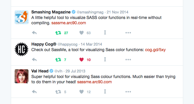
The project lived in the wild for a few years at http://sassme.arc90.com (code was available on Github at arc90/sass-color-picker).
Then, one day, I got a tweet from someone asking me if the site was still around. I visited http://sassme.arc90.com and found the URL was dead. After reaching out to a few contacts, I found out that the parent company who had acquired Arc90 had gone bankrupt and stopped paying their web hosting fees. As a result, all arc90.com related domains had died. Seeing as people still found the tool useful, I resolved to take over the app myself and host it under my domain.
Version 2.0
I copied the code from Arc90’s repository and immediately put it up under my domain at http://jim-nielsen.com/sassme. Shortly thereafter I began rewriting the code to leverage React instead of jQuery. I was able to use a lot of the original math Darren had written for transforming colors, with just a few fine-tuned adjustments here and there to get the colors right (hex color output had been off by a value or two, as mentioned in this issue) which I was able to resolve (at least I think I did ... nobody’s filed an issue yet).
The whole page got a bit of fresh paint from the design side and within a few weeks I pushed out version 2.0 of SassMe to http://jim-nielsen.com/sassme.

It was fun translating this into React project. Using react-create-app to setup all my tooling was stellar. I was able to dig right into coding, rather than spend forever configuring. If you haven’t tried react-create-app yet, give it a try! As for SassMe, you can find the code on Github. Feel free to tweak, adjust, PR, file an issue, whatever. The tool is yours.
Footnotes on the Technical Implementation
I decided to write v2.0 of SassMe using React, and I gotta say, it was a real pleasure to work with (once again). To get started, I looked at the old site and determined what the state of my app would look like:
- Value for initial HEX color
- Value for
lighten()function - Value for
darken()function - Value for
saturate()function - Value for
desaturate()function - Value for
adjust_hue()function
I also wanted to support passing in these state values via the url, i.e. http://jim-nielsen.com/sassme/?hex=123456&lighten=20. Along with a few other reasons, including tests, having a single object type that represents the state of my app allowed me to boot the app up however I wanted, either empty or fully configured with a color and transformation values. To do this, I configured a specific object type like the following:
/*
 * The SassMeState object type is used quite extensively throughout this app.
 * Learn it. Love it.
 *
 * @typedef {Object} SassMeState
 * @property {String} hex - Value, valid 6 character hexadecimal color
 * @property {number} lighten - Value [0 -> 100]
 * @property {number} darken - Value [0 -> 100]
 * @property {number} saturate - Value [0 -> 100]
 * @property {number} desaturate - Value [0 -> 100]
 * @property {number} adjust_hue - Value [-360 -> 360]
 */
Any time the user triggers an action where they would expect the application to repaint, I would use React’s setState() function and pass in my state object. Then React does all the legwork and the UI re-renders.
As far as color transformations, rendering the output color based on transformation inputs was pretty straightforward. Anytime the state changes for the app, I run a function that does the following:
- Convert the HEX value in the state to RGB then to HSL
- Adjust the H (hue), S (saturation), or L (lightness) values based on the user’s input
- Convert the newly-calculated HSL value back to RGB then to HEX
- Render that value to the UI (both the hexadecimal value and the color)
As an example, if the user drags the lighten() value up to 12 (i.e. code output lighten(#123456, 12)) the HEX input value in the state is transformed to HSL then the L value is added upon by 12 (because the lightness value is a percentage between 0 and 100). Once we’ve modified the HSL values based on the user’s input(s), we convert the modified HSL value back to HEX and render that color and value to the UI. There are a few checks in place that ensure the user’s input(s) fall within the appropriate thresholds of the HSL color values. That way, if the user inputs a dark color like #111111 and sets darken() to 15 or 90, the UI will still render the maximum darken() value: #000000.
If you’d like to know more about what’s going on under the hood, take a look at the code on Github.