Reading Notes, September 2016
Book: Git for Humans from A Book Apart
I’ve been creating web stuff for over 10 years, and i’ve been working with Git for probably the last 4 or 5 of those. So I consider myself relatively rote in basic Git commands like commit, push, pull, etc. However, I’ve never felt like I really understood Git, so I grabbed this book thinking it might help. One of the more lasting impressions this book left me was a concept introduced in the preface of the book by Mandy Brown:
Knowing when and how to commit a change is more than just a means of updating code—it’s also a practice for communicating and sharing work. ... By all means, devour the following chapters in order to t understand how to manage merge conflicts and interpret a log. But don’t forget that Git’s ultimate audience isn’t machines—it’s humans.
This idea of looking at Git as a communication tool is reinforced throughout the entire book. Git can be seen as a way to tell a story about what’s happening to your codebase in a way that’s much “closer to the metal” than other communication tools Slack or email. It’s made me rethink my actions in Git, like how I craft commit messages, how I tag branches, and how I propose and merge pull requests. These can be viewed as more than commands in the terminal but as methods of communicating to humans in the story book of a project, Git becomes a powerful tool of communication over the life arc of your codebase.
For example, when I was first introduced to Git I thought it rather laborious. I liked the idea of saving changes often but having to write a message for every save? That seemed a bit much. Which is why my commit history looked something like:
Initial work on sidebar widgetmore changesstill more changeslast changeok this is the last change
Now after reading this book, I want to be more thoughtful in my approach to Git and commit messages. I want to have the change of mindset the author himself had and describes in the book:
I came to appreciate the benefits of having every signification version of my projects stored, annotated, and neatly organized ... [it helped me] to think of commits as significant changes, as opposed to the hundreds of little changes I might save in a given hour. The extra steps involved in committing ... have ultimately helped me develop a more thoughtful and judicious way of working.
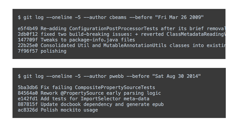
I think if you work in Git long enough, you’ll begin to appreciate how all those little commits and actions stack up over the course of a project. To have a couple year-old project that is beautifully documented in Git is something you’ll never get through shortcuts. You’ll only get it through disciplined, thoughtful work over a long span of time. Chris Beams talks about this in his article “How to Write a Git Commit Message”. He begins by showing two examples of commit histories, one earlier in his project when he wasn’t caring about commit messages and the other later in the project when he began caring:
The former varies wildly in length and form; the latter is concise and consistent. The former is what happens by default; the latter never happens by accident.
If you’ve worked in software, you know the truth of those words: “the former is what happens by default, the latter never happens by accident”. The author of “Git for Humans” touches on this same point in his book:
Every commit you add to your repository contributes to the historical record of your project, so it’s a good idea to make the best, most meaningful commits you can.
That’s what I enjoyed most about this book. I didn’t come away with a lot of technical tips and tricks on using Git (though I’m sure as a newbie to Git you could gain precisely that). Rather, I came away with a broader view of Git as a tool and a process. Git can be about version control, yes. But it can also be about regular people making changes, evolving a code base, crafting a history, and doing it all together. Git can be a story, the story of your time with other people on a project, a biography of yourself, your team, and your product.
Book: Responsive Design: Patterns & Principles from A Book Apart
Here’s the thing about this book: it covers a lot of information that, if you’re current on the latest trends in web design, isn’t new. Don’t get me wrong, the author covers it in a clear, concise manner. If I was a beginner to the field, I would find this book very useful. But as a practitioner, I found the book mostly reviewing things I’m already doing every day (or am at least aware of in some fashion). I would still think the book is well written and would recommend it to anyone who is new to the landscape of responsive web design and wondering how all this responsive stuff is actually accomplished. But for a practitioner there won’t be a lot of new “tips and tricks”. With that said, here are a few things that stood out to me that I enjoyed:
Ajax-Include Pattern
Ethan covers the topic of conditionally loading menus and other content via javascript (as opposed to serving everything on page load and then just showing/hiding parts via CSS). One method he gives for accomplishing this, which I had not seen but found to be quite clever and semantic, is the Filament Group's Ajax-include pattern. You can simply reference the HTML want you loaded in an HTML5 data attribute, like so:
<li data-append="/politics/latest-stories.html">
    <a href="/politics">Politics</a>
</li>
I thought this a great example of progressive enhancement. If javascript is available on the client, it fetches that document fragment and appends it in context.
For what it’s worth, the plugin appears to have a good API which allows additional options such as conditionally loading the content based on a media query, i.e. data-media="(min-width:500px)".
A/B Testing
This is the reason we A/B test in the first place, because the findings of others...are all unproven until they've been tested against our customers, on our platform.
That’s Ethan quoting Michel Ferreria talking about how A/B tests results can be useful but you've got to remember to weigh them against your own user base. So often it feels like A/B test results from another product are improperly used to justify decisions in your own product. Obviously people on your team are not trying sabotage your product. We all just have biases and try to use data to back up our bias. We make the results fit our desired outcome.
I think it’s good to remember (and point out where necessary) that A/B tests from others are performed under conditions unique to them, conditions that often will not mirror those of your own product. You wouldn’t take the results of a research project in Antartica which prove it’s cold outside to mean everyone in desert in Phoenix should buy a coat. They are different circumstances, different conditions. By all means, weigh the data from an A/B test against your own user base and product and make use of the work of others. Just remember data isn’t fact just because its data.
The <img> tag and max-width: 100%
One of the supposed downsides of simply setting max-width: 100% on all <img> elements is that some images don’t scale down nicely. For example, let’s say you have a 1200x1200 pixel infographic. At full resolution the type is set at 16 pixels. That means when the infographic’s <img> element is responsively scaled down on a mobile device to a width of say 300x300 pixels, the text on that graphic is going to be completely illegible.
Now, from a technological standpoint, some people may argue that what you need are tools, tools, tools! Design the infographic in three different sizes, crop it for seven different media queries, and output fifteen different versions of one image in order to account for sizing, pixel density, etc. Then serve all those different images using the <picture> element with a javascript polyfill (or some other cutting edge feature).
Now you could well go and do that. And there are cases when I’m sure that is proper. But I’d like to also suggest another solution: just wrap the <img> element in an <a> tag. That’s it. If the image gets resized to a small viewport, that’s ok. If the user needs to see the full-sized image, they can simply click on it and then use their native hardware’s pan/zoom tools. Sure some might argue that this solution isn’t as optimal as the other scenario, but it’s just as accessible (one could argue possibly more-so). A simple link can be quite effective because hey, that’s how the web was designed to work: link to resources on computers. I’ll be a web page designed today with <a><img></a> will still work in twenty years on a web-accessible device. While a hundreds-of-lines polyfill in javascript designed to fetch and serve one of twenty different images may not.
Mobile Desktop First
One of the reasons I often start my designs at 960px and then design more narrow screens as I go is aptly described by the guys who did the Boston Globe website, as quoted by Ethan in this book:
Ours designs began at 960px, arguably the most complicated breakpoint, with several columns of content. Maybe this just came naturally after years of designing for that width. But I think it’s more than that. It’s easier to design with more screen real-estate — you see more at one time, you have a more nuanced hierarchy ... So starting at 960, we designed downward. Every decision informed the one before it and the one after; we flipped back and forth between break points a lot. As the Mobile First mantra suggest, designing for mobile was most instructive because it forced us to decide what was most important. And since we refused to hide content between break points, the mobile view could send us flying back up to the top level to remove complexity. The process felt a bit like sculpting.
I think that’s an apt justification for how I’ve arrived at my current process for responsive design. Start at 960px and get a good grasp for content relationships, patterns, and hierarchy. As you transitions those responsive modules down to mobile break points, things often break and you discover better solutions for content relationship, UI patterns, and element hierarchy. This sends you back up to 960 pixels where, often, you end up solving problems that were slightly nagging you in the first place. That moving up and down the viewport spectrum and seeing how things flow down to smaller break points helps me arrive at the designs I want without starting “mobile first”.
Final Points
In writing about the need for effective language around responsive design, Ethan writes:
We need a design language that’s as nimble and modular as our layout systems are becoming.
This describes one of the points I felt Ethan was trying to hammer home throughout this book. He wasn’t just writing a tutorial-style book on “how-to responsive design”. To me, at a higher level this book was a suggestion to change the way we think and talk about responsive design rather than the way we implement it. Talking about process and methodology is always harder than technical implementation, often because there is no language for doing it. We haven’t really come up with a really concise vocabulary for responsive web design yet, at least that’s what Ethan suggests in this book. That, more than any particular technical tip or trick, will help propel us to more effective web designs. As the author Jan Swafford once stated, “To discover new means of expression is to discover new territories of the human”.